دکمه عملیاتی شناور (FAB) یک دکمه با تأکید بالا است که به کاربر اجازه میدهد یک عمل اصلی را در یک برنامه انجام دهد. این دکمه یک عمل واحد و متمرکز را ترویج میدهد که رایجترین مسیری است که کاربر ممکن است طی کند و معمولاً در پایین سمت راست صفحه نمایش قرار دارد.
این سه مورد استفاده را در نظر بگیرید که در آنها میتوانید از FAB استفاده کنید:
- ایجاد آیتم جدید : در یک برنامه یادداشتبرداری، میتوان از FAB برای ایجاد سریع یک یادداشت جدید استفاده کرد.
- افزودن مخاطب جدید : در یک برنامه چت، یک FAB میتواند رابطی را باز کند که به کاربر اجازه میدهد شخصی را به مکالمه اضافه کند.
- موقعیت مکانی در مرکز : در یک رابط نقشه، یک FAB میتواند نقشه را در مرکز موقعیت فعلی کاربر قرار دهد.
در طراحی متریال، چهار نوع FAB وجود دارد:
- FAB : یک دکمه عملیاتی شناور با اندازه معمولی.
- FAB کوچک : یک دکمه عملیاتی شناور کوچکتر.
- FAB بزرگ : یک دکمه عملیاتی شناور بزرگتر.
- دکمه عملیاتی شناور توسعهیافته (Extended FAB) : یک دکمه عملیاتی شناور که شامل بیش از یک آیکون است.

سطح API
اگرچه چندین ترکیبپذیر وجود دارد که میتوانید برای ایجاد دکمههای اکشن شناور سازگار با طراحی متریال از آنها استفاده کنید، پارامترهای آنها تفاوت چندانی با هم ندارند. از جمله پارامترهای کلیدی که باید در نظر داشته باشید موارد زیر است:
-
onClick: تابعی که هنگام فشردن دکمه توسط کاربر فراخوانی میشود. -
containerColor: رنگ دکمه. -
contentColor: رنگ آیکون.
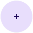
دکمه عملیاتی شناور
برای ایجاد یک دکمه عملیاتی شناور عمومی، از ترکیببندی پایه FloatingActionButton استفاده کنید. مثال زیر پیادهسازی اولیه یک FAB را نشان میدهد:
@Composable fun Example(onClick: () -> Unit) { FloatingActionButton( onClick = { onClick() }, ) { Icon(Icons.Filled.Add, "Floating action button.") } }
این پیادهسازی به صورت زیر ظاهر میشود:

دکمه کوچک
برای ایجاد یک دکمه عملیاتی شناور کوچک، از کامپوننت SmallFloatingActionButton استفاده کنید. مثال زیر نحوه انجام این کار را با اضافه کردن رنگهای سفارشی نشان میدهد.
@Composable fun SmallExample(onClick: () -> Unit) { SmallFloatingActionButton( onClick = { onClick() }, containerColor = MaterialTheme.colorScheme.secondaryContainer, contentColor = MaterialTheme.colorScheme.secondary ) { Icon(Icons.Filled.Add, "Small floating action button.") } }
این پیادهسازی به صورت زیر ظاهر میشود:

دکمه بزرگ
برای ایجاد یک دکمه عملیاتی شناور بزرگ، از ترکیبکننده LargeFloatingActionButton استفاده کنید. این ترکیبکننده تفاوت چندانی با مثالهای دیگر ندارد، به جز اینکه منجر به یک دکمه بزرگتر میشود.
در ادامه، پیادهسازی سادهای از یک FAB بزرگ ارائه شده است.
@Composable fun LargeExample(onClick: () -> Unit) { LargeFloatingActionButton( onClick = { onClick() }, shape = CircleShape, ) { Icon(Icons.Filled.Add, "Large floating action button") } }
این پیادهسازی به صورت زیر ظاهر میشود:
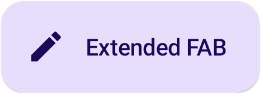
دکمه توسعه یافته
شما میتوانید دکمههای عملیاتی شناور پیچیدهتری را با استفاده از ExtendedFloatingActionButton composable ایجاد کنید. تفاوت کلیدی بین آن و FloatingActionButton این است که پارامترهای icon و text اختصاصی دارد. آنها به شما امکان میدهند دکمهای با محتوای پیچیدهتر ایجاد کنید که برای تناسب با محتوایش، مقیاسپذیر میشود.
قطعه کد زیر نحوه پیادهسازی ExtendedFloatingActionButton را نشان میدهد، به همراه مقادیر نمونهای که برای icon و text ارسال میشوند.
@Composable fun ExtendedExample(onClick: () -> Unit) { ExtendedFloatingActionButton( onClick = { onClick() }, icon = { Icon(Icons.Filled.Edit, "Extended floating action button.") }, text = { Text(text = "Extended FAB") }, ) }
این پیادهسازی به صورت زیر ظاهر میشود: