
The Chip component is a compact, interactive UI element. It represents complex
entities like a contact or tag, often with an icon and label. It can be
checkable, dismissible, or clickable.
The four types of chips and where you might use them are as follows:
- Assist: Guides the user during a task. Often appears as a temporary UI element in response to user input.
- Filter: Allows users to refine content from a set of options. They can be selected or deselected, and may include a checkmark icon when selected.
- Input: Represents user-provided information, such as selections in a menu. They can contain an icon and text, and provide an X for removal.
- Suggestion: Provides recommendations to the user based on their recent activity or input. Typically appear beneath an input field to prompt user actions.

API surface
There are four composables that correspond to the four types of chips. The following sections outline these composables and their differences in detail. However, they share the following parameters:
label: The string that appears on the chip.icon: The icon displayed at the start of the chip. Some of the specific composables have a separateleadingIconandtrailingIconparameter.onClick: The lambda that the chip calls when the user presses it.
Assist chip
The AssistChip composable provides a straightforward way to create an
assist chip that nudges the user in a particular direction. One distinguishing
feature is its leadingIcon parameter that lets you display an icon on the left
side of the chip. The following example demonstrates how you can implement it:
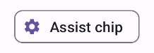
@Composable fun AssistChipExample() { AssistChip( onClick = { Log.d("Assist chip", "hello world") }, label = { Text("Assist chip") }, leadingIcon = { Icon( Icons.Filled.Settings, contentDescription = "Localized description", Modifier.size(AssistChipDefaults.IconSize) ) } ) }
This implementation appears as follows.
Filter chip
The FilterChip composable requires you to track whether or not the chip
is selected. The following example demonstrates how you can show a leading
checked icon only when the user has selected the chip:
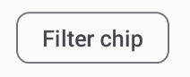
@Composable fun FilterChipExample() { var selected by remember { mutableStateOf(false) } FilterChip( onClick = { selected = !selected }, label = { Text("Filter chip") }, selected = selected, leadingIcon = if (selected) { { Icon( imageVector = Icons.Filled.Done, contentDescription = "Done icon", modifier = Modifier.size(FilterChipDefaults.IconSize) ) } } else { null }, ) }
This implementation appears as follows when unselected:
And appears as follows when selected:

Input chip
You can use the InputChip composable to create chips that result from
user interaction. For example, in an email client, when the user is writing an
email, an input chip might represent a contact the user has added to the "To:"
field.
The following implementation demonstrates an input chip that is already in a selected state. The user dismisses the chip when they press it.
@Composable fun InputChipExample( text: String, onDismiss: () -> Unit, ) { var enabled by remember { mutableStateOf(true) } if (!enabled) return InputChip( onClick = { onDismiss() enabled = !enabled }, label = { Text(text) }, selected = enabled, avatar = { Icon( Icons.Filled.Person, contentDescription = "Localized description", Modifier.size(InputChipDefaults.AvatarSize) ) }, trailingIcon = { Icon( Icons.Default.Close, contentDescription = "Localized description", Modifier.size(InputChipDefaults.AvatarSize) ) }, ) }
This implementation appears as follows.

Suggestion chip
The SuggestionChip composable is the most basic of the composables listed
on this page, both in its API definition and its common use cases. Suggestion
chips present dynamically generated hints. For example, in an AI chat app, you
might use suggestion chips to present possible responses to the most recent
message.
Consider this implementation of SuggestionChip:
@Composable fun SuggestionChipExample() { SuggestionChip( onClick = { Log.d("Suggestion chip", "hello world") }, label = { Text("Suggestion chip") } ) }
This implementation appears as follows:

Elevated chip
All the examples in this document use the base composables that take a flat appearance. If you want a chip that has an elevated appearance, use one of the three following composables: