
از یک نشان برای نمایش یک عنصر بصری کوچک جهت نشان دادن وضعیت یا یک مقدار عددی روی یک عنصر قابل ترکیب دیگر استفاده کنید. در اینجا چند سناریوی رایج وجود دارد که ممکن است در آنها از یک نشان استفاده کنید:
- اعلانها : تعداد اعلانهای خوانده نشده را روی نماد برنامه یا زنگ اعلان نمایش دهید.
- پیامها : پیامهای جدید یا خوانده نشده را در یک برنامه چت مشخص کنید.
- بهروزرسانیهای وضعیت : وضعیت یک کار، مانند «کامل»، «در حال انجام» یا «ناموفق» را نشان میدهد.
- تعداد سبد خرید : تعداد اقلام موجود در سبد خرید کاربر را نمایش میدهد.
- محتوای جدید : محتوا یا ویژگیهای جدید موجود برای کاربر را برجسته کنید.

سطح API
از BadgedBox composable برای پیادهسازی مدالها در برنامه خود استفاده کنید. در نهایت این یک کانتینر است. شما ظاهر آن را با این دو پارامتر اصلی کنترل میکنید:
-
content: محتوای قابل ترکیب کهBadgedBoxشامل آن است. معمولاًIcon. -
badge: نشان قابل ترکیب که به عنوان نشان روی محتوا ظاهر میشود. معمولاًBadgeقابل ترکیب اختصاصی.
مثال پایه
این قطعه کد، پیادهسازی اولیهی BadgedBox را نشان میدهد:
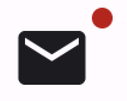
@Composable fun BadgeExample() { BadgedBox( badge = { Badge() } ) { Icon( imageVector = Icons.Filled.Mail, contentDescription = "Email" ) } }
این مثال یک نشان را نمایش میدهد که با Icon ترکیبی ارائه شده همپوشانی دارد. به موارد زیر در کد توجه کنید:
-
BadgedBoxبه عنوان کانتینر کلی عمل میکند. - آرگومان پارامتر
badgeدرBadgedBox،Badgeاست. از آنجا کهBadgeهیچ آرگومانی از خود ندارد، برنامه نشان پیشفرض را که یک دایره قرمز کوچک است، نمایش میدهد. -
Iconبه عنوان آرگومان برای پارامترcontentBadgedBoxعمل میکند. این آیکونی است که نشان روی آن ظاهر میشود. در این مورد، این یک آیکون ایمیل است.
اینگونه ظاهر میشود:
مثال تفصیلی
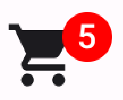
قطعه کد زیر نشان میدهد که چگونه میتوانید مقادیری را در نشان نمایش دهید که به اقدامات کاربر پاسخ میدهند.
@Composable fun BadgeInteractiveExample() { var itemCount by remember { mutableIntStateOf(0) } Column( verticalArrangement = Arrangement.spacedBy(16.dp) ) { BadgedBox( badge = { if (itemCount > 0) { Badge( containerColor = Color.Red, contentColor = Color.White ) { Text("$itemCount") } } } ) { Icon( imageVector = Icons.Filled.ShoppingCart, contentDescription = "Shopping cart", ) } Button(onClick = { itemCount++ }) { Text("Add item") } } }
این مثال یک آیکون سبد خرید به همراه یک نشان که تعداد اقلام موجود در سبد خرید کاربر را نمایش میدهد، پیادهسازی میکند.
-
BadgedBoxفقط زمانی نمایش داده میشود که تعداد آیتمها از ۰ بیشتر باشد. - آرگومانهای مربوط به
containerColorوcontentColorظاهر نشان را کنترل میکنند. -
Textقابل ترکیب برای جایگاه محتوایBadge، درون نشان نمایش داده میشود. در این حالت، تعداد اقلام موجود در سبد خرید را نمایش میدهد.
این پیادهسازی به صورت زیر ظاهر میشود: