
請將 Button 元件用在使用者充分瞭解且不需要文字標籤的動作。按鈕為圓形設計,這是和方塊的區別。
圖解
A. 內容
按鈕會為圖示或文字保留一個版位。請選取與執行按鈕動作相關的圖示。如果圖示無法描述相關動作,您可以使用文字,但不能超過三個字元。如果圖示無法清楚描述動作,請考慮使用方塊元件
B. 容器
按鈕容器只能填入單色。
按鈕類型
階層
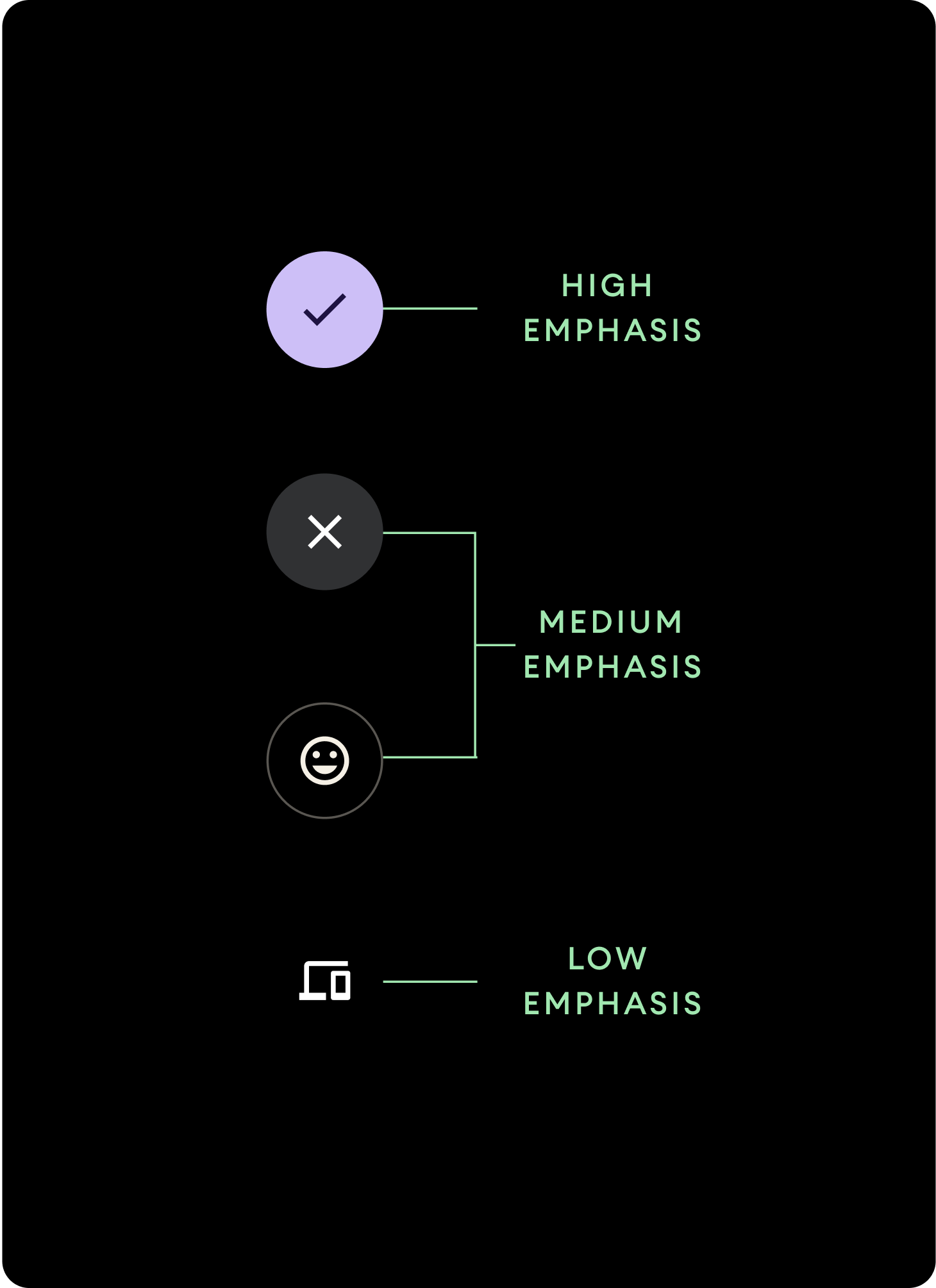
使用不同的填滿色彩表示按鈕階層。
高強調
高強調按鈕包含應用程式的主要動作。針對這類按鈕,請為容器使用 Primary 或 Secondary 顏色,並將 On Primary 和 On Secondary 顏色用於內容。詳情請參閱「Wear Material 主題設定」。
中強調
中強調按鈕的塗色較不鮮明。比起主要動作,這些按鈕包含的動作比較不重要。請為容器使用 Surface 顏色,並將 On Surface 顏色用於內容。
或者,您也可以針對中強調按鈕,使用自訂 OutlinedButton 元件。這個元件含有透明背景、不透明度 60% 的 Primary Variant 色彩筆劃,以及 Primary 顏色的內容。
低強調 (僅限圖示)低強調按鈕的特徵就是沒有塗色。這個選項最適合用於錶面上需要精簡規劃的較小區域。請為內容使用疊加表面色。
大小
使用不同大小的按鈕,來增加強調或減少強調動作。
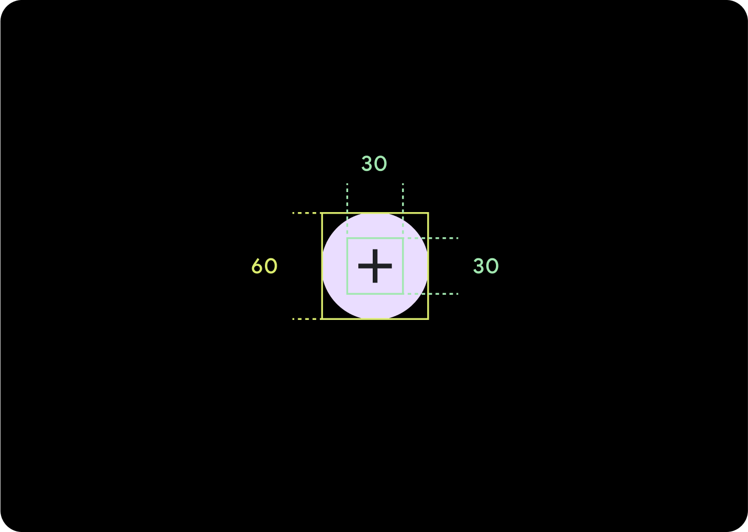
大
圖示 (30 x 30 dp)
容器 (60 x 60 dp)
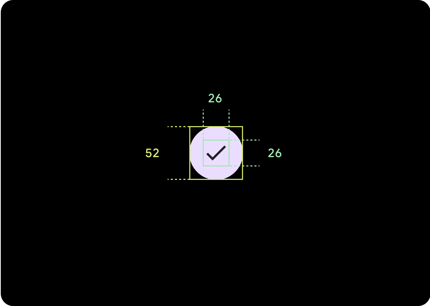
預設
圖示 (26 x 26 dp)
容器 (52 x 52 dp)
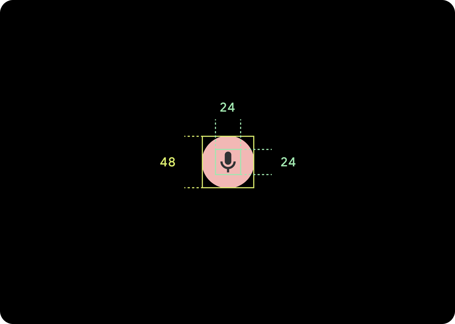
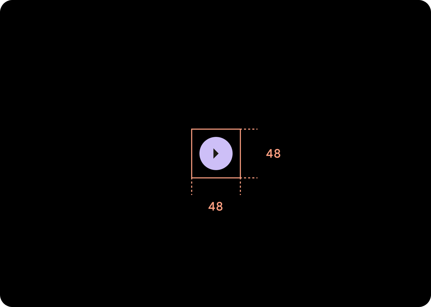
小
圖示 (24 x 24 dp)
容器 (48 x 48 dp)
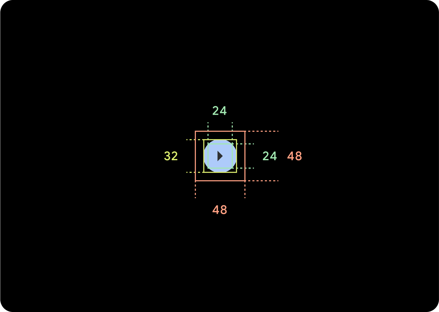
XS
圖示 (24 x 24 dp)
容器 (32 x 32 dp)
建議您在按鈕周圍加上額外的邊框間距,以便建立至少 48 dp 的輕觸目標。這是無障礙功能的最低輕觸目標大小。
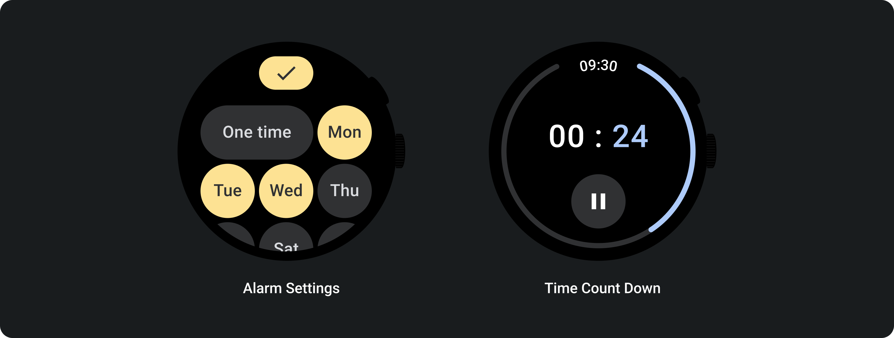
用量
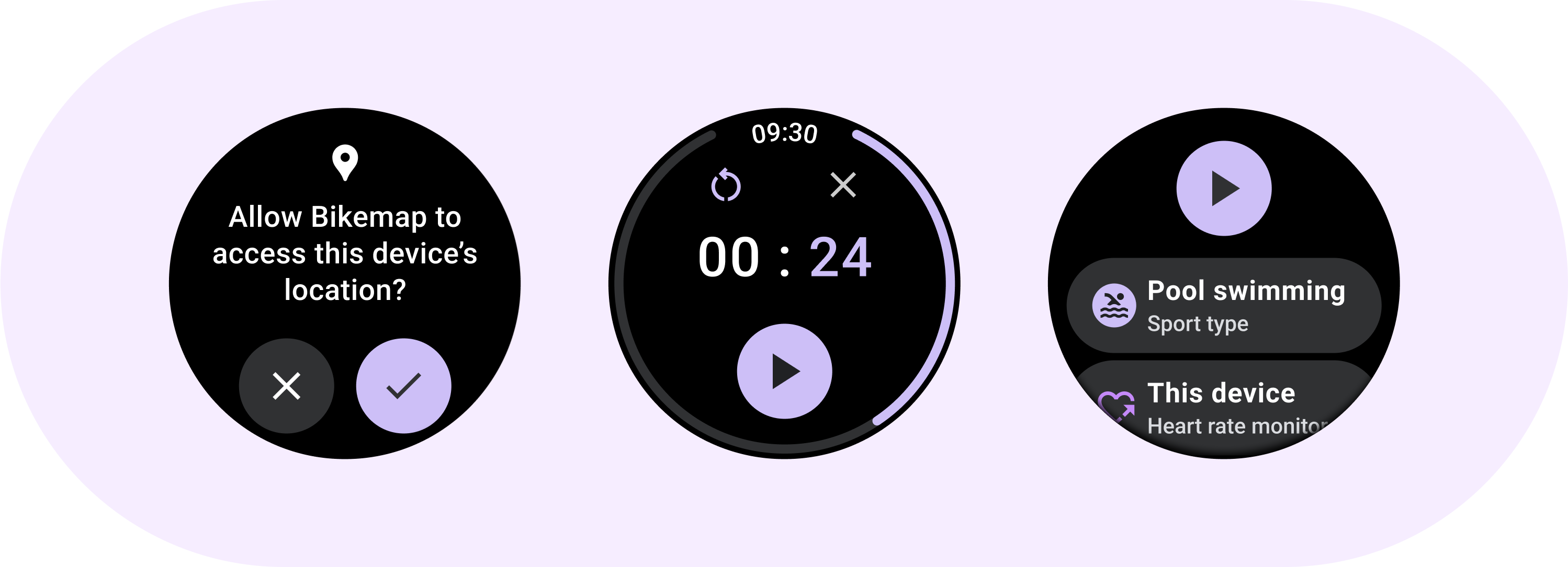
您可運用標準按鈕讓使用者執行單一動作,例如接受或拒接來電,或啟動計時器。
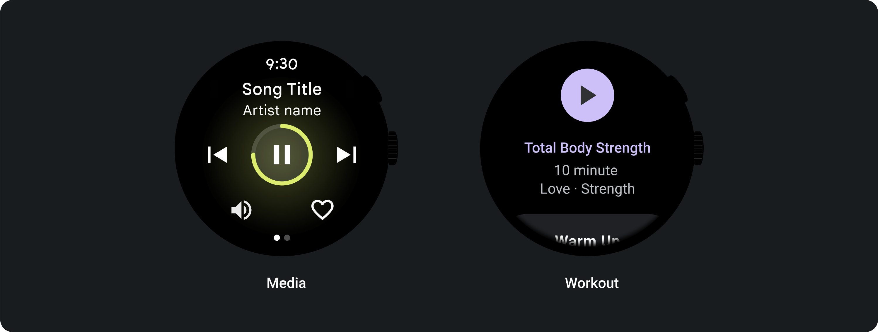
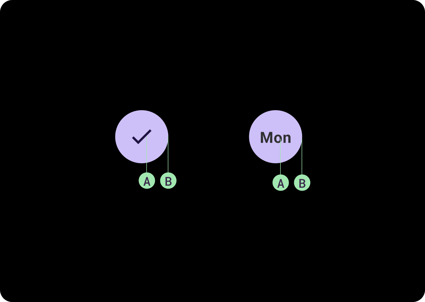
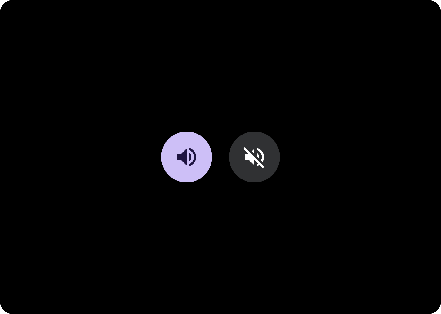
若要讓使用者開啟或關閉特定選項,例如選取和取消選取星期幾,或是暫停及重新啟動計時器,則可以運用切換按鈕達到目的。
自動調整式版面配置
回應式行為
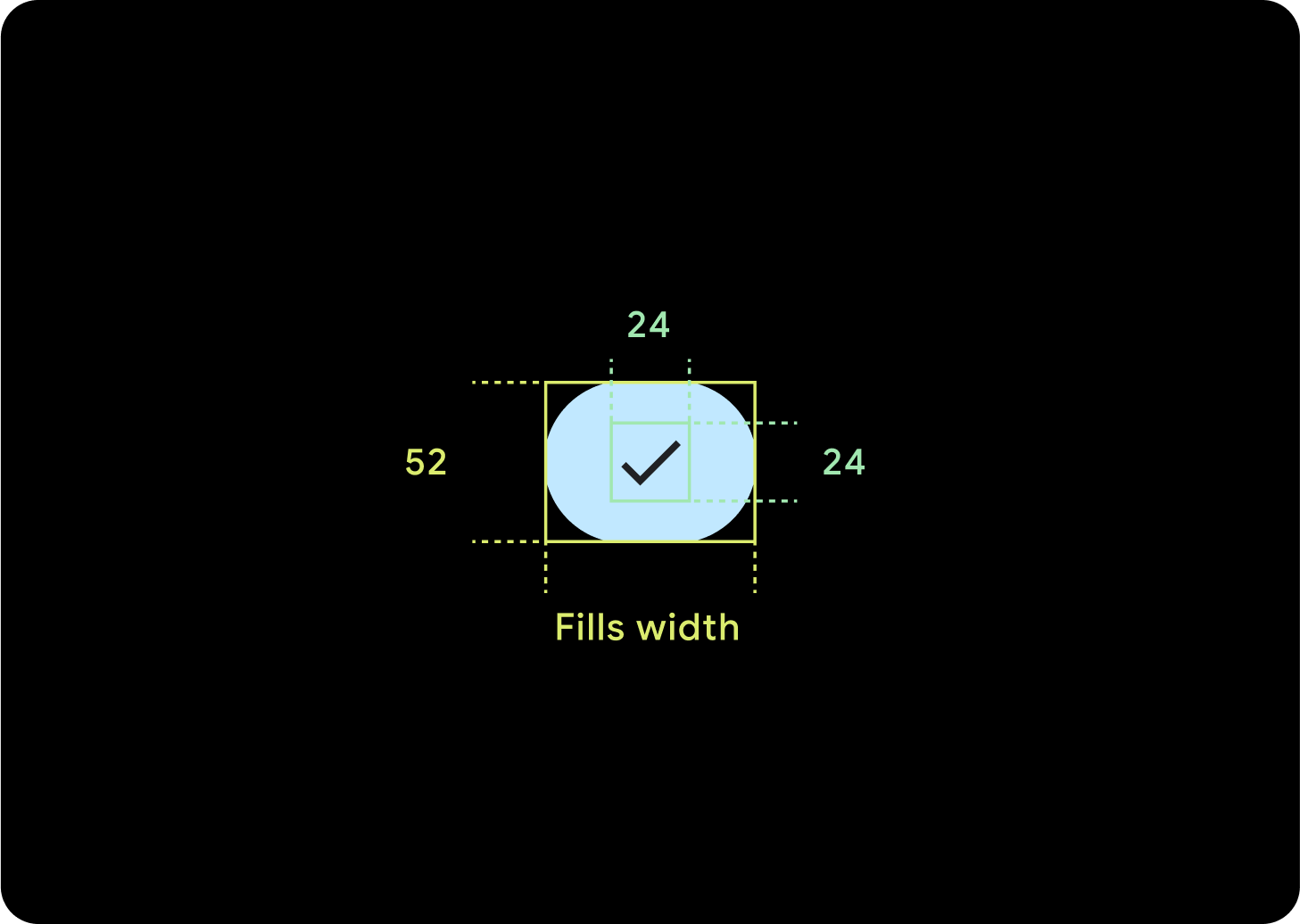
1 個按鈕
內部邊距會保持不變,邊框應為百分比,以免按鈕過度拉長,並維持相對大小。
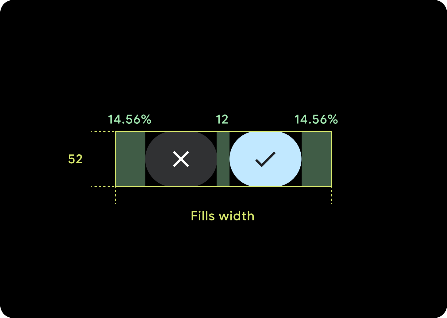
2 個按鈕
如果有 2 個按鈕,系統會加入百分比內部邊距,避免按鈕過度拉伸,並維持相對大小。
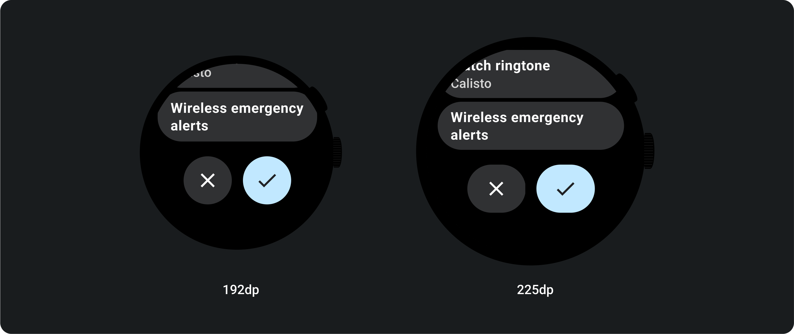
IME
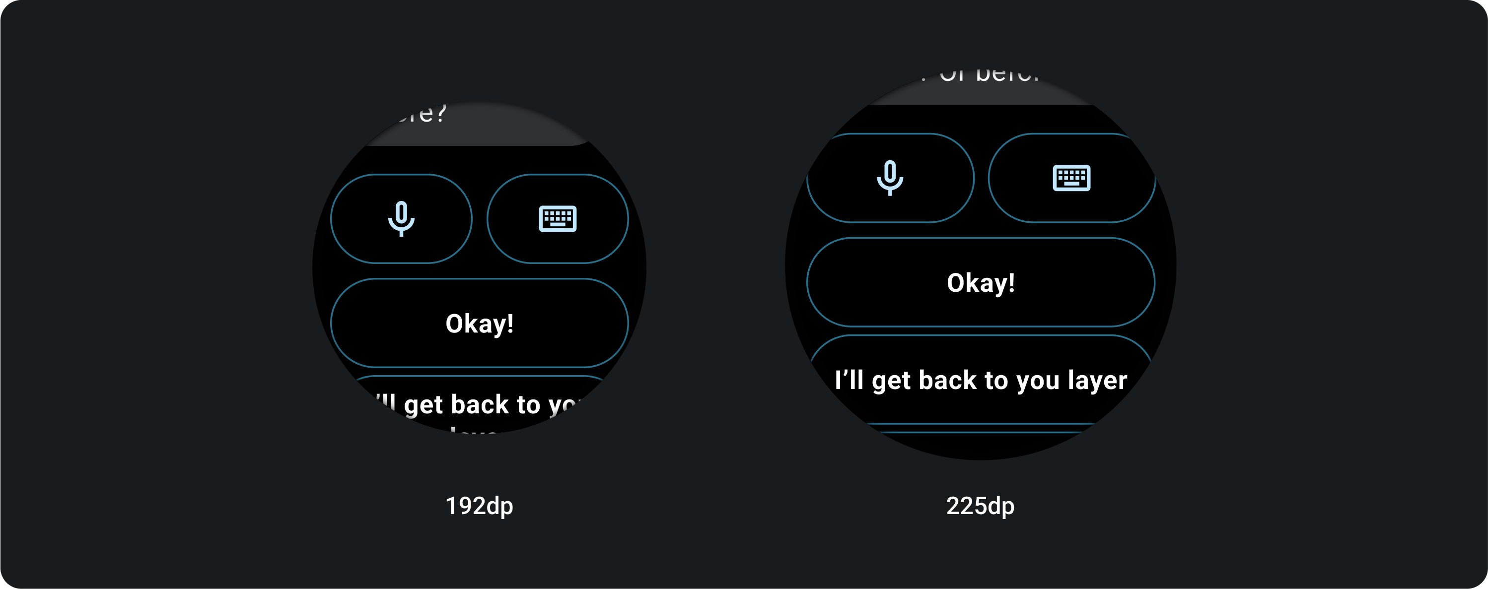
1 或 2 個按鈕
無論螢幕大小為何,使用 2 個或單一按鈕鎖定功能的 IME 一律會一直延伸到側邊邊界。
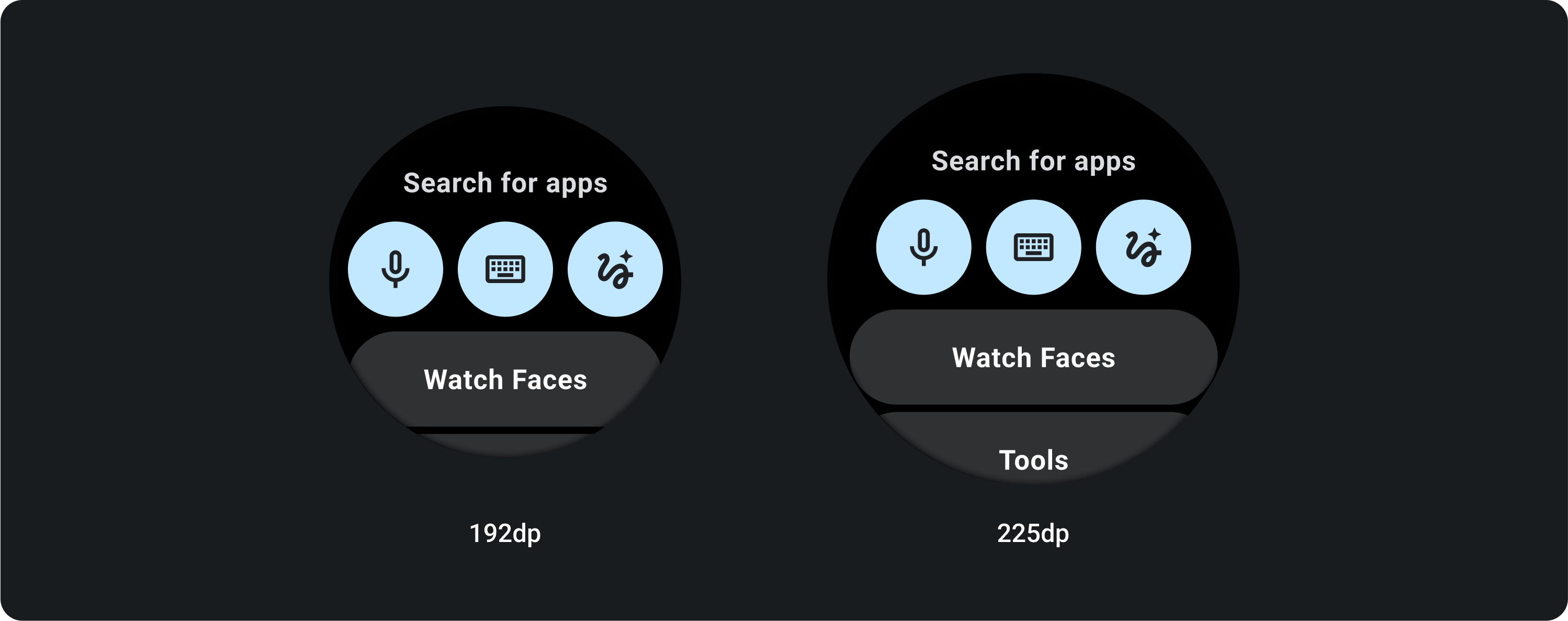
3 個按鈕
在小於 225 dp 的螢幕上,按鈕會維持圓形,不會拉長。在 225 dp 以上的大螢幕上,按鈕會一直延伸到側邊邊界。