
The Layout Inspector in Android Studio lets you debug the layout of your app by showing a view hierarchy where you can inspect the properties of each view. With the Layout Inspector, you can compare your app layout with design mockups, display a magnified or 3D view of your app, and examine details of its layout at runtime. This is especially useful when your layout is built at runtime rather than entirely in XML and the layout is behaving unexpectedly.
Get started
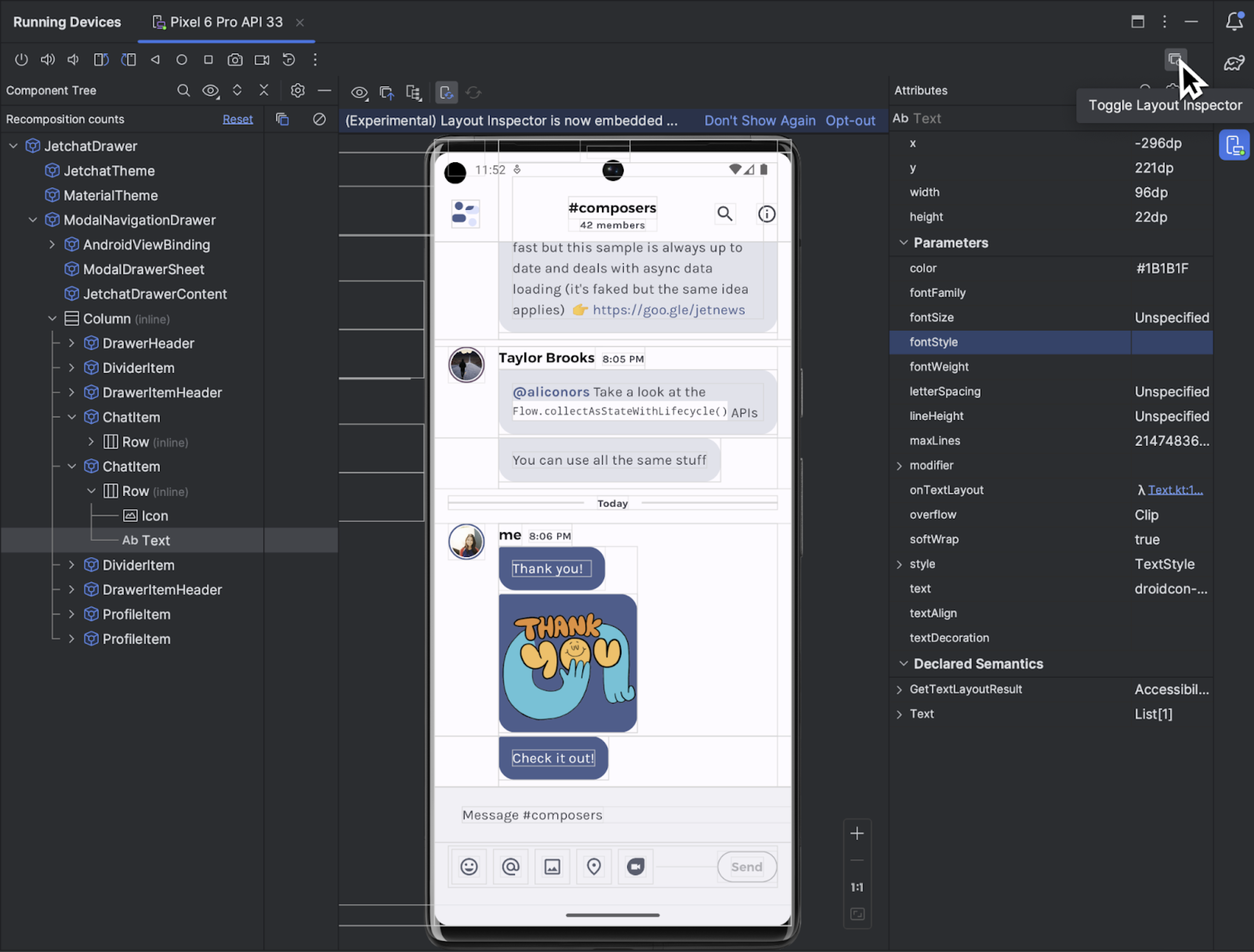
To start the Layout Inspector, run your app, go to the
Running Devices window, and click Toggle Layout Inspector  .
If you switch among multiple devices or projects, the Layout Inspector
automatically connects to the debuggable processes running in the foreground of
the connected device.
.
If you switch among multiple devices or projects, the Layout Inspector
automatically connects to the debuggable processes running in the foreground of
the connected device.
Here's how to do some common tasks:
- To view hierarchy and inspect the properties of each view, use the Component Tree and Attributes tool windows. Layout Inspector might require an activity restart to access the attributes. For more information, see View Attribute Inspection.
- To select views by single clicking directly on the views or navigate to code
by double clicking on the views, enable Toggle Deep Inspect
 .
. - To interact with the app, disable Toggle Deep Inspect .
- To inspect physical devices, enable device mirroring.
- To enable live updates as you update your app's UI, check that Live Edit is enabled.
- To use 3D mode, take a Layout Inspector snapshot
 and then
click 3D Mode
and then
click 3D Mode  .
.
Select or isolate a view
A view usually draws something the user can see and interact with. The Component Tree shows your app's hierarchy in real time with each view component, which helps you debug your app's layout because you can visualize the elements within your app and the values associated with them.
To select a view, click it in the Component Tree or the Layout Display. All of the layout attributes for the selected view appear in the Attributes panel.
If your layout includes overlapping views, you can see all the views in a region
when you right-click in Deep Inspect mode
. To select
a view that isn't in front, click it in the Component Tree or
rotate the layout.
To work with complex layouts, you can isolate individual views so that only a
subset of the layout is shown in the Component Tree and rendered in the
Layout Display. To isolate a view, take a snapshot
, right-click
the view in the Component Tree and select Show Only Subtree or
Show Only Parents. To return to the full view, right-click the view and
select Show All. You must take a snapshot before isolating a view.
Hide layout borders and view labels
To hide the bounding box or view labels for a layout element, click View
Options  at the top of the Layout Display and toggle Show Borders or Show View
Label.
at the top of the Layout Display and toggle Show Borders or Show View
Label.
Capture layout hierarchy snapshots
Layout Inspector lets you save snapshots of your running app's layout hierarchy, so that you can share them with others or refer to them later.
Snapshots capture the data you would typically see when using the Layout
Inspector, including a detailed 3D rendering of your layout, the component tree
of your View, Compose, or hybrid layout, and detailed attributes for each
component of your UI. To save a snapshot, click Snapshot Export/Import
and then
Export Snapshot.
Load a previously saved Layout Inspector snapshot by clicking Import Snapshot.
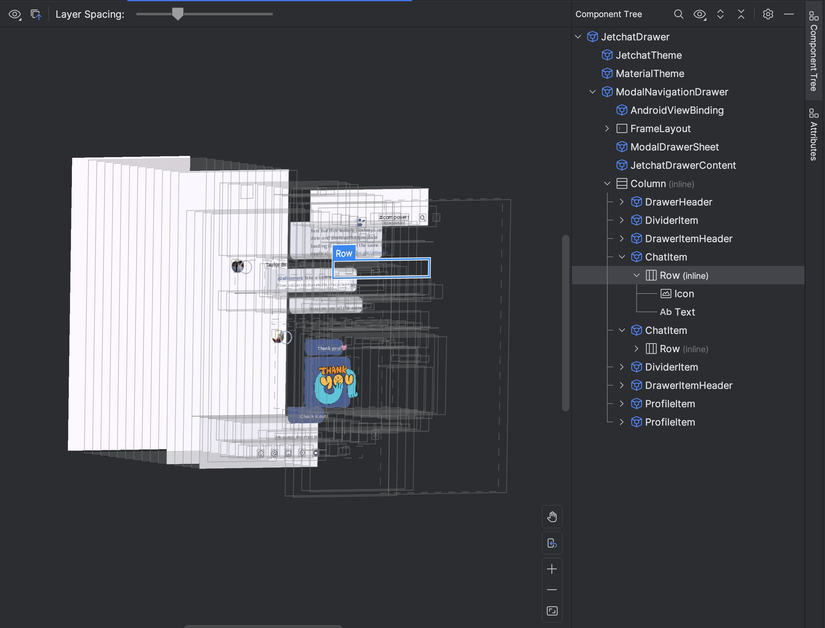
3D mode
The Layout Display features an advanced 3D visualization of your
app's view hierarchy at runtime. To use this feature, take a snapshot
, click
the 3D Mode button
in the
snapshot Inspector window, and rotate it by dragging the mouse.

Compare app layout to a reference image overlay
To compare your app layout with a reference image, such as a UI mockup, you can load a bitmap image overlay in the Layout Inspector.
- To load an overlay, select the Load Overlay
 option from the Layout Inspector toolbar. The overlay is scaled to fit the
layout.
option from the Layout Inspector toolbar. The overlay is scaled to fit the
layout. - To adjust the transparency of the overlay, use the Overlay Alpha slider.
- To remove the overlay, click Clear Overlay

Inspect Compose
Layout Inspector lets you inspect a Compose layout inside a running app in an emulator or physical device. You can use the Layout Inspector to check how often a composable is recomposed or skipped, which can help identify issues with your app. For example, some coding errors might force your UI to recompose excessively, which can cause poor performance. Some coding errors can prevent your UI from recomposing and, therefore, preventing your UI changes from showing up on the screen.
Learn more about Layout Inspector for Compose
View Attribute Inspection
Layout Inspector requires the following global setting to function properly:
adb shell settings put global debug_view_attributes 1
This option generates extra information for inspection on all of the processes on the device.
Layout Inspector automatically enables the setting when started. This causes the current foreground Activity to restart. You will not see another Activity restart unless the flag is manually disabled on the device.
To disable the flag, run the following adb command:
adb shell settings delete global debug_view_attributes
Alternatively, turn off Enable view attribute inspection from your device's developer options.
Standalone Layout Inspector
For optimal performance, we recommend using the Layout Inspector in its default embedded mode. If you want to un-embed the Layout Inspector, go to File (Android Studio on macOS)> Settings > Tools > Layout Inspector and clear the Enable embedded Layout Inspector checkbox.
In standalone mode, enable live updates by clicking the Live Updates
 option from
the Layout Inspector toolbar.
option from
the Layout Inspector toolbar.