
The Text composable has multiple optional parameters to style its content.
Below, we’ve listed parameters that cover the most common use cases with text.
For all the parameters of Text, see the Compose Text
source code.
Whenever you set one of these parameters, you’re applying the style to the whole text value. If you need to apply multiple styles within the same line or paragraphs, see the section on multiple inline styles.
Common text stylings
The following sections describe common ways to style your text.
Change text color
@Composable fun BlueText() { Text("Hello World", color = Color.Blue) }

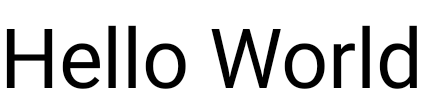
Change text size
@Composable fun BigText() { Text("Hello World", fontSize = 30.sp) }
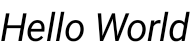
Make text italic
Use the fontStyle parameter to italicize text (or set another
FontStyle).
@Composable fun ItalicText() { Text("Hello World", fontStyle = FontStyle.Italic) }
Make text bold
Use the fontWeight parameter to bold text (or set another FontWeight).
@Composable fun BoldText() { Text("Hello World", fontWeight = FontWeight.Bold) }

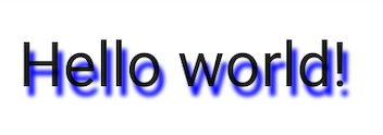
Add shadow
The style parameter lets you set an object of type TextStyle
and configure multiple parameters, for example shadow.
Shadow receives a color
for the shadow, the offset, or where it is located in respect of the Text and
the blur radius which is how blurry it looks.
@Composable fun TextShadow() { val offset = Offset(5.0f, 10.0f) Text( text = "Hello world!", style = TextStyle( fontSize = 24.sp, shadow = Shadow( color = Color.Blue, offset = offset, blurRadius = 3f ) ) ) }
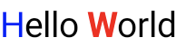
Add multiple styles in text
To set different styles within the same Text
composable, use an AnnotatedString,
a string that can be annotated with styles of arbitrary annotations.
AnnotatedString is a data class containing:
- A
Textvalue - A
ListofSpanStyleRange, equivalent to inline styling with position range within the text value - A
ListofParagraphStyleRange, specifying text alignment, text direction, line height, and text indent styling
TextStyle is for use
in the Text composable, whereas SpanStyle
and ParagraphStyle
is for use in AnnotatedString. For more information about multiple styles in
a paragraph, see Add multiple styles in a paragraph.
AnnotatedString has a type-safe
builder
to make it easier to create: buildAnnotatedString.
@Composable fun MultipleStylesInText() { Text( buildAnnotatedString { withStyle(style = SpanStyle(color = Color.Blue)) { append("H") } append("ello ") withStyle(style = SpanStyle(fontWeight = FontWeight.Bold, color = Color.Red)) { append("W") } append("orld") } ) }
Display HTML with links in text
Use AnnotatedString.fromHtml() to display HTML-formatted text with
clickable links in your Jetpack Compose application. This function converts a
string with HTML tags into an AnnotatedString, allowing for styling and link
handling.
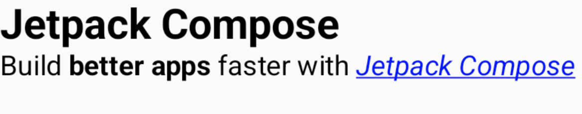
Example: HTML with styled link
This snippet renders HTML-formatted text with a link, applying specific styling to the link:
@Composable fun AnnotatedHtmlStringWithLink( modifier: Modifier = Modifier, htmlText: String = """ <h1>Jetpack Compose</h1> <p> Build <b>better apps</b> faster with <a href="https://www.android.com">Jetpack Compose</a> </p> """.trimIndent() ) { Text( AnnotatedString.fromHtml( htmlText, linkStyles = TextLinkStyles( style = SpanStyle( textDecoration = TextDecoration.Underline, fontStyle = FontStyle.Italic, color = Color.Blue ) ) ), modifier ) }
Key points about the code
AnnotatedString.fromHtml()converts thehtmlTextstring into anAnnotatedString. ThelinkStylesparameter customizes link appearance.TextLinkStylesdefines the style for links within the HTML.SpanStylesets text decoration, font style, and color for the links.The
Textcomposable displays the resultingAnnotatedString.
Result
This snippet enables "Jetpack Compose" as a clickable link, styled with blue color, underlined, and italicized:
Enable advanced styling with Brush
To enable more advanced text styling, you can use the Brush API with
TextStyle and SpanStyle. In any place where you would typically
use TextStyle or SpanStyle, you can now also use Brush.
Use a brush for text styling
Configure your text using a built-in brush within TextStyle. For example, you
can configure a linearGradient brush to your text as follows:
val gradientColors = listOf(Cyan, LightBlue, Purple /*...*/) Text( text = text, style = TextStyle( brush = Brush.linearGradient( colors = gradientColors ) ) )
linearGradient function with a defined list of colors.You are not limited to this particular color scheme or style of coloring. While
we have provided a simple example to highlight, use any of the built-in
brushes or even just a SolidColor to enhance your text.
Integrations
Since you can use Brush alongside both TextStyle and SpanStyle,
integration with TextField and buildAnnotatedString is seamless.
For more information about using the brush API within a TextField, see
Style input with Brush API.
Additional styling using SpanStyle
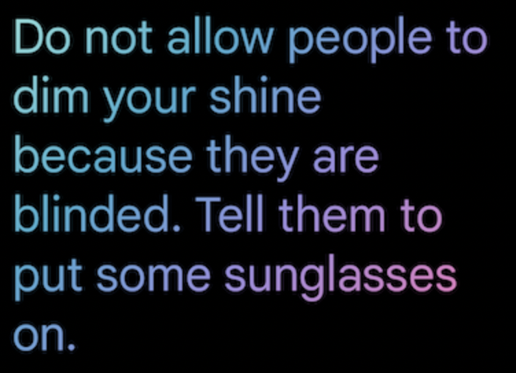
Apply a brush to a span of text
If you only want to apply a brush to parts of your text, use
buildAnnotatedString and the SpanStyle API, along with your brush
and gradient of choice.
Text( text = buildAnnotatedString { append("Do not allow people to dim your shine\n") withStyle( SpanStyle( brush = Brush.linearGradient( colors = rainbowColors ) ) ) { append("because they are blinded.") } append("\nTell them to put some sunglasses on.") } )
linearGradient as a style for Text.Opacity in a span of text
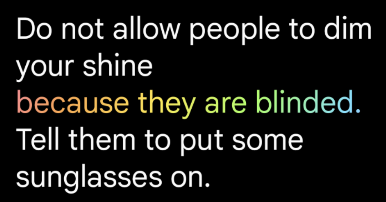
To adjust the opacity of a particular span of text, use SpanStyle's
optional alpha parameter. Use the same brush for
both parts of a text, and change the alpha parameter in the corresponding span.
In the code sample, the first span of text displays at half opacity
(alpha =.5f) while the second displays at full opacity (alpha = 1f).
val brush = Brush.linearGradient(colors = rainbowColors) buildAnnotatedString { withStyle( SpanStyle( brush = brush, alpha = .5f ) ) { append("Text in ") } withStyle( SpanStyle( brush = brush, alpha = 1f ) ) { append("Compose ❤️") } }

buildAnnotatedString and SpanStyle’s alpha parameter, along with linearGradient to add opacity to a span of text.Apply marquee effect to text
You can apply the basicMarquee modifier to any composable to
produce an animated scrolling effect. The marquee effect occurs if the content
is too wide to fit in the available constraints. By default, basicMarquee has
certain configurations (such as velocity and initial delay) set, but you can
modify these parameters to customize the effect.
The following snippet implements a basic marquee effect on a Text composable:
@Composable fun BasicMarqueeSample() { // Marquee only animates when the content doesn't fit in the max width. Column(Modifier.width(400.dp)) { Text( "Learn about why it's great to use Jetpack Compose", modifier = Modifier.basicMarquee(), fontSize = 50.sp ) } }
Figure 6. The basicMarquee modifier applied to text.
Additional resources
- Brushing Up on Compose Text Coloring
- Animating brush Text coloring in Compose
- Support multiple links in a single string of text
Recommended for you
- Note: link text is displayed when JavaScript is off
- Style paragraph
- Material Design 2 in Compose
- Graphics Modifiers