
Todas las pantallas de tu app deben ser responsivas y adaptarse al espacio disponible.
Puedes compilar una IU responsiva con ConstraintLayout que permita que un enfoque de panel único se adapte a muchos tamaños, pero los dispositivos más grandes pueden beneficiarse si divides el diseño en varios paneles. Por ejemplo, es posible que desees que una pantalla muestre una lista de elementos junto a una lista de detalles del elemento seleccionado.
El componente SlidingPaneLayout admite que se muestren dos paneles, uno al lado del otro, en dispositivos más grandes y plegables, y se adapta automáticamente para mostrar solo un panel a la vez en dispositivos más pequeños, como teléfonos.
Para obtener asesoramiento específico de un dispositivo, consulta la descripción general de compatibilidad de pantalla.
Configuración
Para usar SlidingPaneLayout, incluye la siguiente dependencia en el archivo build.gradle de tu app:
Groovy
dependencies {
    implementation "androidx.slidingpanelayout:slidingpanelayout:1.2.0"
}
Kotlin
dependencies {
    implementation("androidx.slidingpanelayout:slidingpanelayout:1.2.0")
}
Configuración del diseño XML
SlidingPaneLayout proporciona un diseño horizontal de dos paneles para usar en el nivel superior de una IU. Este diseño usa el primer panel como una lista de contenido o un navegador, subordinado a una vista principal de detalles para mostrar contenido en el otro panel.
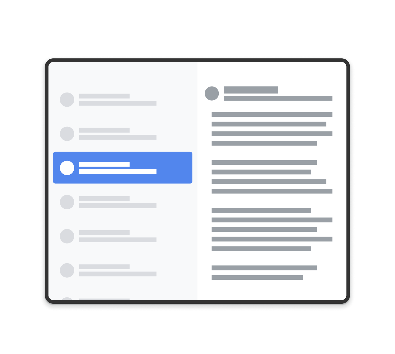
SlidingPaneLayout.
SlidingPaneLayout usa el ancho de los dos paneles para determinar si se muestran los paneles uno al lado del otro. Por ejemplo, si el panel de la lista se mide para tener un tamaño mínimo de 200 dp y el panel de detalles necesita 400 dp, SlidingPaneLayout mostrará automáticamente los dos paneles uno al lado del otro, siempre que tenga disponibles al menos 600 dp de ancho.
Las vistas secundarias se superponen si el ancho combinado supera el ancho disponible en el SlidingPaneLayout. En este caso, las vistas secundarias se expanden para llenar el ancho disponible en el SlidingPaneLayout. El usuario puede arrastrar la vista superior desde el borde de la pantalla y deslizarla hacia afuera.
Si las vistas no se superponen, SlidingPaneLayout admite el uso del parámetro de diseño layout_weight en las vistas secundarias para definir cómo dividir el espacio restante después de que se completa la medición. Este parámetro solo es relevante para el ancho.
En un dispositivo plegable que tiene espacio en la pantalla para mostrar ambas vistas una al lado de la otra, SlidingPaneLayout ajusta automáticamente el tamaño de los dos paneles para que se posicionen en ambos lados de un pliegue o una bisagra. En este caso, los anchos establecidos se consideran el ancho mínimo que debe existir en cada lado del atributo de plegado. Si no hay suficiente espacio para mantener ese tamaño mínimo, SlidingPaneLayout vuelve a superponer las vistas.
El siguiente es un ejemplo de cómo usar un SlidingPaneLayout que tiene un RecyclerView como panel izquierdo y un FragmentContainerView como vista principal de detalles para mostrar contenido del panel izquierdo:
<!-- two_pane.xml -->
<androidx.slidingpanelayout.widget.SlidingPaneLayout
   xmlns:android="http://schemas.android.com/apk/res/android"
   android:id="@+id/sliding_pane_layout"
   android:layout_width="match_parent"
   android:layout_height="match_parent">

   <!-- The first child view becomes the left pane. When the combined needed
        width, expressed using android:layout_width, doesn't fit on-screen at
        once, the right pane is permitted to overlap the left. -->

   <androidx.recyclerview.widget.RecyclerView
             android:id="@+id/list_pane"
             android:layout_width="280dp"
             android:layout_height="match_parent"
             android:layout_gravity="start"/>

   <!-- The second child becomes the right (content) pane. In this example,
        android:layout_weight is used to expand this detail pane to consume
        leftover available space when the entire window is wide enough to fit
        the left and right pane.-->
   <androidx.fragment.app.FragmentContainerView
       android:id="@+id/detail_container"
       android:layout_width="300dp"
       android:layout_weight="1"
       android:layout_height="match_parent"
       android:background="#ff333333"
       android:name="com.example.SelectAnItemFragment" />
</androidx.slidingpanelayout.widget.SlidingPaneLayout>
En este ejemplo, el atributo android:name de FragmentContainerView agrega el fragmento inicial al panel de detalles y garantiza que los usuarios de dispositivos con pantalla grande no vean un panel derecho vacío cuando inicien la app por primera vez.
Cómo intercambiar el panel de detalles de manera programática
En el ejemplo de XML anterior, cuando presionas un elemento en RecyclerView, se activa un cambio en el panel de detalles. Cuando se usan fragmentos, se requiere un FragmentTransaction que reemplace el panel derecho y llame a open() en el SlidingPaneLayout para cambiar al fragmento que se volvió visible:
Kotlin
// A method on the Fragment that owns the SlidingPaneLayout,called by the
// adapter when an item is selected.
fun openDetails(itemId: Int) {
    childFragmentManager.commit {
        setReorderingAllowed(true)
        replace<ItemFragment>(R.id.detail_container,
            bundleOf("itemId" to itemId))
        // If it's already open and the detail pane is visible, crossfade
        // between the fragments.
        if (binding.slidingPaneLayout.isOpen) {
            setTransition(FragmentTransaction.TRANSIT_FRAGMENT_FADE)
        }
    }
    binding.slidingPaneLayout.open()
}
Java
// A method on the Fragment that owns the SlidingPaneLayout, called by the
// adapter when an item is selected.
void openDetails(int itemId) {
    Bundle arguments = new Bundle();
    arguments.putInt("itemId", itemId);
    FragmentTransaction ft = getChildFragmentManager().beginTransaction()
            .setReorderingAllowed(true)
            .replace(R.id.detail_container, ItemFragment.class, arguments);
    // If it's already open and the detail pane is visible, crossfade
    // between the fragments.
    if (binding.getSlidingPaneLayout().isOpen()) {
        ft.setTransition(FragmentTransaction.TRANSIT_FRAGMENT_FADE);
    }
    ft.commit();
    binding.getSlidingPaneLayout().open();
}
Este código en particular no llama a addToBackStack() en el FragmentTransaction. Esto evita que se compile una pila de actividades en el panel de detalles.
Implementación de componentes de Navigation
En los ejemplos de esta página, se usa SlidingPaneLayout directamente y se te solicita que administres las transacciones de fragmentos manualmente. Sin embargo, el componente de Navigation proporciona una implementación prediseñada de un diseño de dos paneles a través de AbstractListDetailFragment, una clase de API que usa un SlidingPaneLayout de forma interna para administrar los paneles de lista y de detalles.
Esto te permite simplificar la configuración de tu diseño XML. En lugar de declarar de manera explícita un SlidingPaneLayout y ambos paneles, el diseño solo necesita un FragmentContainerView para contener tu implementación de AbstractListDetailFragment:
<FrameLayout xmlns:android="http://schemas.android.com/apk/res/android"
    xmlns:app="http://schemas.android.com/apk/res-auto"
    android:layout_width="match_parent"
    android:layout_height="match_parent">
    <androidx.fragment.app.FragmentContainerView
        android:id="@+id/two_pane_container"
        <!-- The name of your AbstractListDetailFragment implementation.-->
        android:name="com.example.testapp.TwoPaneFragment"
        android:layout_width="match_parent"
        android:layout_height="match_parent"
        <!-- The navigation graph for your detail pane.-->
        app:navGraph="@navigation/two_pane_navigation" />
</FrameLayout>
Implementa onCreateListPaneView() y onListPaneViewCreated() para proporcionar una vista personalizada para tu panel de lista. En el panel de detalles, AbstractListDetailFragment usa un NavHostFragment.
Esto significa que puedes definir un gráfico de navegación que solo contenga los destinos que se mostrarán en el panel de detalles. Luego, puedes usar NavController para cambiar el panel de detalles entre los destinos en el gráfico de navegación autónomo:
Kotlin
fun openDetails(itemId: Int) {
    val navController = navHostFragment.navController
    navController.navigate(
        // Assume the itemId is the android:id of a destination in the graph.
        itemId,
        null,
        NavOptions.Builder()
            // Pop all destinations off the back stack.
            .setPopUpTo(navController.graph.startDestination, true)
            .apply {
                // If it's already open and the detail pane is visible,
                // crossfade between the destinations.
                if (binding.slidingPaneLayout.isOpen) {
                    setEnterAnim(R.animator.nav_default_enter_anim)
                    setExitAnim(R.animator.nav_default_exit_anim)
                }
            }
            .build()
    )
    binding.slidingPaneLayout.open()
}
Java
void openDetails(int itemId) {
    NavController navController = navHostFragment.getNavController();
    NavOptions.Builder builder = new NavOptions.Builder()
            // Pop all destinations off the back stack.
            .setPopUpTo(navController.getGraph().getStartDestination(), true);
    // If it's already open and the detail pane is visible, crossfade between
    // the destinations.
    if (binding.getSlidingPaneLayout().isOpen()) {
        builder.setEnterAnim(R.animator.nav_default_enter_anim)
                .setExitAnim(R.animator.nav_default_exit_anim);
    }
    navController.navigate(
        // Assume the itemId is the android:id of a destination in the graph.
        itemId,
        null,
        builder.build()
    );
    binding.getSlidingPaneLayout().open();
}
Los destinos del gráfico de navegación del panel de detalles no deben estar presentes en ningún gráfico externo de navegación para toda la app. Sin embargo, cualquier vínculo directo dentro del gráfico de navegación del panel de detalles debe adjuntarse al destino que aloja al SlidingPaneLayout. Esto garantiza que los vínculos directos externos naveguen primero al destino SlidingPaneLayout y, luego, al destino del panel de detalles correcto.
Consulta el ejemplo de TwoPaneFragment para obtener una implementación completa de un diseño de dos paneles con el componente Navigation.
Cómo integrar con el botón Atrás del sistema
En dispositivos más pequeños, en los que los paneles de lista y detalles se superponen, asegúrate de que el botón Atrás del sistema lleve al usuario del panel de detalles al panel de listas. Para ello, proporciona una navegación hacia atrás personalizada y conecta un OnBackPressedCallback al estado actual del SlidingPaneLayout:
Kotlin
class TwoPaneOnBackPressedCallback(
    private val slidingPaneLayout: SlidingPaneLayout
) : OnBackPressedCallback(
    // Set the default 'enabled' state to true only if it is slidable, such as
    // when the panes overlap, and open, such as when the detail pane is
    // visible.
    slidingPaneLayout.isSlideable && slidingPaneLayout.isOpen
), SlidingPaneLayout.PanelSlideListener {

    init {
        slidingPaneLayout.addPanelSlideListener(this)
    }

    override fun handleOnBackPressed() {
        // Return to the list pane when the system back button is tapped.
        slidingPaneLayout.closePane()
    }

    override fun onPanelSlide(panel: View, slideOffset: Float) { }

    override fun onPanelOpened(panel: View) {
        // Intercept the system back button when the detail pane becomes
        // visible.
        isEnabled = true
    }

    override fun onPanelClosed(panel: View) {
        // Disable intercepting the system back button when the user returns to
        // the list pane.
        isEnabled = false
    }
}
Java
class TwoPaneOnBackPressedCallback extends OnBackPressedCallback
        implements SlidingPaneLayout.PanelSlideListener {

    private final SlidingPaneLayout mSlidingPaneLayout;

    TwoPaneOnBackPressedCallback(@NonNull SlidingPaneLayout slidingPaneLayout) {
        // Set the default 'enabled' state to true only if it is slideable, such
        // as when the panes overlap, and open, such as when the detail pane is
        // visible.
        super(slidingPaneLayout.isSlideable() && slidingPaneLayout.isOpen());
        mSlidingPaneLayout = slidingPaneLayout;
        slidingPaneLayout.addPanelSlideListener(this);
    }

    @Override
    public void handleOnBackPressed() {
        // Return to the list pane when the system back button is tapped.
        mSlidingPaneLayout.closePane();
    }

    @Override
    public void onPanelSlide(@NonNull View panel, float slideOffset) { }

    @Override
    public void onPanelOpened(@NonNull View panel) {
        // Intercept the system back button when the detail pane becomes
        // visible.
        setEnabled(true);
    }

    @Override
    public void onPanelClosed(@NonNull View panel) {
        // Disable intercepting the system back button when the user returns to
        // the list pane.
        setEnabled(false);
    }
}
Puedes agregar la devolución de llamada al OnBackPressedDispatcher con addCallback():
Kotlin
class TwoPaneFragment : Fragment(R.layout.two_pane) {

    override fun onViewCreated(view: View, savedInstanceState: Bundle?) {
        val binding = TwoPaneBinding.bind(view)

        // Connect the SlidingPaneLayout to the system back button.
        requireActivity().onBackPressedDispatcher.addCallback(viewLifecycleOwner,
            TwoPaneOnBackPressedCallback(binding.slidingPaneLayout))

        // Set up the RecyclerView adapter.
    }
}
Java
class TwoPaneFragment extends Fragment {

    public TwoPaneFragment() {
        super(R.layout.two_pane);
    }

    @Override
    public void onViewCreated(@NonNull View view,
             @Nullable Bundle savedInstanceState) {
        TwoPaneBinding binding = TwoPaneBinding.bind(view);

        // Connect the SlidingPaneLayout to the system back button.
        requireActivity().getOnBackPressedDispatcher().addCallback(
            getViewLifecycleOwner(),
            new TwoPaneOnBackPressedCallback(binding.getSlidingPaneLayout()));

        // Set up the RecyclerView adapter.
    }
}
Modo bloqueado
SlidingPaneLayout siempre te permite llamar de forma manual a open() y a close() para hacer la transición entre los paneles de lista y de detalles en teléfonos. Estos métodos no tienen efecto si ambos paneles son visibles y no se superponen.
Cuando se superponen los paneles de lista y de detalles, los usuarios pueden deslizar el dedo de forma predeterminada hacia cualquiera de ellos para alternar entre ambas direcciones, incluso cuando no usan la navegación por gestos. Para controlar la dirección del deslizamiento, configura el modo bloqueado del SlidingPaneLayout:
Kotlin
binding.slidingPaneLayout.lockMode = SlidingPaneLayout.LOCK_MODE_LOCKED
Java
binding.getSlidingPaneLayout().setLockMode(SlidingPaneLayout.LOCK_MODE_LOCKED);
Más información
Para obtener más información sobre el diseño de diseños para diferentes factores de forma, consulta la siguiente documentación:
- Descripción general de la compatibilidad de pantallas
- Cómo diseñar para diferentes factores de forma