Dynamic Color, which was added in Android 12, enables users to personalize their devices to align tonally with the color scheme of their personal wallpaper or through a selected color in the wallpaper picker.
You can leverage this feature by adding the DynamicColors API, which
applies this theming to your app or activity to make your app more personalized
to the user.
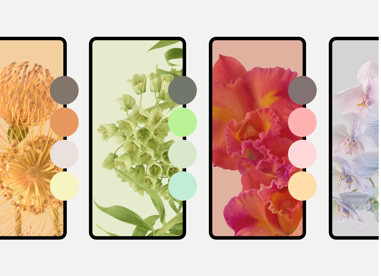
This page includes instructions for implementing Dynamic Colors in your app. This feature is also available separately for widgets and adaptive icons, as described later on this page. You can also try out the codelab.
How Android creates color schemes
Android performs the following steps to generate color schemes from a user's wallpaper.
The system detects the main colors in the selected wallpaper image and extracts a source color.
The system uses that source color to further extrapolate five key colors known as Primary, Secondary, Tertiary, Neutral, and Neutral variant.
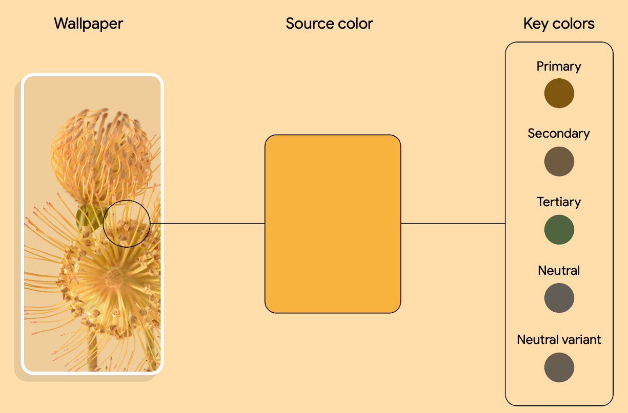
Figure 2. Example of source color extraction from wallpaper image and extraction to five key colors The system interprets each key color into a tonal palette of 13 tones.
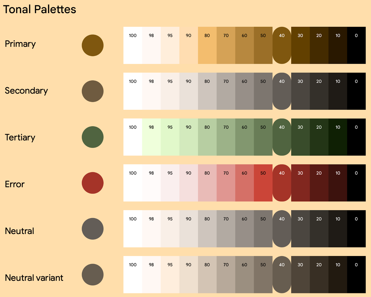
Figure 3. Example of generating a given tonal palettes The system uses this single wallpaper to derive five different color schemes, which provides the basis for any light and dark themes.
How color variants display on a user's device
Users can select color variants from wallpaper-extracted colors and different themes starting in Android 12, with more variants added in Android 13. For example, a user with a Pixel phone running Android 13 would select a variant from the Wallpaper & style settings, as shown in figure 4.
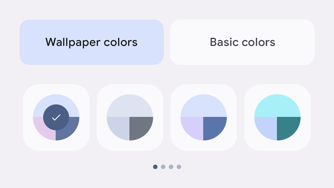
Android 12 added the Tonal Spot variant, followed by the Neutral, Vibrant Tonal, and Expressive variants in Android 13. Each variant has a unique recipe that transforms the seed colors of a user's wallpaper through vibrancy and rotating the hue. The following example shows a single color scheme expressed through these four color variants.
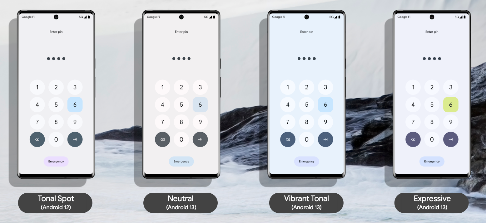
Your app still uses the same tokens to access these colors. For details about tokens, see Create your theme with tokens on this page.
Get started with Views
You can apply Dynamic Color at the app or activity level. To do so, call
applyToActivitiesIfAvailable() to register an
ActivityLifeCycleCallbacks to your app.
Kotlin
class MyApplication: Application() {
    override fun onCreate() {
        DynamicColors.applyToActivitiesIfAvailable(this)
    }
}
Java
public class MyApplication extends Application {
  @Override
  public void onCreate() {
    super.onCreate();
    DynamicColors.applyToActivitiesIfAvailable(this);
  }
}
Next, add the theme to your app.
<style
    name="AppTheme"
    parent="ThemeOverlay.Material3.DynamicColors.DayNight">
    ...
</style>
Create your theme with tokens
Dynamic Color takes advantage of design tokens to make assigning colors to different UI elements more streamlined and consistent. A design token allows you to semantically assign color roles, rather than a set value, to different elements of a UI. This enables your app's tonal system to have more flexibility, scalability, and consistency, and is particularly powerful when designing for light and dark themes and dynamic color.
The following snippets show examples of light and dark themes, and a corresponding color xml, after applying dynamic color tokens.
Light theme
Themes.xml

<resources>
  <style name="AppTheme" parent="Theme.Material3.Light.NoActionBar">
    <item name="colorPrimary">@color/md_theme_light_primary</item>
    <item name="colorOnPrimary">@color/md_theme_light_onPrimary</item>
    <item name="colorPrimaryContainer">@color/md_theme_light_primaryContainer</item>
    <item name="colorOnPrimaryContainer">@color/md_theme_light_onPrimaryContainer</item>
    <item name="colorError">@color/md_theme_light_error</item>
    <item name="colorOnError">@color/md_theme_light_onError</item>
    <item name="colorErrorContainer">@color/md_theme_light_errorContainer</item>
    <item name="colorOnErrorContainer">@color/md_theme_light_onErrorContainer</item>
    <item name="colorOnBackground">@color/md_theme_light_onBackground</item>
    <item name="colorSurface">@color/md_theme_light_surface</item>
    <item name="colorOnSurface">@color/md_theme_light_onSurface</item>
    …..
  </style>
</resources>
Dark theme
Themes.xml

<resources>
  <style name="AppTheme" parent="Theme.Material3.Dark.NoActionBar">
    <item name="colorPrimary">@color/md_theme_dark_primary</item>
    <item name="colorOnPrimary">@color/md_theme_dark_onPrimary</item>
    <item name="colorPrimaryContainer">@color/md_theme_dark_primaryContainer</item>
    <item name="colorOnPrimaryContainer">@color/md_theme_dark_onPrimaryContainer</item>
    <item name="colorError">@color/md_theme_dark_error</item>
    <item name="colorOnError">@color/md_theme_dark_onError</item>
    <item name="colorErrorContainer">@color/md_theme_dark_errorContainer</item>
    <item name="colorOnErrorContainer">@color/md_theme_dark_onErrorContainer</item>
    <item name="colorOnBackground">@color/md_theme_dark_onBackground</item>
    <item name="colorSurface">@color/md_theme_dark_surface</item>
    <item name="colorOnSurface">@color/md_theme_dark_onSurface</item>
    ……
  </style>
</resources>
Colors xml
Colors.xml

<resources>
  <color name="md_theme_light_primary">#6750A4</color>
  <color name="md_theme_light_onPrimary">#FFFFFF</color>
  <color name="md_theme_light_primaryContainer">#EADDFF</color>
  <color name="md_theme_light_onPrimaryContainer">#21005D</color>
  <color name="md_theme_light_error">#B3261E</color>
  <color name="md_theme_light_onError">#FFFFFF</color>
  <color name="md_theme_light_errorContainer">#F9DEDC</color>
  <color name="md_theme_light_onErrorContainer">#410E0B</color>
  <color name="md_theme_light_surface">#FFFBFE</color>
  <color name="md_theme_light_onSurface">#1C1B1F</color>
  <color name="md_theme_light_surfaceVariant">#E7E0EC</color>
  <color name="md_theme_dark_primary">#D0BCFF</color>
  <color name="md_theme_dark_onPrimary">#381E72</color>
  <color name="md_theme_dark_primaryContainer">#4F378B</color>
  <color name="md_theme_dark_onPrimaryContainer">#EADDFF</color>
  <color name="md_theme_dark_secondary">#CCC2DC</color>
  <color name="md_theme_dark_onSecondary">#332D41</color>
  <color name="md_theme_dark_secondaryContainer">#4A4458</color>
  <color name="md_theme_dark_onSurface">#E6E1E5</color>
  <color name="md_theme_dark_surfaceVariant">#49454F</color>
</resources>
For more information:
To learn more about Dynamic Color, custom colors, and generating tokens, check out the Material 3 Dynamic Color page.
To generate the base color palette and your app's colors and theme, check out the Material Theme Builder, available through a Figma plugin or in browser).
To learn more about how using color schemes can enable better accessibility in your app, see the Material 3 page about Color system accessibility.
Retain custom or brand colors
If your app has custom or brand colors that you don't want to change with the user's preferences, you can add them individually as you build out your color scheme. For example:
Themes.xml

<resources>
    <style name="AppTheme" parent="Theme.Material3.Light.NoActionBar">
        ...
        <item name="home_lamp">@color/home_yellow</item>
          ...
    </style>
</resources>
Colors.xml
<resources>
   <color name="home_yellow">#E8D655</color>
</resources>
Alternatively, you can use the Material Theme Builder to import additional
colors that extend your color scheme, thereby creating a unified color system.
With this option, use HarmonizedColors to shift the tone of custom
colors. This achieves a visual balance and accessible contrast when combined
with user-generated colors. It occurs at runtime with
applyToContextIfAvailable().
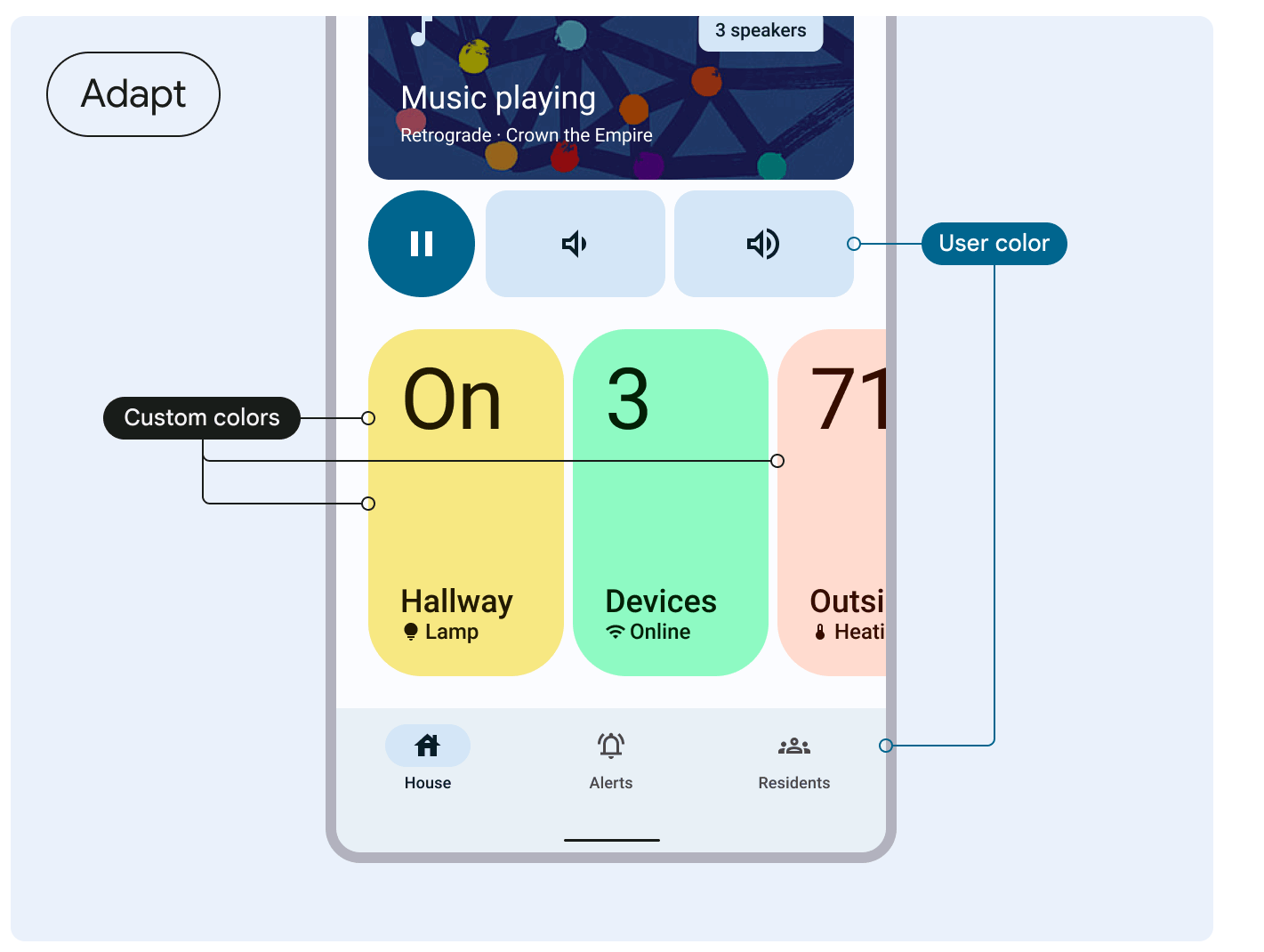
See Material 3's guidance on harmonizing custom colors.
Apply Dynamic Color to your adaptive icons and widgets
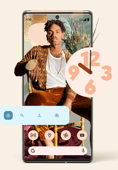
In addition to enabling Dynamic Color theming on your app, you can also support Dynanmic Color theming for widgets starting in Android 12, and for adaptive icons starting in Android 13.

