
规范化布局是经过验证的通用型布局,可在各种规格的设备上提供最佳用户体验。
规范化布局既支持小屏幕的手机,也支持平板电脑、可折叠设备和 ChromeOS 设备。此类布局遵循 Material Design 指南,不仅十分美观 ,而且功能强大。
Android 框架包含专门的组件,让您可以使用 View 和 Jetpack Compose 方便而可靠地实现此类布局。
借助规范化布局,您可以构建出引人注目且能提高效率的界面,为打造优秀的应用奠定基础。
如果您对自适应应用规范化布局很熟悉,但不确定哪些 Android API 适用于您的应用,请跳转到适用性部分,该部分可帮助您确定哪种布局适用于您的应用用例。
列表详情
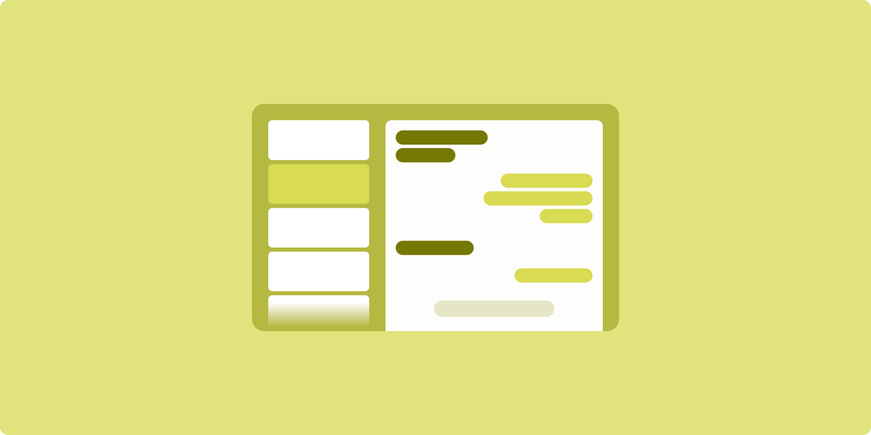
借助列表详情布局,用户可以浏览包含描述性、解释性或其他补充信息(即“项详情”)的项列表。
该布局可将应用窗口分为两个并排显示的窗格:一个用于显示列表,另一个用于显示详情。用户从列表中选择要查看的项,即可显示对应的项详情。详情中的深层链接可以在详情窗格中显示更多内容。
较大宽度的显示屏(请参阅使用窗口大小类别)可同时容纳 列表和详情。选择列表项后,详情窗格会更新,以显示所选项的相关内容。
中等宽度和紧凑宽度的显示屏可以显示列表或详情,具体取决于用户与应用的互动。如果只显示列表,当用户选择某个列表项时,对应的详情便会取代列表进行显示。如果只显示详情,当用户按返回按钮时,系统会重新显示列表。
配置更改(例如设备屏幕方向更改或应用窗口大小更改)可能会更改显示屏的窗口大小类别。列表详情布局会相应地做出响应,同时保留应用状态:
- 如果展开宽度的显示屏同时显示列表窗格和详情窗格,然后收窄为中等宽度或紧凑宽度,则详情窗格仍会显示,而列表窗格会变为隐藏状态
- 如果中等宽度或紧凑宽度的显示屏先只显示“详细信息”窗格,然后窗口大小类别展开为较大宽度,则列表和详情会一起显示,并且列表会指明与“详细信息”窗格中的内容对应的项已被选中
- 如果中等宽度或较小宽度的屏幕先只显示列表窗格,然后展开为较大宽度,则列表和占位符详情窗格会一起显示
列表详情布局非常适合即时通讯应用、通讯录管理器、互动 媒体浏览器或内容可整理为 项列表(用于显示额外信息)的任何应用。
实现
您可以使用各种技术创建列表-详情布局,包括 Compose、View 和 activity 嵌入(适用于旧版应用)。如需我们帮助您确定哪项技术最适用于您的应用,请参阅适用性部分。
SlidingPaneLayout 库旨在基于 View 或 fragment 实现列表详情布局。
首先,将 SlidingPaneLayout 声明为 XML 布局的根元素。接下来,添加两个子元素(View 或 fragment),用于表示列表和详情内容。
实现一种通信方法,以便在列表-详情 View 或 fragment 之间传递数据。建议使用 ViewModel,因为它能存储业务逻辑,并且可在配置更改后继续留存。
SlidingPaneLayout 会自动判断列表和详情应该同时显示还是单独显示。如果窗口的横向空间足够同时容纳列表和详情,二者会并排显示。如果窗口空间不足,系统会根据用户与应用的互动单独显示列表或详情。
如需查看示例实现,请参阅包含滑动窗格的列表-详情示例。
activity 嵌入
借助 activity 嵌入,可以让旧版的多 activity 应用在同一屏幕中并排显示两个 activity,或让两个 activity 堆叠显示(一个叠加在另一个之上)。如果您的应用在单独的 activity 中分别实现列表详情布局的列表和详情,借助 activity 嵌入,您只需进行少量代码重构(甚至无需重构),即可创建列表详情布局。
如需实现 activity 嵌入,只需使用 XML 配置文件指定任务窗口拆分即可。分屏定义了主要 activity(用于启动分屏)和辅助 activity。使用窗口大小类别断点指定拆分的显示屏宽度下限。当显示屏宽度低于断点下限时,activity 便会叠加显示。例如,如果显示屏宽度下限为 600dp,那么在较小宽度的显示屏上,activity 会叠加显示;但在中等宽度和较大宽度的显示屏上,activity 会并排显示。
Android 12L(API 级别 32)及更高版本支持 activity 嵌入,但经设备制造商实现后,较低的 API 级别也可提供相应支持。如果设备不支持 activity 嵌入,回退行为会导致列表 activity 或详情 activity 占据整个应用窗口,具体取决于用户与应用的互动。
如需了解详情,请参阅 activity 嵌入。
如需查看示例实现,请参阅使用 activity 嵌入构建列表详情示例。
信息流
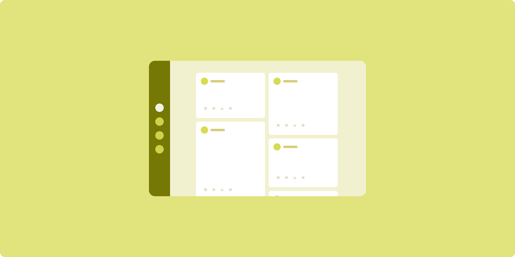
Feed 布局能够以可配置网格的形式排列等效的内容元素,以便用户快速、方便地查看大量内容。
内容元素之间的关系由大小和位置确定。
如要创建内容组,可以将相关元素设置为相同的大小,并将这些元素放置到一起。如要吸引用户注意某个元素,可以将其设置为比附近的元素大。
卡片和列表是 Feed 布局的常见组件。
Feed 布局支持几乎任何尺寸的显示屏,因为网格可从滚动的单列调整为滚动的多列内容 Feed。
Feed 尤其适用于 新闻和社交媒体应用。
实现
RecyclerView 可在单个列中高效呈现大量的项。GridLayoutManager 以网格形式排列各个项,支持配置项的大小和 span。
根据可用显示区域的大小配置网格列,以设置项允许的最小宽度。
如需替换 GridLayoutManager 的默认 span 设置策略(即每个项对应一个 span),可以创建自定义 SpanSizeLookup。调整 span 即可让某些项比其他项更为醒目。
如果显示屏因宽度较小而只够显示一个列,请使用 LinearLayoutManager,而不是 GridLayoutManager。
如需查看示例实现,请参阅使用 View 构建 Feed 示例。
辅助窗格

辅助窗格布局会按主要显示区域和辅助显示区域来整理应用内容。
主要显示区域占据应用窗口的大部分区域(通常占据三分之二左右),并且包含主要内容。辅助显示区域是一个窗格,它占据应用窗口的其余区域,并会展示主要内容的辅助性内容。
辅助窗格布局在采用横屏模式的较大宽度显示屏(请参阅使用窗口大小类别)上效果出众。在以下情况下,中等宽度或紧凑宽度的显示屏支持同时显示主要显示区域和辅助显示区域:内容可适应狭窄的显示空间,或者附加内容最初可隐藏在底部或侧边动作条(可通过菜单或按钮等控件访问)中。
主要内容和辅助内容之间的关系是辅助窗格布局与列表详情布局的区别所在。辅助窗格内容只在与主要内容相关时才有用;例如,如果单独使用,辅助窗格工具窗口则没有意义。但是,即使没有主要内容,列表详情布局的详情窗格中的补充内容仍然有意义;例如,商品详情中的商品说明。
辅助窗格的用例包括:
- 效率应用:在辅助窗格中附有评价者所发表 评论的文档或电子表格
- 媒体应用:在辅助窗格中显示流式视频和相关视频列表,或附有播放列表的音乐专辑说明
- 工具和设置:在辅助窗格中显示调色板、效果和其他设置的媒体编辑工具
实现
辅助窗格布局是使用 LinearLayout 或 ConstraintLayout 等辅助布局实现的。建立窗口大小类别
用于将应用可用的横向显示空间量
三个类别:较小 (< 600dp)、中等 (>= 600dp) 和较大
(>= 840dp)。
针对每个窗口大小类别,按以下方式定义布局:
- 紧凑:在应用资源
layout文件夹中,放置 在主要内容下方或底部动作条内呈现辅助窗格 - 中等:在
layout-w600dp文件夹中提供辅助窗格内容,使主要内容和辅助窗格并排呈现,并平均分配横向显示空间 - 展开:在
layout-w840dp文件夹中添加辅助窗格内容,使主要内容和辅助窗格并排呈现;不过,让辅助窗格只占据横向空间的 30%,并将其余 70% 的空间留给主要内容
使用 ViewModel 在主要内容和
无论是使用 View、fragment 还是二者结合使用,都可以在辅助窗格中显示。
如需查看实现示例,请参阅以下示例:
适用性
规范布局可对内容进行多层面的展示,以便于访问和深入发掘。您可以利用以下流程图来确定哪种布局和实现策略最适用于您的应用用例。
如需查看在不同类型的应用中实现的规范化布局的示例,请参阅大屏幕图库。

其他资源
- Material Design:规范化布局