
ConstraintLayout एक ऐसा लेआउट है जिसकी मदद से, स्क्रीन पर मौजूद अन्य कंपोज़ेबल के मुकाबले, कंपोज़ेबल को प्लेस किया जा सकता है. यह, नेस्ट किए गए कई
Row, Column, Box, और अन्य कस्टम लेआउट एलिमेंट का इस्तेमाल करने का एक विकल्प है.
View सिस्टम में, बड़े और जटिल लेआउट बनाने के लिए ConstraintLayout का इस्तेमाल करने का सुझाव दिया जाता था. ऐसा इसलिए, क्योंकि नेस्ट किए गए व्यू के मुकाबले, फ़्लैट व्यू हैरारकी (व्यू और व्यू ग्रुप के लेआउट का क्रम) बेहतर परफ़ॉर्मेंस देता था. हालांकि, Compose में ऐसा नहीं है. यह डीप लेआउट के क्रम को असरदार तरीके से मैनेज कर सकता है. इसलिए, ConstraintLayout उतना फ़ायदेमंद नहीं है.
ConstraintLayout का इस्तेमाल करना
Compose में ConstraintLayout का इस्तेमाल करने के लिए, आपको Compose सेटअप के अलावा, आपके
build.gradle में यह डिपेंडेंसी जोड़नी होगी:
implementation "androidx.constraintlayout:constraintlayout-compose:$constraintlayout_compose_version"
Compose में ConstraintLayout,
DSL का इस्तेमाल करके इस तरह काम करता है:
ConstraintLayoutमें मौजूद हर कंपोज़ेबल के लिए रेफ़रंस बनाएं. इसके लिए,createRefs()याcreateRefFor()का इस्तेमाल करें.constrainAs()मॉडिफ़ायर का इस्तेमाल करके, कंस्ट्रेंट दिए जाते हैं. यह रेफ़रंस को पैरामीटर के तौर पर लेता है और आपको बॉडी लैम्डा में इसके कंस्ट्रेंट तय करने की अनुमति देता है.linkTo()या अन्य मददगार तरीकों का इस्तेमाल करके, कंस्ट्रेंट तय किए जाते हैं.parentएक मौजूदा रेफ़रंस है. इसका इस्तेमाल,ConstraintLayoutकंपोज़ेबल के लिए कंस्ट्रेंट तय करने के लिए किया जा सकता है.
यहां ConstraintLayout का इस्तेमाल करने वाले कंपोज़ेबल का एक उदाहरण दिया गया है:
@Composable fun ConstraintLayoutContent() { ConstraintLayout { // Create references for the composables to constrain val (button, text) = createRefs() Button( onClick = { /* Do something */ }, // Assign reference "button" to the Button composable // and constrain it to the top of the ConstraintLayout modifier = Modifier.constrainAs(button) { top.linkTo(parent.top, margin = 16.dp) } ) { Text("Button") } // Assign reference "text" to the Text composable // and constrain it to the bottom of the Button composable Text( "Text", Modifier.constrainAs(text) { top.linkTo(button.bottom, margin = 16.dp) } ) } }
इस कोड में, Button के सबसे ऊपर वाले हिस्से को 16.dp के मार्जिन के साथ पैरंट से और Text को Button के सबसे नीचे वाले हिस्से को भी 16.dp के मार्जिन के साथ कंस्ट्रेंट किया जाता है.
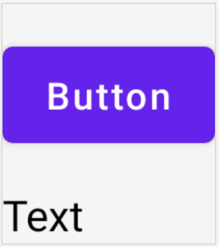
ConstraintLayout में, एक-दूसरे से कंस्ट्रेंट किया गया Button और एक Text कंपोज़ेबल.
डीकपल्ड एपीआई
ConstraintLayout के उदाहरण में, कंस्ट्रेंट को इनलाइन तय किया जाता है. साथ ही, कंपोज़ेबल में एक मॉडिफ़ायर भी होता है जिस पर ये कंस्ट्रेंट लागू होते हैं. हालांकि, कुछ स्थितियों में, कंस्ट्रेंट को उन लेआउट से डीकपल्ड करना बेहतर होता है जिन पर ये लागू होते हैं.
उदाहरण के लिए, हो सकता है कि आपको स्क्रीन कॉन्फ़िगरेशन के आधार पर कंस्ट्रेंट बदलने हों या दो कंस्ट्रेंट सेट के बीच ऐनिमेशन दिखाना हो.
ऐसे मामलों में, ConstraintLayout का इस्तेमाल किसी दूसरे तरीके से किया जा सकता है:
ConstraintSetको पैरामीटर के तौर परConstraintLayoutमें पास करें.- `
layoutId` मॉडिफ़ायर का इस्तेमाल करके, `ConstraintSet` में बनाए गए रेफ़रंस को कंपोज़ेबल असाइन करें.
@Composable fun DecoupledConstraintLayout() { BoxWithConstraints { val constraints = if (minWidth < 600.dp) { decoupledConstraints(margin = 16.dp) // Portrait constraints } else { decoupledConstraints(margin = 32.dp) // Landscape constraints } ConstraintLayout(constraints) { Button( onClick = { /* Do something */ }, modifier = Modifier.layoutId("button") ) { Text("Button") } Text("Text", Modifier.layoutId("text")) } } } private fun decoupledConstraints(margin: Dp): ConstraintSet { return ConstraintSet { val button = createRefFor("button") val text = createRefFor("text") constrain(button) { top.linkTo(parent.top, margin = margin) } constrain(text) { top.linkTo(button.bottom, margin) } } }
इसके बाद, कंस्ट्रेंट बदलने के लिए, सिर्फ़ कोई दूसरा ConstraintSet पास करें.
ConstraintLayout के कॉन्सेप्ट
ConstraintLayout में दिशा-निर्देश, बैरियर, और चेन जैसे कॉन्सेप्ट शामिल हैं. इनकी मदद से, कंपोज़ेबल में एलिमेंट की पोज़िशन तय की जा सकती है.
दिशा-निर्देश
दिशा-निर्देश, लेआउट डिज़ाइन करने में मदद करने वाले छोटे विज़ुअल होते हैं. कंपोज़ेबल को किसी दिशा-निर्देश से कंस्ट्रेंट किया जा सकता है. दिशा-निर्देश, पैरंट कंपोज़ेबल में किसी
खास dp या percentage पर एलिमेंट की पोज़िशन तय करने के लिए काम के होते हैं.
दिशा-निर्देश दो तरह के होते हैं: वर्टिकल और हॉरिज़ॉन्टल. हॉरिज़ॉन्टल दिशा-निर्देश, top और bottom होते हैं. वहीं, वर्टिकल दिशा-निर्देश, start और end होते हैं.
ConstraintLayout { // Create guideline from the start of the parent at 10% the width of the Composable val startGuideline = createGuidelineFromStart(0.1f) // Create guideline from the end of the parent at 10% the width of the Composable val endGuideline = createGuidelineFromEnd(0.1f) // Create guideline from 16 dp from the top of the parent val topGuideline = createGuidelineFromTop(16.dp) // Create guideline from 16 dp from the bottom of the parent val bottomGuideline = createGuidelineFromBottom(16.dp) }
दिशा-निर्देश बनाने के लिए, ज़रूरी दिशा-निर्देश के टाइप के साथ createGuidelineFrom* का इस्तेमाल करें. इससे एक रेफ़रंस बनता है. इसका इस्तेमाल, Modifier.constrainAs() ब्लॉक में किया जा सकता है.
बैरियर
बैरियर, कई कंपोज़ेबल को रेफ़रंस करके, एक वर्चुअल दिशा-निर्देश बनाता है जो बताई गई साइड पर सबसे बड़े विजेट पर आधारित होता है.
बैरियर बनाने के लिए, createTopBarrier() (या: createBottomBarrier(), createEndBarrier(), createStartBarrier()) का इस्तेमाल करें. साथ ही, वे रेफ़रंस दें जिनसे बैरियर बनना चाहिए.
ConstraintLayout { val constraintSet = ConstraintSet { val button = createRefFor("button") val text = createRefFor("text") val topBarrier = createTopBarrier(button, text) } }
इसके बाद, बैरियर का इस्तेमाल Modifier.constrainAs() ब्लॉक में किया जा सकता है.
चेन
चेन, एक ऐक्सिस (हॉरिज़ॉन्टल या वर्टिकल) में ग्रुप जैसा व्यवहार करती हैं. दूसरे ऐक्सिस को अलग से कंस्ट्रेंट किया जा सकता है.
चेन बनाने के लिए, createVerticalChain या
createHorizontalChain का इस्तेमाल करें:
ConstraintLayout { val constraintSet = ConstraintSet { val button = createRefFor("button") val text = createRefFor("text") val verticalChain = createVerticalChain(button, text, chainStyle = ChainStyle.Spread) val horizontalChain = createHorizontalChain(button, text) } }
इसके बाद, चेन का इस्तेमाल Modifier.constrainAs() ब्लॉक में किया जा सकता है.
चेन को अलग-अलग ChainStyles के साथ कॉन्फ़िगर किया जा सकता है. इससे यह तय होता है कि कंपोज़ेबल के आस-पास मौजूद स्पेस को कैसे मैनेज किया जाए. जैसे:
ChainStyle.Spread: स्पेस को सभी कंपोज़ेबल में बराबर बांटा जाता है. इसमें पहले कंपोज़ेबल से पहले और आखिरी कंपोज़ेबल के बाद मौजूद खाली स्पेस भी शामिल होता है.ChainStyle.SpreadInside: स्पेस को सभी कंपोज़ेबल में बराबर बांटा जाता है. इसमें पहले कंपोज़ेबल से पहले या आखिरी कंपोज़ेबल के बाद मौजूद खाली स्पेस शामिल नहीं होता.ChainStyle.Packed: स्पेस को पहले कंपोज़ेबल से पहले और आखिरी कंपोज़ेबल के बाद बांटा जाता है. कंपोज़ेबल को एक साथ पैक किया जाता है. इनके बीच कोई स्पेस नहीं होता.