
Jetpack Compose offers an implementation of Material Design, a comprehensive design system for creating digital interfaces. The Material Design components (buttons, cards, switches, and so on) are built on top of Material Theming, which is a systematic way to customize Material Design to better reflect your product’s brand. A Material Theme contains color, typography, and shape attributes. When you customize these attributes, your changes are automatically reflected in the components you use to build your app.
Jetpack Compose implements these concepts with the MaterialTheme
composable:
MaterialTheme( colors = // ... typography = // ... shapes = // ... ) { // app content }
Configure the parameters you pass to MaterialTheme to theme your application.
Color
Colors are modeled in Compose with the Color class, a data-holding class.
val Red = Color(0xffff0000) val Blue = Color(red = 0f, green = 0f, blue = 1f)
While you can organize these however you like (as top-level constants, within a singleton, or defined inline), we strongly recommend specifying colors in your theme and retrieving the colors from there. This approach makes it possible to support dark theme and nested themes.
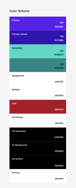
Compose provides the Colors class to model the Material color
system. Colors provides builder functions to create sets of
light or dark colors:
private val Yellow200 = Color(0xffffeb46) private val Blue200 = Color(0xff91a4fc) // ... private val DarkColors = darkColors( primary = Yellow200, secondary = Blue200, // ... ) private val LightColors = lightColors( primary = Yellow500, primaryVariant = Yellow400, secondary = Blue700, // ... )
After you have defined your Colors, you can pass them to a MaterialTheme:
MaterialTheme( colors = if (darkTheme) DarkColors else LightColors ) { // app content }
Use theme colors
You can retrieve the Colors provided to the MaterialTheme composable by
using MaterialTheme.colors.
Text( text = "Hello theming", color = MaterialTheme.colors.primary )
Surface and content color
Many components accept a pair of color and content color:
Surface( color = MaterialTheme.colors.surface, contentColor = contentColorFor(color), // ... ) { /* ... */ } TopAppBar( backgroundColor = MaterialTheme.colors.primarySurface, contentColor = contentColorFor(backgroundColor), // ... ) { /* ... */ }
This lets you not only set the color of a composable, but also provide a
default color for the content, the composables contained within it. Many
composables use this content color by default. For example, Text bases its
color on its parent's content color, and Icon uses that color to set its tint.
The contentColorFor() method retrieves the appropriate "on" color for
any theme colors. For example, if you set a primary background color on
Surface, it uses this function to set onPrimary as the content color.
If you set a non-theme background color, you should also specify an appropriate
content color. Use LocalContentColor to retrieve the preferred content
color for the current background, at a given position in the hierarchy.
Content alpha
Often you want to vary how much you emphasize content to communicate importance and provide visual hierarchy. The Material Design text legibility recommendations advise employing different levels of opacity to convey different importance levels.
Jetpack Compose implements this using LocalContentAlpha. You can specify
a content alpha for a hierarchy by providing a value for this
CompositionLocal. Nested composables can use this value to apply the
alpha treatment to their content. For example, Text and Icon by
default use the combination of LocalContentColor adjusted to use
LocalContentAlpha. Material specifies some standard alpha values
(high, medium, disabled) which are modeled by the
ContentAlpha object.
// By default, both Icon & Text use the combination of LocalContentColor & // LocalContentAlpha. De-emphasize content by setting content alpha CompositionLocalProvider(LocalContentAlpha provides ContentAlpha.medium) { Text( // ... ) } CompositionLocalProvider(LocalContentAlpha provides ContentAlpha.disabled) { Icon( // ... ) Text( // ... ) }
To learn more about CompositionLocal, see Locally scoped data with
CompositionLocal.
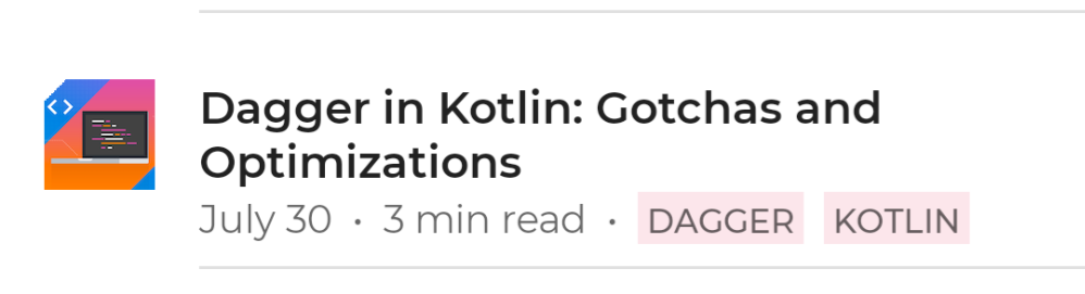
ContentAlpha.high. The second line contains less-important metadata, and thus uses ContentAlpha.medium.Dark theme
In Compose, you implement light and dark themes by providing different sets of
Colors to the MaterialTheme composable:
@Composable fun MyTheme( darkTheme: Boolean = isSystemInDarkTheme(), content: @Composable () -> Unit ) { MaterialTheme( colors = if (darkTheme) DarkColors else LightColors, /*...*/ content = content ) }
In this example, MaterialTheme is wrapped in its own composable function,
which accepts a parameter that specifies whether to use a dark theme or not. In
this case, the function gets the default value for darkTheme by querying the
device theme setting.
You can use code like this to check if the current Colors are light or dark:
val isLightTheme = MaterialTheme.colors.isLight Icon( painterResource( id = if (isLightTheme) { R.drawable.ic_sun_24 } else { R.drawable.ic_moon_24 } ), contentDescription = "Theme" )
Elevation overlays
In Material, surfaces in dark themes with higher elevations receive elevation overlays, which lighten their background. The higher a surface's elevation (raising it closer to an implied light source), the lighter that surface becomes.
The Surface composable applies these overlays automatically when using
dark colors, and so does any other Material composable which uses a surface:
Surface( elevation = 2.dp, color = MaterialTheme.colors.surface, // color will be adjusted for elevation /*...*/ ) { /*...*/ }
surface color as their background. Since the cards and bottom navigation are at different elevation levels above the background, they have slightly different colors–the cards are lighter than the background and the bottom navigation is lighter than the cards.For custom scenarios that don’t involve a Surface, use
LocalElevationOverlay, a CompositionLocal containing the
ElevationOverlay used by Surface components:
// Elevation overlays // Implemented in Surface (and any components that use it) val color = MaterialTheme.colors.surface val elevation = 4.dp val overlaidColor = LocalElevationOverlay.current?.apply( color, elevation )
To disable elevation overlays, provide null at the chosen point in a
composable hierarchy:
MyTheme { CompositionLocalProvider(LocalElevationOverlay provides null) { // Content without elevation overlays } }
Limited color accents
Material recommends applying limited color accents for dark
themes by preferring the use of the surface color over the primary color in
most cases. Material composables like TopAppBar and BottomNavigation
implement this behavior by default.
For custom scenarios, use the primarySurface extension property:
Surface( // Switches between primary in light theme and surface in dark theme color = MaterialTheme.colors.primarySurface, /*...*/ ) { /*...*/ }
Typography
Material defines a type system, encouraging you to use a small number of semantically-named styles.
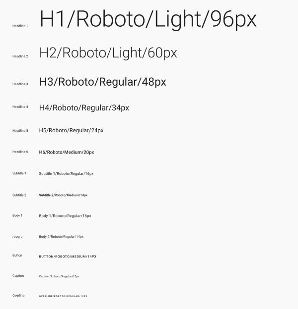
Compose implements the type system with the Typography,
TextStyle, and font-related classes. The Typography constructor
offers defaults for each style so you can omit any you don't want to customize:
val raleway = FontFamily( Font(R.font.raleway_regular), Font(R.font.raleway_medium, FontWeight.W500), Font(R.font.raleway_semibold, FontWeight.SemiBold) ) val myTypography = Typography( h1 = TextStyle( fontFamily = raleway, fontWeight = FontWeight.W300, fontSize = 96.sp ), body1 = TextStyle( fontFamily = raleway, fontWeight = FontWeight.W600, fontSize = 16.sp ) /*...*/ ) MaterialTheme(typography = myTypography, /*...*/) { /*...*/ }
If you want to use the same typeface throughout, specify the
defaultFontFamily parameter and omit the fontFamily of any
TextStyle elements:
val typography = Typography(defaultFontFamily = raleway) MaterialTheme(typography = typography, /*...*/) { /*...*/ }
Use text styles
TextStyle elements are accessed using MaterialTheme.typography. Retrieve
the TextStyle elements as follows:
Text( text = "Subtitle2 styled", style = MaterialTheme.typography.subtitle2 )

Shape
Material defines a shape system, letting you define shapes for large, medium, and small components.
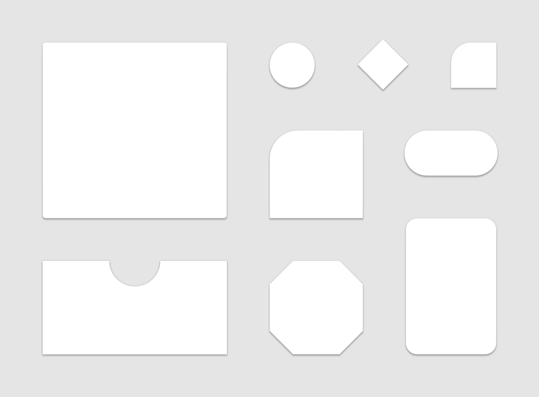
Compose implements the shape system with the Shapes class, which lets
you specify a CornerBasedShape for each size category:
val shapes = Shapes( small = RoundedCornerShape(percent = 50), medium = RoundedCornerShape(0f), large = CutCornerShape( topStart = 16.dp, topEnd = 0.dp, bottomEnd = 0.dp, bottomStart = 16.dp ) ) MaterialTheme(shapes = shapes, /*...*/) { /*...*/ }
Many components use these shapes by default. For example, Button,
TextField, and FloatingActionButton default to small,
AlertDialog defaults to medium, and ModalDrawer defaults to
large — see the shape scheme reference for the complete
mapping.
Use shapes
Shape elements are accessed using MaterialTheme.shapes. Retrieve the
Shape elements with code like this:
Surface( shape = MaterialTheme.shapes.medium, /*...*/ ) { /*...*/ }
Default styles
There is no equivalent concept in Compose of default styles from Android
Views. You can provide similar functionality by creating your own overload
composable functions that wrap Material components. For example, to create a
style of button, wrap a button in your own composable function, directly setting
the parameters you want or need to alter and exposing others as parameters to
the containing composable.
@Composable fun MyButton( onClick: () -> Unit, modifier: Modifier = Modifier, content: @Composable RowScope.() -> Unit ) { Button( colors = ButtonDefaults.buttonColors( backgroundColor = MaterialTheme.colors.secondary ), onClick = onClick, modifier = modifier, content = content ) }
Theme overlays
You can achieve the equivalent of theme overlays from Android
Views in Compose by nesting MaterialTheme composables. Because
MaterialTheme defaults the colors, typography, and shapes to the current
theme value, all other parameters keep their default values when a theme only
sets one of those parameters.
Furthermore, when migrating View-based screens to Compose, watch out for usages
of the android:theme attribute. It's likely you need a new MaterialTheme
in that part of the Compose UI tree.
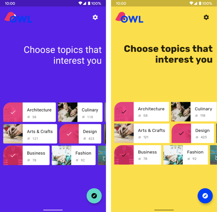
In this example, the details screen uses a PinkTheme for most of the screen,
and then a BlueTheme for the related section. The following screenshot and
code illustrate this concept:
@Composable fun DetailsScreen(/* ... */) { PinkTheme { // other content RelatedSection() } } @Composable fun RelatedSection(/* ... */) { BlueTheme { // content } }
Component states
Material components that can be interacted with (clicked, toggled, etc.) can be in different visual states. States include enabled, disabled, pressed, etc.
Composables often have an enabled parameter. Setting it to false prevents
interaction, and changes properties like color and elevation to visually convey
the component state.
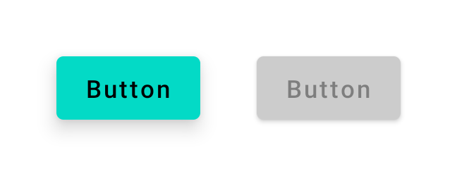
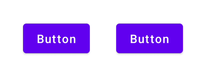
enabled = true (left) and enabled = false (right).In most cases you can rely on defaults for values like color and elevation. If you need to configure values used in different states, there are classes and convenience functions available. Consider the following button example:
Button( onClick = { /* ... */ }, enabled = true, // Custom colors for different states colors = ButtonDefaults.buttonColors( backgroundColor = MaterialTheme.colors.secondary, disabledBackgroundColor = MaterialTheme.colors.onBackground .copy(alpha = 0.2f) .compositeOver(MaterialTheme.colors.background) // Also contentColor and disabledContentColor ), // Custom elevation for different states elevation = ButtonDefaults.elevation( defaultElevation = 8.dp, disabledElevation = 2.dp, // Also pressedElevation ) ) { /* ... */ }
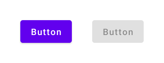
enabled = true (left) and enabled = false (right), with adjusted color and elevation values.Ripples
Material components use ripples to indicate they're being interacted with. If
you're using MaterialTheme in your hierarchy, a Ripple is used as the
default Indication inside modifiers such as clickable and
indication.
In most cases you can rely on the default Ripple. If you need to
configure their appearance, you can use RippleTheme to change properties
like color and alpha.
You can extend RippleTheme and make use of the defaultRippleColor and
defaultRippleAlpha utility functions. You can then provide your custom
ripple theme in your hierarchy using LocalRippleTheme:
@Composable fun MyApp() { MaterialTheme { CompositionLocalProvider( LocalRippleTheme provides SecondaryRippleTheme ) { // App content } } } @Immutable private object SecondaryRippleTheme : RippleTheme { @Composable override fun defaultColor() = RippleTheme.defaultRippleColor( contentColor = MaterialTheme.colors.secondary, lightTheme = MaterialTheme.colors.isLight ) @Composable override fun rippleAlpha() = RippleTheme.defaultRippleAlpha( contentColor = MaterialTheme.colors.secondary, lightTheme = MaterialTheme.colors.isLight ) }
RippleTheme.Learn more
To learn more about Material Theming in Compose, consult the following additional resources.
Codelabs
Videos
Recommended for you
- Note: link text is displayed when JavaScript is off
- Custom design systems in Compose
- Migrate from Material 2 to Material 3 in Compose
- Accessibility in Compose