
Komponen Chip adalah elemen UI interaktif yang ringkas. Chip mewakili entitas kompleks seperti kontak atau tag, sering kali dengan ikon dan label. Chip dapat
diperiksa, ditutup, atau diklik.
Empat jenis chip dan tempat Anda dapat menggunakannya adalah sebagai berikut:
- Bantuan: Memandu pengguna selama melakukan tugas. Sering muncul sebagai elemen UI sementara sebagai respons terhadap input pengguna.
- Filter: Memungkinkan pengguna menyaring konten dari serangkaian opsi. Opsi tersebut dapat dipilih atau dibatalkan pilihannya, dan dapat menyertakan ikon tanda centang saat dipilih.
- Input: Mewakili informasi yang disediakan pengguna, seperti pilihan dalam menu. Chip dapat berisi ikon dan teks, serta menyediakan X untuk penghapusan.
- Saran: Memberikan rekomendasi kepada pengguna berdasarkan aktivitas atau input terbaru mereka. Biasanya muncul di bawah kolom input untuk memicu tindakan pengguna.

Platform API
Ada empat composable yang sesuai dengan empat jenis chip. Bagian berikut menguraikan composable ini dan perbedaannya secara mendetail. Namun, keduanya memiliki parameter berikut:
label: String yang muncul di chip.icon: Ikon yang ditampilkan di awal chip. Beberapa composable tertentu memiliki parameterleadingIcondantrailingIconterpisah.onClick: Lambda yang dipanggil chip saat pengguna menekannya.
Chip bantuan
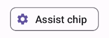
Composable AssistChip menyediakan cara mudah untuk membuat chip bantuan yang mengarahkan pengguna ke arah tertentu. Salah satu fitur yang membedakannya adalah parameter leadingIcon yang memungkinkan Anda menampilkan ikon di sisi kiri chip. Contoh berikut menunjukkan cara Anda dapat menerapkannya:
@Composable fun AssistChipExample() { AssistChip( onClick = { Log.d("Assist chip", "hello world") }, label = { Text("Assist chip") }, leadingIcon = { Icon( Icons.Filled.Settings, contentDescription = "Localized description", Modifier.size(AssistChipDefaults.IconSize) ) } ) }
Penerapan ini akan terlihat seperti berikut.
Chip filter
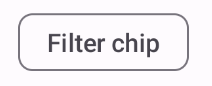
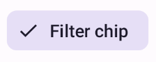
Composable FilterChip mengharuskan Anda melacak apakah chip dipilih atau tidak. Contoh berikut menunjukkan cara menampilkan ikon yang dicentang di bagian depan hanya saat pengguna telah memilih chip:
@Composable fun FilterChipExample() { var selected by remember { mutableStateOf(false) } FilterChip( onClick = { selected = !selected }, label = { Text("Filter chip") }, selected = selected, leadingIcon = if (selected) { { Icon( imageVector = Icons.Filled.Done, contentDescription = "Done icon", modifier = Modifier.size(FilterChipDefaults.IconSize) ) } } else { null }, ) }
Penerapan ini akan muncul sebagai berikut jika tidak dipilih:
Dan akan muncul seperti berikut saat dipilih:
Chip input
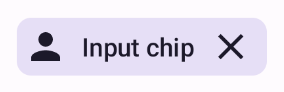
Anda dapat menggunakan composable InputChip untuk membuat chip yang dihasilkan dari interaksi pengguna. Misalnya, di program email, saat pengguna menulis email, chip input dapat merepresentasikan kontak yang telah ditambahkan pengguna ke kolom "Kepada:".
Penerapan berikut menunjukkan chip input yang sudah dalam status dipilih. Pengguna menutup chip saat menekannya.
@Composable fun InputChipExample( text: String, onDismiss: () -> Unit, ) { var enabled by remember { mutableStateOf(true) } if (!enabled) return InputChip( onClick = { onDismiss() enabled = !enabled }, label = { Text(text) }, selected = enabled, avatar = { Icon( Icons.Filled.Person, contentDescription = "Localized description", Modifier.size(InputChipDefaults.AvatarSize) ) }, trailingIcon = { Icon( Icons.Default.Close, contentDescription = "Localized description", Modifier.size(InputChipDefaults.AvatarSize) ) }, ) }
Penerapan ini akan terlihat seperti berikut.
Chip saran
Composable SuggestionChip adalah composable paling dasar yang tercantum di halaman ini, baik dalam definisi API maupun kasus penggunaannya yang umum. Chip saran menampilkan petunjuk yang dibuat secara dinamis. Misalnya, dalam aplikasi chat AI, Anda dapat menggunakan chip saran untuk menampilkan kemungkinan respons terhadap pesan terbaru.
Pertimbangkan penerapan SuggestionChip ini:
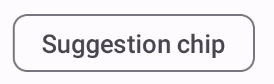
@Composable fun SuggestionChipExample() { SuggestionChip( onClick = { Log.d("Suggestion chip", "hello world") }, label = { Text("Suggestion chip") } ) }
Penerapan ini akan terlihat seperti berikut:
Chip timbul
Semua contoh dalam dokumen ini menggunakan composable dasar yang memiliki tampilan datar. Jika Anda menginginkan chip yang memiliki tampilan lebih tinggi, gunakan salah satu dari tiga composable berikut: