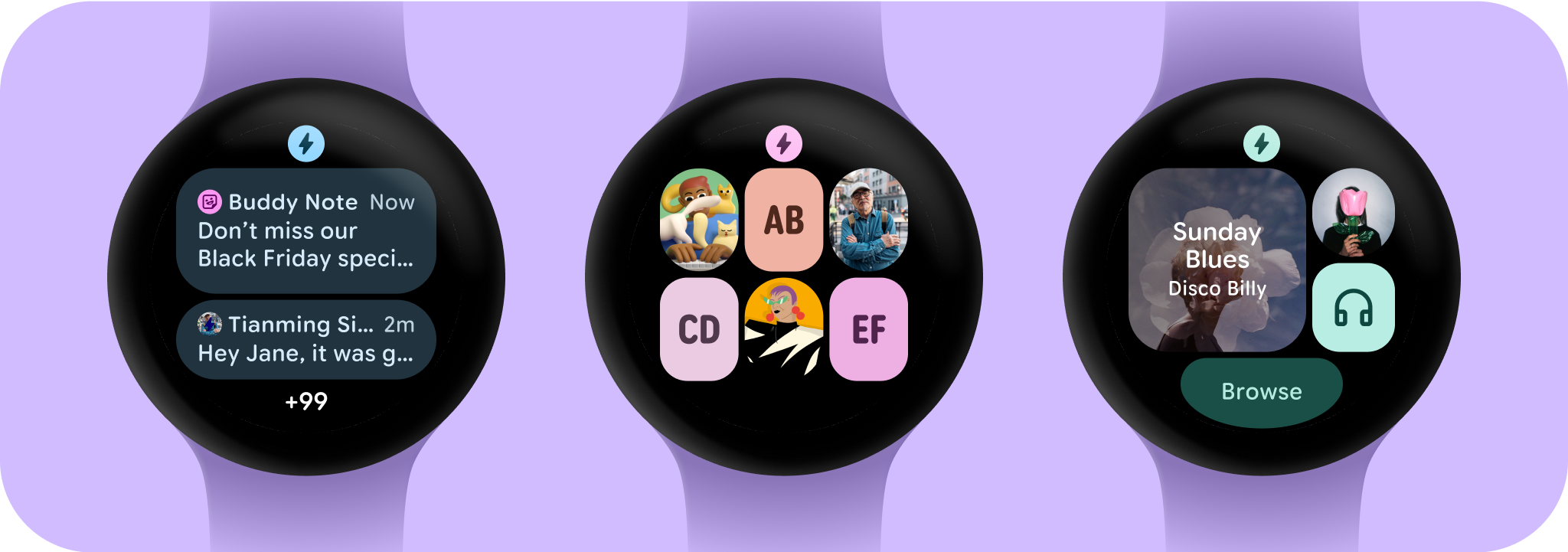
資訊方塊的最佳做法
透過集合功能整理內容
你可以依據偏好儲存及分類內容。

黑底設計
在 Wear OS 上設計黑色背景非常重要,原因有兩個:
- 電池效率:螢幕上每個亮起的像素都會消耗電力。使用黑色背景可減少有效像素數量,延長電池續航力。
- 完美美感:黑色背景可視覺上縮小錶框,營造出延伸至裝置邊緣的連續表面錯覺。在這個空間中加入 UI 元素,可進一步強化這項效果。
check_circle
執行此動作
一律將背景顏色設為黑色。
cancel
請勿這麼做
請勿將背景設為全出血圖片或封閉顏色。
只包含必要元素
在使用者捲動資訊方塊輪轉介面時,Wear OS 會自動顯示永久應用程式圖示。應用程式圖示不應設計為資訊方塊的一部分。
如果資訊方塊採用動態主題,請務必提供單色應用程式圖示。請參閱 Android 產品圖示規範,瞭解如何建立品牌的應用程式圖示。
check_circle
執行此動作
當使用者捲動資訊方塊輪轉介面時,Wear OS 可能會自動顯示應用程式圖示。您不需要在資訊方塊設計中放入應用程式圖示。
cancel
請勿這麼做
請勿在資訊方塊設計中新增應用程式圖示,因為如果在系統層級顯示,圖示可能會重複顯示/重疊。
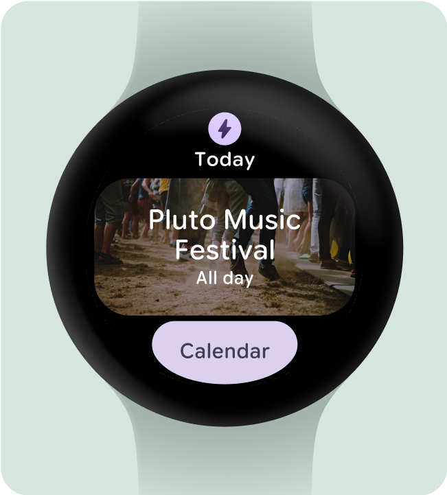
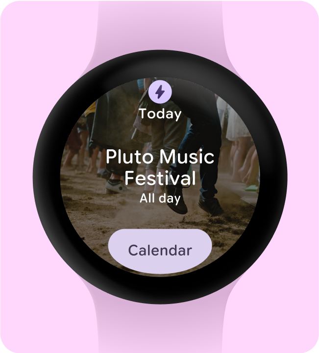
隱藏應用程式標題,確保最少輕觸目標
為確保在較小的螢幕上有足夠的空間放置互動元素,如果資訊方塊使用兩列 (以及底部區段),應用程式標題就會隱藏。這可確保資料列的高度足夠 (至少 48dp)。標題可以在較大的螢幕上重新顯示 (225dp 以上)。
check_circle
執行此動作
在小螢幕上,應用程式會隱藏標題,確保兩個資料列的最小高度和輕觸目標為 48dp。
cancel
請勿這麼做
如果您未在小螢幕上隱藏應用程式標題,且有兩行,元件的高度就不會遵循無障礙標準,且小於最小輕觸目標大小。在這個範例中,按鈕的空間小於 48dp,因此會遭到裁剪。
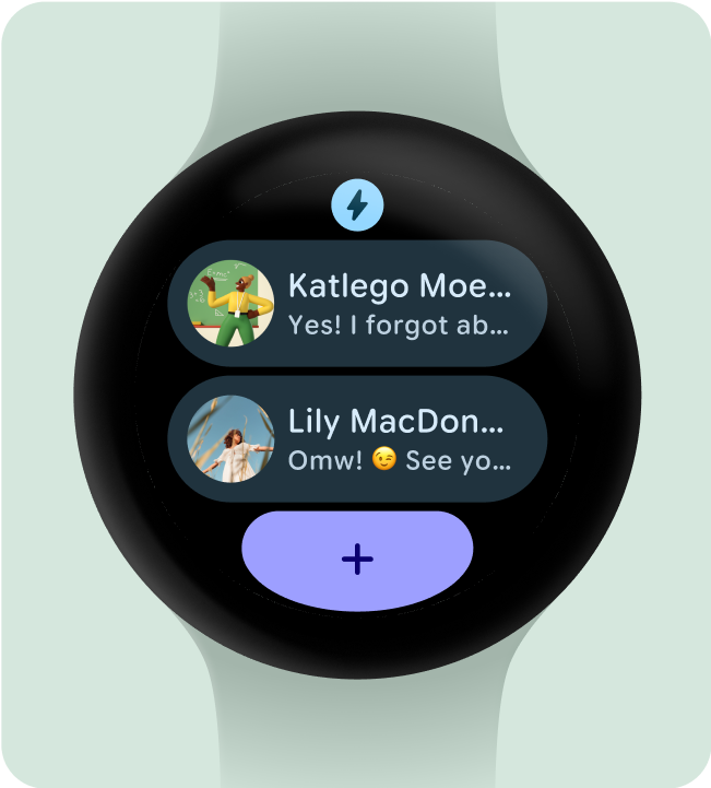
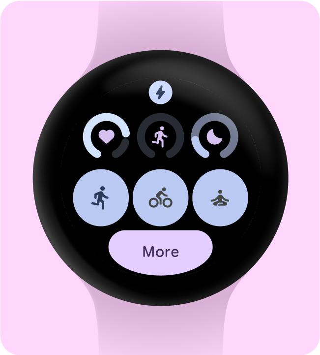
選擇要強調的單一主要用途
為了確保使用者知道如何操作每個資訊方塊 (無論是開啟應用程式、啟動活動,還是瞭解更多資訊),我們需要在其版面配置中加入至少一個互動元素。
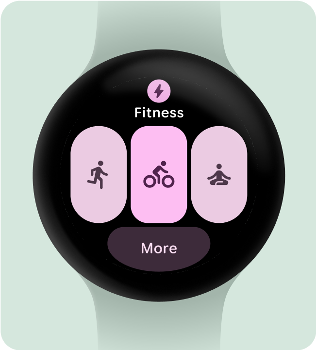
check_circle
執行此動作
這個資訊方塊的效果不錯,因為它提供少量選項,並讓使用者可以查看更多選項
cancel
請勿這麼做
這個解決方案對使用者較不實用,因為提供的選項太多,導致使用者無法做出決定
至少包含一個容器
應用程式中的每個資訊方塊都必須包含至少一個容器元素,且可完全點選,連結至應用程式中的對應畫面。資訊方塊的資訊,無論是包含在容器中或單獨顯示,都必須清楚說明連結的內容或可用的動作。
如果使用按鈕,則應遵循標準設計慣例,並清楚標示功能。
check_circle
執行此動作
這個資訊方塊運作良好,因為使用者可以對每項提供的功能採取行動,且這些功能都有明確的輕觸操作元素。
cancel
應避免的做法
這個資訊方塊的效果較差,因為它沒有清楚說明使用者可以輕觸內容查看其他資訊
讓使用者立即瞭解動作
手錶上的體驗沒有充足的空間可用來傳達意義,因此最有效的資訊方塊應具備可輕鬆預測的互動元件。
check_circle
執行此動作
成功的資訊方塊會充分利用可用的空間,清楚說明每個動作的結果
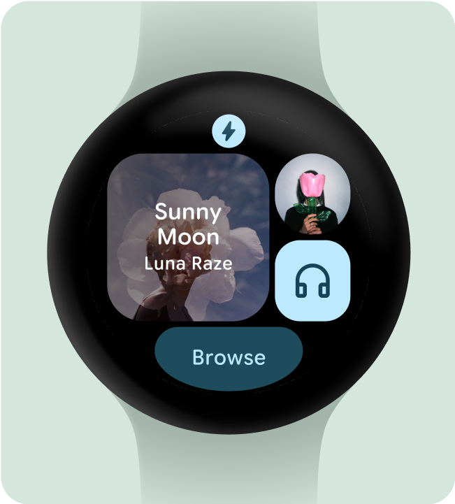
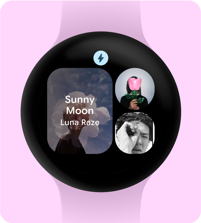
cancel
請勿這麼做
這個資訊方塊中的動作不明確,包含專輯封面的容器會將使用者帶往哪裡?是否與「播放」按鈕不同?
視覺化呈現動作優先順序
為了協助使用者瞭解資訊方塊上最重要的動作,請視覺上優先顯示互動式容器。
- 在主要動作按鈕上使用主要顏色。
- 在次要動作中使用次要/三次色
check_circle
執行此動作
這個資訊方塊使用填滿 (具有主要和次要顏色角色) 與透明的三次底部按鈕角色組合,並採用色調填滿樣式
cancel
請勿這麼做
這個資訊方塊包含太多使用填充樣式按鈕的情況,而且所有按鈕都使用主要顏色角色
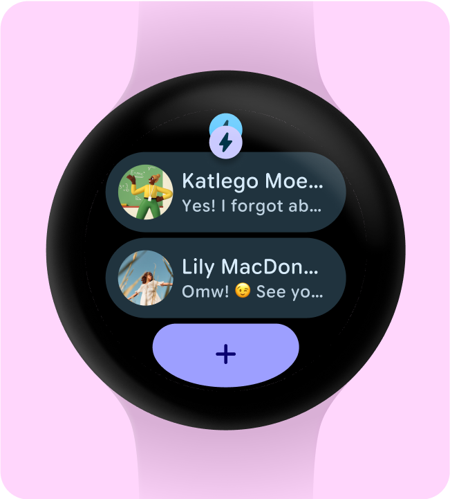
簡化為較少的容器
資訊方塊應避免使用多個互動元件來觸發特定動作,而是嘗試將整體版面配置簡化為較少的容器。
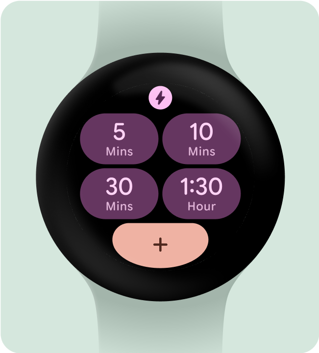
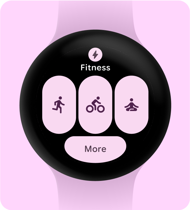
check_circle
執行此動作
這個資訊方塊會使用多個容器,每個容器都會做為按鈕執行特定動作,例如啟動計時器或建立新的計時器
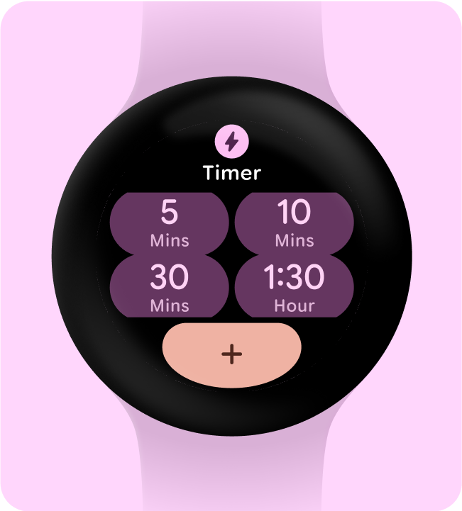
cancel
請勿這麼做
由於所有資訊都會導向相同位置,因此在此處使用 4 個容器並非必要
使用容器來執行功能
為確保使用者能預測資訊方塊中的每個元件會執行哪些操作,我們不建議使用容器做為裝飾或結構用途,以免點選後沒有任何反應。
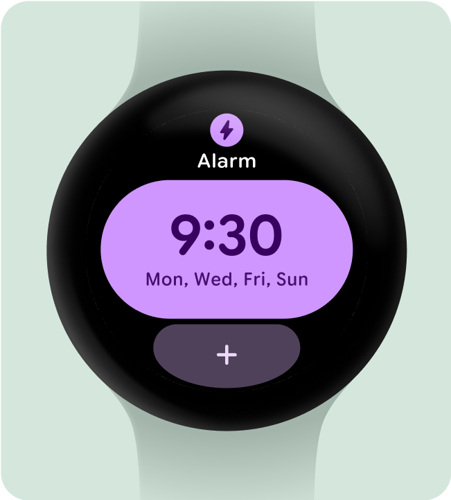
check_circle
執行此動作
這個解決方案有效,是因為資訊方塊的唯一動作是建立流程,所有其他內容都會浮動在黑色背景上
cancel
請勿這麼做
這個資訊方塊會讓使用者感到困惑,因為他們似乎可以與所有容器互動
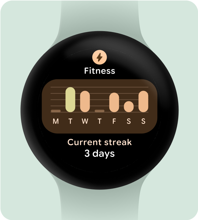
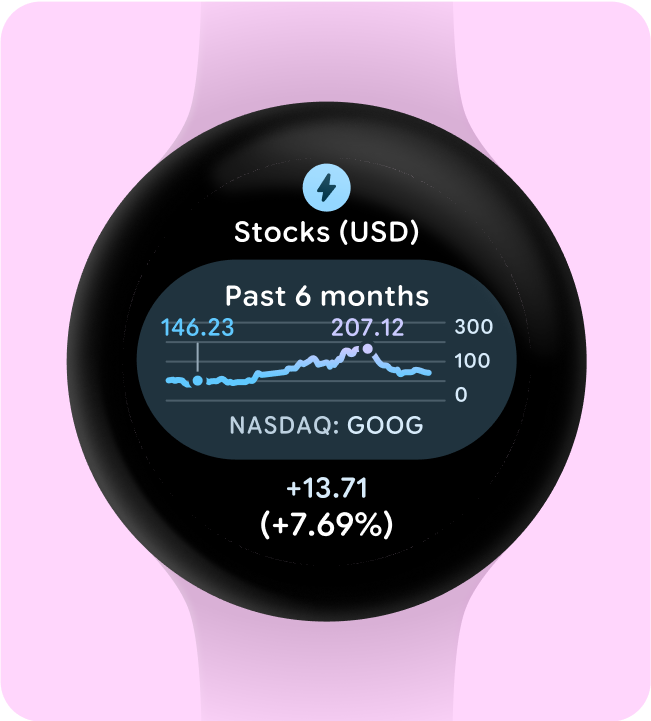
以一目瞭然的方式呈現圖表
一目瞭然是 Wear OS 設計的關鍵。由於螢幕時間有限 (約 7 秒),請以清晰的格式優先顯示重要資訊,讓觀眾一目瞭然。
請記住,手錶可補足手機的功能,讓您快速存取重要詳細資料。
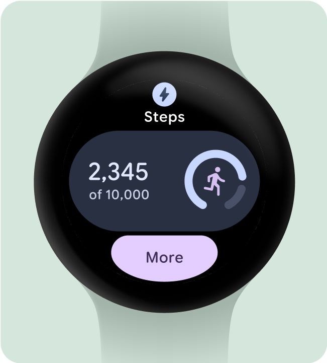
check_circle
執行此動作
以一目了然的方式呈現數值或統計資訊,讓使用者根據需要,輕觸以瞭解應用程式的更多資訊
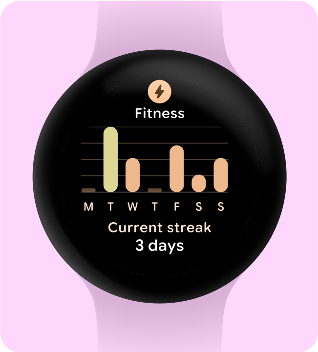
cancel
請勿這麼做
在資訊方塊上顯示詳細數值或統計資訊
這個頁面中的內容和程式碼範例均受《內容授權》中的授權所規範。Java 與 OpenJDK 是 Oracle 和/或其關係企業的商標或註冊商標。
上次更新時間:2025-07-27 (世界標準時間)。
[[["容易理解","easyToUnderstand","thumb-up"],["確實解決了我的問題","solvedMyProblem","thumb-up"],["其他","otherUp","thumb-up"]],[["缺少我需要的資訊","missingTheInformationINeed","thumb-down"],["過於複雜/步驟過多","tooComplicatedTooManySteps","thumb-down"],["過時","outOfDate","thumb-down"],["翻譯問題","translationIssue","thumb-down"],["示例/程式碼問題","samplesCodeIssue","thumb-down"],["其他","otherDown","thumb-down"]],["上次更新時間:2025-07-27 (世界標準時間)。"],[],[],null,["# Best practices for tiles\n\nDesign on black\n---------------\n\nDesigning on a black background is crucial for Wear OS for two key reasons:\n\n- **Battery efficiency:** Each pixel illuminated on the screen consumes power. By using a black background, you minimize the number of active pixels, extending battery life.\n- **Seamless aesthetics:** A black background helps to visually minimize the watch bezel, creating the illusion of a continuous surface that extends to the edge of the device. Containing UI elements within this space further enhances this effect.\n\n\u003cbr /\u003e\n\ncheck_circle\n\n### Do this\n\nAlways set the background color to black. \ncancel\n\n### Don't do this\n\nDon't set the background as a full bleed image or block color.\n\nInclude only necessary elements\n-------------------------------\n\nWhen opt-ed in (for example, using ProtoLayout Material3 PrimaryLayout), Wear OS will automatically display the permanent app icon, which will automatically display as the user scrolls through the Tile carousel. The app icon should not be designed and added as part of the Tile.\n\nEnsure the app icon provided is monochrome if you are having dynamic theming on your tile. Check Android product icon guidelines about how to create the app icon for your brand. \ncheck_circle\n\n### Do this\n\nWear OS may display the app icon automatically as the user scrolls through the Tile carousel. There is no need to put the app icon in the Tile design. \ncancel\n\n### Don't do this\n\nDo not add the app icon in the Tile design as it may appear twice/overlapped if also displayed at the system level.\n\nHide app titles to ensure minimum tap targets\n---------------------------------------------\n\nTo ensure enough space for interactive elements on smaller screens, the app title can be hidden when a Tile uses two rows (and a bottom section). This ensures the rows are tall enough (at least 48dp). The title can reappear on larger screens (225dp+). \ncheck_circle\n\n### Do this\n\nOn small screens, the app title is hidden to ensure the two rows have a minimum height and tap target of 48dp. \ncancel\n\n### Don't do this\n\nIf you do not hide the app title on small screen, and have two rows, the height of the components will not adhere to our accessibility standards, and be less than the minimum tap target size. In this example the space for the buttons is smaller than 48dp, so it clips.\n\nChoose a single primary use-case to highlight\n---------------------------------------------\n\nTo make sure users know what to do with each Tile - whether it's opening an app, starting an activity, or learning more - we need them to include at least one interactive element in their layout. \ncheck_circle\n\n### Do this\n\nThis specific Tile is effective because it provides a small collection of options, and then the ability to see more \ncancel\n\n### Don't do this\n\nThis solution is less helpful to user because it introduces decision paralysis because of too many provided options\n\nInclude (at least) one container\n--------------------------------\n\nEach tile in the app must contain at least one container element and be fully tappable, linking to a corresponding screen within the app. The Tile's information, whether contained within the container or presented separately, must clearly communicate the linked content or available action.\n\nIf buttons are used, they should adhere to standard design conventions and provide a clear indication of their function. \ncheck_circle\n\n### Do this\n\nThis Tile works well because the user can take action on each of the provided capabilities since they have clear tap affordances \ncancel\n\n### Don't do this\n\nThis Tile is less effective because it doesn't make it clear that the user can tap on the content to see additional information\n\nMake actions instantly understandable\n-------------------------------------\n\nExperiences on the watch don't have the luxury of having ample space to communicate their meaning, so the most effective Tiles have easily predictable interactive components. \ncheck_circle\n\n### Do this\n\nA successful TIle takes full advantage the space available to clearly communicate the outcome of each action \ncancel\n\n### Don't do this\n\nThe actions in this Tile are unclear---where does the container with the album art take the user, and is that different from the \"Play\" button?\n\nVisually prioritize actions\n---------------------------\n\nTo help users understand the most important action on a Tile, interactive containers should be visually prioritized.\n\n- Use primary colors on primary action buttons.\n- Use secondary/tertiary colors on secondary actions\n\ncheck_circle\n\n### Do this\n\nThis Tile uses a combination of filled (with primary and secondary color roles) with a clear tertiary bottom button role, using the tonal-fill style \ncancel\n\n### Don't do this\n\nThis Tile contains too many uses of filled style buttons, additionally all using the primary color role\n\nSimplify into fewer containers\n------------------------------\n\nTiles should seek to refrain from using more than one interactive component to trigger a specific action, and instead attempt to simplify the overall layout into fewer containers. \ncheck_circle\n\n### Do this\n\nThis tile is using several containers and each container acts as a button to perform a specific action like starting a timer or creating a new one \ncancel\n\n### Don't do this\n\nThe use of 4 containers here is unnecessary since all the information will navigate to the same location\n\nUse containers for functional purposes\n--------------------------------------\n\nTo ensure users can anticipate what each component within a Tile will do, we don't recommend using containers for decorative or structural purposes to avoid taps that don't do anything. \ncheck_circle\n\n### Do this\n\nThis solution works because the sole action of the Tile is a creation flow, and all other content is floating on the black background \ncancel\n\n### Don't do this\n\nThis Tile is more confusing because it seems like the user would be able to interact with all the containers\n\nShow glanceable representations of graphs and charts\n----------------------------------------------------\n\nGlanceability is key for Wear OS design. With limited screen time (around 7 seconds), prioritize essential information in a clear format, that's easy to understand at a glance.\n\nRemember, the watch complements the phone experience, providing quick access to key details. \ncheck_circle\n\n### Do this\n\nShow quick, glanceable representations of numerical or statistical information and allow the user to tap to see more in an app if needed \ncancel\n\n### Don't do this\n\nShow detailed numerical or statistical information on the Tile"]]