

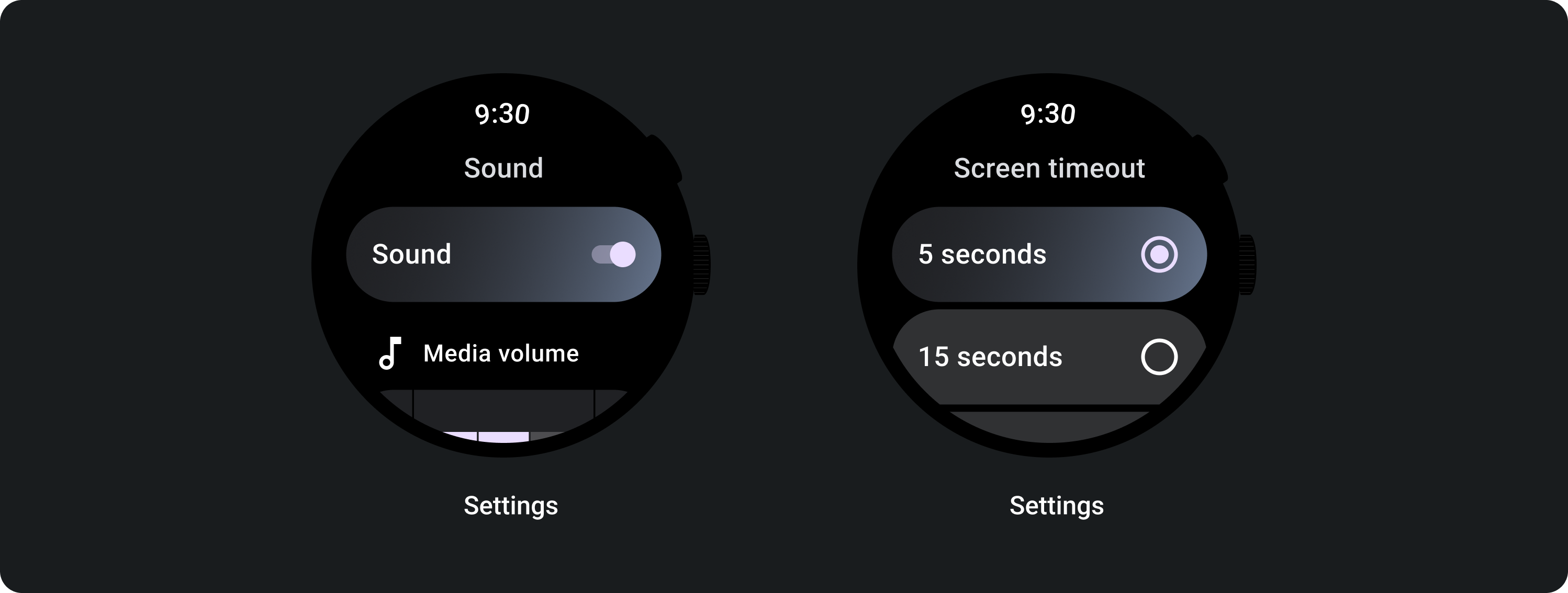
ToggleChip 是特殊的方塊,可讓使用者選取各種選項。
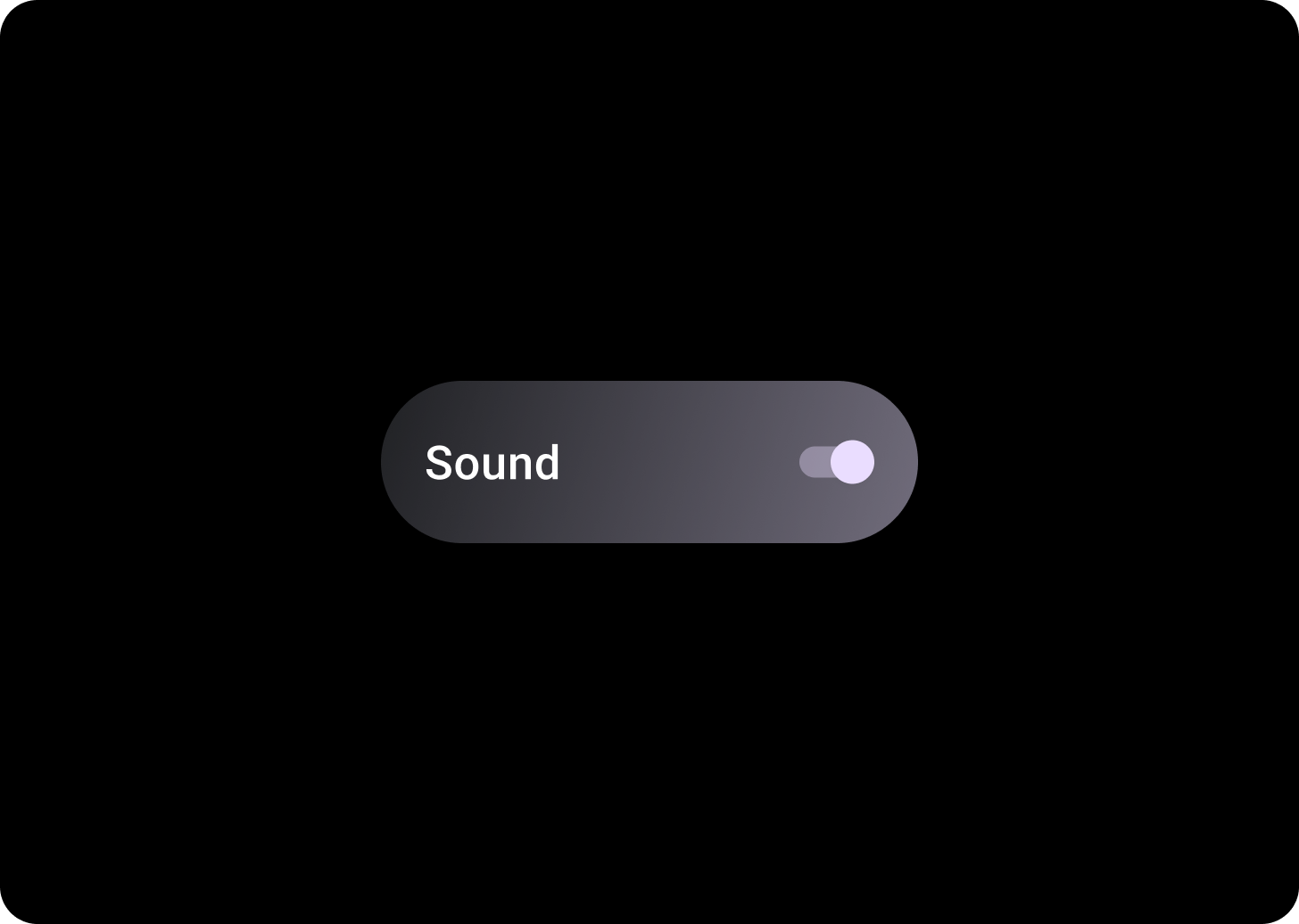
切換方塊包含雙狀態切換控制項。雙狀態切換控制項的範例包括切換按鈕、圓形按鈕或核取方塊。如果需要快速輕鬆設定多個選項,請使用切換方塊,例如「設定」。
圖解
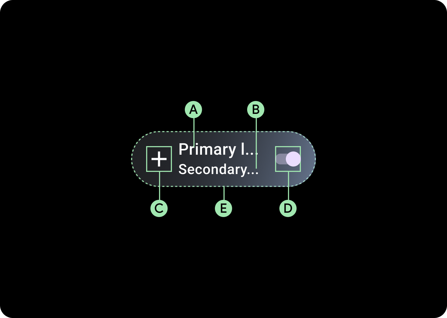
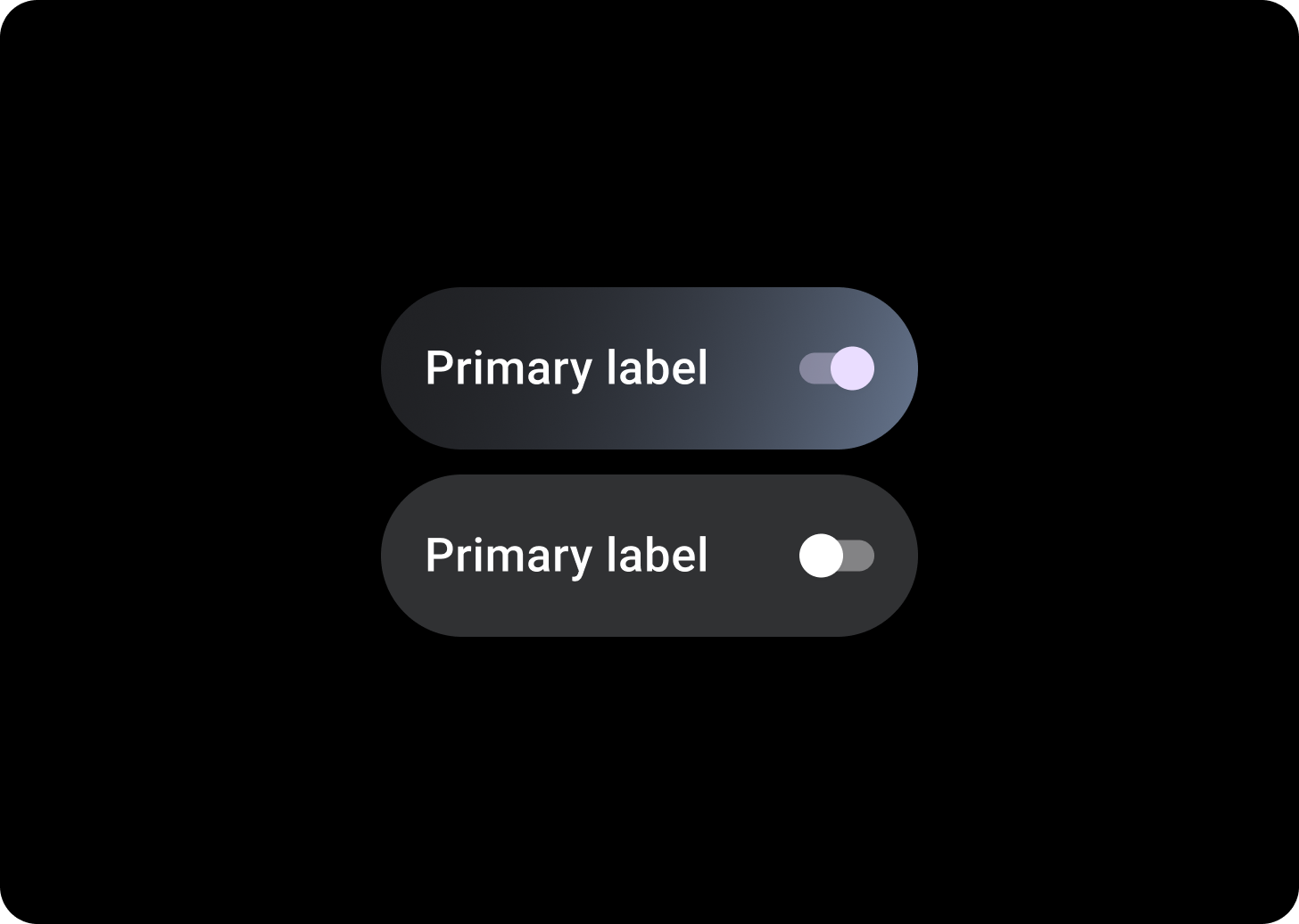
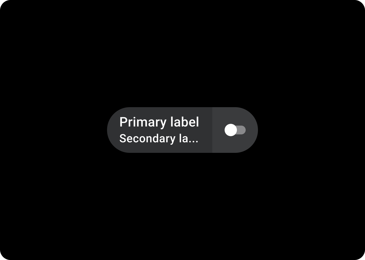
切換方塊有四個版位,包括兩個文字標籤、一個選取控制項和一個應用程式圖示。圖示和次要標籤為選用項目。
A. 標籤
B. 次要標籤
C. 圖示
D. 選取控制項
E. 容器
切換方塊漸層
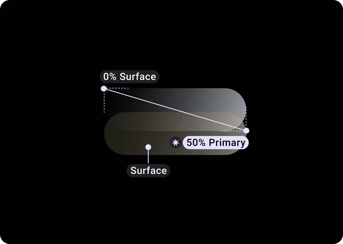
上方/左側 = 0% 途徑
底部/右側 = 50% 主要
(表面顏色背景上的漸層疊加層)
選取控制項
Switch
請用切換按鈕開啟或關閉選取內容。
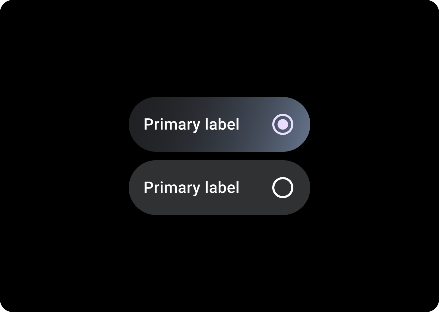
圓形按鈕
在使用者只能選取一個選項清單中,使用圓形按鈕。

Checkbox
在使用者可選取多個選項的清單中,使用核取方塊。
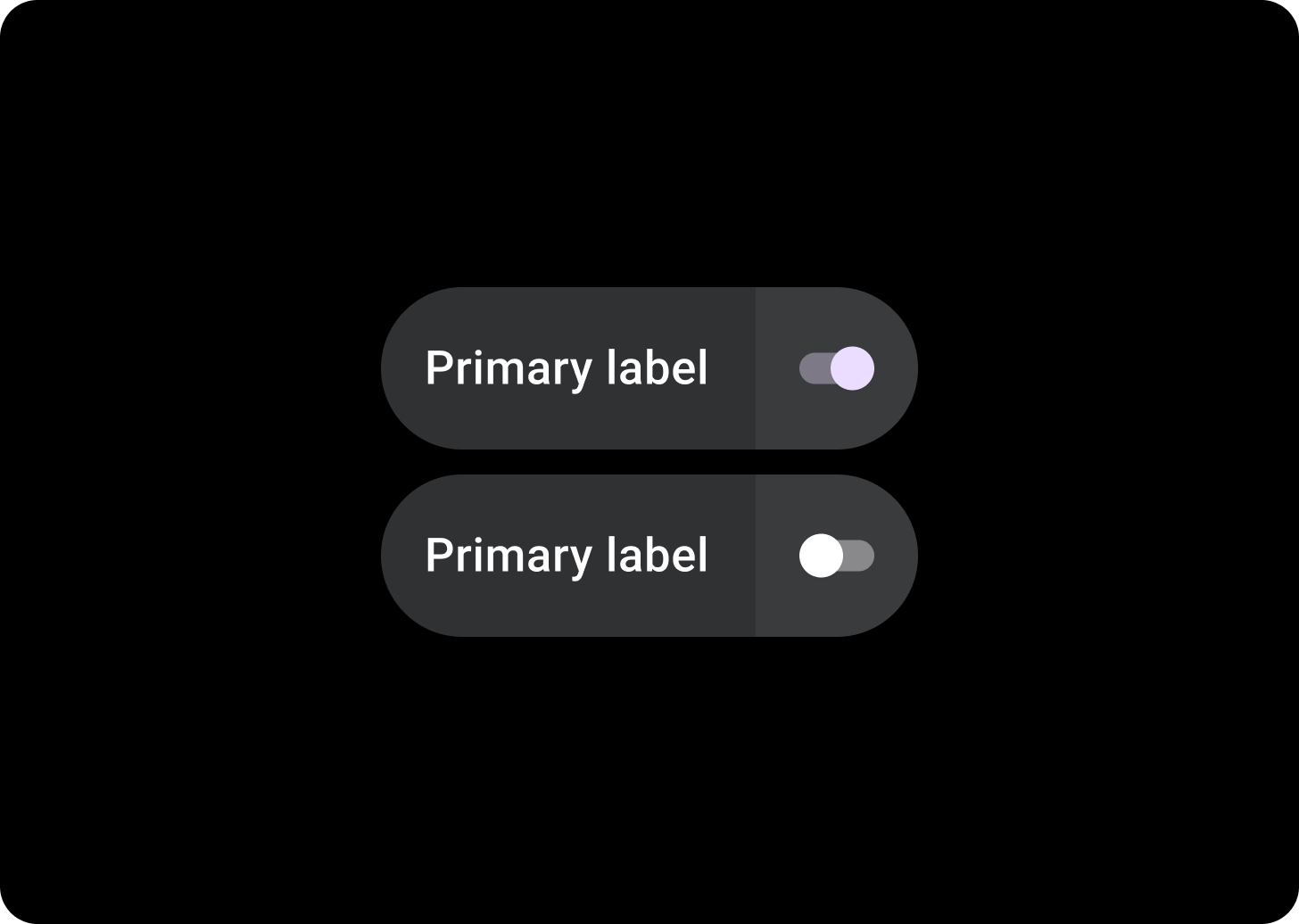
分割切換方塊
如要有兩個可輕觸的區域,請使用分割切換方塊。
相關元件
分割切換方塊
SplitToggleChip 與 ToggleChip 不同,包含兩個可輕觸的區域、一個可點選的區域,另一個有切換按鈕。
在分割切換方塊中,為各個區塊設定不同顏色,以便區分可輕觸的背景區域和切換鈕控制項。
使用方式
請使用 ToggleChips,如以下範例所示。
自動調整式版面配置
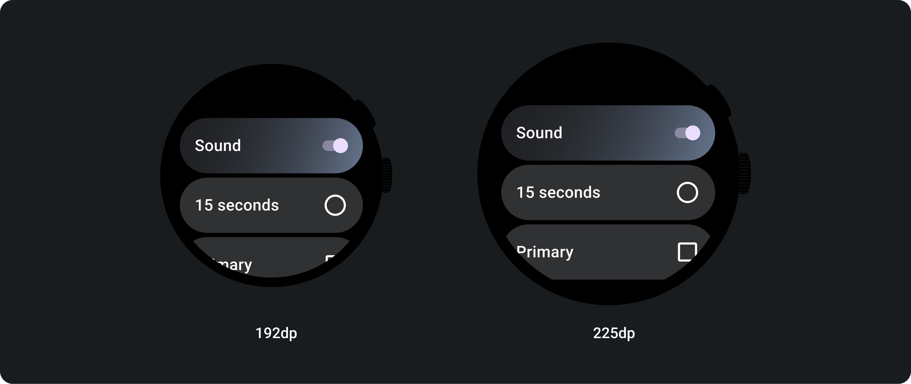
回應式行為
ToggleChips 會在較大的螢幕上延展可用寬度。
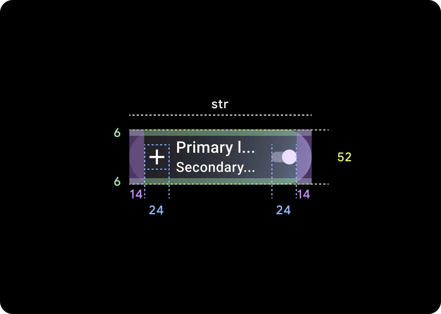
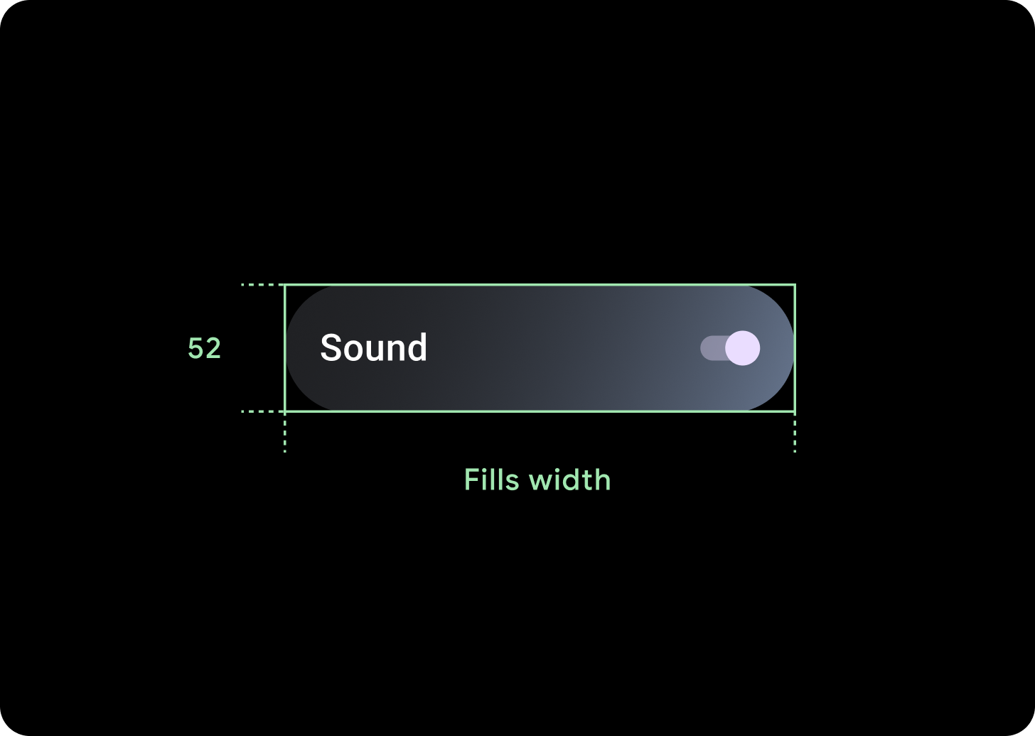
圖示 (24 x 24 dp)
容器 (52 x XX dp)