
Picker 可協助使用者選取及設定特定資料。

Picker
使用挑選器可讓使用者從有限數量的項目中選擇。
根據預設,項目會在這兩個方向無限循環。如果清單中的順序很重要,請考慮停用這項行為,或是讓使用者透過快速滑動前往第一個和最後一個元素。
圖解
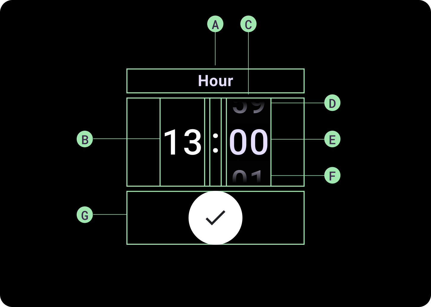
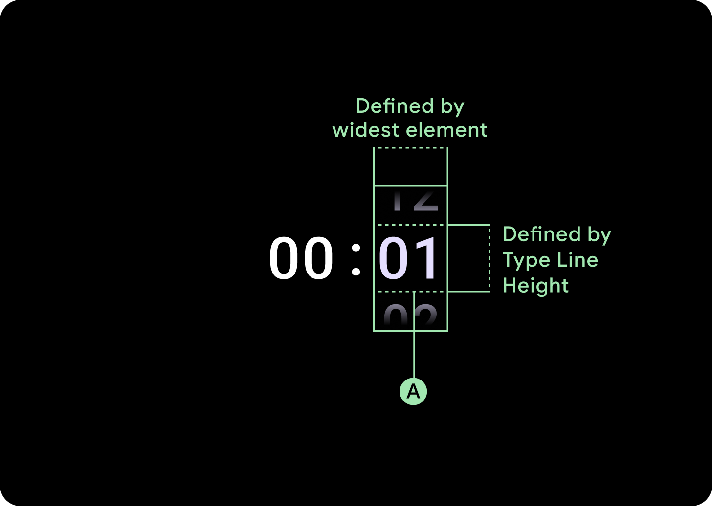
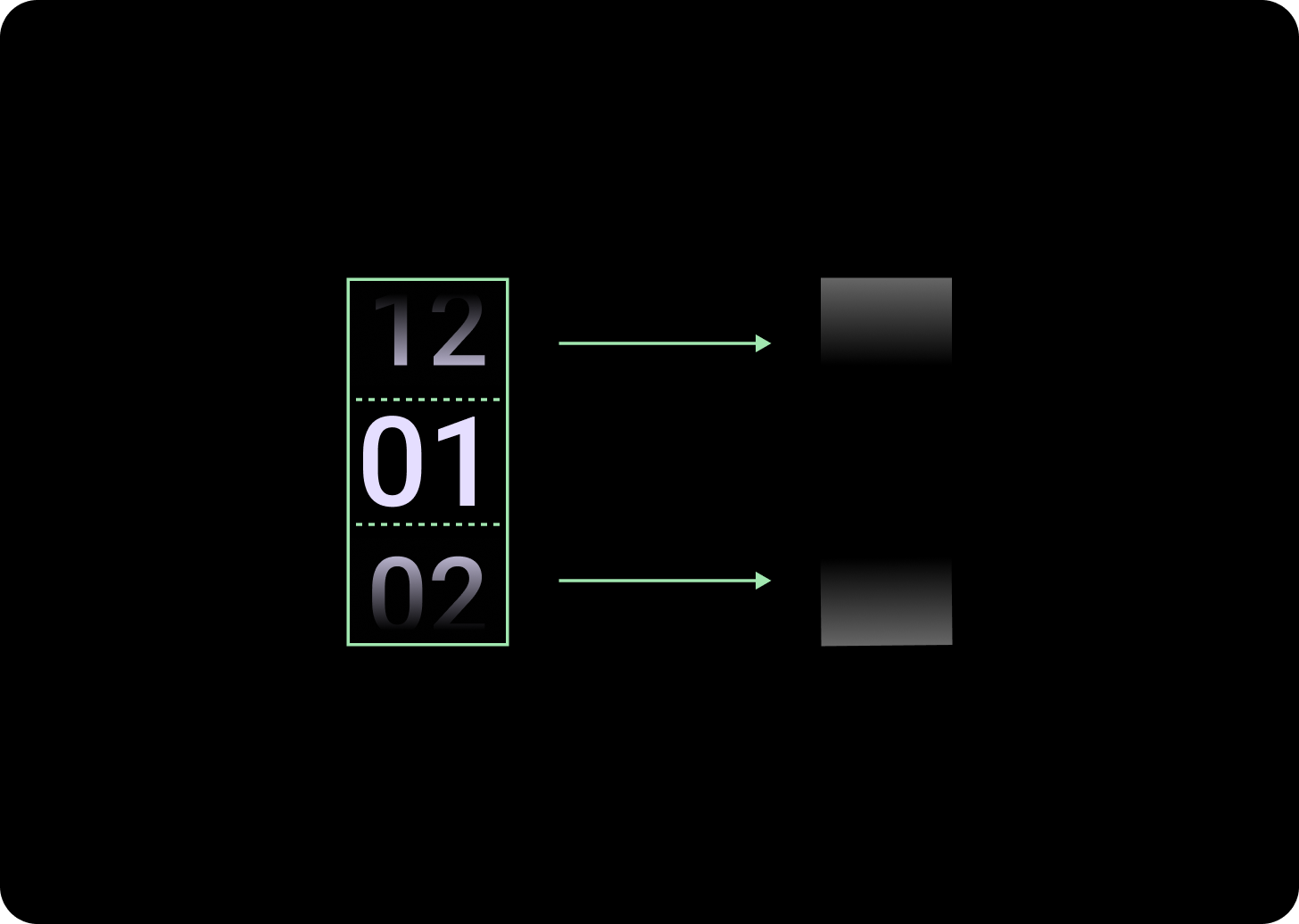
解剖
A. 未使用的資料欄
B. 冒號分隔符
C. 挑選器資料欄
D. 熱門內容
E. 中間內容
F. 底部內容
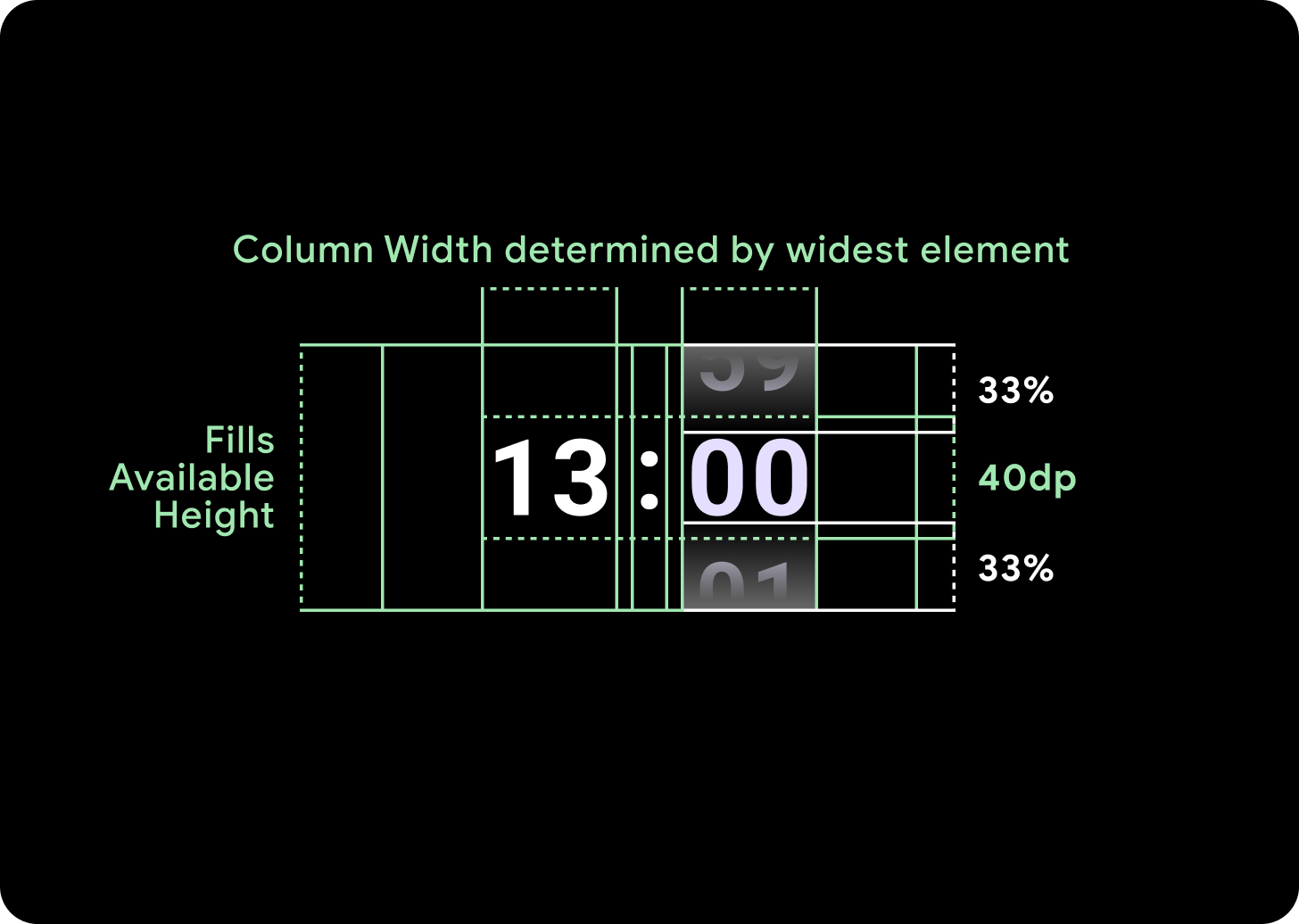
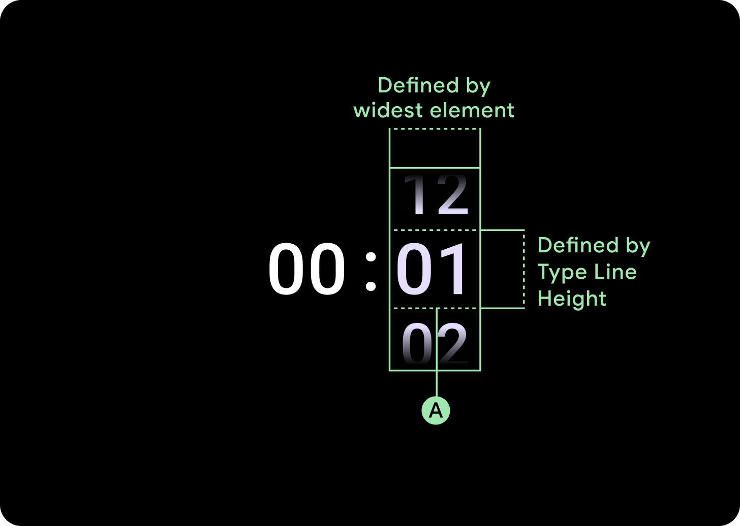
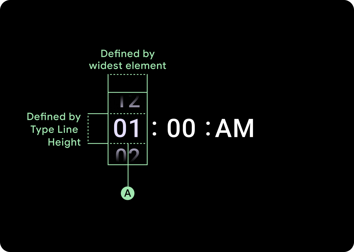
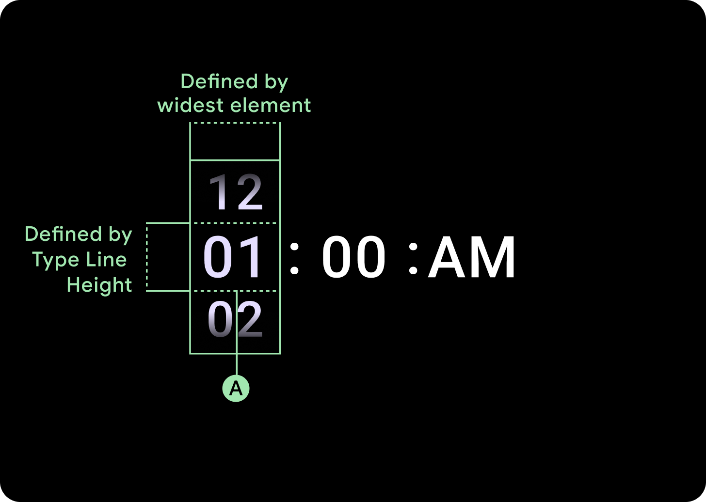
寬度和高度
Picker Group 會填滿可用的高度和寬度。挑選器資料欄有四種版面配置選項。每個版面配置都會置中,並填滿可用的高度。資料欄寬度是由字型中所需的數字數量所定義,日期挑選器則是例外,它會在水平方向上填滿畫面,並溢出畫面邊緣。
舉例來說,數字會計算出「00」的寬度,然後設定寬度。對於文字欄位 (例如月份欄位),系統會將寬度設為「MMM」(拉丁字母中寬度最大的字母)。因此,寬度和高度 (即所用字型樣式的行高) 會受到所用字型的影響。
在不同的中斷點中,選擇器項目的大小會有所不同。
用量
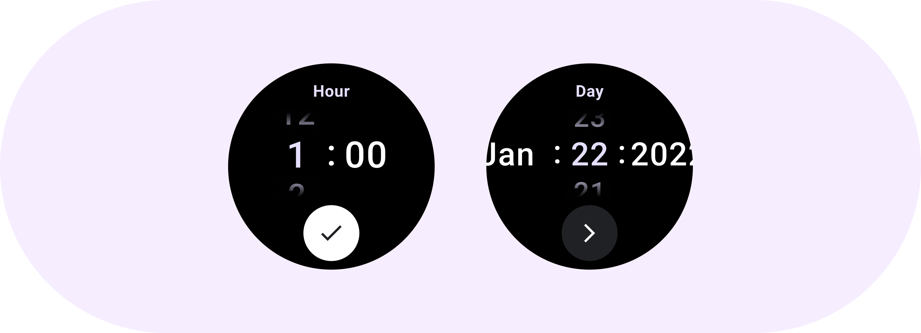
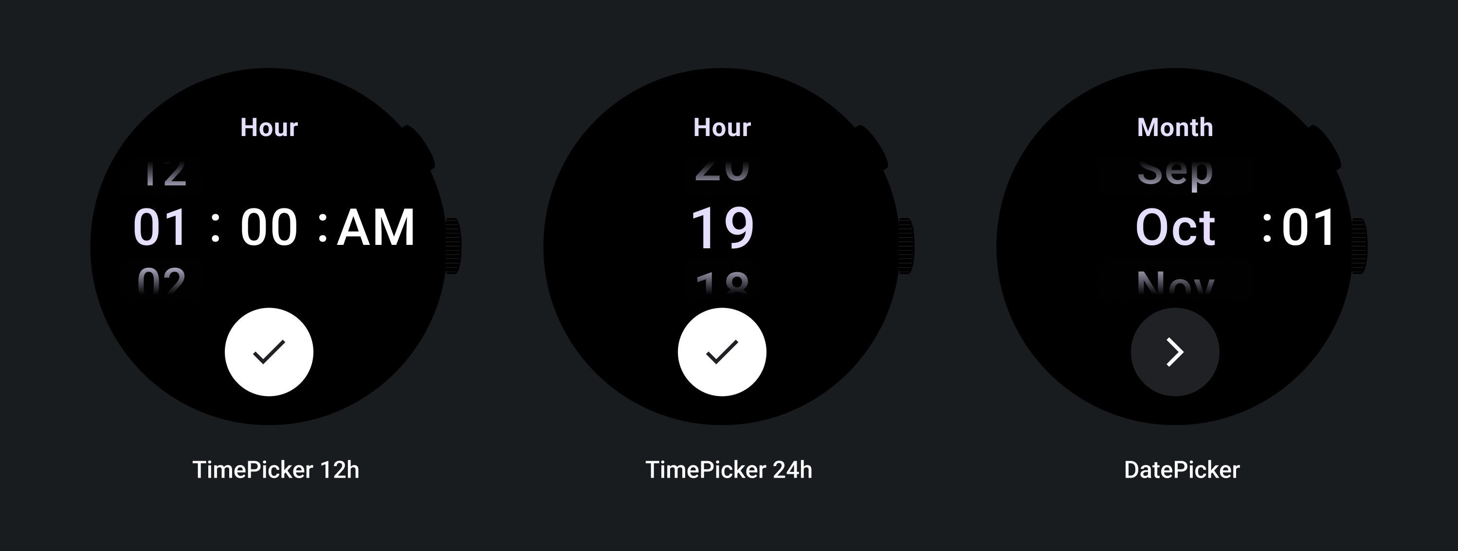
請參閱下列日期和時間挑選器範例
如需預先建構的日期與時間挑選器實作,請前往 GitHub 查看 Horologist 程式庫。
如果您想建立類似的體驗,讓使用者在多個挑選器中選擇多個值,請使用內建的 PickerGroup 元件。這個物件會使用焦點協調工具物件,將焦點指派給正確的 Picker 元素。
自動調整式版面配置
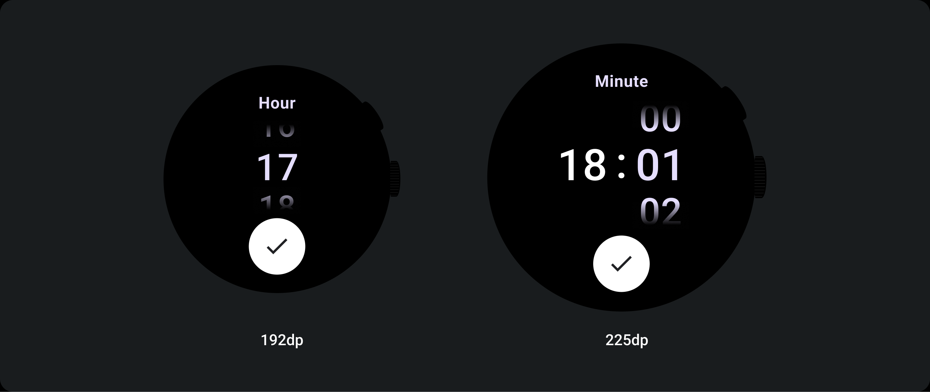
TimePicker 24H
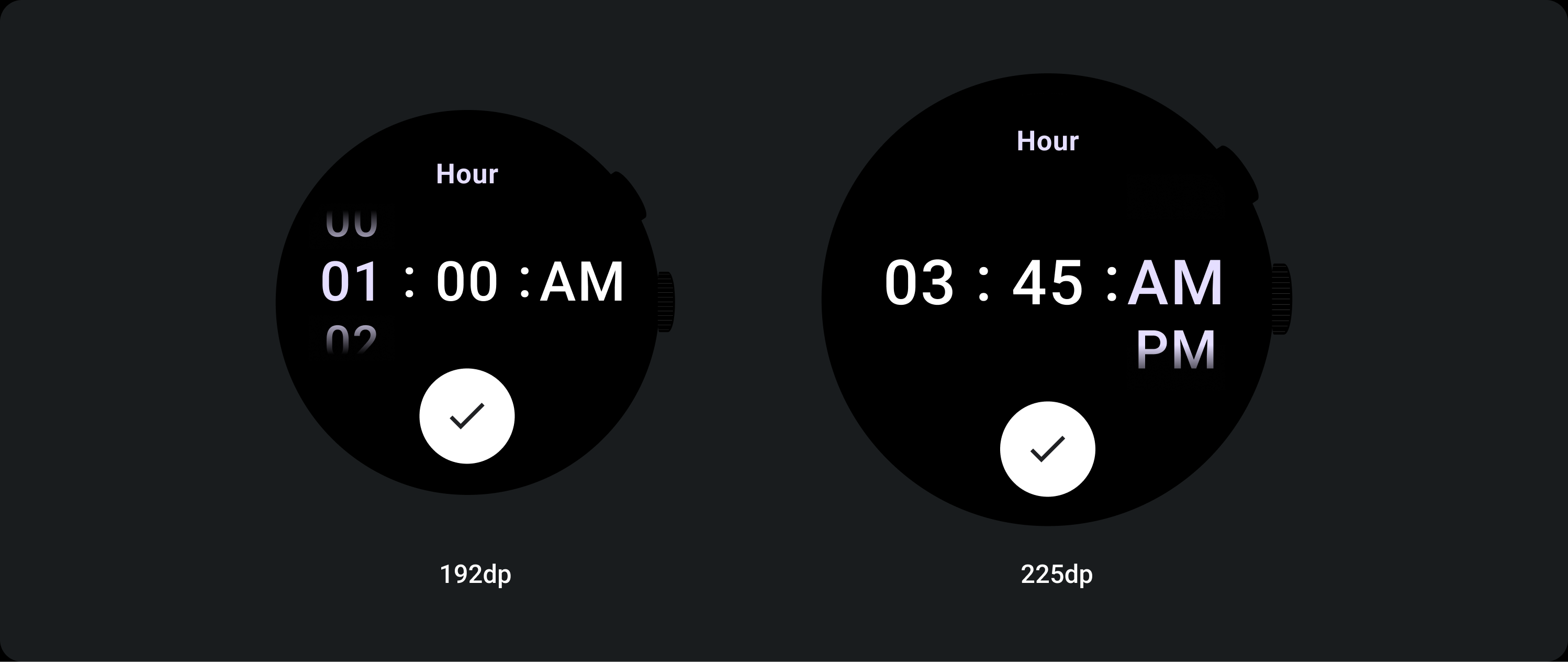
TimePicker 12H
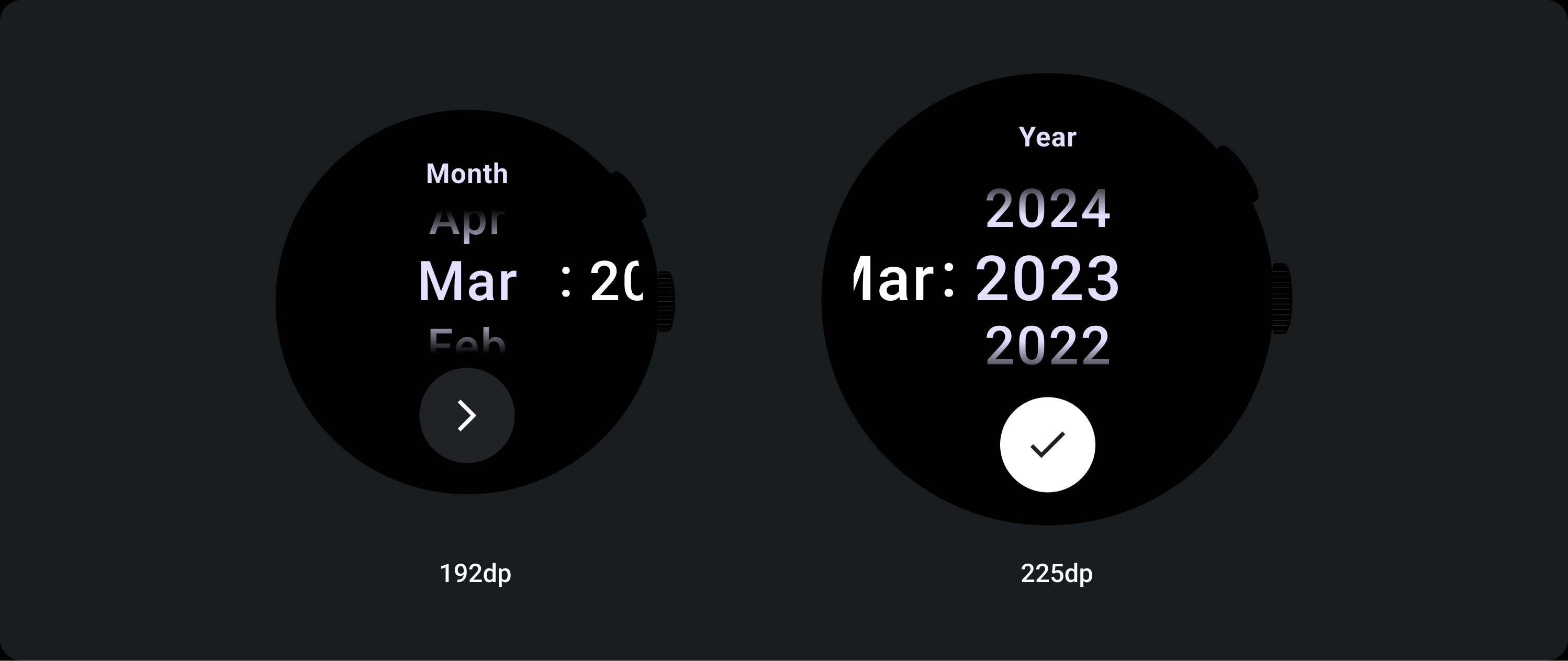
日期挑選器
回應式行為
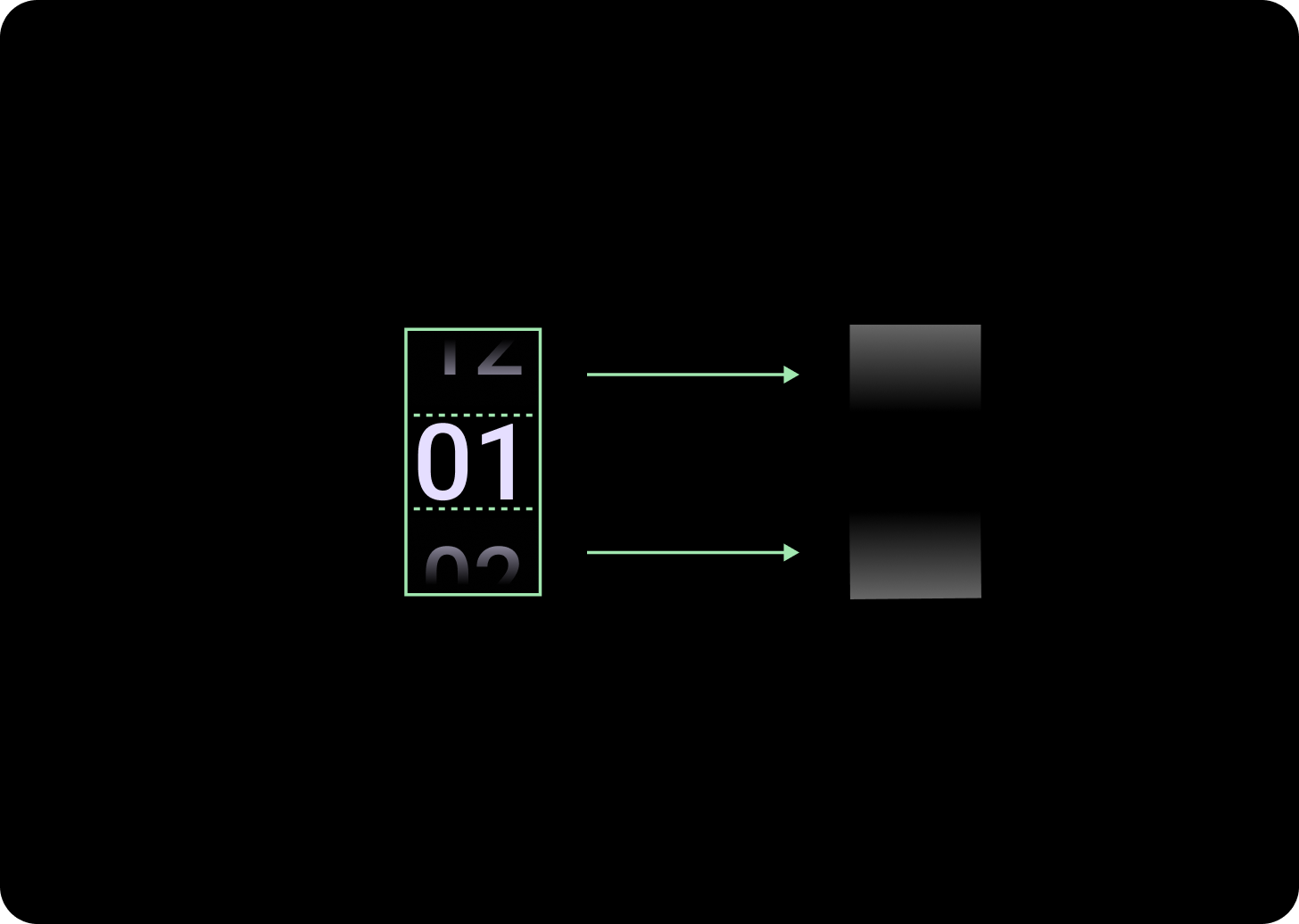
放大文字
超過 225+ 中斷點後,Picker 元素的字型大小會變更。延遲捲動資料欄中的頂端和底部副本會調整 (A),中間副本也會調整。以下列舉幾個例子:
兩欄版面配置
低於 225 dp 中斷點
字型:Display 2
高於 225 dp 中斷點
字型:螢幕 1
三欄版面配置
低於 225 dp 中斷點
字型:Display 3
超過 225 dp 中斷點
字型:Display 2
漸層大小增加
Picker 資料欄的漸層效果高度會由可用空間定義。頂部和底部漸層都設為可用高度的三分之一 (33%)。也就是說,在每個可用的螢幕大小下,漸層都會按比例縮放。不受資料欄版面配置影響。
低於 225 dp 中斷點
大小:欄高 33%
超過 225 dp 中斷點
大小:欄高 33%
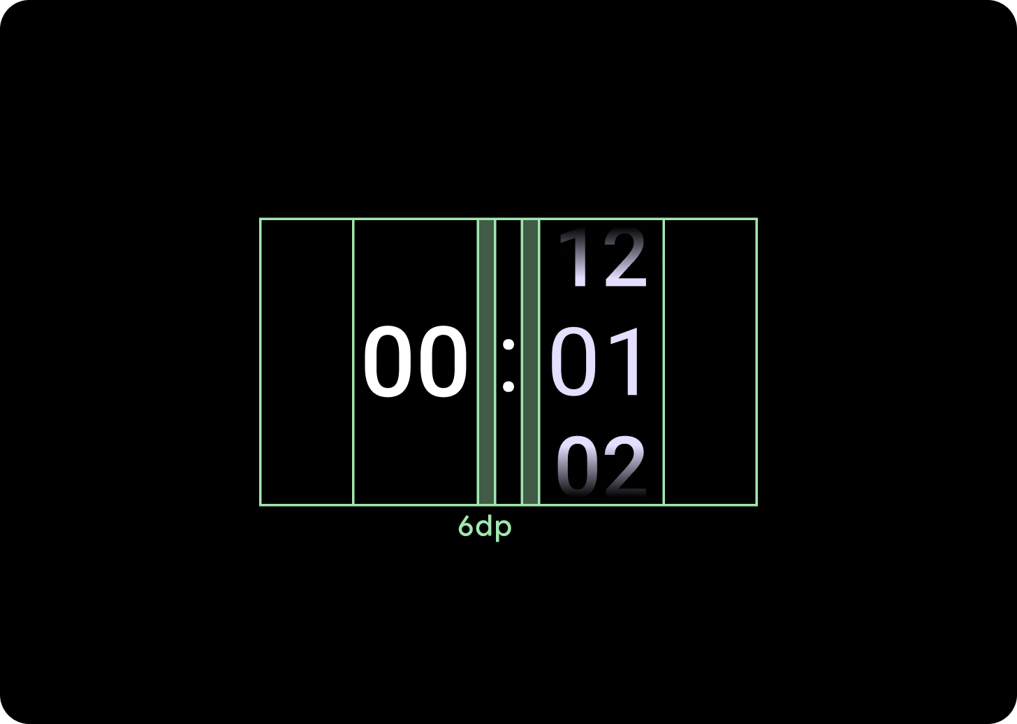
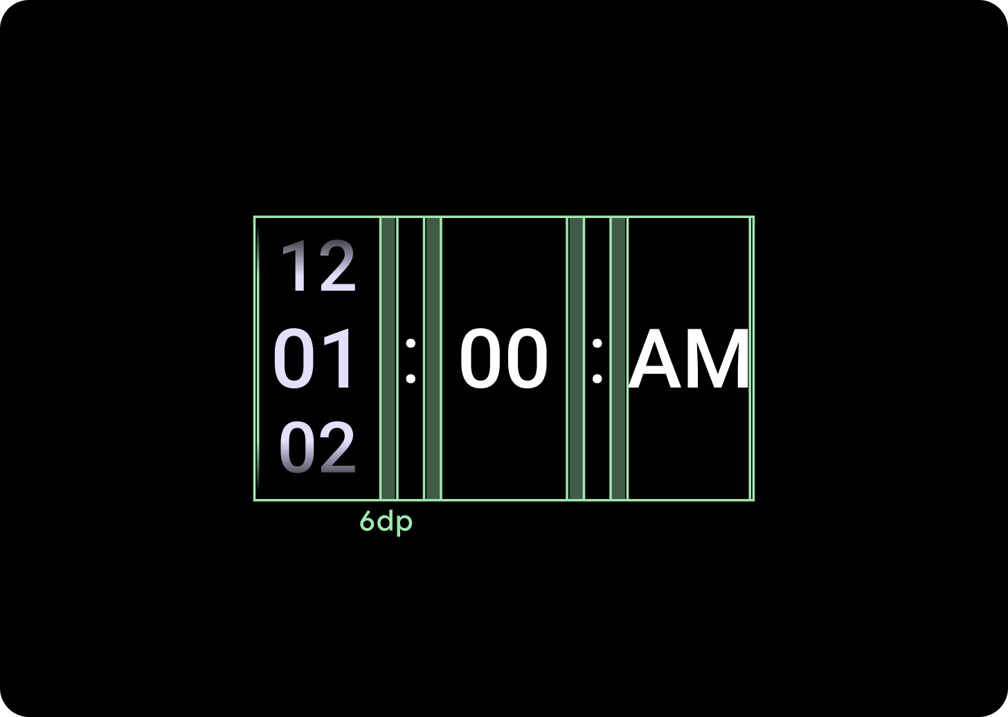
增加欄間距
當列間距超過 225+ 中斷點時,會從 2 dp 或 4 dp 開始,並逐漸增至 6 dp。這取決於您選取的版面配置,即 2 或 3 欄版面配置
兩欄版面配置
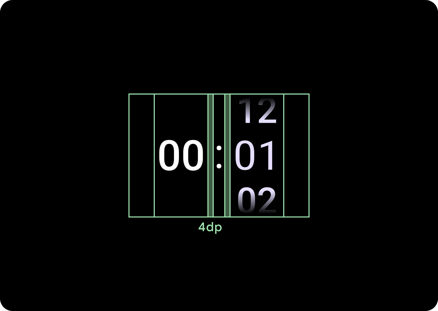
低於 225 dp 中斷點
4 dp 欄距
超過 225 dp 中斷點
6 dp 欄間距
三欄版面配置
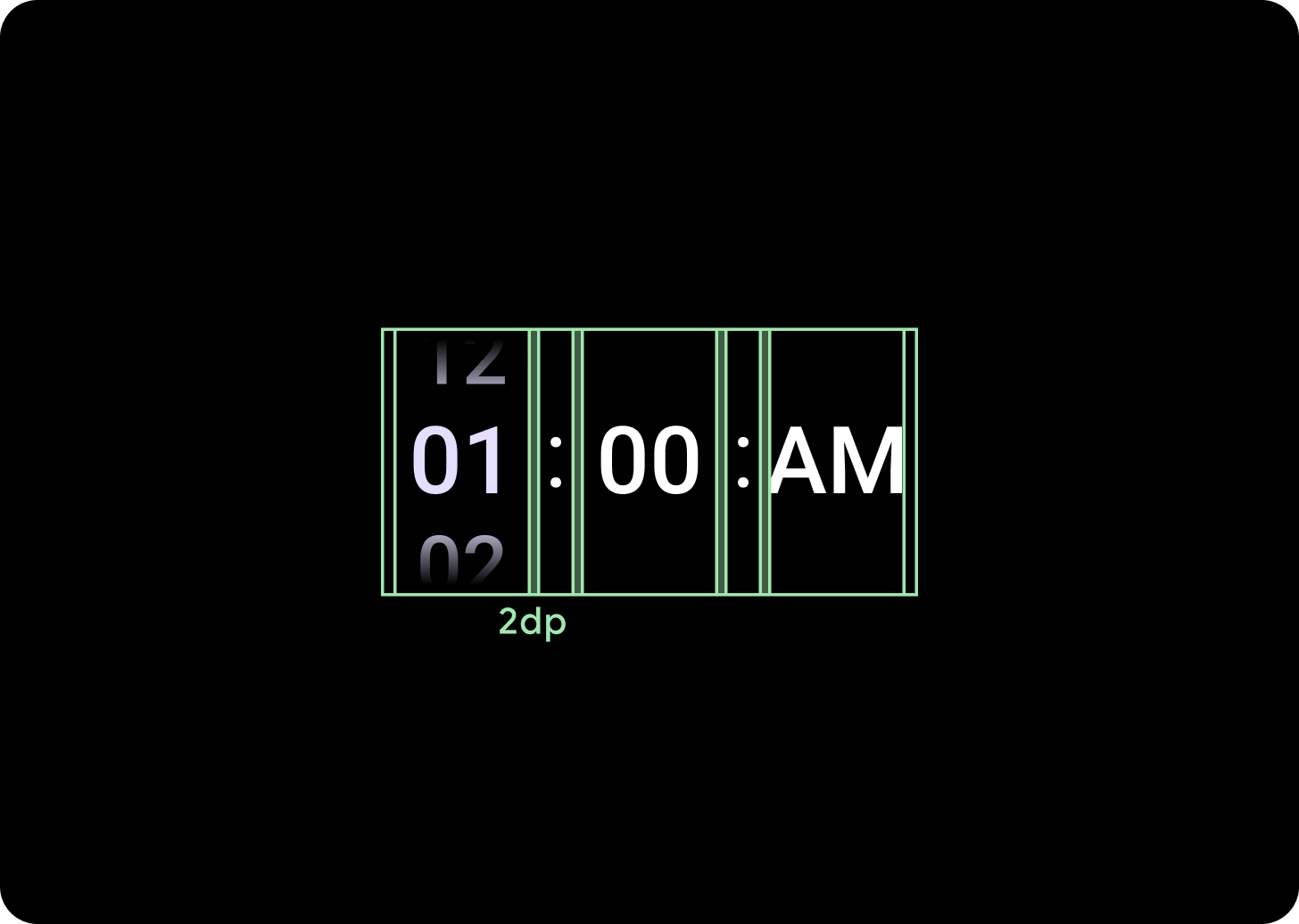
低於 225 dp 中斷點
2 dp 欄距
超過 225 dp 中斷點
6 dp 欄間距