 Google uses AI technology to translate content into your preferred language. AI translations can contain errors.
避免文字截斷和內容剪輯
透過集合功能整理內容
你可以依據偏好儲存及分類內容。
智慧手錶的螢幕尺寸比手持裝置小,因此請務必排列顯示元素,以便使用者能夠有效存取,並且有效率地使用可用的螢幕空間。如要讓項目符合螢幕大小,請使用 Material 指南中指定的正確邊框間距和邊界大小。
即使設計符合螢幕大小,使用者執行下列任一操作時,介面元素可能會遭到截斷或裁剪:
- 變更顯示語言。
- 變更文字大小。
- 啟用「粗體文字」系統設定。
測試設計時請務必考量這些事項,確保設計能完美適應不同的使用者環境。
讓互動元素保持完整顯示
如果您的介麵包含互動式元素,請檢查使用者能否完全捲動這些元素,特別是將這些元素放在網頁邊緣時。如果您的應用程式使用 Horologist 程式庫,請使用 responsive() 版面配置工廠。否則,請使用空格字元,並在 ScalingLazyColumn 物件的頂端和底部加上邊界,避免系統一律裁剪第一個和最後一個清單項目。
密集的版面配置使用方塊 (而非資訊卡)
如果您需要更密集的版面配置,請使用 CompactChip,而非資訊卡。資訊卡的顯示區域越大,就越難避免文字遭到截斷及內容裁剪。
考量螢幕尺寸對截斷和裁剪的影響
視 Wear OS 裝置的螢幕大小而定,顯示其他文字和按鈕的空間會比較大:
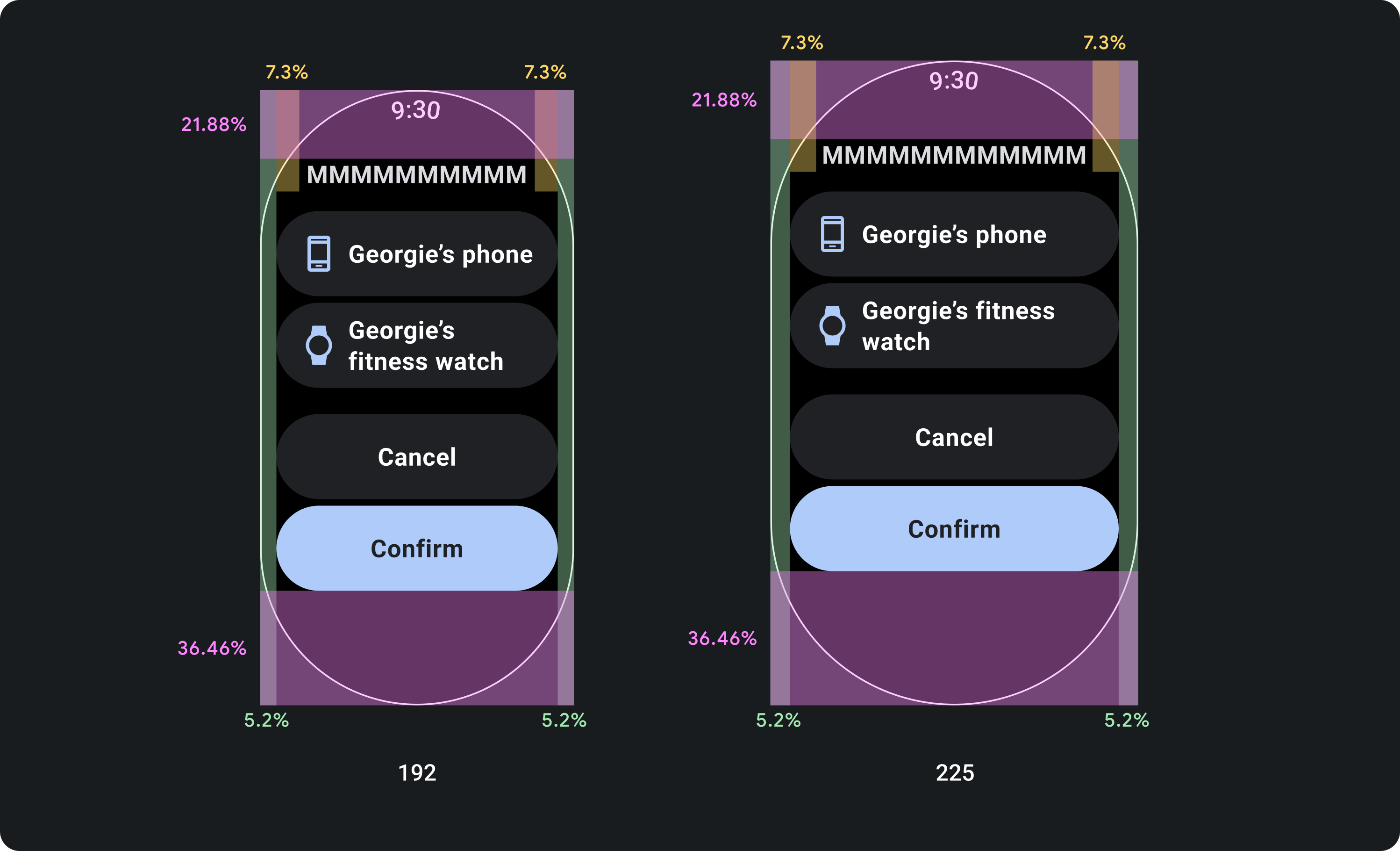
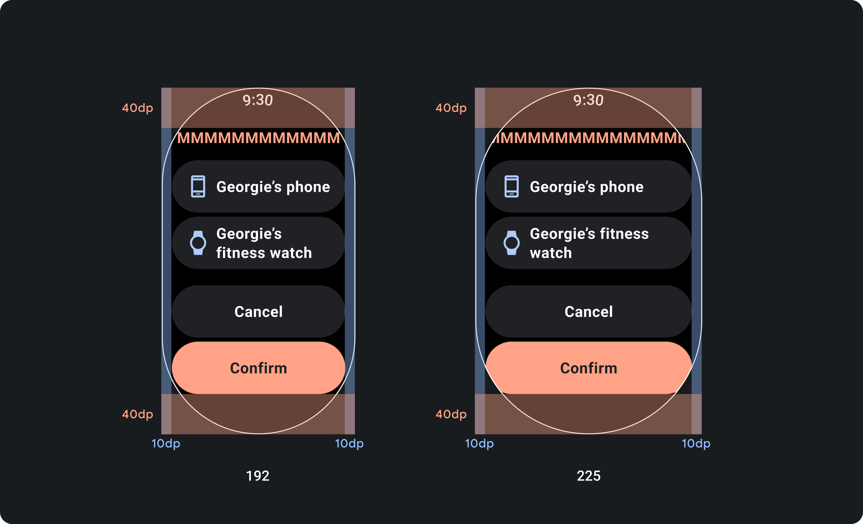
設計百分比邊界,而非固定邊界
如要建立會配合 Wear OS 裝置的螢幕大小調整內容,請套用百分比邊界,也就是每個邊界的大小與螢幕大小相對應。如果項目位於螢幕頂端或底部,請套用額外的內部邊框間距,盡量避免從螢幕曲線邊緣裁剪內容。相反地,如果內容群組的大小足以容納同一個畫面,頂端和底部的空間會增加。
check_circle
正確做法
元件必須遵循百分比邊界,這樣元件的大小才能依照螢幕大小縮放。這樣一來,螢幕內容一律會填滿可用空間,而且不會遭到螢幕邊緣裁剪。
cancel
錯誤做法
不要在未考量在較小的螢幕上截斷文字並影響設計功能的方式,就不能使用最大可用的文字空間。
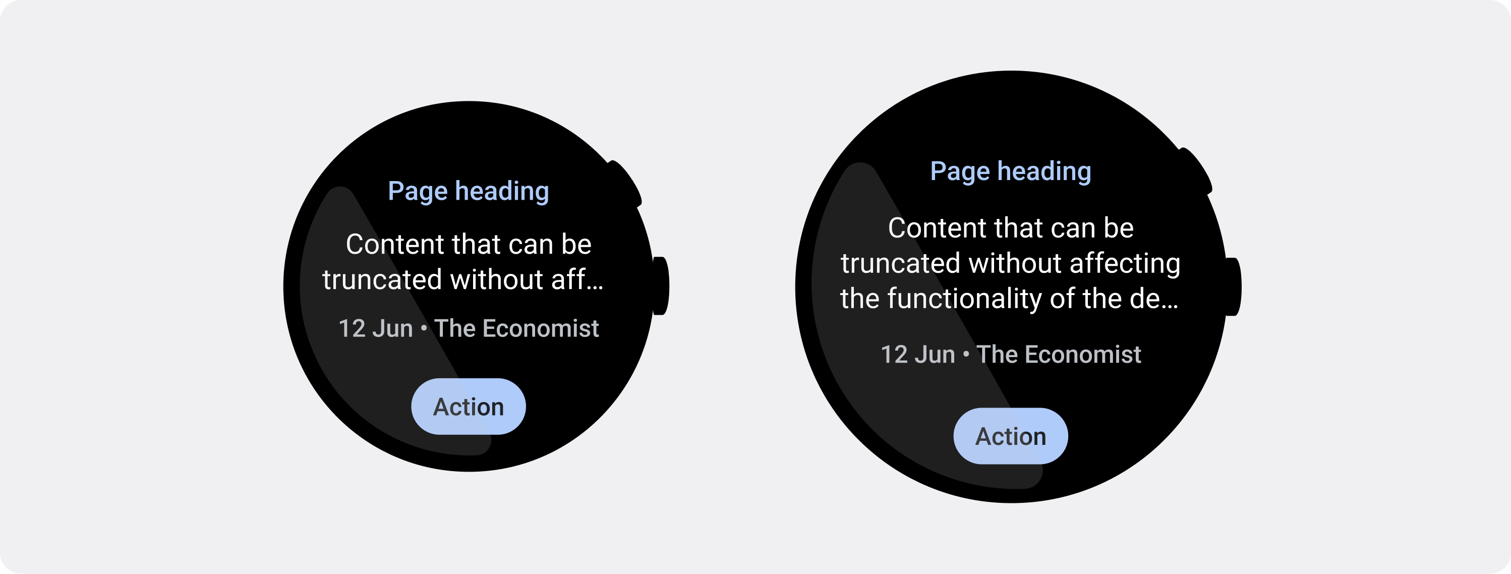
使用較小的螢幕所規定的字元限制
在大多數情況下,大螢幕可在截斷前顯示更多文字和內容。不過,雖然可用的水平空間可能更多,但請一律針對最小的螢幕大小設計,以便在各種裝置上提供一致的體驗。
舉例來說,在較大的螢幕上,按鈕可能會在截斷前保留更多字元空間,但如果這些按鈕是重要的行動號召,對使用者體驗至關重要,那麼請在小型裝置的螢幕上使用足夠簡短 (不截斷的文字)。
或者,如果資訊方塊顯示變數內容 (例如從伺服器擷取的文字),請妥善規劃,可能使文字在較小的螢幕上遭到截斷。
check_circle
正確做法
影響設計功能的文字 (例如行動號召按鈕) 是以最小螢幕為設計主軸。在較大的螢幕上,可在中斷點後面顯示額外的文字行。文字行數取決於元件和內容。
cancel
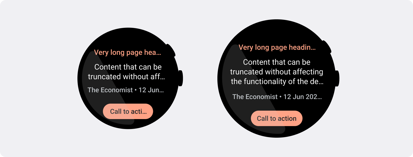
錯誤做法
請勿撰寫會佔用大螢幕可用空間最大空間的文字,也不要考量這類文字在小螢幕上可能遭到截斷的情形,並影響設計功能。
這個頁面中的內容和程式碼範例均受《內容授權》中的授權所規範。Java 與 OpenJDK 是 Oracle 和/或其關係企業的商標或註冊商標。
上次更新時間:2025-07-27 (世界標準時間)。
[[["容易理解","easyToUnderstand","thumb-up"],["確實解決了我的問題","solvedMyProblem","thumb-up"],["其他","otherUp","thumb-up"]],[["缺少我需要的資訊","missingTheInformationINeed","thumb-down"],["過於複雜/步驟過多","tooComplicatedTooManySteps","thumb-down"],["過時","outOfDate","thumb-down"],["翻譯問題","translationIssue","thumb-down"],["示例/程式碼問題","samplesCodeIssue","thumb-down"],["其他","otherDown","thumb-down"]],["上次更新時間:2025-07-27 (世界標準時間)。"],[],[]]
