常見的自動調整式設計版面配置
透過集合功能整理內容
你可以依據偏好儲存及分類內容。
常見的設計版面配置 (也稱為標準設計版面配置) 是經過實證、功能多元的應用程式版面配置,可在 Wear OS 提供的各種螢幕大小上提供最佳使用者體驗。
請運用自適應和回應式 UI 原則,為所有使用者提供最優質的體驗。無論在哪種大小的螢幕上顯示,自動調整式 UI 都會拉伸及變更,以充分利用所有可用的螢幕空間。
自動調整式 UI 會使用直接建構在版面配置邏輯中的元件和方法,以回應式方式進行變更。這些版面配置也會使用螢幕大小中斷點,在不同螢幕大小上套用不同的設計,為所有使用者打造更豐富的體驗。
使用已建立的常用版面配置
使用已建立的標準版面配置,讓 UI 在各種裝置尺寸下順暢調整。這些標準版面配置可在所有螢幕尺寸上提供高品質體驗。
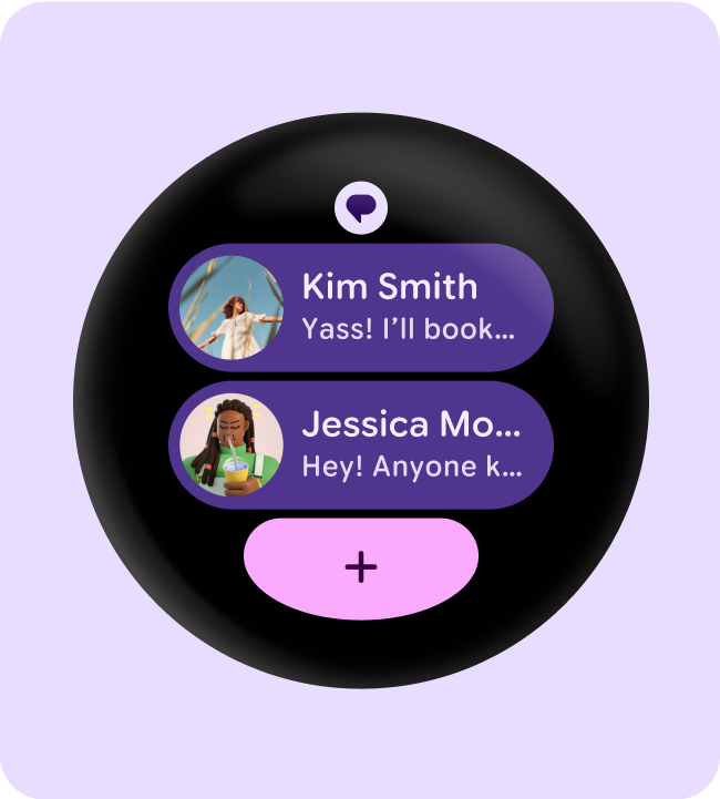
資訊方塊 (非捲動版面配置)
資訊方塊是不會捲動的檢視畫面版面配置,可讓使用者快速存取所需資訊或進行操作,處理大小事務。只要滑動錶面,使用者就能掌握自己的健身目標進度、查看天氣資訊,以及執行其他操作等。例如透過資訊方塊快速啟動應用程式或完成重要工作。
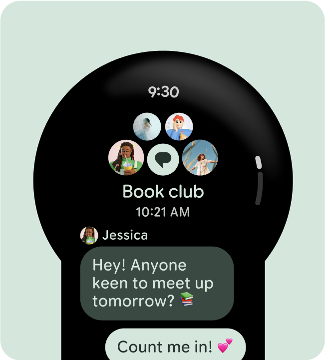
應用程式 (捲動版面配置)
捲動應用程式檢視畫面版面配置包括清單 (ScalingLazyColumn
) 和對話方塊。這些版面配置構成了大部分的應用程式畫面,且代表需要配合較大螢幕尺寸調整的元件集合。
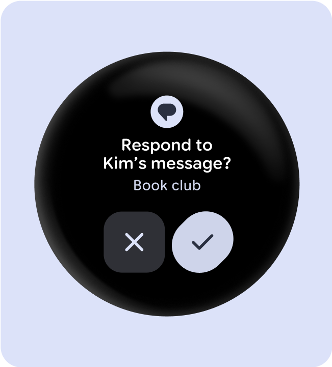
應用程式 (非捲動式版面配置)
不捲動的應用程式檢視畫面版面配置包括媒體播放器、挑選器、切換器、部分對話方塊,以及使用進度指標的特殊健身或追蹤畫面。
這個頁面中的內容和程式碼範例均受《內容授權》中的授權所規範。Java 與 OpenJDK 是 Oracle 和/或其關係企業的商標或註冊商標。
上次更新時間:2025-07-26 (世界標準時間)。
[[["容易理解","easyToUnderstand","thumb-up"],["確實解決了我的問題","solvedMyProblem","thumb-up"],["其他","otherUp","thumb-up"]],[["缺少我需要的資訊","missingTheInformationINeed","thumb-down"],["過於複雜/步驟過多","tooComplicatedTooManySteps","thumb-down"],["過時","outOfDate","thumb-down"],["翻譯問題","translationIssue","thumb-down"],["示例/程式碼問題","samplesCodeIssue","thumb-down"],["其他","otherDown","thumb-down"]],["上次更新時間:2025-07-26 (世界標準時間)。"],[],[],null,["# Common adaptive design layouts\n\nCommon design layouts---also known as canonical design layouts---are proven,\nversatile app layouts that provide an optimal user experience on the wide\nvariety of screen sizes that are available with Wear OS.\n\nUse adaptive and responsive UI principles to deliver the highest quality\nexperience for everyone. Adaptive UIs stretch and change to make the most of\nall available screen space, no matter what size screen they're rendered on.\n\nAdaptive UIs change responsively, using components and methods built directly\ninto the layout logic. These layouts also utilize screen size\nbreakpoints---applying a different design on different screen sizes---to create an\neven richer experience for everyone.\n\nUse established common layouts\n------------------------------\n\nUse established canonical layouts to help your UIs adapt smoothly across a\nrange of device sizes. These canonical layouts offer a high quality experience\nacross all screen sizes.\n\n\n**Tiles (non-scrolling layouts)**\n\nTiles are non-scrolling view layouts which provide quick access to information\nand actions users need to get things done. With a swipe from the watch face, a\nuser can see how they are progressing towards their fitness goals, check the\nweather, and more. Launch an app or get essential tasks done quickly from tiles. \n\n**Apps (scrolling layouts)**\n\nScrolling app view layouts include lists (`ScalingLazyColumn`) and dialogs.\nThese layouts make up the majority of app screens, and they represent a\ncollection of components which need to adapt to larger screen sizes. \n\n**Apps (non-scrolling layouts)**\n\nNon-scrolling app view layouts include media players, pickers, switchers, some\ndialogs, and special fitness or tracking screens that use progress indicators.\n\n\u003cbr /\u003e"]]