捲動式應用程式的常見版面配置
透過集合功能整理內容
你可以依據偏好儲存及分類內容。
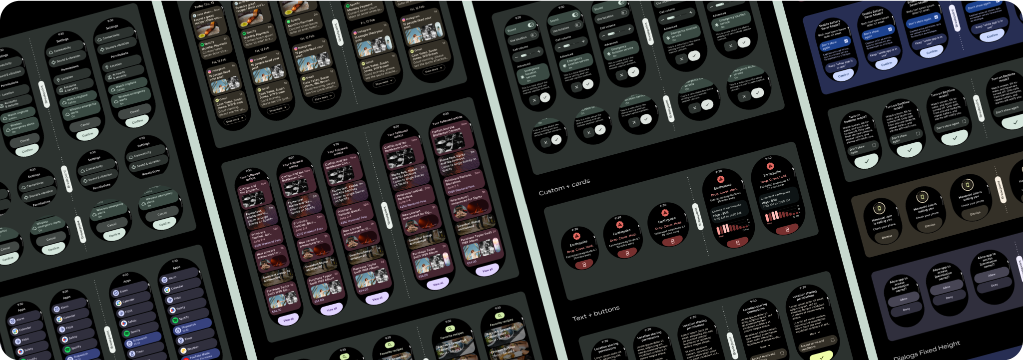
捲動應用程式檢視畫面版面配置包括清單 (TransformingLazyColumn
) 和對話方塊。這些版面配置構成了大部分的應用程式畫面,且代表需要配合較大螢幕尺寸調整的元件集合。請確認元件是否回應式,也就是說,當螢幕高度可用時,元件會填滿可用的寬度,並採用 TransformingLazyColumn
調整。這些版面配置已採用回應式設計,我們也提供一些額外建議,協助您進一步發揮擴充空間的效益。

建立回應式及最佳化設計
為協助您設計的版面配置適應更大的螢幕大小,我們已更新版面配置和元件的行為,讓這些元素具備內建的回應式行為,包括以百分比為準的邊界和邊框間距。為解決這個問題,我們已更新 Android UI 程式庫版面配置和元件,並內建回應式行為,包括以百分比為依據的邊界和邊框間距。如果您使用 Compose 元件,可以自動繼承這項回應能力。
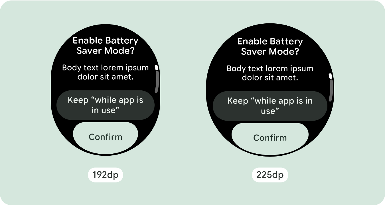
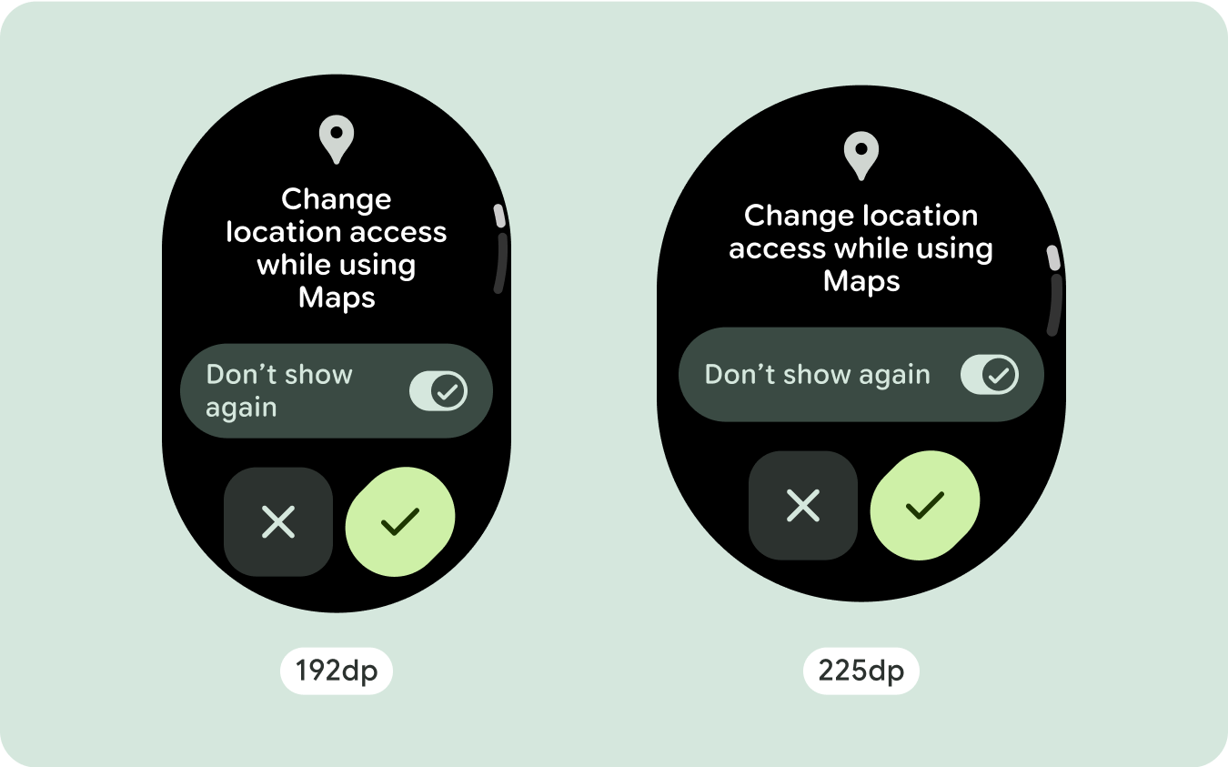
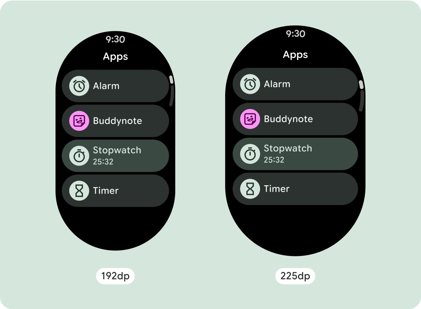
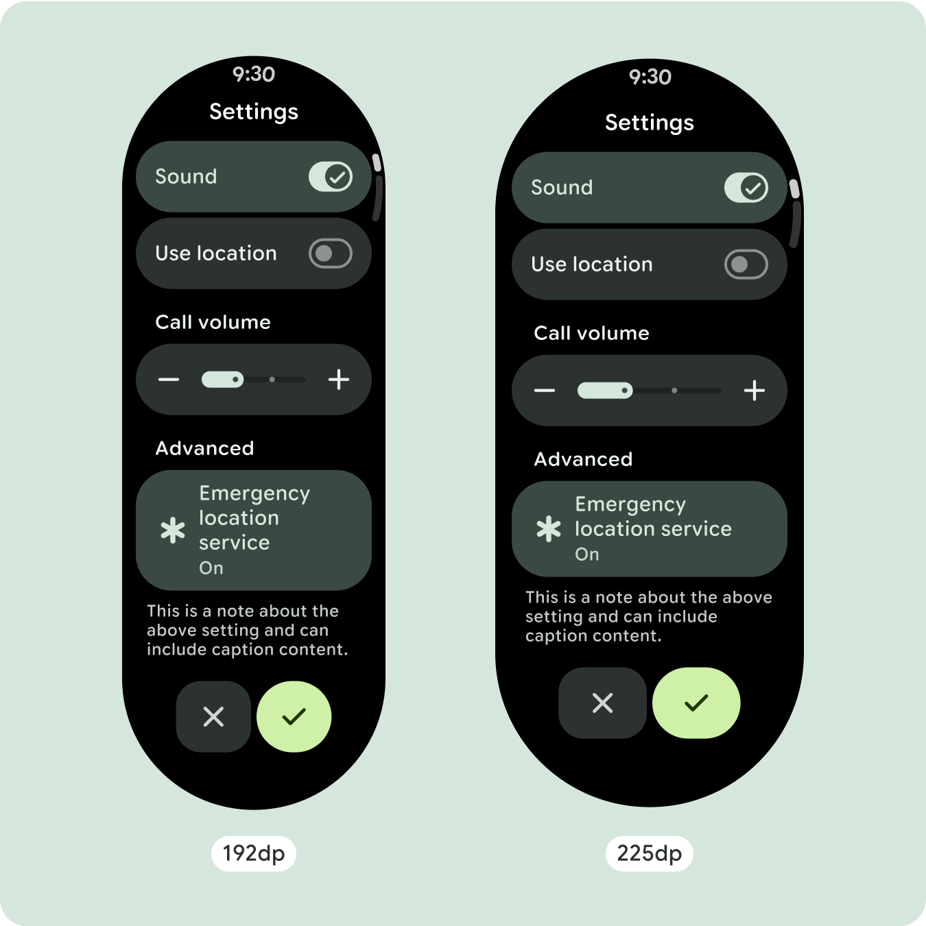
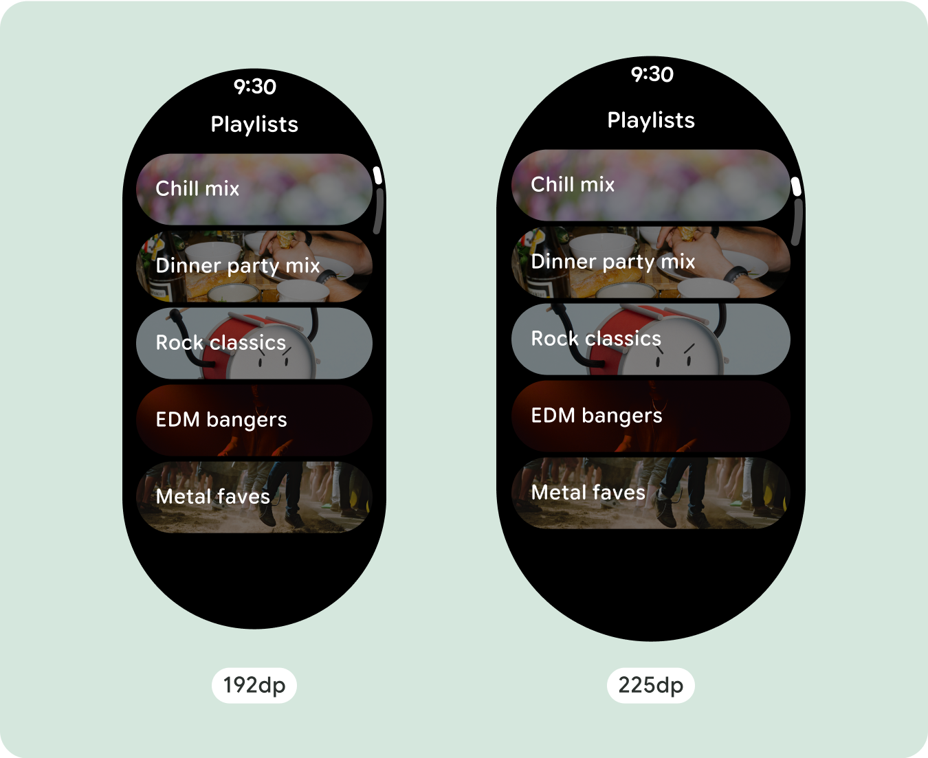
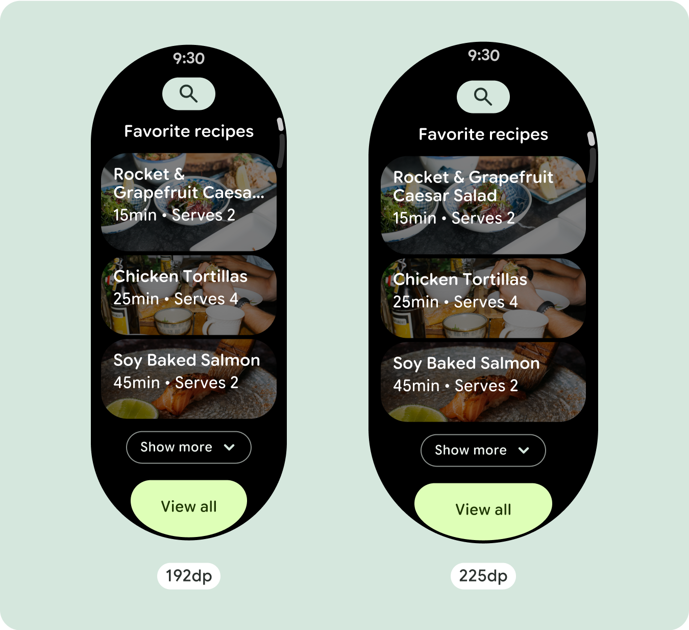
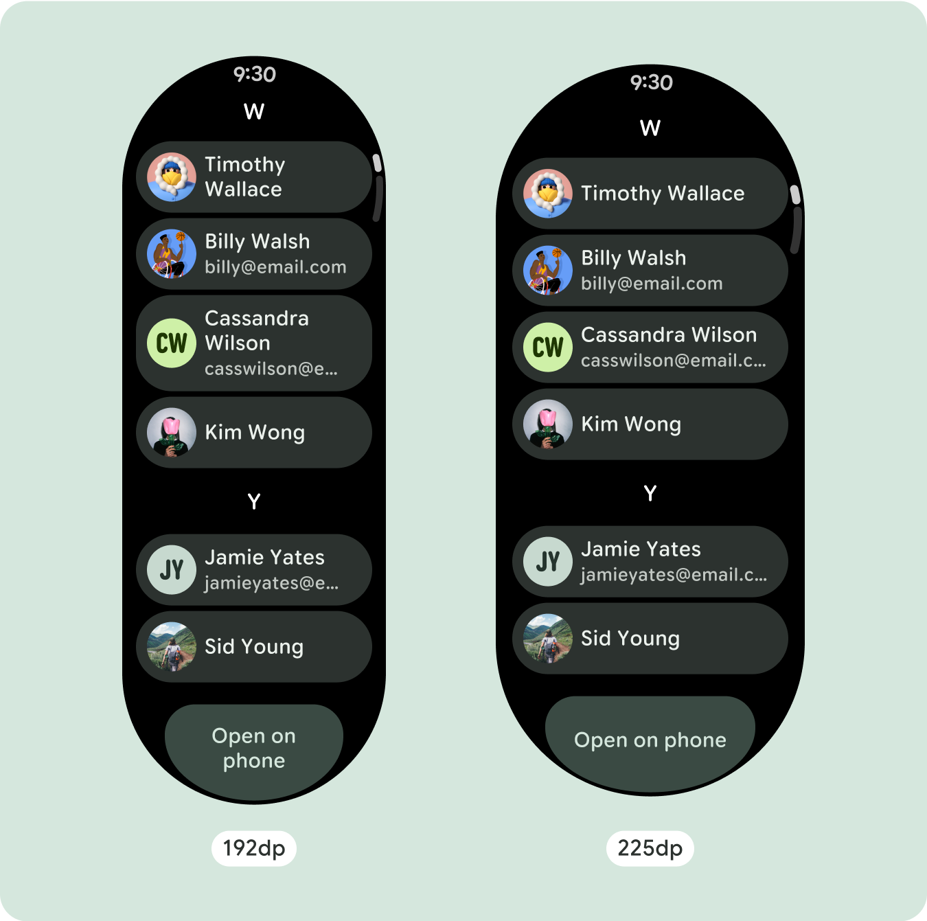
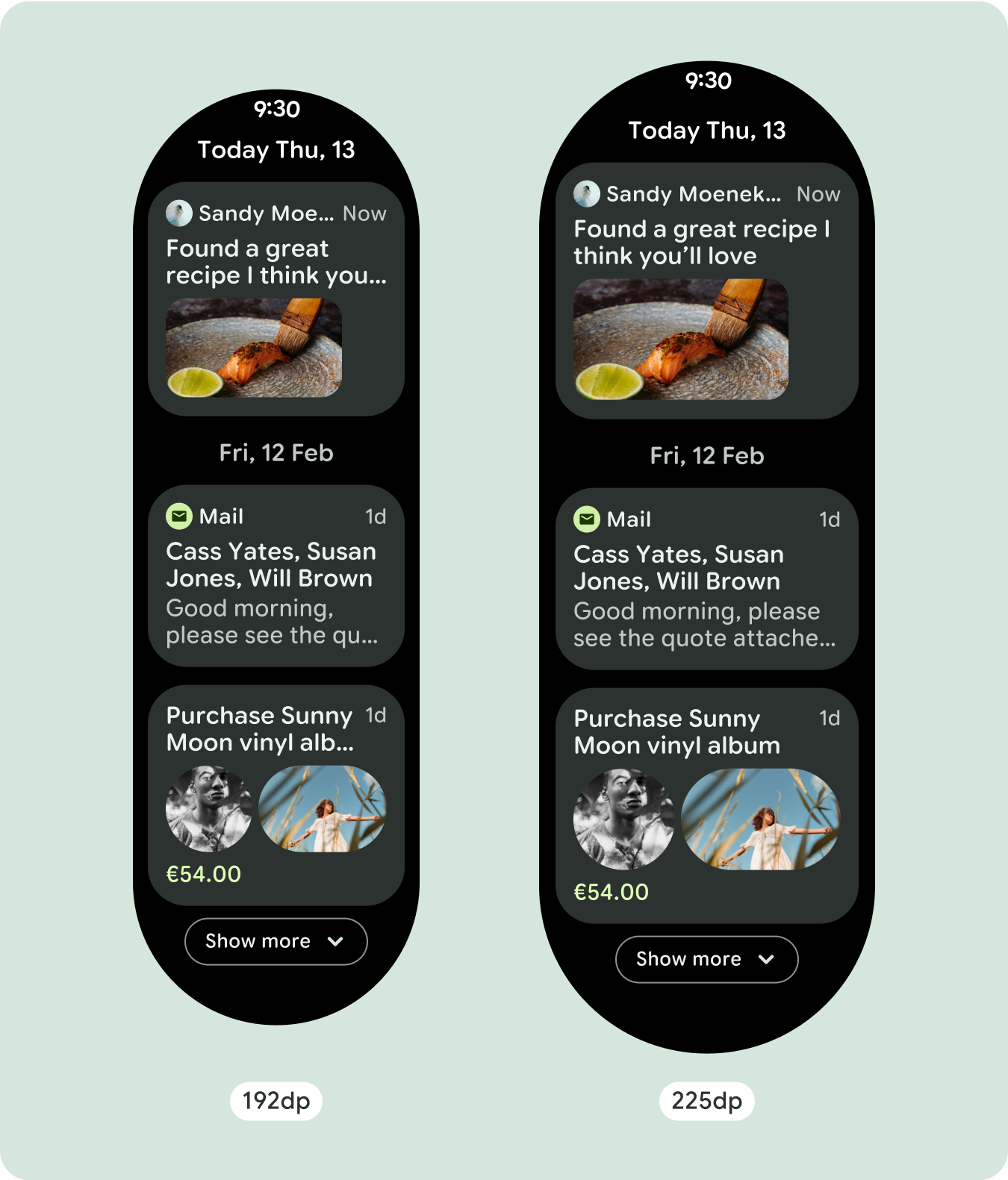
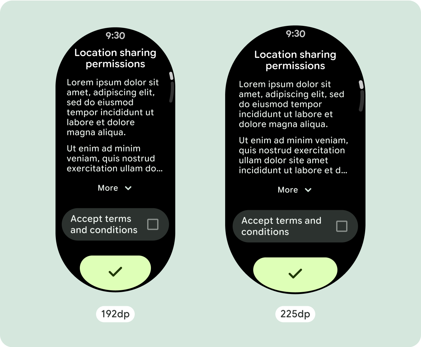
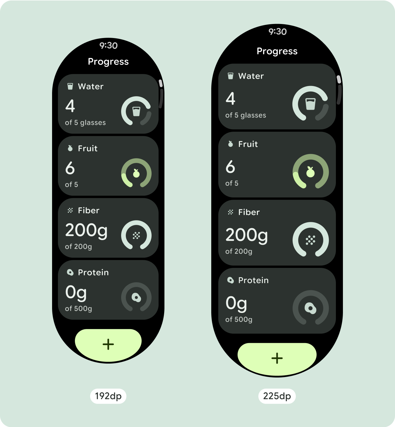
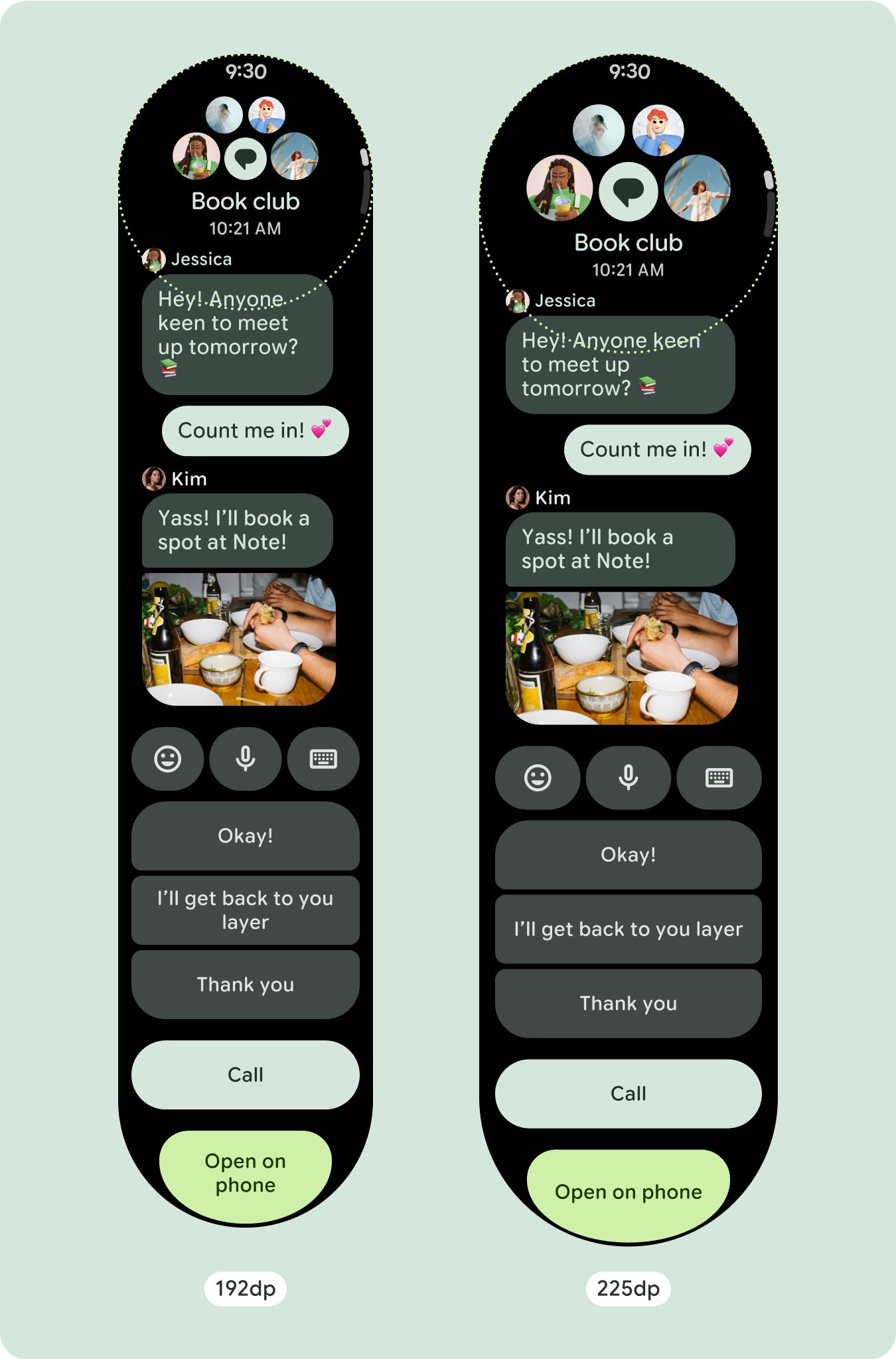
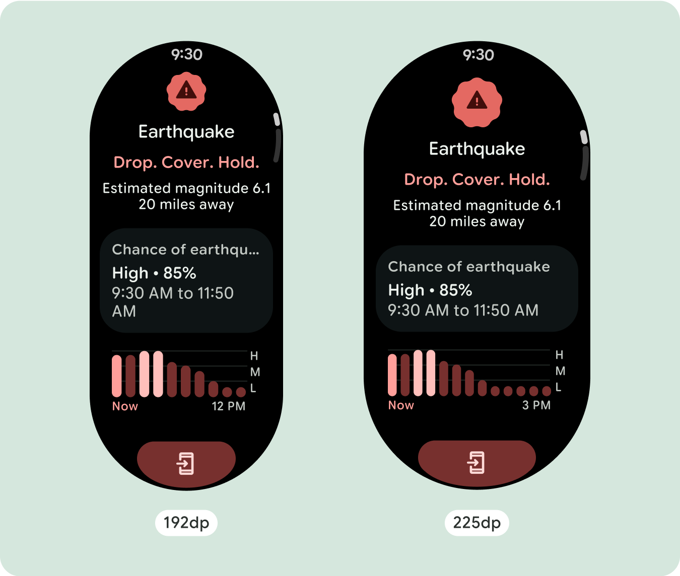
針對獨特的螢幕設計,請在各種螢幕尺寸上徹底測試,確保元件和元素能順利調整,並避免內容遭到裁剪。百分比邊界可有效調整間距,建議您使用 225dp 的斷點,在較大的智慧手錶螢幕上顯示其他資訊和強化功能。
檢查元件是否填滿可用的寬度
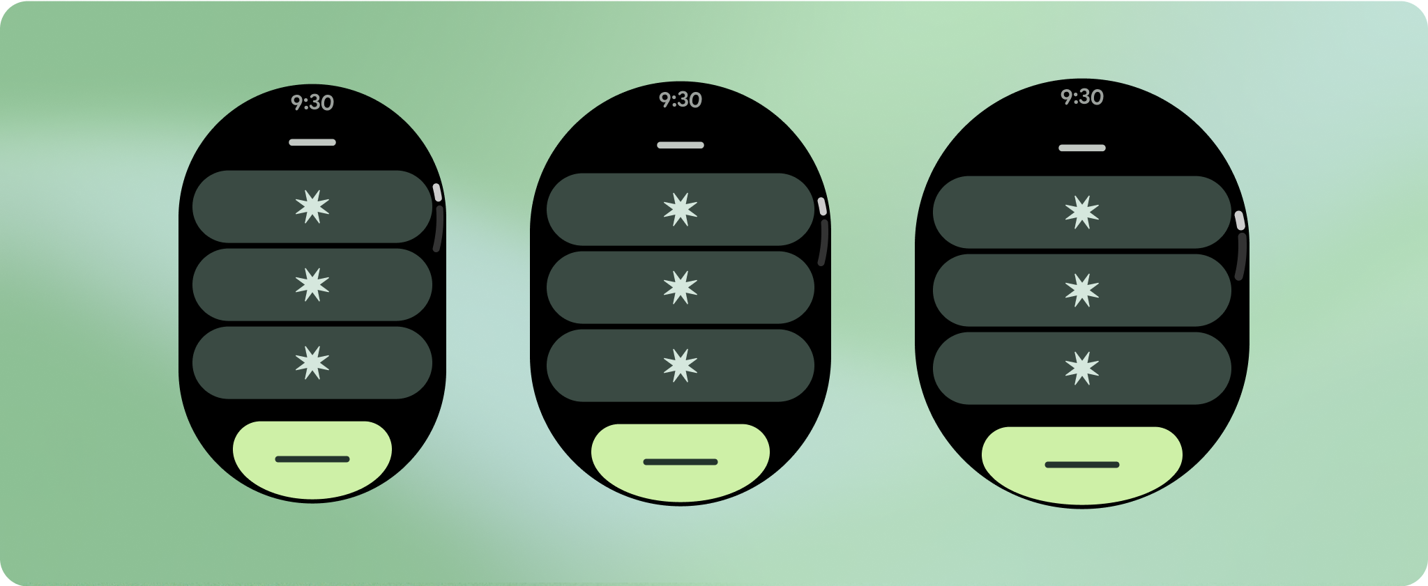
所有元件都是以回應式方式建構,也就是說,它們會填滿可用的寬度和高度。請務必留有必要的邊界,確保內容不會遭到圓角螢幕裁剪。
顯示其他文字字元
大多數元件都有可填滿可用寬度的文字方塊。也就是說,隨著螢幕寬度增加,字元數量也會自動增加。
建構可自動調整且獨樹一格的設計
由於捲動版面配置會自動顯示先前隱藏在螢幕折疊下方的更多內容,因此您不需要做太多事情就能增加價值。每個元件都會填滿可用的寬度,在某些情況下,元件可能會增加多行文字 (例如資訊卡),或是元件會拉伸以填滿可用的寬度 (例如圖示按鈕)。
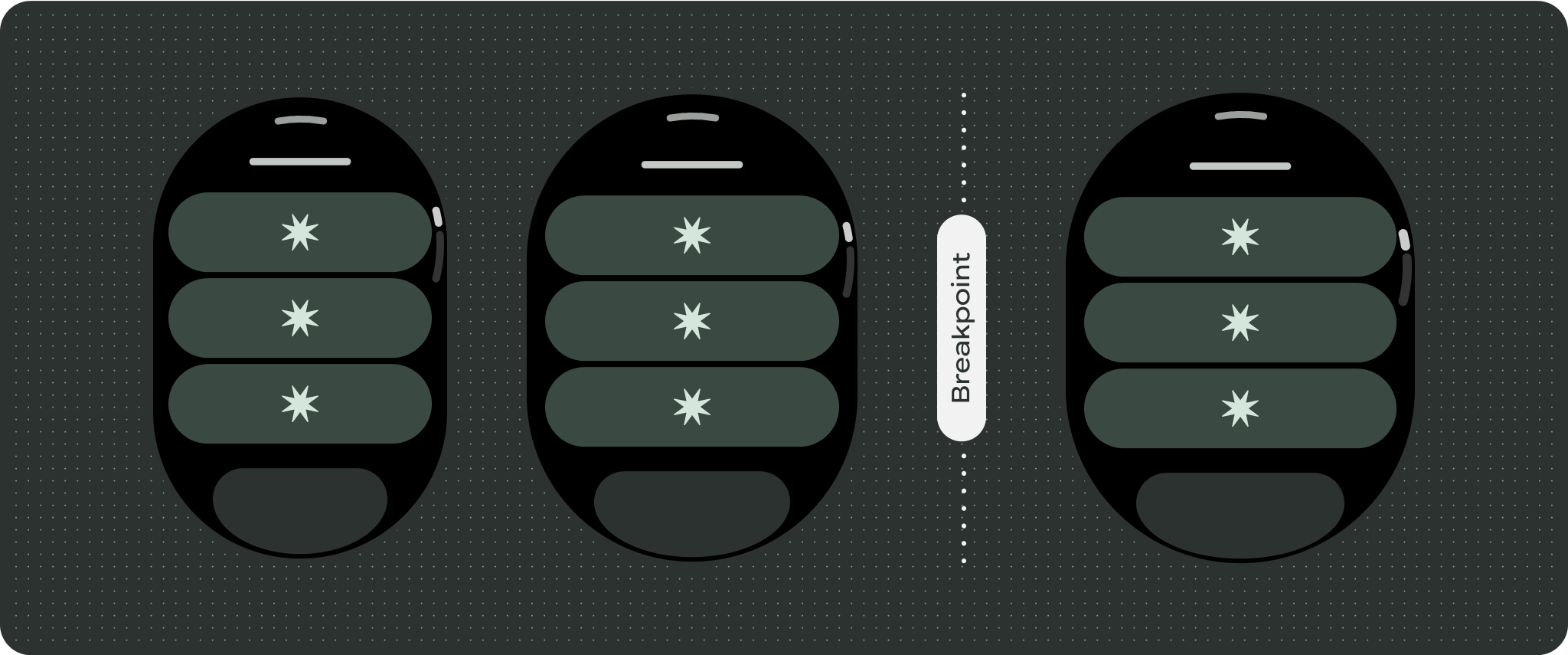
如要充分利用大螢幕的額外空間,請在 225dp 處新增大小中斷點。這個中斷點可讓您顯示其他內容、加入更多按鈕或資料,或變更版面配置,以便更適合較大的螢幕。這需要為每個暫停點設計不同的版面配置。較大的螢幕設計 (225 以上) 可包含下列額外元素:
增加現有元件的大小或變更其狀態
這麼做可以顯示更多詳細資訊,或讓內容更容易一目瞭然。
經過最佳化且不重複的版面配置
在 225dp 中斷點之後,版面配置可能會略微變更,以便在預設檢視畫面中優化摺疊區域上方的內容,但摺疊區域下方的所有相同內容應仍可使用,不受螢幕大小影響。
回應式和自動調整行為
Compose 程式庫中的所有元件都會自動調整為更寬的螢幕尺寸,並獲得寬度和高度。採用回應式設計做法的捲動檢視畫面通常會配合各種螢幕大小調整。不過,在某些特殊情況下,您可以使用中斷點覆寫尺寸並擴充版面配置,以便擴充功能、改善一覽功能,或讓內容更適合顯示在螢幕上。
所有頂部、底部和側邊邊界都應以百分比定義,以免裁剪並提供元素的比例縮放功能。請考慮在使用者捲動時顯示 PositionIndicator
,且無論螢幕大小為何,都會自動緊貼螢幕邊框。
檢查清單
- 套用建議的頂端、底部和側邊邊界。
- 以百分比值定義外部邊界,避免在可捲動的容器開頭和結尾處出現裁剪情形。
- 在 UI 元素之間使用固定的 DP 值套用邊界。
- 建議您在 225dp 處套用中斷點,以便在較大的螢幕尺寸上顯示其他內容,或讓現有內容更容易瀏覽。

打造與眾不同的體驗
捲動檢視畫面可高度自訂,可按任意順序新增任何元件組合。上邊界和下邊界會因頂端和底端的元件而異動。這可避免內容因螢幕的曲線而遭到裁剪。

這個頁面中的內容和程式碼範例均受《內容授權》中的授權所規範。Java 與 OpenJDK 是 Oracle 和/或其關係企業的商標或註冊商標。
上次更新時間:2025-07-27 (世界標準時間)。
[[["容易理解","easyToUnderstand","thumb-up"],["確實解決了我的問題","solvedMyProblem","thumb-up"],["其他","otherUp","thumb-up"]],[["缺少我需要的資訊","missingTheInformationINeed","thumb-down"],["過於複雜/步驟過多","tooComplicatedTooManySteps","thumb-down"],["過時","outOfDate","thumb-down"],["翻譯問題","translationIssue","thumb-down"],["示例/程式碼問題","samplesCodeIssue","thumb-down"],["其他","otherDown","thumb-down"]],["上次更新時間:2025-07-27 (世界標準時間)。"],[],[],null,["# Common layouts for scrolling apps\n\nScrolling app view layouts include lists (`TransformingLazyColumn`) and dialogs.\nThese layouts make up the majority of app screens, and they represent a\ncollection of components which need to adapt to larger screen sizes. Check that\nthe components are responsive---that is, that they fill the available width and\nadopt the `TransformingLazyColumn` adjustments when more of the screen's height\nis available. These layouts are built responsively already, and we have some\nadditional recommendations to take further advantage of the expanded real\nestate.\n\nBuild responsive and optimized designs\n--------------------------------------\n\nTo help your design layouts adapt to larger screen sizes, we have updated the\nbehavior of our layouts and components to have built-in responsive behavior,\nincluding percentage-based margins and padding. To address this, we have updated\nour Android UI library layouts and components with built-in responsive behavior,\nincluding percentage-based margins and padding. If you're utilizing our Compose\ncomponents, you can automatically inherit this responsiveness.\n\nFor unique screen designs, thoroughly test across a variety of screen sizes,\nensuring components and elements adapt smoothly and avoid content clipping. Our\npercentage margins help spacers scale effectively, and we recommend using a\nbreakpoint at 225dp to introduce additional information and enhanced\nfunctionality on larger watch screens.\n\n### Check that components fill the available width\n\n\nAll components are built responsively, meaning they fill the available width and\nheight. Make sure you have the necessary margins to ensure content doesn't get\nclipped by the rounding screen. \n\n\n\u003cbr /\u003e\n\n### Show additional text characters\n\n\nMost components have text boxes which fill the available width. This means that\nthey automatically gain character counts as the screen width increases. \n\n\n\u003cbr /\u003e\n\nBuild adaptive and differentiated designs\n-----------------------------------------\n\nAs scrolling layouts will automatically show more of what was previously hidden\nbelow the screen fold, there isn't much you need to do to add value. Each\ncomponent fills the available width, and in some cases, a component might gain\nadditional rows of text (such as cards), or components stretch to fill the\navailable width (such as icon buttons).\n\nTo best use the additional space on larger screen sizes, add a size breakpoint\nat 225dp. This breakpoint makes it possible to reveal additional content,\ninclude more buttons or data, or change the layout to better suit the larger\nscreen. This requires a different design for each breakpoint. The larger screen\ndesign (225+) could include the following additional elements:\n\n### Increase the size or change the state of the existing components\n\n\nThis could be done in order to show more detail or make the content more\nglanceable. \n\n\u003cbr /\u003e\n\n### Optimized and differentiated layouts\n\n\nThe layout can alter slightly after the 225dp breakpoint, so that the content\nabove the fold in the default view is optimized, however all of the same content\nbelow the fold should still be available regardless of screen size. \n\n\u003cbr /\u003e\n\nResponsive and adaptive behavior\n--------------------------------\n\nAll components in the Compose library will automatically adapt to the wider\nscreen size, and gain width and height. Scroll views that use responsive design\npractices usually adapt to a range of screen sizes. However, in some special\ncases, you can use a breakpoint to override dimensions and augment layouts which\nexpand functionality, improve glanceability, or make content fit better on\nscreen.\n\nAll top, bottom, and side margins should be defined in percentages to avoid\nclipping and provide proportional scaling of elements. Consider that the\n`PositionIndicator` appears when the user scrolls, and it automatically hugs the\nscreen's bezel no matter its size.\n\n### Checklist\n\n- Apply the recommended top, bottom, and side margins.\n- Define outer margins in percentage values to prevent clipping at the beginning and end of the scrollable container.\n- Apply margins in fixed DP values between UI elements.\n- Consider applying a breakpoint at 225dp to introduce additional content or make existing content more glanceable when on bigger screen sizes.\n\nCreate differentiated experiences\n---------------------------------\n\nScrolling views are highly customizable, with the ability to add any combination\nof components in any order. The top and bottom margins can change depending on\nwhich components sit at the top and bottom. This is to prevent content from\nbeing clipped by the growing curve of the screen."]]