
The
draggable
modifier is the high-level entry point to drag gestures in a single orientation,
and reports the drag distance in pixels.
It's important to note that this modifier is similar to scrollable, in that it
only detects the gesture. You need to hold the state and represent it on screen
by, for example, moving the element via the
offset
modifier:
@Composable private fun DraggableText() { var offsetX by remember { mutableFloatStateOf(0f) } Text( modifier = Modifier .offset { IntOffset(offsetX.roundToInt(), 0) } .draggable( orientation = Orientation.Horizontal, state = rememberDraggableState { delta -> offsetX += delta } ), text = "Drag me!" ) }
If you need to control the whole dragging gesture, consider using the drag
gesture detector instead, via the
pointerInput
modifier.
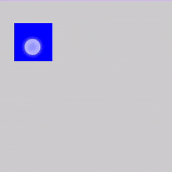
@Composable private fun DraggableTextLowLevel() { Box(modifier = Modifier.fillMaxSize()) { var offsetX by remember { mutableFloatStateOf(0f) } var offsetY by remember { mutableFloatStateOf(0f) } Box( Modifier .offset { IntOffset(offsetX.roundToInt(), offsetY.roundToInt()) } .background(Color.Blue) .size(50.dp) .pointerInput(Unit) { detectDragGestures { change, dragAmount -> change.consume() offsetX += dragAmount.x offsetY += dragAmount.y } } ) } }
Swiping
The
swipeable
modifier lets you drag elements which, when released, animate towards typically
two or more anchor points defined in an orientation. A common usage for this is
to implement a ‘swipe-to-dismiss’ pattern.
It's important to note that this modifier does not move the element, it only
detects the gesture. You need to hold the state and represent it on screen by,
for example, moving the element via the
offset
modifier.
The swipeable state is required in the swipeable modifier, and can be created
and remembered with
rememberSwipeableState().
This state also provides a set of useful methods to programmatically animate to
anchors (see
snapTo,
animateTo,
performFling,
and
performDrag)
as well as properties to observe the dragging progress.
The swipe gesture can be configured to have different threshold types, such as
FixedThreshold(Dp)
and
FractionalThreshold(Float),
and they can be different for each anchor point from-to combination.
For more flexibility, you can configure the resistance when swiping past the
bounds and, also, the velocityThreshold which will animate a swipe to the
next state, even if the positional thresholdshave not been reached.
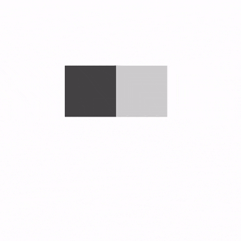
@OptIn(ExperimentalMaterialApi::class) @Composable private fun SwipeableSample() { val width = 96.dp val squareSize = 48.dp val swipeableState = rememberSwipeableState(0) val sizePx = with(LocalDensity.current) { squareSize.toPx() } val anchors = mapOf(0f to 0, sizePx to 1) // Maps anchor points (in px) to states Box( modifier = Modifier .width(width) .swipeable( state = swipeableState, anchors = anchors, thresholds = { _, _ -> FractionalThreshold(0.3f) }, orientation = Orientation.Horizontal ) .background(Color.LightGray) ) { Box( Modifier .offset { IntOffset(swipeableState.offset.value.roundToInt(), 0) } .size(squareSize) .background(Color.DarkGray) ) } }
Recommended for you
- Note: link text is displayed when JavaScript is off
- Understand gestures
- Advanced animation example: Gestures {:#gesture-and-animation}
- Value-based animations