
Jetpack Compose offers an implementation of Material You and Material 3 Expressive, the next evolution of Material Design. M3 Expressive is an expansion of Material Design 3, including research-backed updates to theming, components, motion, typography, and more — all designed to help you make engaging and desirable products that users love. It also supports Material You personalization features like dynamic color. M3 Expressive complements the Android 16 visual style and system UI.
Below, we demonstrate the Material Design 3 implementation using the Reply sample app as an example. The Reply sample is based entirely on Material Design 3.
Dependency
To start using Material 3 in your Compose app, add the Compose Material 3
dependency to your build.gradle files:
implementation "androidx.compose.material3:material3:$material3_version"
Once the dependency is added, you can start adding Material Design systems, including color, typography, and shape, to your apps.
Experimental APIs
Some M3 APIs are considered experimental. In such cases you need to opt in at
the function or file level using the ExperimentalMaterial3Api annotation:
// import androidx.compose.material3.ExperimentalMaterial3Api @Composable fun AppComposable() { // M3 composables }
Material theming
An M3 theme contains the following subsystems: color scheme, typography and shapes. When you customize these values, your changes are automatically reflected in the M3 components you use to build your app.
Jetpack Compose implements these concepts with the M3 MaterialTheme
composable:
MaterialTheme( colorScheme = /* ... typography = /* ... shapes = /* ... ) { // M3 app content }
To theme your application content, define the color scheme, typography, and shapes specific to your app.
Color scheme
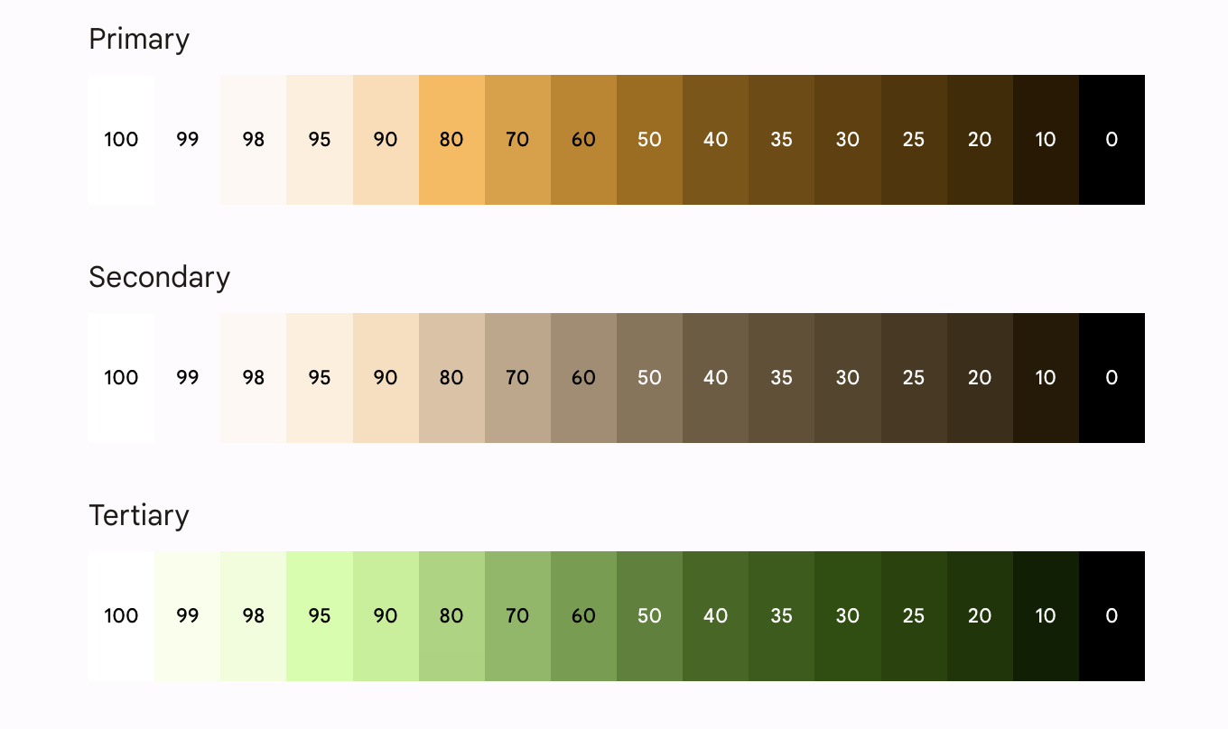
The foundation of a color scheme is the set of five key colors. Each of these colors relate to a tonal palette of 13 tones, which are used by Material 3 components. For example, this is the color scheme for light theme for Reply:
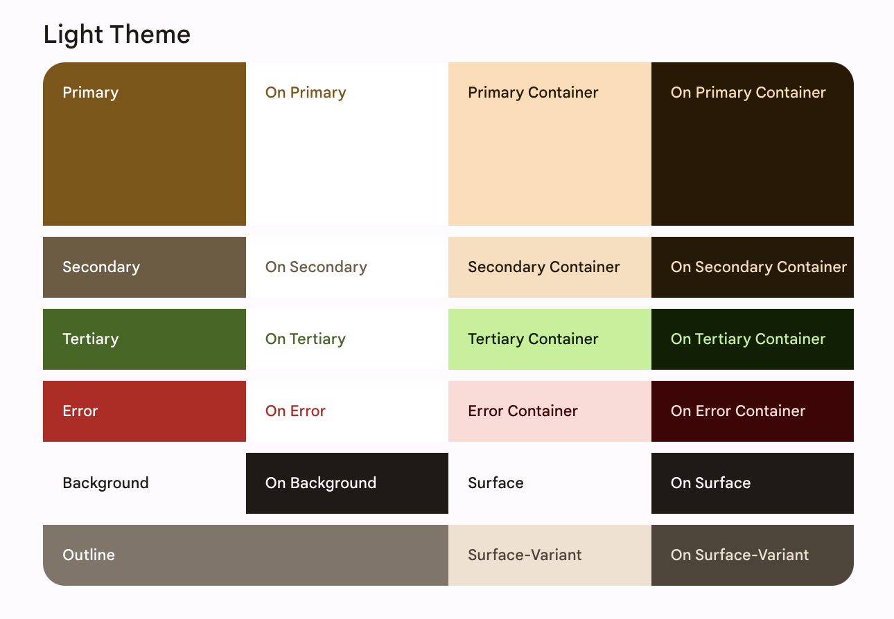
Read more about the Color scheme and color roles.
Generate color schemes
While you can create a custom ColorScheme manually, it’s often easier to
generate one using source colors from your brand. The Material Theme
Builder tool allows you to do this, and optionally export
Compose theming code. The following files are generated:
Color.ktcontains the colors of your theme with all the roles defined for both light and dark theme colors.
val md_theme_light_primary = Color(0xFF476810) val md_theme_light_onPrimary = Color(0xFFFFFFFF) val md_theme_light_primaryContainer = Color(0xFFC7F089) // .. // .. val md_theme_dark_primary = Color(0xFFACD370) val md_theme_dark_onPrimary = Color(0xFF213600) val md_theme_dark_primaryContainer = Color(0xFF324F00) // .. // ..
Theme.ktcontains a setup for light and dark color schemes and the app theme.
private val LightColorScheme = lightColorScheme( primary = md_theme_light_primary, onPrimary = md_theme_light_onPrimary, primaryContainer = md_theme_light_primaryContainer, // .. ) private val DarkColorScheme = darkColorScheme( primary = md_theme_dark_primary, onPrimary = md_theme_dark_onPrimary, primaryContainer = md_theme_dark_primaryContainer, // .. ) @Composable fun ReplyTheme( darkTheme: Boolean = isSystemInDarkTheme(), content: @Composable () -> Unit ) { val colorScheme = if (!darkTheme) { LightColorScheme } else { DarkColorScheme } MaterialTheme( colorScheme = colorScheme, content = content ) }
To support light and dark themes, use isSystemInDarkTheme(). Based on the
system setting, define which color scheme to use: light or dark.
Dynamic color schemes
Dynamic color is the key part of Material You, in which an algorithm derives custom colors from a user’s wallpaper to be applied to their apps and system UI. This color palette is used as the starting point to generate light and dark color schemes.
Dynamic color is available on Android 12 and above. If dynamic color is
available, you can set up a dynamic ColorScheme. If not, you should fall back
to using a custom light or dark ColorScheme.
ColorScheme provides builder functions to create a dynamic light or
dark color scheme:
// Dynamic color is available on Android 12+ val dynamicColor = Build.VERSION.SDK_INT >= Build.VERSION_CODES.S val colors = when { dynamicColor && darkTheme -> dynamicDarkColorScheme(LocalContext.current) dynamicColor && !darkTheme -> dynamicLightColorScheme(LocalContext.current) darkTheme -> DarkColorScheme else -> LightColorScheme }
Color usage
You can access Material theme colors in your app via
MaterialTheme.colorScheme:
Text( text = "Hello theming", color = MaterialTheme.colorScheme.primary )
Each color role can be used in a variety of places depending on the component’s state, prominence, and emphasis.
- Primary is the base color, used for main components like prominent buttons, active states, and the tint of elevated surfaces.
- The secondary key color is used for less prominent components in the UI, such as filter chips, and expands the opportunity for color expression.
- The tertiary key color is used to derive the roles of contrasting accents that can be used to balance primary and secondary colors or bring enhanced attention to an element.
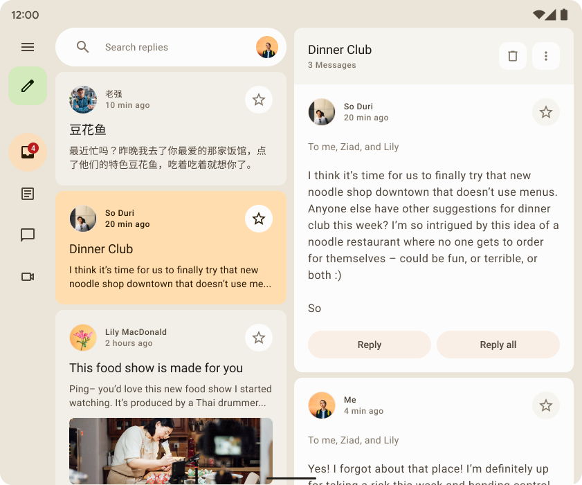
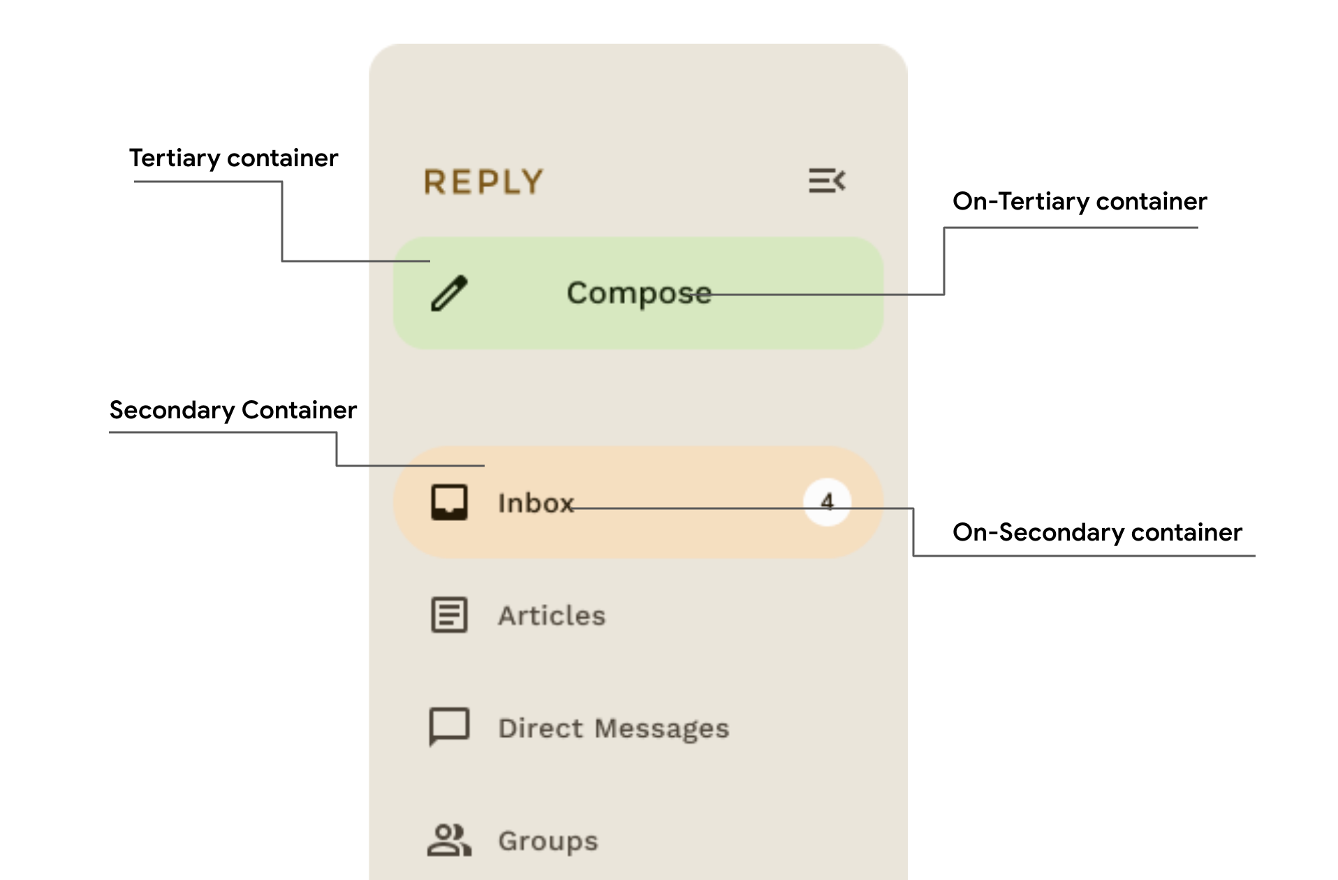
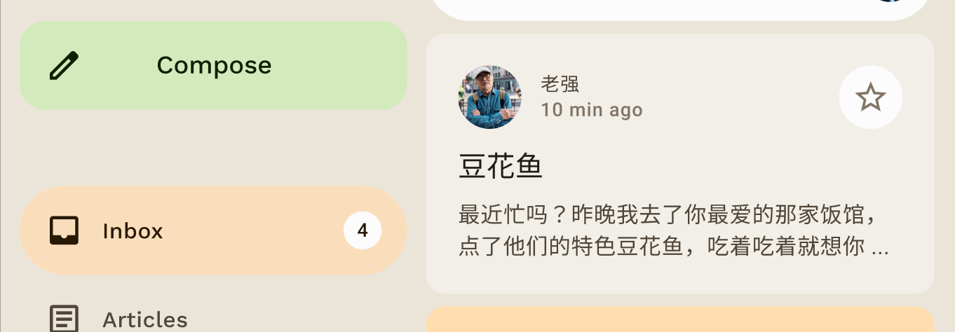
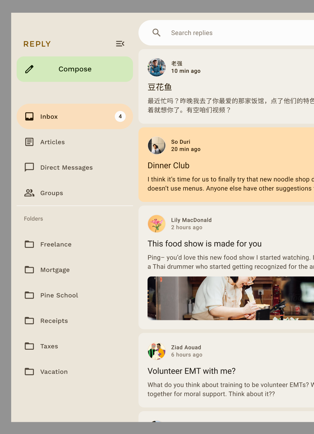
The Reply sample app design uses on-primary-container color on top of primary-container to put emphasis on the selected item.
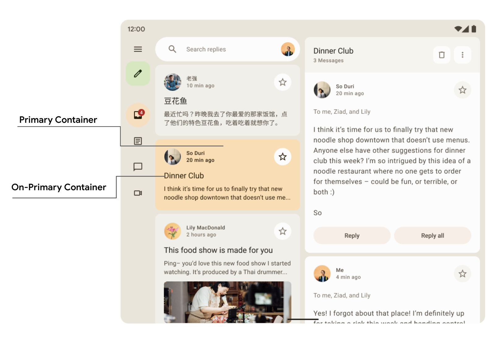
Card( colors = CardDefaults.cardColors( containerColor = if (isSelected) MaterialTheme.colorScheme.primaryContainer else MaterialTheme.colorScheme.surfaceVariant ) ) { Text( text = "Dinner club", style = MaterialTheme.typography.bodyLarge, color = if (isSelected) MaterialTheme.colorScheme.onPrimaryContainer else MaterialTheme.colorScheme.onSurface, ) }
Here you can see in the Reply Navigation drawer how secondary and tertiary container colors are used in contrast to create emphasis and accent.
Typography
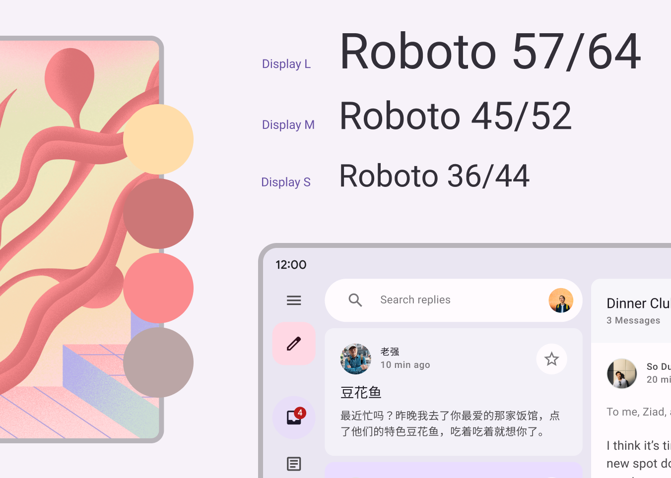
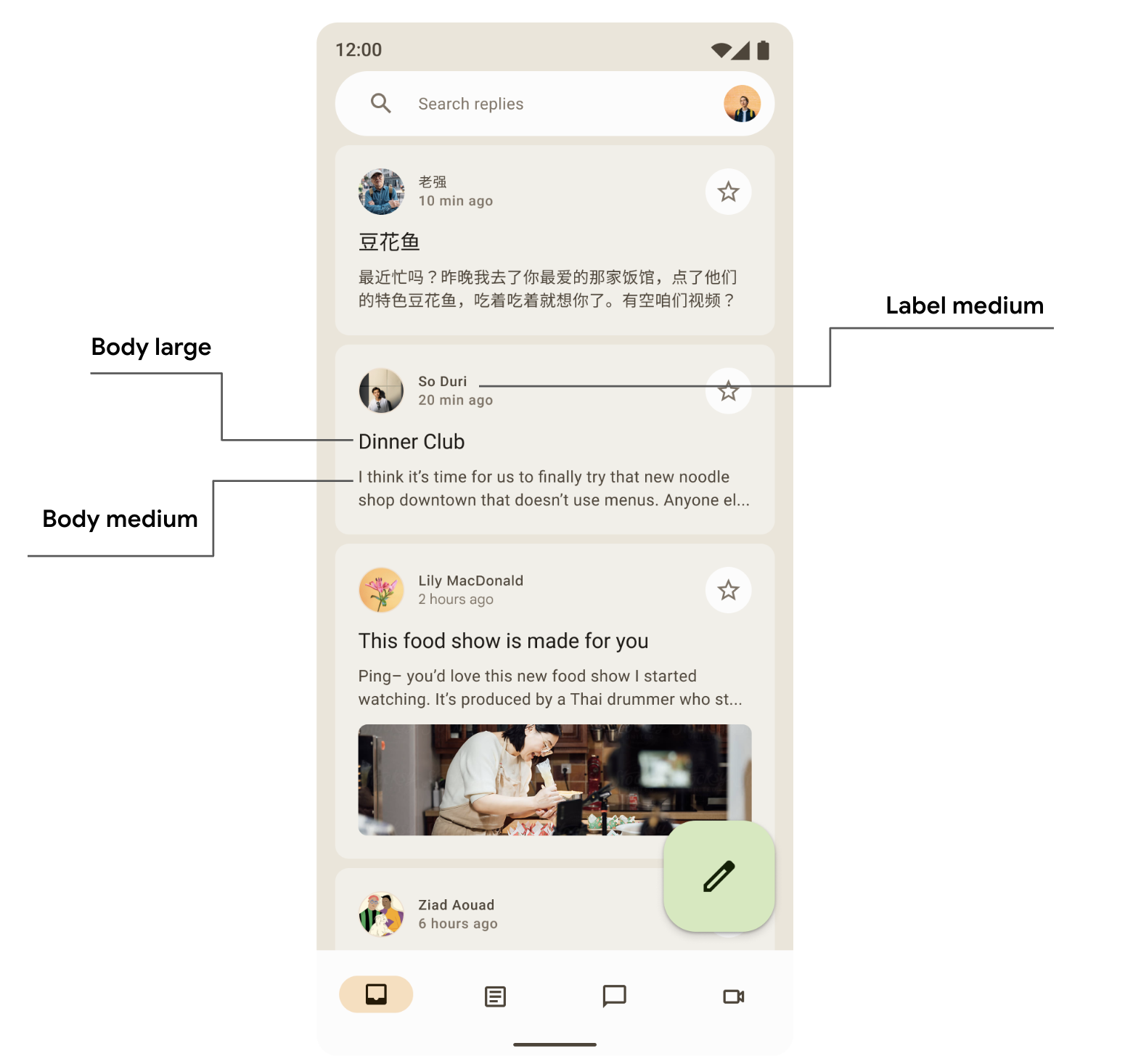
Material Design 3 defines a type scale, including text styles that have been adapted from Material Design 2. The naming and grouping have been simplified to: display, headline, title, body, and label, with large, medium, and small sizes for each.
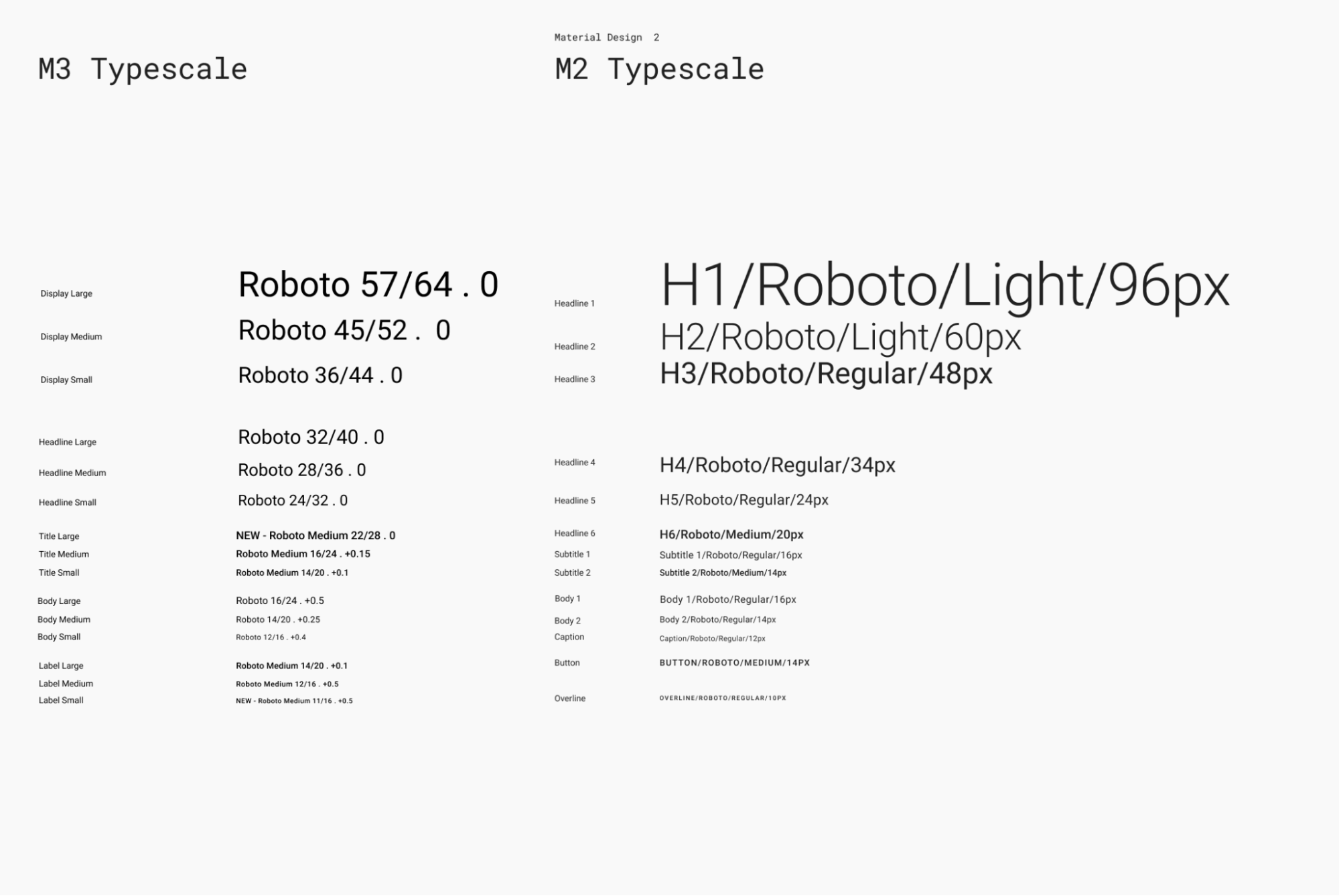
| M3 | Default Font Size/Line Height |
displayLarge |
Roboto 57/64 |
displayMedium |
Roboto 45/52 |
displaySmall |
Roboto 36/44 |
headlineLarge |
Roboto 32/40 |
headlineMedium |
Roboto 28/36 |
headlineSmall |
Roboto 24/32 |
titleLarge |
New- Roboto Medium 22/28 |
titleMedium |
Roboto Medium 16/24 |
titleSmall |
Roboto Medium 14/20 |
bodyLarge |
Roboto 16/24 |
bodyMedium |
Roboto 14/20 |
bodySmall |
Roboto 12/16 |
labelLarge |
Roboto Medium 14/20 |
labelMedium |
Roboto Medium 12/16 |
labelSmall |
New Roboto Medium, 11/16 |
Define typography
Compose provides the M3 Typography class — along with the existing
TextStyle and font-related classes — to model the Material 3 type
scale. The Typography constructor offers defaults for each style so you can omit
any parameters you do not want to customize:
val replyTypography = Typography( titleLarge = TextStyle( fontWeight = FontWeight.SemiBold, fontSize = 22.sp, lineHeight = 28.sp, letterSpacing = 0.sp ), titleMedium = TextStyle( fontWeight = FontWeight.SemiBold, fontSize = 16.sp, lineHeight = 24.sp, letterSpacing = 0.15.sp ), // .. ) // ..
Your product will likely not need all 15 default styles from the Material Design type scale. In this example, five sizes are chosen for a reduced set while the rest are omitted.
You can customize your typography by changing default values of TextStyle
and font-related properties like fontFamily and letterSpacing.
bodyLarge = TextStyle( fontWeight = FontWeight.Normal, fontFamily = FontFamily.SansSerif, fontStyle = FontStyle.Italic, fontSize = 16.sp, lineHeight = 24.sp, letterSpacing = 0.15.sp, baselineShift = BaselineShift.Subscript ),
Once you have defined your Typography, pass it to the M3 MaterialTheme:
MaterialTheme( typography = replyTypography, ) { // M3 app Content }
Use text styles
You can retrieve the typography provided to the M3 MaterialTheme composable by
using MaterialTheme.typography:
Text( text = "Hello M3 theming", style = MaterialTheme.typography.titleLarge ) Text( text = "you are learning typography", style = MaterialTheme.typography.bodyMedium )
You can read more about the Material guidelines on applying typography.
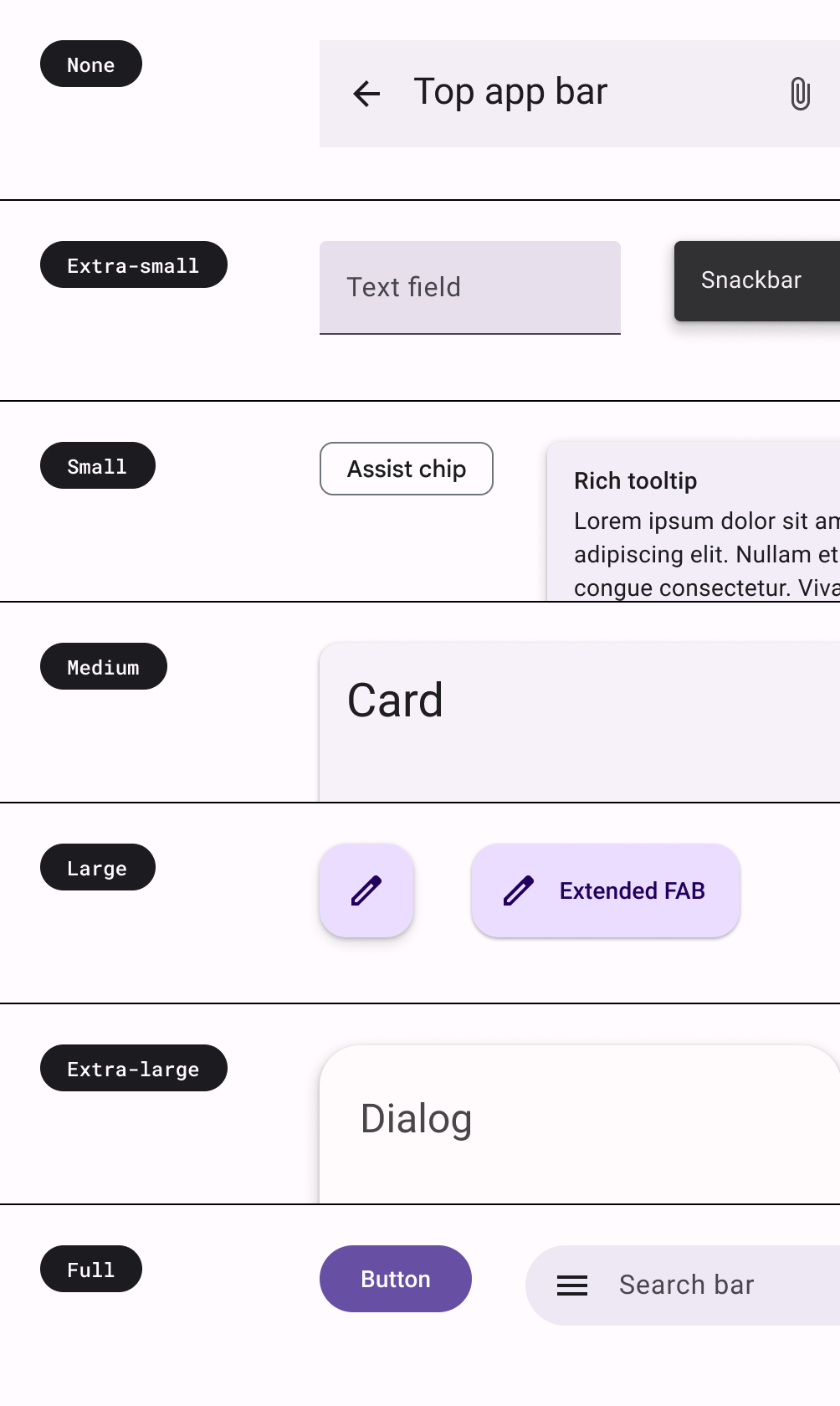
Shapes
Material surfaces can be displayed in different shapes. Shapes direct attention, identify components, communicate state, and express brand.
The shape scale defines the style of container corners, offering a range of roundedness from square to fully circular.
Define shapes
Compose provides the M3 Shapes class with expanded parameters to support
new M3 shapes. The M3 shape scale is more like the type scale,
enabling an expressive range of shapes across the UI.
There are different sizes of shapes:
- Extra Small
- Small
- Medium
- Large
- Extra Large
By default, each shape has a default value, but you can override those:
val replyShapes = Shapes( extraSmall = RoundedCornerShape(4.dp), small = RoundedCornerShape(8.dp), medium = RoundedCornerShape(12.dp), large = RoundedCornerShape(16.dp), extraLarge = RoundedCornerShape(24.dp) )
Once you have defined your Shapes, you can pass it to the M3 MaterialTheme:
MaterialTheme( shapes = replyShapes, ) { // M3 app Content }
Use shapes
You can customize the shape scale for all components in the MaterialTheme or
you can do it on a per component basis.
Apply medium and large shape with default values:
Card(shape = MaterialTheme.shapes.medium) { /* card content */ } FloatingActionButton( shape = MaterialTheme.shapes.large, onClick = { } ) { /* fab content */ }
There are two other shapes — RectangleShape and CircleShape — which are part
of Compose. Rectangle shape is with no border radius and circle shape shows full
circled edges:
Card(shape = RectangleShape) { /* card content */ } Card(shape = CircleShape) { /* card content */ }
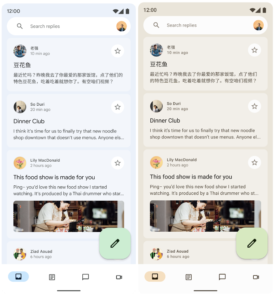
The examples below demonstrate some of the components with default shape values applied to them:
You can read more about the Material guidelines on applying shape.
Emphasis
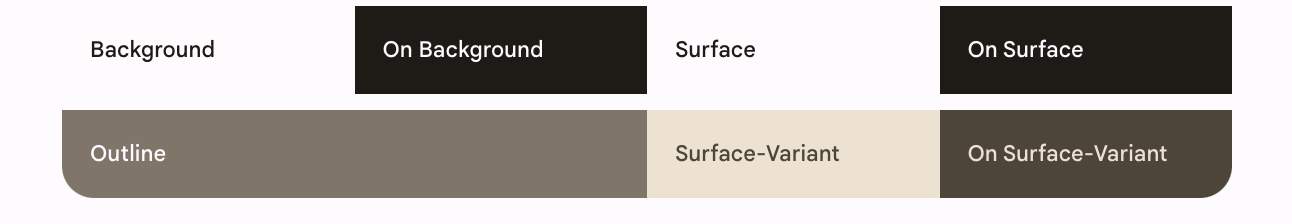
Emphasis in M3 is provided using variations of color and its on-color combinations. In M3, there are two ways to add emphasis to your UI:
- Using surface, surface-variant and background alongside on-surface, on-surface-variants colors from the expanded M3 color system. For example, surface can be used with on-surface-variant and surface-variant can be used with on-surface to provide different levels of emphasis.
- Using different font weights for text. Above, you saw that you can provide custom weights to our type scale for providing different emphasis.
bodyLarge = TextStyle( fontWeight = FontWeight.Bold ), bodyMedium = TextStyle( fontWeight = FontWeight.Normal )
Elevation
Material 3 represents elevation mainly using tonal color overlays. This is a new way to differentiate containers and surfaces from each other — increasing tonal elevation uses a more prominent tone — in addition to shadows.
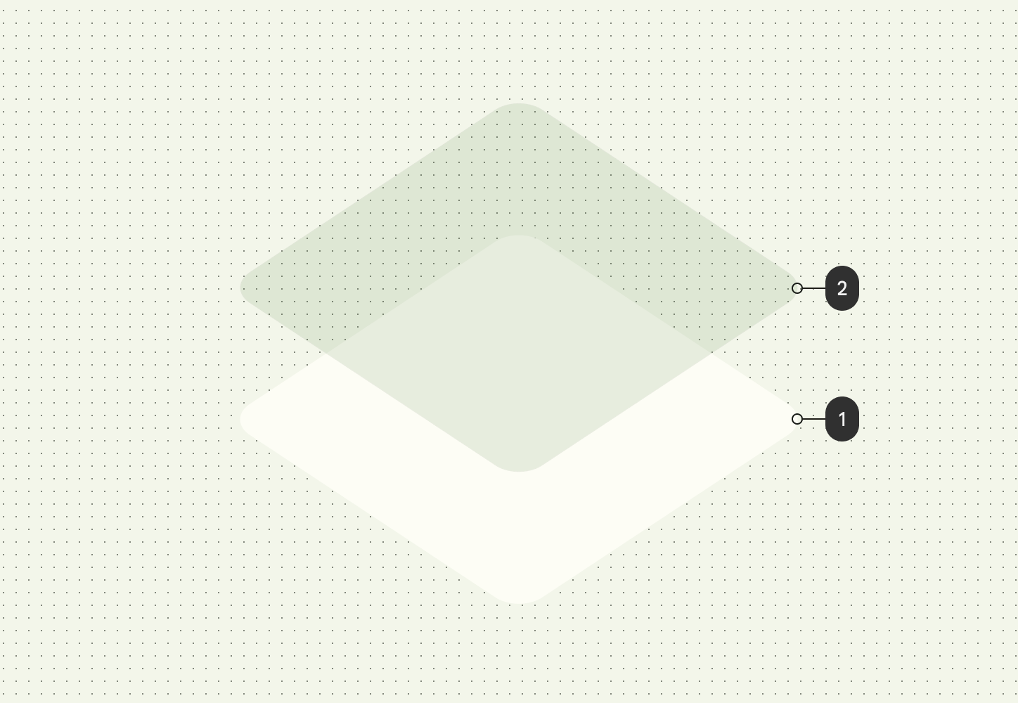
Elevation overlays in dark themes have also changed to tonal color overlays in Material 3. The overlay color comes from the primary color slot.
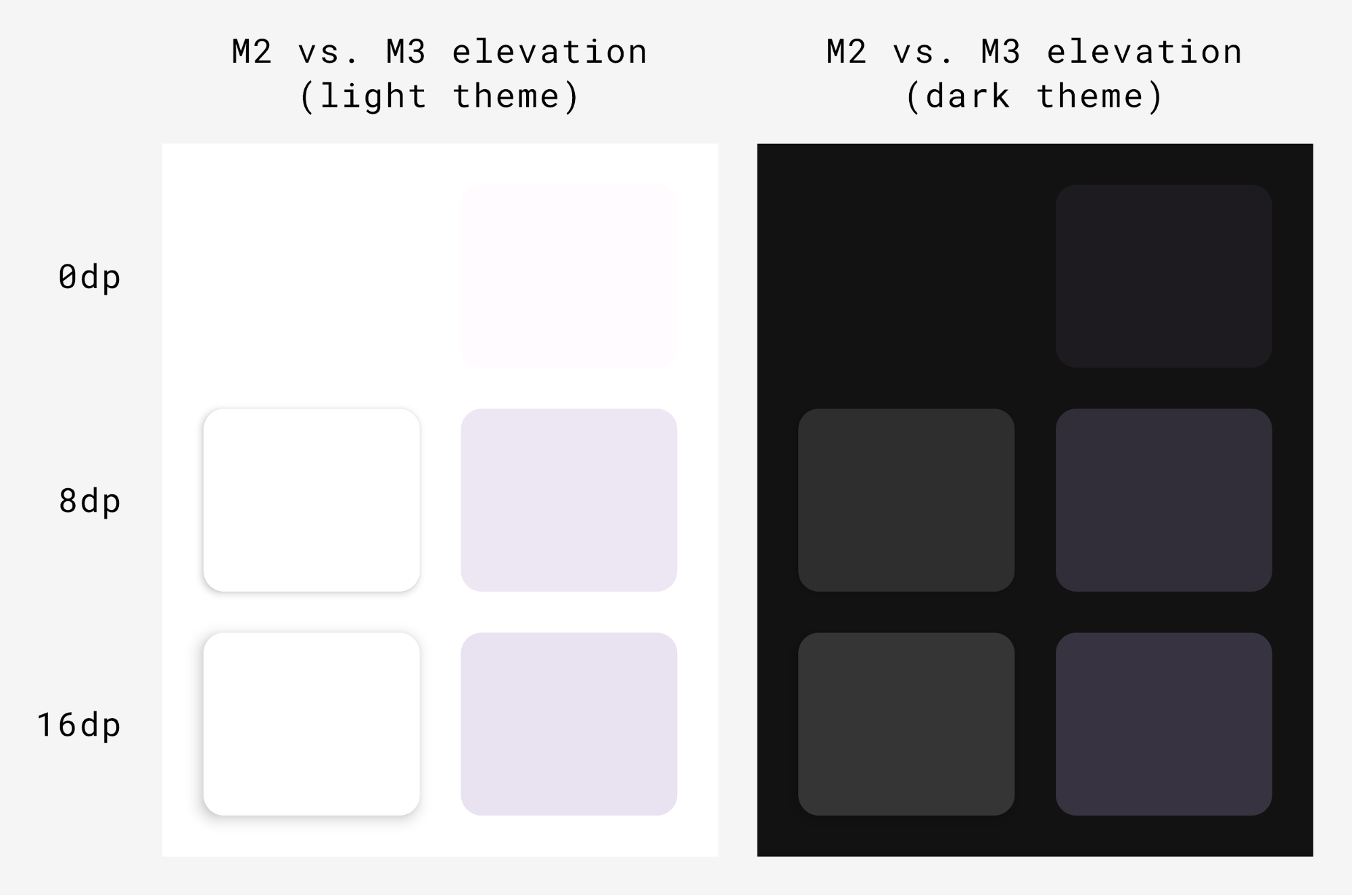
The M3 Surface — the backing composable behind most M3 components — includes support for both tonal and shadow elevation:
Surface( modifier = Modifier, tonalElevation = /*... shadowElevation = /*... ) { Column(content = content) }
Material components
Material Design comes with a rich set of Material components (such as buttons, chips, cards, navigation bar) which already follow Material Theming and help you make beautiful Material Design apps. You can start using components with default properties right out of the box.
Button(onClick = { /*..*/ }) { Text(text = "My Button") }
M3 provides many versions of the same components to be used in different roles according to emphasis and attention.
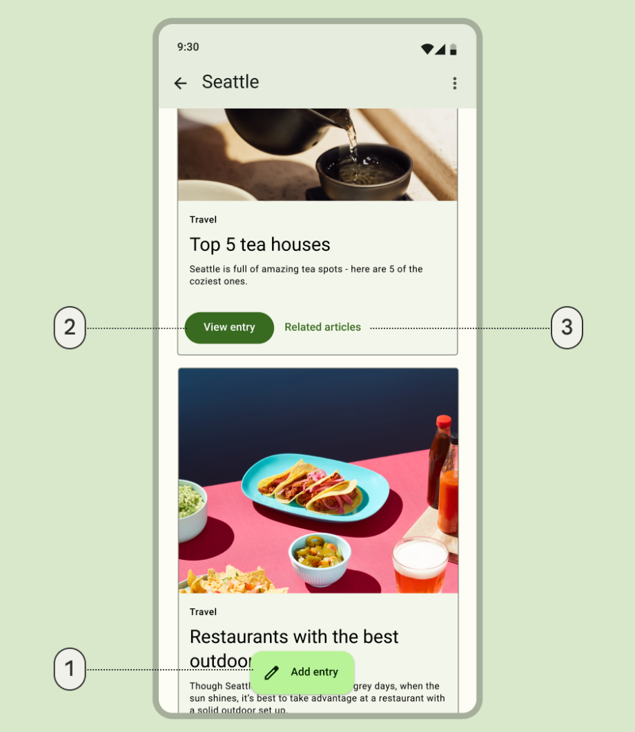
- An extended floating action button for the highest emphasis action:
ExtendedFloatingActionButton( onClick = { /*..*/ }, modifier = Modifier ) { Icon( imageVector = Icons.Default.Edit, contentDescription = stringResource(id = R.string.edit), ) Text( text = stringResource(id = R.string.add_entry), ) }
- A filled button for a high emphasis action:
Button(onClick = { /*..*/ }) { Text(text = stringResource(id = R.string.view_entry)) }
- A text button for a low emphasis action:
TextButton(onClick = { /*..*/ }) { Text(text = stringResource(id = R.string.replated_articles)) }
You can read more about Material buttons and other components. Material 3 provides a wide variety of component suites such as Buttons, App bars, Navigation components that are specifically designed for different use cases and screen sizes.
Navigation components
Material also provides several navigation components that help you implement navigation, depending on different screen sizes and states.
NavigationBar is used for compact devices when you want to target 5 or less
destinations:
NavigationBar(modifier = Modifier.fillMaxWidth()) { Destinations.entries.forEach { replyDestination -> NavigationBarItem( selected = selectedDestination == replyDestination, onClick = { }, icon = { } ) } }
NavigationRail is used for small-to-medium size tablets or phones in
landscape mode. It provides ergonomics to users and improves the user experience
for those devices.
NavigationRail( modifier = Modifier.fillMaxHeight(), ) { Destinations.entries.forEach { replyDestination -> NavigationRailItem( selected = selectedDestination == replyDestination, onClick = { }, icon = { } ) } }
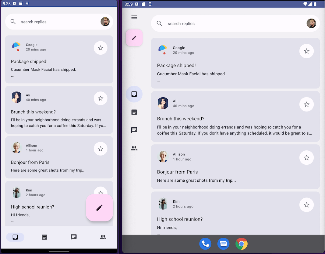
BottomNavigationBar (Left) and NavigationRail (Right)Reply using both in default theming to provide immersive user experience for all device sizes.
NavigationDrawer is used for medium-to-large size tablets where you have
enough space to show detail. You can use both PermanentNavigationDrawer or
ModalNavigationDrawer along with NavigationRail.
PermanentNavigationDrawer(modifier = Modifier.fillMaxHeight(), drawerContent = { Destinations.entries.forEach { replyDestination -> NavigationRailItem( selected = selectedDestination == replyDestination, onClick = { }, icon = { }, label = { } ) } }) { }
Navigation options enhance the user experience, ergonomics and reachability. You can learn more about Material navigation components in the Compose adaptive codelab.
Customize a component's theming
M3 encourages personalization and flexibility. All components have default colors applied to them but expose flexible APIs to customize their colors if required.
Most components, like cards and buttons, provide a default object exposing color and elevation interfaces that can be modified to customize your component:
val customCardColors = CardDefaults.cardColors( contentColor = MaterialTheme.colorScheme.primary, containerColor = MaterialTheme.colorScheme.primaryContainer, disabledContentColor = MaterialTheme.colorScheme.surface, disabledContainerColor = MaterialTheme.colorScheme.onSurface, ) val customCardElevation = CardDefaults.cardElevation( defaultElevation = 8.dp, pressedElevation = 2.dp, focusedElevation = 4.dp ) Card( colors = customCardColors, elevation = customCardElevation ) { // m3 card content }
You can read more about customizing Material 3.
System UI
Some aspects of Material You come from the new visual style and system UI on Android 12 and above. Two key areas where there are changes are ripple and overscroll. No additional work is required to implement these changes.
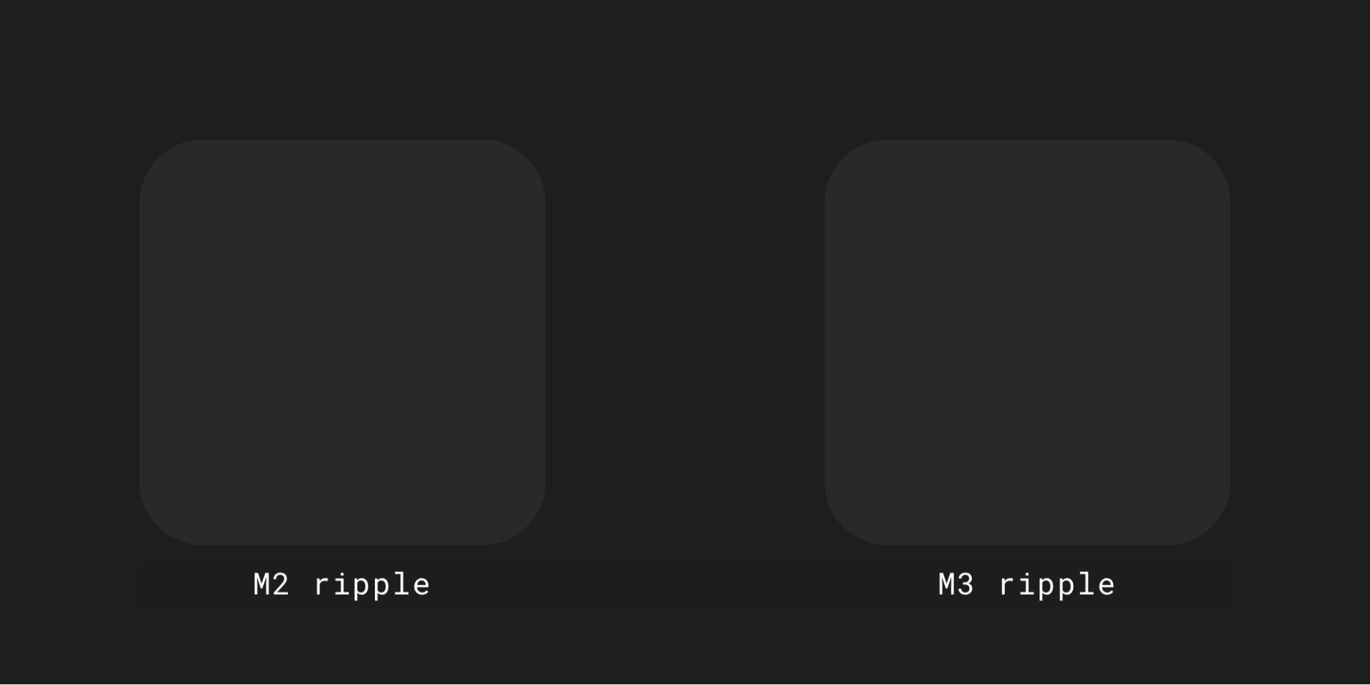
Ripple
Ripple now uses a subtle sparkle to illuminate surfaces when pressed. Compose Material Ripple uses a platform RippleDrawable under the hood on Android, so sparkle ripple is available on Android 12 and above for all Material components.
Overscroll
Overscroll now uses a stretch effect at the edge of scrolling containers.
Stretch overscroll is on by default in scrolling container composables — for
example, LazyColumn, LazyRow, and LazyVerticalGrid — in
Compose Foundation 1.1.0 and above, regardless of API level.
Accessibility
Accessibility standards built into Material components are designed to provide a foundation for inclusive product design. Understanding your product’s accessibility can enhance usability for all users, including those with low vision, blindness, hearing impairments, cognitive impairments, motor impairments, or situational disabilities (such as a broken arm).
Color accessibility
Dynamic color is designed to meet accessibility standards for color contrast. The system of tonal palettes is critical to making any color scheme accessible by default.
Material's color system provides standard tone values and measurements that can be used to meet accessible contrast ratios.
All Material components and dynamic theming already use the above color roles from a set of tonal palettes, selected to meet accessibility requirements. However, if you are customizing components, make sure to use appropriate color roles and avoid mismatch.
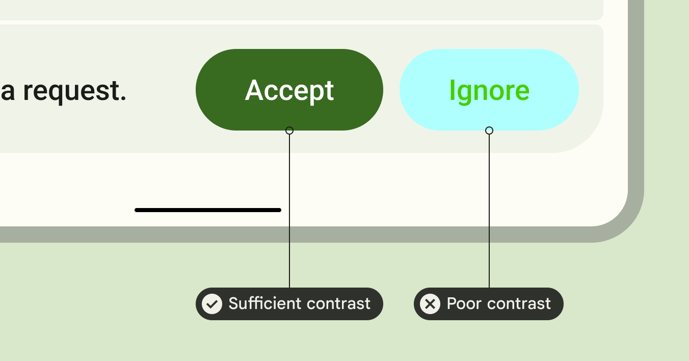
Use on-primary on top of primary, and on-primary-container on top of primary-container, and the same for other accent and neutral colors to provide accessible contrast to the user.
The use of a tertiary container on top of primary gives the user a poor contrast button:
// ✅ Button with sufficient contrast ratio Button( onClick = { }, colors = ButtonDefaults.buttonColors( containerColor = MaterialTheme.colorScheme.primary, contentColor = MaterialTheme.colorScheme.onPrimary ) ) { } // ❌ Button with poor contrast ratio Button( onClick = { }, colors = ButtonDefaults.buttonColors( containerColor = MaterialTheme.colorScheme.tertiaryContainer, contentColor = MaterialTheme.colorScheme.primaryContainer ) ) { }
Typography accessibility
The M3 type scale updates the static type ramp and values to offer a simplified but dynamic framework of size categories that scale across devices.
For example, in M3, Display Small can be assigned different values depending upon the device context, such as a phone or a tablet.
Large screens
Material provides guidance on adaptive layouts and foldables to make your apps accessible and improve the ergonomics of users holding large devices.
Material provides different kinds of navigation to help you provide better user experience for large devices.
You can learn more about Android large screen app quality guidelines and see our Reply sample for adaptive and accessible design.
Learn more
To learn more about Material Theming in Compose, check out the following resources:
Sample apps
Docs
API reference and source code
Videos
Recommended for you
- Note: link text is displayed when JavaScript is off
- Migrate from Material 2 to Material 3 in Compose
- Material Design 2 in Compose
- Custom design systems in Compose