Dialog কম্পোনেন্টটি অ্যাপের মূল কন্টেন্টের উপরের একটি লেয়ারে ডায়ালগ মেসেজ প্রদর্শন করে অথবা ব্যবহারকারীর ইনপুট অনুরোধ করে। এটি ব্যবহারকারীর মনোযোগ আকর্ষণ করার জন্য একটি বিঘ্ন সৃষ্টিকারী UI অভিজ্ঞতা তৈরি করে।
ডায়ালগ ব্যবহারের কয়েকটি ক্ষেত্র নিচে উল্লেখ করা হলো:
- ব্যবহারকারীর কোনো কাজ নিশ্চিত করা, যেমন কোনো ফাইল মুছে ফেলার সময়।
- ব্যবহারকারীর মতামত চাওয়া, যেমন কোনো করণীয় কাজের তালিকা অ্যাপে।
- ব্যবহারকারীর নির্বাচনের জন্য বিকল্পগুলির একটি তালিকা উপস্থাপন করা, যেমন প্রোফাইল তৈরির সময় দেশ বেছে নেওয়া।

সতর্কীকরণ ডায়ালগ
AlertDialog কম্পোজেবলটি ম্যাটেরিয়াল ডিজাইন থিমের ডায়ালগ তৈরির জন্য একটি সুবিধাজনক এপিআই প্রদান করে। ডায়ালগের নির্দিষ্ট উপাদানগুলো পরিচালনার জন্য AlertDialog বিশেষ প্যারামিটার রয়েছে। সেগুলোর মধ্যে নিম্নলিখিতগুলো অন্তর্ভুক্ত:
-
title: ডায়ালগের শীর্ষে প্রদর্শিত লেখা। -
text: যে লেখাটি ডায়ালগের কেন্দ্রে প্রদর্শিত হয়। -
icon: যে গ্রাফিকটি ডায়ালগের শীর্ষে প্রদর্শিত হয়। -
onDismissRequest: এই ফাংশনটি তখন কল করা হয় যখন ব্যবহারকারী ডায়ালগটি বন্ধ করে দেন, যেমন এর বাইরে ট্যাপ করার মাধ্যমে। -
dismissButton: একটি কম্পোজেবল যা ডিসমিস বাটন হিসেবে কাজ করে। -
confirmButton: একটি কম্পোজেবল যা কনফার্ম বাটন হিসেবে কাজ করে।
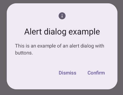
নিম্নলিখিত উদাহরণটিতে একটি অ্যালার্ট ডায়ালগে দুটি বাটন প্রয়োগ করা হয়েছে: একটি ডায়ালগটি বন্ধ করার জন্য এবং অন্যটি এর অনুরোধটি নিশ্চিত করার জন্য।
@Composable fun AlertDialogExample( onDismissRequest: () -> Unit, onConfirmation: () -> Unit, dialogTitle: String, dialogText: String, icon: ImageVector, ) { AlertDialog( icon = { Icon(icon, contentDescription = "Example Icon") }, title = { Text(text = dialogTitle) }, text = { Text(text = dialogText) }, onDismissRequest = { onDismissRequest() }, confirmButton = { TextButton( onClick = { onConfirmation() } ) { Text("Confirm") } }, dismissButton = { TextButton( onClick = { onDismissRequest() } ) { Text("Dismiss") } } ) }
এই বাস্তবায়নে একটি প্যারেন্ট কম্পোজেবল থাকে যা চাইল্ড কম্পোজেবলে আর্গুমেন্টগুলো এইভাবে প্রেরণ করে:
@Composable fun DialogExamples() { // ... val openAlertDialog = remember { mutableStateOf(false) } // ... when { // ... openAlertDialog.value -> { AlertDialogExample( onDismissRequest = { openAlertDialog.value = false }, onConfirmation = { openAlertDialog.value = false println("Confirmation registered") // Add logic here to handle confirmation. }, dialogTitle = "Alert dialog example", dialogText = "This is an example of an alert dialog with buttons.", icon = Icons.Default.Info ) } } } }
এই বাস্তবায়নটি নিম্নরূপ:
সংলাপ রচনাযোগ্য
Dialog হলো একটি মৌলিক কম্পোজেবল যা কন্টেন্টের জন্য কোনো স্টাইলিং বা পূর্বনির্ধারিত স্লট প্রদান করে না। এটি তুলনামূলকভাবে একটি সরল কন্টেইনার যা আপনার Card মতো কোনো কন্টেইনার দিয়ে পূরণ করা উচিত। নিচে একটি ডায়ালগের কিছু মূল প্যারামিটার দেওয়া হলো:
-
onDismissRequest: ব্যবহারকারী যখন ডায়ালগটি বন্ধ করে, তখন এই ল্যাম্বডাটি কল করা হয়। -
properties:DialogPropertiesএর একটি ইনস্ট্যান্স যা কাস্টমাইজেশনের জন্য কিছু অতিরিক্ত সুযোগ প্রদান করে।
মৌলিক উদাহরণ
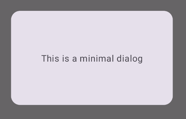
নিম্নলিখিত উদাহরণটি Dialog composable-এর একটি প্রাথমিক বাস্তবায়ন। লক্ষ্য করুন যে এটি দ্বিতীয় কন্টেইনার হিসেবে একটি Card ব্যবহার করে। Card ছাড়া, Text কম্পোনেন্টটি অ্যাপের মূল কন্টেন্টের উপরে একাই প্রদর্শিত হতো।
@Composable fun MinimalDialog(onDismissRequest: () -> Unit) { Dialog(onDismissRequest = { onDismissRequest() }) { Card( modifier = Modifier .fillMaxWidth() .height(200.dp) .padding(16.dp), shape = RoundedCornerShape(16.dp), ) { Text( text = "This is a minimal dialog", modifier = Modifier .fillMaxSize() .wrapContentSize(Alignment.Center), textAlign = TextAlign.Center, ) } } }
এই বাস্তবায়নটি নিম্নরূপ। লক্ষ্য করুন যে, যখন ডায়ালগটি খোলা থাকে, তখন এর নীচের মূল অ্যাপের বিষয়বস্তু অন্ধকারাচ্ছন্ন এবং ধূসর হয়ে যায়:
উন্নত উদাহরণ
নিম্নলিখিতটি হলো Dialog composable-এর একটি আরও উন্নত বাস্তবায়ন। এক্ষেত্রে, কম্পোনেন্টটি উপরের AlertDialog উদাহরণের মতো একটি ইন্টারফেস ম্যানুয়ালি প্রয়োগ করে।
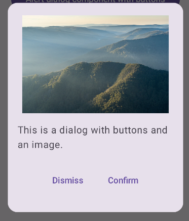
@Composable fun DialogWithImage( onDismissRequest: () -> Unit, onConfirmation: () -> Unit, painter: Painter, imageDescription: String, ) { Dialog(onDismissRequest = { onDismissRequest() }) { // Draw a rectangle shape with rounded corners inside the dialog Card( modifier = Modifier .fillMaxWidth() .height(375.dp) .padding(16.dp), shape = RoundedCornerShape(16.dp), ) { Column( modifier = Modifier .fillMaxSize(), verticalArrangement = Arrangement.Center, horizontalAlignment = Alignment.CenterHorizontally, ) { Image( painter = painter, contentDescription = imageDescription, contentScale = ContentScale.Fit, modifier = Modifier .height(160.dp) ) Text( text = "This is a dialog with buttons and an image.", modifier = Modifier.padding(16.dp), ) Row( modifier = Modifier .fillMaxWidth(), horizontalArrangement = Arrangement.Center, ) { TextButton( onClick = { onDismissRequest() }, modifier = Modifier.padding(8.dp), ) { Text("Dismiss") } TextButton( onClick = { onConfirmation() }, modifier = Modifier.padding(8.dp), ) { Text("Confirm") } } } } } }
এই বাস্তবায়নটি নিম্নরূপ: