
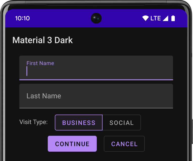
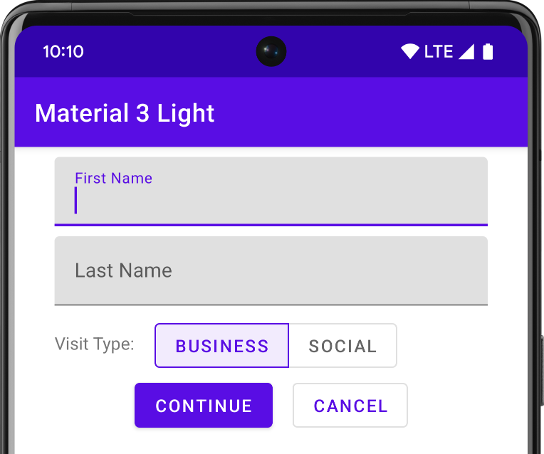
Material Design is a comprehensive guide for visual, motion, and interaction design across platforms and devices. To use Material Design in your Android apps, follow the guidelines defined in the Material Design specification. If your app uses Jetpack Compose, you can use the Compose Material 3 library. If your app uses views, you can use the Android Material Components library.
Android provides the following features to help you build Material Design apps:
- A Material Design app theme to style all your UI widgets
- Widgets for complex views, such as lists and cards
- APIs for custom shadows and animations
Material theme and widgets
To take advantage of the Material features, such as styling for standard UI widgets, and to streamline your app's style definition, apply a Material-based theme to your app.
If you use Android Studio to create your Android project, it applies a Material theme by default. To learn how to update your project's theme, see Styles and themes.
To provide your users a familiar experience, use Material's most common UX patterns:
- Promote your UI's main action with a floating action button (FAB).
- Show your brand, navigation, search, and other actions using the app bar.
- Show and hide your app's navigation with the navigation drawer.
- Choose from the many other Material Components for your app layout and navigation, such as collapsing toolbars, tabs, a bottom nav bar, and more. To see them all, see the Material Components for Android catalog.
Whenever possible, use predefined Material Icons. For example, for the navigation "menu" button for your navigation drawer, use the standard "hamburger" icon. See Material Design Icons for a list of available icons. You can also import SVG icons from the Material Icon library with Android Studio's Vector Asset Studio.
Elevation shadows and cards
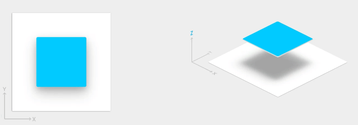
In addition to the X and Y properties, views in Android have a Z property. This property represents the elevation of a view, which determines the following:
- The size of its shadow: views with higher Z values cast bigger shadows.
- The drawing order: views with higher Z values appear on top of other views.
You can apply elevation to a card-based layout, which helps you display important pieces of
information inside cards that provide a Material look. You can use the
CardView widget to
create cards with a default elevation. For more information, see
Create a card-based layout.
For information about adding elevation to other views, see Create shadows and clip views.
Animations
Animation APIs let you create custom animations for touch feedback in UI controls, changes in view state, and activity transitions.
These APIs let you:
- Respond to touch events in your views with touch feedback animations.
- Hide and show views with circular reveal animations.
- Switch between activities with custom activity transition animations.
- Create more natural animations with curved motion.
- Animate changes in one or more view properties with view state change animations.
- Show animations in state list drawables between view state changes.
Touch feedback animations are built into several standard views, such as buttons. The animation APIs let you customize these animations and add them to your custom views.
For more information, see Introduction to animations.
Drawables
These capabilities for drawables help you implement Material Design apps:
- Vector drawables are scalable without losing definition and are perfect for single-color in-app icons. Learn more about vector drawables.
- Drawable tinting lets you define bitmaps as an alpha mask and tint them with a color at runtime. See how to add tint to drawables.
- Color extraction lets you automatically extract prominent colors from a bitmap image. See how to select colors with the Palette API.