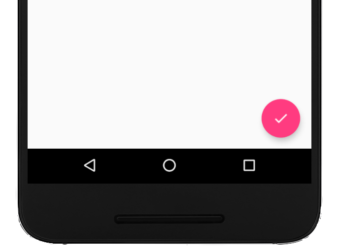
A floating action button (FAB) is a circular button that triggers the primary action in your app's UI. This document shows how to add a FAB to your layout, customize some of its appearance, and respond to button taps.
To learn more about how to design a FAB for your app according to the Material Design Guidelines, see Material Design FAB .

Add the floating action button to your layout
The following code shows how the
FloatingActionButton
appears in your layout file:
<com.google.android.material.floatingactionbutton.FloatingActionButton
        android:id="@+id/fab"
        android:layout_width="wrap_content"
        android:layout_height="wrap_content"
        android:layout_gravity="end|bottom"
        android:src="@drawable/ic_my_icon"
        android:contentDescription="@string/submit"
        android:layout_margin="16dp" />
By default, a FAB is colored by the colorAccent attribute, which you can
customize with the theme's color
palette.
You can configure other FAB properties using XML attributes or corresponding methods, such as the following:
- The size of the FAB, using the
app:fabSizeattribute or thesetSize()method - The ripple color of the FAB, using the
app:rippleColorattribute or thesetRippleColor()method - The FAB icon, using the
android:srcattribute or thesetImageDrawable()method
Respond to button taps
You can then apply an
View.OnClickListener to
handle FAB taps. For example, the following code displays a
Snackbar when
the user taps the FAB:
Kotlin
val fab: View = findViewById(R.id.fab)
fab.setOnClickListener { view ->
    Snackbar.make(view, "Here's a Snackbar", Snackbar.LENGTH_LONG)
            .setAction("Action", null)
            .show()
}
Java
FloatingActionButton fab = findViewById(R.id.fab);
fab.setOnClickListener(new View.OnClickListener() {
    @Override
    public void onClick(View view) {
        Snackbar.make(view, "Here's a Snackbar", Snackbar.LENGTH_LONG)
                .setAction("Action", null).show();
    }
});
For more information about the capabilities of the FAB, see the API reference
for the
FloatingActionButton.

