
隨著摺疊式裝置問世,開發人員有機會以創新方法開發應用程式:一台裝置上同時有大小兩個螢幕,可以提供彼此互補但各自獨立的互動體驗;桌面型態或書本型態等摺疊功能,可以帶來創意十足的版面配置,以及跳脫傳統的使用者介面。
回應式/自動調整設計
如果您想打造適用於摺疊式裝置的應用程式,不妨從回應式設計著手。回應式版面配置可讓應用程式在各種螢幕尺寸上,呈現良好的視覺效果並妥善運作。使用 BoxWithConstraints 可組合函式實作回應式設計。
但為了盡可能支援摺疊式裝置的摺疊和展開螢幕,版面配置必須自動調整。某些裝置在摺疊和展開前後有非常顯著的螢幕大小和顯示比例差異,這種情況下,回應式版面配置也無法按照這兩種螢幕調整大小。自動調整式設計可針對不同螢幕大小和設定,建立最佳化的替代版面配置。不論是在摺疊式裝置對摺前後、螢幕方向為直向/橫向,還是處於桌面型態或書本型態,自動調整的版面配置都可以提供最佳化的使用者體驗。
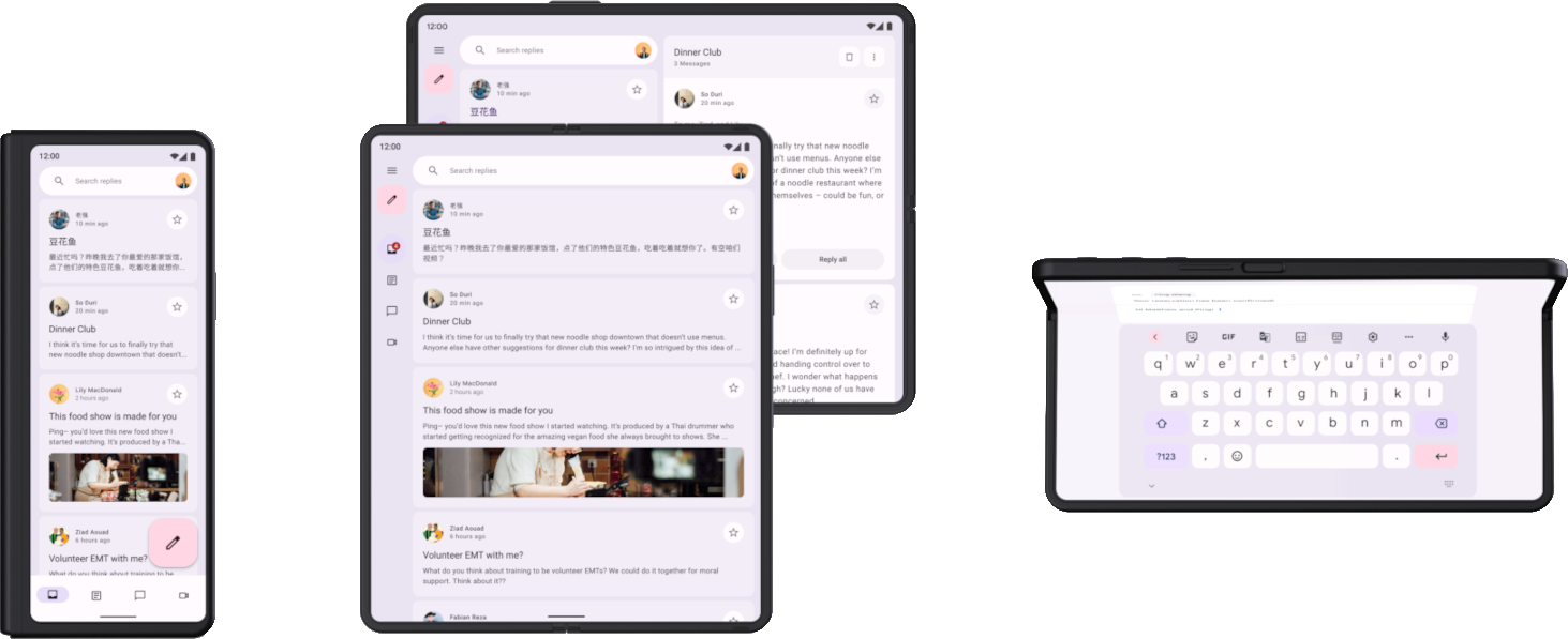
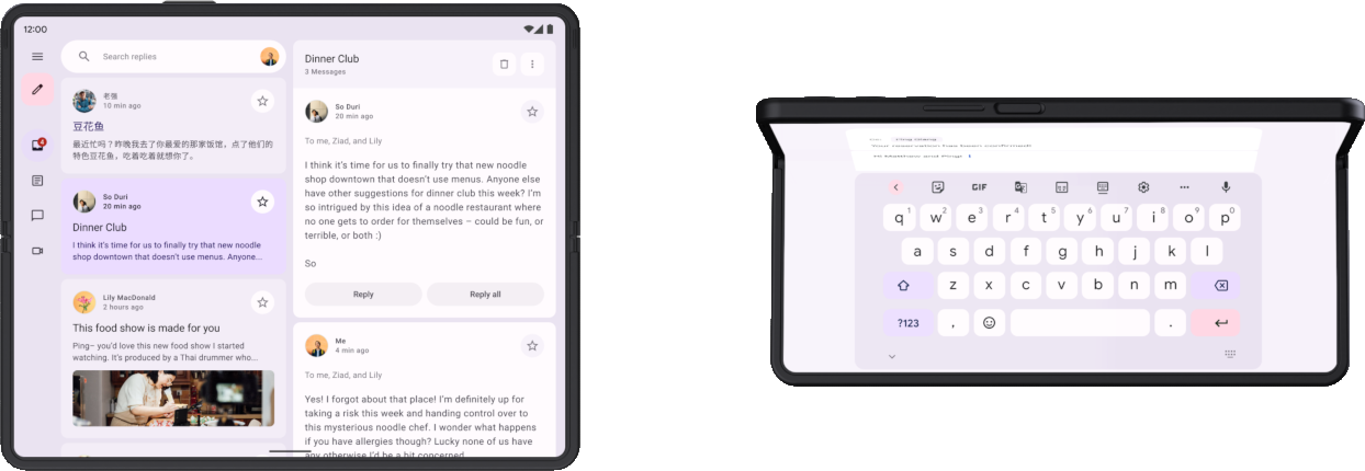
舉例來說,如果一台有大型螢幕的摺疊式裝置在展開後採用橫向螢幕方向 (如平板電腦),那麼採用兩個窗格的版面配置搭配導覽邊欄,便可徹底發揮寬螢幕的優勢。摺疊後的裝置則與標準手機相似,可以採用單欄版面配置搭配底部導覽列,不僅簡單效果又好。由於版面配置各自獨立,因此您可以依據具體用途分別將版面配置最佳化。
摺疊式裝置的摺疊方式有很多種,如往內摺疊 (將螢幕往裝置內部摺疊) 或往外摺疊 (用螢幕包住裝置)。有了回應式/自動調整設計,應用程式就能支援各種摺疊式裝置的板型規格。
如要進一步瞭解摺疊式裝置的回應式/自動調整設計,請參閱以下資源:
摺疊狀態與型態
折疊式裝置的折疊位置會將螢幕分割為兩個區塊。折疊位置可能是螢幕的彈性區域,如果是雙螢幕裝置,則是從轉軸分成兩個螢幕。
折疊位置具有維度,而且能夠使用 occlusionType 定義折疊後是否會遮蔽部分螢幕。在雙螢幕裝置上,occlusionType 為 FULL,因此即使應用程式可能橫跨顯示在兩個螢幕上,在摺疊位置 (轉軸) 區域依然無法看到任何內容。
摺疊式裝置可能處於各種不同的折疊狀態,如 FLAT (完全展開) 或 HALF_OPENED (介於完整展開和完全關閉之間)。
如果裝置處於 HALF_OPENED 狀態,則根據摺疊方向,該裝置可能有兩種型態:桌面型態 (水平摺疊) 和書本型態 (垂直摺疊)。
雖然桌面和書本型態可能提供新的版面配置,但 HALF_OPENED
的裝置狀態也代表著某些限制。舉例來說,使用者可能難以操作摺疊位置附近的 UI 控制項,而位於摺疊處的文字也可能非常難以閱讀 (如果 occlusionType 為 FULL,則完全無法閱讀)。
因此,設計版面配置時,請確保不論裝置處於何種狀態,使用者都要能夠存取 UI 元素。您可以調整對話方塊和彈出式選單的位置,以免和摺疊位置重疊。 當裝置部分摺起時,務必要讓使用者有辦法查看重要內容。 此外,當裝置處於半開式狀態時,請將內容分割成兩個區域:如果是桌面型態就是上下兩塊,書本型態則是左右兩塊。
如要進一步瞭解摺疊位置和摺疊式裝置型態,請參閱「讓應用程式適用摺疊式裝置」一文。
應用程式連續性
裝置在折疊或展開時,應用程式會在內容從一個螢幕移動到另一個螢幕時停止運作,然後重新啟動。為了維持使用者的連續性,應用程式在針對摺疊或展開的螢幕重新建立應用程式版面配置時,應該要儲存應用程式的狀態。舉例來說,應用程式應該:
- 保留輸入欄位內輸入的文字
- 還原鍵盤狀態
- 還原捲動欄位的捲軸位置
- 接續應用程式停止運作時的進度播放媒體
摺疊式裝置的不同螢幕版面配置也應彼此互補。舉例來說,如果摺疊後的螢幕會顯示某網路商店產品的圖片和說明,那麼展開後的螢幕就應該維持連續性,顯示同樣的圖片和說明,但同時也提供產品規格或評論等補充內容。
如要進一步瞭解如何管理應用程式狀態和連續性,請參閱「儲存 UI 狀態」和「處理設定變更」。
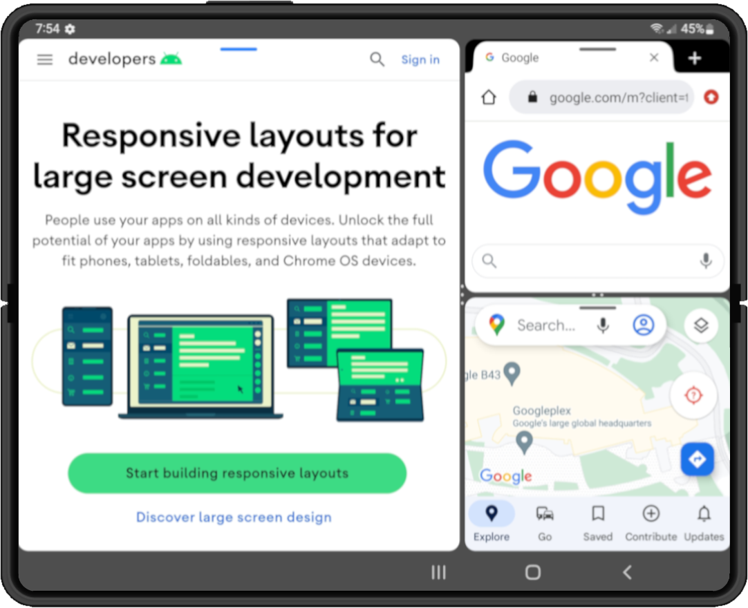
多工處理
有大型螢幕的摺疊式裝置會擁有平板電腦大小的螢幕,非常適合使用多視窗模式進行多工處理。折疊式裝置支援分割畫面模式,某些裝置更支援電腦分割視窗模式,在此模式下,應用程式會裝在可以移動並調整大小的視窗內,如同桌上型電腦的視窗系統。
|
|
|
|
|
Android 12 (API 級別 31) 以上版本會預設使用多視窗模式:在大型螢幕上,無論應用程式設定為何,所有應用程式都會以多視窗模式執行。而在 Android 12 到 7.0 (API 級別 24) 之間的版本中,您必須將應用程式設為可調整大小,才能支援多視窗模式。
如要進一步瞭解多視窗模式的多工處理功能,請參閱「支援多視窗模式」。
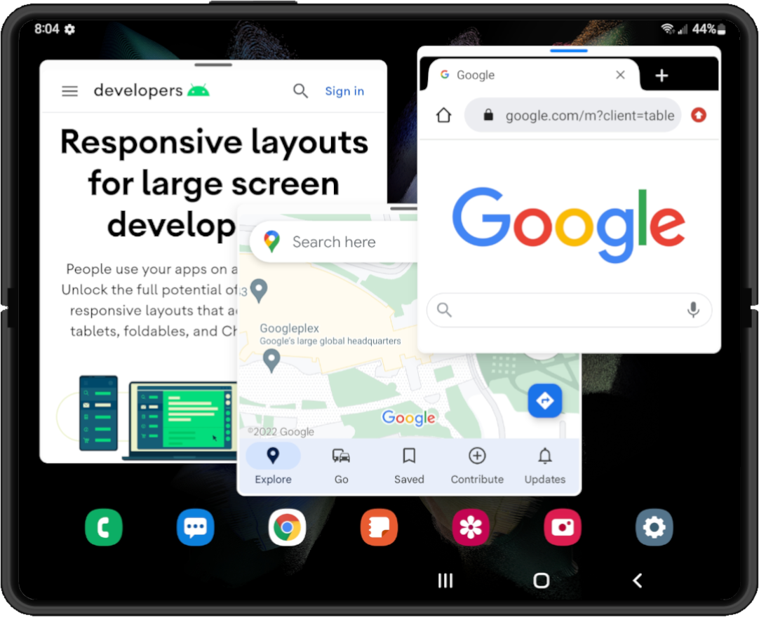
拖曳
大型螢幕的摺疊式裝置具有充足的螢幕空間,可供使用者以拖放方式進行互動。利用摺疊式裝置上的多視窗模式,使用者可在應用程式之間拖曳項目。
拖曳互動功能可以提供有效率且互動良好的使用者體驗。利用 Android 的拖曳架構,為應用程式加入拖曳功能。詳情請參閱「啟用拖曳架構」。