
Wenn du ein View-basiertes Layout verwendest, gibt es drei Hauptmöglichkeiten zum Implementieren von Ein-/Aus-Schaltflächen. Wir empfehlen die Verwendung der Komponente SwitchMaterial aus der Bibliothek Materialkomponenten:
<androidx.constraintlayout.widget.ConstraintLayout xmlns:android="http://schemas.android.com/apk/res/android"
    xmlns:app="http://schemas.android.com/apk/res-auto"
    android:layout_width="match_parent"
    android:layout_height="match_parent"
    android:padding="16dp">

    <com.google.android.material.switchmaterial.SwitchMaterial
        android:id="@+id/material_switch"
        android:layout_width="wrap_content"
        android:layout_height="wrap_content"
        android:text="@string/material_switch"
        app:layout_constraintEnd_toEndOf="parent"
        app:layout_constraintStart_toStartOf="parent"
        app:layout_constraintTop_toTopOf="parent" />

</androidx.constraintlayout.widget.ConstraintLayout>
Legacy-Anwendungen verwenden möglicherweise weiterhin die ältere AppCompat-Komponente SwitchCompat, wie im folgenden Beispiel gezeigt:
<androidx.constraintlayout.widget.ConstraintLayout xmlns:android="http://schemas.android.com/apk/res/android"
    xmlns:app="http://schemas.android.com/apk/res-auto"
    android:layout_width="match_parent"
    android:layout_height="match_parent"
    android:padding="16dp">

    <androidx.appcompat.widget.SwitchCompat
        android:id="@+id/switchcompat"
        android:layout_width="wrap_content"
        android:layout_height="wrap_content"
        android:text="@string/switchcompat"
        app:layout_constraintEnd_toEndOf="parent"
        app:layout_constraintStart_toStartOf="parent"
        app:layout_constraintTop_toTopOf="parent" />

</androidx.constraintlayout.widget.ConstraintLayout>
Das folgende Beispiel zeigt AppCompatToggleButton, eine weitere ältere Komponente mit einer deutlich anderen Benutzeroberfläche:
<androidx.constraintlayout.widget.ConstraintLayout xmlns:android="http://schemas.android.com/apk/res/android"
    xmlns:app="http://schemas.android.com/apk/res-auto"
    android:layout_width="match_parent"
    android:layout_height="match_parent"
    android:padding="16dp">

    <TextView
        android:id="@+id/toggle_button_label"
        android:layout_width="wrap_content"
        android:layout_height="wrap_content"
        app:layout_constraintStart_toStartOf="parent"
        app:layout_constraintEnd_toStartOf="@id/toggle"
        app:layout_constraintHorizontal_chainStyle="packed"
        app:layout_constraintBaseline_toBaselineOf="@id/toggle"
        android:text="@string/toggle_button" />

    <androidx.appcompat.widget.AppCompatToggleButton
        android:id="@+id/toggle"
        android:layout_width="wrap_content"
        android:layout_height="wrap_content"
        app:layout_constraintEnd_toEndOf="parent"
        app:layout_constraintStart_toEndOf="@id/toggle_button_label"
        app:layout_constraintTop_toTopOf="parent"
        app:layout_constraintBottom_toBottomOf="parent"/>

</androidx.constraintlayout.widget.ConstraintLayout>
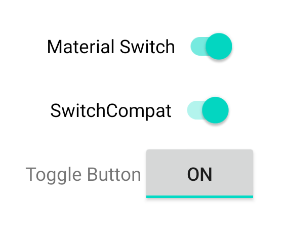
Diese drei Komponenten verhalten sich gleich, sehen aber unterschiedlich aus. Die Unterschiede zwischen SwitchMaterial und SwitchCompat sind subtil, aber AppCompatToggleButton unterscheidet sich deutlich:
Statusänderungen verarbeiten
SwitchMaterial, SwitchCompat und AppCompatToggleButton sind abgeleitete Klassen von CompoundButton und bieten ihnen daher einen gemeinsamen Mechanismus für die Verarbeitung geprüfter Statusänderungen. Dazu implementierst du eine Instanz von CompoundButton.OnCheckedChangeListener und fügst sie der Schaltfläche hinzu, wie im folgenden Beispiel gezeigt:
Kotlin
class MainActivity : AppCompatActivity() {
    override fun onCreate(savedInstanceState: Bundle?) {
        super.onCreate(savedInstanceState)

        val binding: SwitchLayoutBinding = SwitchLayoutBinding.inflate(layoutInflater)
        setContentView(binding.root)

        binding.materialSwitch.setOnCheckedChangeListener { _, isChecked ->
            if (isChecked) {
                // The switch is checked.
            } else {
                // The switch isn't checked.
            }
        }
    }
}
Java
public class MainActivity extends AppCompatActivity {

    @Override
    protected void onCreate(Bundle savedInstanceState) {
        super.onCreate(savedInstanceState);

        SwitchLayoutBinding binding = SwitchLayoutBinding.inflate(getLayoutInflater());
        setContentView(binding.getRoot());

        binding.materialSwitch.setOnCheckedChangeListener((buttonView, isChecked) -> {
            if (isChecked) {
                // The switch is checked.
            } else {
                // The switch isn't checked.
            }
        });
    }
}
CompoundButton.OnCheckedChangeListener ist eine einzelne abstrakte Methodenschnittstelle (oder SAM-Schnittstelle). Sie können sie also als Lambda implementieren. Die Lambda-Funktion wird immer dann aufgerufen, wenn sich der Status ändert. Der Wert des booleschen isChecked-Werts, der an die Lambda-Funktion übergeben wird, gibt den neuen Status an.