
Styles and themes on Android let you separate the details of your app design from the UI structure and behavior, similar to stylesheets in web design.
A style is a collection of attributes that specifies the appearance for a single
View. A style can specify attributes
such as font color, font size, background color, and much more.
A theme is a collection of attributes that's applied to an entire app, activity, or view hierarchy—not just an individual view. When you apply a theme, every view in the app or activity applies each of the theme's attributes that it supports. Themes can also apply styles to non-view elements, such as the status bar and window background.
Styles and themes are declared in a
style resource file in
res/values/, usually named styles.xml.
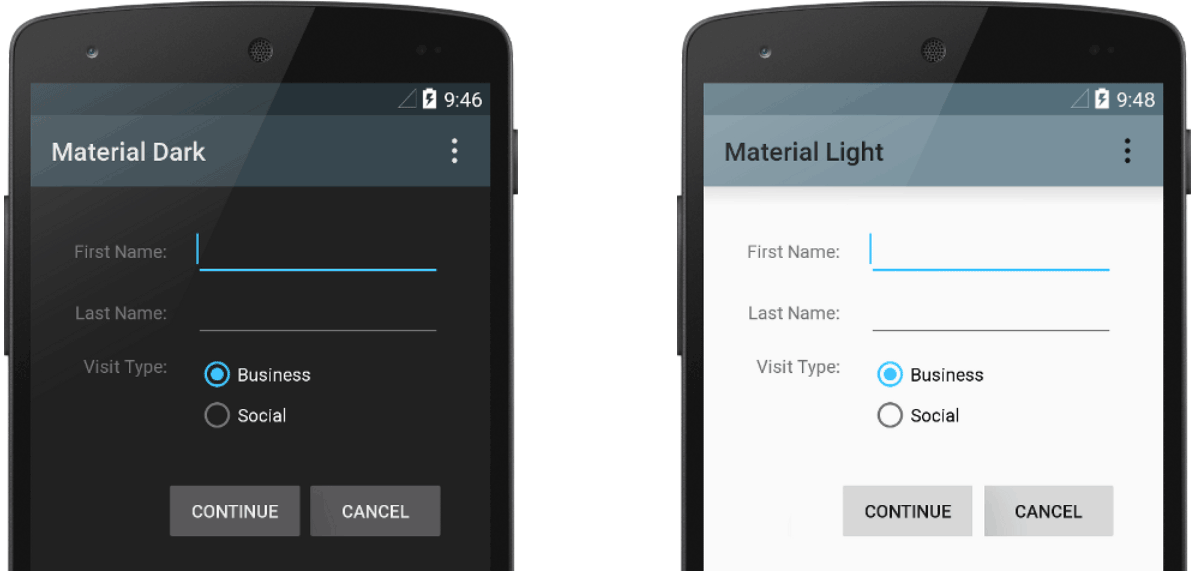
Figure 1. Two themes applied to the same activity:
Theme.AppCompat (left) and Theme.AppCompat.Light (right).
Themes versus styles
Themes and styles have many similarities, but they are used for different purposes. Themes and styles have the same basic structure—a key-value pair that maps attributes to resources.
A style specifies attributes for a particular type of view. For example, one style might specify a button's attributes. Every attribute you specify in a style is an attribute you can set in the layout file. Extracting all the attributes to a style makes it easy to use and maintain them across multiple widgets.
A theme defines a collection of named resources that can be referenced by styles, layouts,
widgets, and so on. Themes assign semantic names, like colorPrimary, to Android
resources.
Styles and themes are meant to work together. For example, you might have a style that specifies
that one part of a button is colorPrimary, and another part is
colorSecondary. The actual definitions of those colors are provided in the theme. When
the device goes into night mode, your app can switch from its "light" theme to its "dark" theme,
changing the values for all those resource names. You don't need to change the styles, since the
styles are using the semantic names and not specific color definitions.
For more information about how themes and styles work together, see the blog post Android styling: themes vs styles.
Create and apply a style
To create a new style, open your project's res/values/styles.xml file. For
each style you want to create, follow these steps:
- Add a
<style>element with a name that uniquely identifies the style. - Add an
<item>element for each style attribute you want to define. Thenamein each item specifies an attribute you otherwise use as an XML attribute in your layout. The value in the<item>element is the value for that attribute.
For example, suppose you define the following style:
<?xml version="1.0" encoding="utf-8"?>
<resources>
    <style name="GreenText" parent="TextAppearance.AppCompat">
        <item name="android:textColor">#00FF00</item>
    </style>
</resources>
You can apply the style to a view as follows:
<TextView
    style="@style/GreenText"
    ... />
Each attribute specified in the style is applied to that view if the view accepts it. The view ignores any attributes that it doesn't accept.
However, instead of applying a style to individual views, you typically apply styles as a theme for your entire app, activity, or collection of views, as described in another section of this guide.
Extend and customize a style
When creating your own styles, always extend an existing style from the framework or Support
Library so that you maintain compatibility with platform UI styles. To extend a style, specify the
style you want to extend with the parent attribute. You can then override the inherited
style attributes and add new ones.
For example, you can inherit the Android platform's default text appearance and modify it as follows:
<style name="GreenText" parent="@android:style/TextAppearance">
    <item name="android:textColor">#00FF00</item>
</style>
However, always inherit your core app styles from the Android Support Library. The styles in the
Support Library provide compatibility by optimizing each style for the UI attributes available in
each version. The Support Library styles often have a name similar to the style from the platform,
but with AppCompat included.
To inherit styles from a library or your own project, declare the parent style name
without the @android:style/ part shown in the preceding example. For example,
the following example inherits text appearance styles from the Support Library:
<style name="GreenText" parent="TextAppearance.AppCompat">
    <item name="android:textColor">#00FF00</item>
</style>
You can also inherit styles—except those from the platform—by extending a style's
name with a dot notation, instead of using the parent attribute. That is, prefix the
name of your style with the name of the style you want to inherit, separated by a period. You
typically only do this when extending your own styles, not styles from other libraries. For example,
the following style inherits all styles from the GreenText in the preceding example
and then increases the text size:
<style name="GreenText.Large">
    <item name="android:textSize">22dp</item>
</style>
You can continue inheriting styles like this as many times as you want by chaining on more names.
To find which attributes you can declare with an <item> tag, refer to the "XML
attributes" table in the various class references. All views support
XML attributes from the base
View class, and many views add their own special attributes. For example, the
TextView XML attributes
include the
android:inputType
attribute that you can apply to a text view that receives input, such as an
EditText widget.
Apply a style as a theme
You can create a theme the same way you create styles. The difference is how you apply it:
instead of applying a style with the style attribute on a view, you apply a theme with
the android:theme attribute on either the <application> tag or an
<activity> tag in the AndroidManifest.xml file.
For example, here's how to apply the Android Support Library's Material Design "dark" theme to the whole app:
<manifest ... >
    <application android:theme="@style/Theme.AppCompat" ... >
    </application>
</manifest>
And here's how to apply the "light" theme to just one activity:
<manifest ... >
    <application ... >
        <activity android:theme="@style/Theme.AppCompat.Light" ... >
        </activity>
    </application>
</manifest>
Every view in the app or activity applies the styles that it supports from those defined in the given theme. If a view supports only some of the attributes declared in the style, then it applies only those attributes and ignores the ones it doesn't support.
Beginning with Android 5.0 (API level 21) and Android Support Library v22.1, you can also specify
the android:theme attribute to a view in your layout file. This modifies the theme for
that view and any child views, which is useful for altering theme color palettes in a specific
portion of your interface.
The previous examples show how to apply a theme such as Theme.AppCompat that's
supplied by the Android Support Library. However, you typically want to customize the theme to fit
your app's brand. The best way to do so is to extend these styles from the Support Library and
override some of the attributes, as described in the following section.
Style hierarchy
Android provides a variety of ways to set attributes throughout your Android app. For example, you can set attributes directly in a layout, apply a style to a view, apply a theme to a layout, and even set attributes programmatically.
When choosing how to style your app, be mindful of Android's style hierarchy. In general, use themes and styles as much as possible for consistency. If you specify the same attributes in multiple places, the following list determines which attributes are ultimately applied. The list is ordered from highest precedence to lowest.
- Applying character- or paragraph-level styling using text spans to
TextView-derived classes. - Applying attributes programmatically.
- Applying individual attributes directly to a view.
- Applying a style to a view.
- Default styling.
- Applying a theme to a collection of views, an activity, or your entire app.
- Applying certain view-specific styling, such as setting a
TextAppearanceon aTextView.
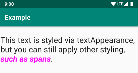
Figure 2. Styling from a span overrides styling from a
textAppearance.
TextAppearance
One limitation with styles is that you can apply only one style to a View. In a
TextView, however, you can also specify a
TextAppearance attribute
that functions similarly to a style, as shown in the following example:
<TextView
    ...
    android:textAppearance="@android:style/TextAppearance.Material.Headline"
    android:text="This text is styled via textAppearance!" />
TextAppearance lets you define text-specific styling while leaving the style of a
View available for other uses. Note, however, that if you define any text attributes
directly on the View or in a style, those values override the
TextAppearance values.
TextAppearance supports a subset of styling attributes that TextView
offers. For the full attribute list, see
TextAppearance.
Some common TextView attributes not included are
lineHeight[Multiplier|Extra],
lines,
breakStrategy, and
hyphenationFrequency.
TextAppearance works at the character level and not the paragraph level, so
attributes that affect the entire layout aren't supported.
Customize the default theme
When you create a project with Android Studio, it applies a Material Design theme to your app by
default, as defined in your project's styles.xml file. This AppTheme style
extends a theme from the Support Library and includes overrides for color attributes that are used
by key UI elements, such as the app bar and the
floating action button, if used. So, you
can quickly customize your app's color design by updating the provided colors.
For example, your styles.xml file looks similar to this:
<style name="AppTheme" parent="Theme.AppCompat.Light.DarkActionBar">
    <!-- Customize your theme here. -->
    <item name="colorPrimary">@color/colorPrimary</item>
    <item name="colorPrimaryDark">@color/colorPrimaryDark</item>
    <item name="colorAccent">@color/colorAccent</item>
</style>
The style values are actually references to other
color resources, defined in the
project's res/values/colors.xml file. That's the file you edit to change the colors.
See the
Material Design Color Overview
to improve the user experience with dynamic color and additional custom colors.
Once you know your colors, update the values in res/values/colors.xml:
<?xml version="1.0" encoding="utf-8"?>
<resources>
    <!--   Color for the app bar and other primary UI elements. -->
    <color name="colorPrimary">#3F51B5</color>

    <!--   A darker variant of the primary color, used for
           the status bar (on Android 5.0+) and contextual app bars. -->
    <color name="colorPrimaryDark">#303F9F</color>

    <!--   a secondary color for controls like checkboxes and text fields. -->
    <color name="colorAccent">#FF4081</color>
</resources>
You can then override whatever other styles you want. For example, you can change the activity background color as follows:
<style name="AppTheme" parent="Theme.AppCompat.Light.DarkActionBar">
    ...
    <item name="android:windowBackground">@color/activityBackground</item>
</style>
For a list of attributes you can use in your theme, see the table of attributes at
R.styleable.Theme. When adding
styles for the views in your layout, you can also find attributes by looking at the "XML attributes"
table in the view class references. For example, all views support
XML attributes from the base View
class.
Most attributes are applied to specific types of views, and some apply to all views. However,
some theme attributes listed at
R.styleable.Theme apply to the
activity window, not the views in the layout. For example, windowBackground changes the
window background and windowEnterTransition defines a transition animation to use when
the activity starts. For more details, see Start
an activity using an animation.
The Android Support Library also provides other attributes you can use to customize your theme
extended from Theme.AppCompat, such as the colorPrimary attribute shown in
the preceding example. These are best viewed in the
library's attrs.xml file.
There are also different themes available from the Support Library that you might want to extend
instead of the ones shown in the preceding example. The best place to see the available themes is
the
library's themes.xml file.
Add version-specific styles
If a new version of Android adds theme attributes you want to use, you can add them to your theme
while still being compatible with old versions. All you need is another styles.xml file
saved in a values directory that includes the
resource version
qualifier:
res/values/styles.xml        # themes for all versions
res/values-v21/styles.xml    # themes for API level 21+ only
Because the styles in the values/styles.xml file are available for all versions,
your themes in values-v21/styles.xml can inherit them. This means that you can avoid
duplicating styles by beginning with a "base" theme and then extending it in your version-specific
styles.
For example, to declare window transitions for Android 5.0 (API level 21) and higher, you need
to use new attributes. So, your base theme in res/values/styles.xml can look like
this:
<resources>
    <!-- Base set of styles that apply to all versions. -->
    <style name="BaseAppTheme" parent="Theme.AppCompat.Light.DarkActionBar">
        <item name="colorPrimary">@color/primaryColor</item>
        <item name="colorPrimaryDark">@color/primaryTextColor</item>
        <item name="colorAccent">@color/secondaryColor</item>
    </style>

    <!-- Declare the theme name that's actually applied in the manifest file. -->
    <style name="AppTheme" parent="BaseAppTheme" />
</resources>
Then, add the version-specific styles in res/values-v21/styles.xml, as follows:
<resources>
    <!-- extend the base theme to add styles available only with API level 21+ -->
    <style name="AppTheme" parent="BaseAppTheme">
        <item name="android:windowActivityTransitions">true</item>
        <item name="android:windowEnterTransition">@android:transition/slide_right</item>
        <item name="android:windowExitTransition">@android:transition/slide_left</item>
    </style>
</resources>
Now you can apply AppTheme in your manifest file, and the system selects the styles
available for each system version.
For more information about using alternative resources for different devices, see Providing alternative resources.
Customize widget styles
Every widget in the framework and Support Library has a default style. For example, when you
style your app using a theme from the Support Library, an instance of
Button is styled using the
Widget.AppCompat.Button style. If you want to apply a different widget style to a
button, you can do so with the style attribute in your layout file. For example, the
following applies the library's borderless button style:
<Button
    style="@style/Widget.AppCompat.Button.Borderless"
    ... />
If you want to apply this style to all buttons, you can declare it in your theme's
buttonStyle as follows:
<style name="AppTheme" parent="Theme.AppCompat.Light.DarkActionBar">
    <item name="buttonStyle">@style/Widget.AppCompat.Button.Borderless</item>
    ...
</style>
You can also extend widget styles, just like extending any other style, and then apply your custom widget style in your layout or theme.
Additional resources
To learn more about themes and styles, see the following additional resources:
Blog posts
- Android styling: themes vs styles
- Android styling: common theme attributes
- Android styling: prefer theme attributes