
Large unfolded displays and unique folded states enable new user experiences on foldable devices. To make your app fold aware, use the Jetpack WindowManager library, which provides an API surface for foldable device window features such as folds and hinges. When your app is fold aware, it can adapt its layout to avoid placing important content in the area of folds or hinges and use folds and hinges as natural separators.
Understanding whether a device supports configurations such as tabletop or book posture can guide decisions about supporting different layouts or providing specific features.
Window information
The WindowInfoTracker interface in Jetpack WindowManager exposes window
layout information. The interface's windowLayoutInfo() method returns a
stream of WindowLayoutInfo data that informs your app about a foldable
device's fold state. The WindowInfoTracker#getOrCreate() method creates an
instance of WindowInfoTracker.
WindowManager provides support for collecting WindowLayoutInfo data using
Kotlin flows and Java callbacks.
Kotlin flows
To start and stop WindowLayoutInfo data collection, you can use a restartable
lifecycle-aware coroutine in which the repeatOnLifecycle code block is
executed when the lifecycle is at least STARTED and is stopped when the
lifecycle is STOPPED. Execution of the code block is automatically restarted
when the lifecycle is STARTED again. In the following example, the code block
collects and uses WindowLayoutInfo data:
class DisplayFeaturesActivity : AppCompatActivity() {

    private lateinit var binding: ActivityDisplayFeaturesBinding

    override fun onCreate(savedInstanceState: Bundle?) {
        super.onCreate(savedInstanceState)

        binding = ActivityDisplayFeaturesBinding.inflate(layoutInflater)
        setContentView(binding.root)

        lifecycleScope.launch(Dispatchers.Main) {
            lifecycle.repeatOnLifecycle(Lifecycle.State.STARTED) {
                WindowInfoTracker.getOrCreate(this@DisplayFeaturesActivity)
                    .windowLayoutInfo(this@DisplayFeaturesActivity)
                    .collect { newLayoutInfo ->
                        // Use newLayoutInfo to update the layout.
                    }
            }
        }
    }
}
Java callbacks
The callback compatibility layer included in the
androidx.window:window-java dependency enables you to collect
WindowLayoutInfo updates without using a Kotlin flow. The artifact includes
the WindowInfoTrackerCallbackAdapter class, which adapts a
WindowInfoTracker to support registering (and unregistering) callbacks to
receive WindowLayoutInfo updates, for example:
public class SplitLayoutActivity extends AppCompatActivity {

    private WindowInfoTrackerCallbackAdapter windowInfoTracker;
    private ActivitySplitLayoutBinding binding;
    private final LayoutStateChangeCallback layoutStateChangeCallback =
            new LayoutStateChangeCallback();

   @Override
   protected void onCreate(@Nullable Bundle savedInstanceState) {
       super.onCreate(savedInstanceState);

       binding = ActivitySplitLayoutBinding.inflate(getLayoutInflater());
       setContentView(binding.getRoot());

       windowInfoTracker =
                new WindowInfoTrackerCallbackAdapter(WindowInfoTracker.getOrCreate(this));
   }

   @Override
   protected void onStart() {
       super.onStart();
       windowInfoTracker.addWindowLayoutInfoListener(
                this, Runnable::run, layoutStateChangeCallback);
   }

   @Override
   protected void onStop() {
       super.onStop();
       windowInfoTracker
           .removeWindowLayoutInfoListener(layoutStateChangeCallback);
   }

   class LayoutStateChangeCallback implements Consumer<WindowLayoutInfo> {
       @Override
       public void accept(WindowLayoutInfo newLayoutInfo) {
           SplitLayoutActivity.this.runOnUiThread( () -> {
               // Use newLayoutInfo to update the layout.
           });
       }
   }
}
RxJava support
If you're already using RxJava (version 2 or 3),
you can take advantage of artifacts that enable you to use an
Observable or Flowable
to collect WindowLayoutInfo updates without using a Kotlin flow.
The compatibility layer provided by the androidx.window:window-rxjava2 and
androidx.window:window-rxjava3 dependencies includes the
WindowInfoTracker#windowLayoutInfoFlowable() and
WindowInfoTracker#windowLayoutInfoObservable() methods, which enable your
app to receive WindowLayoutInfo updates, for example:
class RxActivity: AppCompatActivity {

    private lateinit var binding: ActivityRxBinding

    private var disposable: Disposable? = null
    private lateinit var observable: Observable<WindowLayoutInfo>

   @Override
   protected void onCreate(@Nullable Bundle savedInstanceState) {
       super.onCreate(savedInstanceState);

       binding = ActivitySplitLayoutBinding.inflate(getLayoutInflater());
       setContentView(binding.getRoot());

        // Create a new observable.
        observable = WindowInfoTracker.getOrCreate(this@RxActivity)
            .windowLayoutInfoObservable(this@RxActivity)
   }

   @Override
   protected void onStart() {
       super.onStart();

        // Subscribe to receive WindowLayoutInfo updates.
        disposable?.dispose()
        disposable = observable
            .observeOn(AndroidSchedulers.mainThread())
            .subscribe { newLayoutInfo ->
            // Use newLayoutInfo to update the layout.
        }
   }

   @Override
   protected void onStop() {
       super.onStop();

        // Dispose of the WindowLayoutInfo observable.
        disposable?.dispose()
   }
}
Features of foldable displays
The WindowLayoutInfo class of Jetpack WindowManager makes the features of a
display window available as a list of DisplayFeature elements.
A FoldingFeature is a type of DisplayFeature that provides information
about foldable displays, including the following properties:
state: The folded state of the device,FLATorHALF_OPENEDorientation: The orientation of the fold or hinge,HORIZONTALorVERTICALocclusionType: Whether the fold or hinge conceals part of the display,NONEorFULLisSeparating: Whether the fold or hinge creates two logical display areas, true or false
A foldable device that is HALF_OPENED always reports isSeparating as true
because the screen is separated into two display areas. Also, isSeparating is
always true on a dual‑screen device when the application spans both
screens.
The FoldingFeature bounds property (inherited from DisplayFeature)
represents the bounding rectangle of a folding feature such as a fold or hinge.
The bounds can be used to position elements on screen relative to the feature:
Kotlin
override fun onCreate(savedInstanceState: Bundle?) {
    // ...
    lifecycleScope.launch(Dispatchers.Main) {
        lifecycle.repeatOnLifecycle(Lifecycle.State.STARTED) {
            // Safely collects from WindowInfoTracker when the lifecycle is
            // STARTED and stops collection when the lifecycle is STOPPED.
            WindowInfoTracker.getOrCreate(this@MainActivity)
                .windowLayoutInfo(this@MainActivity)
                .collect { layoutInfo ->
                    // New posture information.
                    val foldingFeature = layoutInfo.displayFeatures
                        .filterIsInstance<FoldingFeature>()
                        .firstOrNull()
                    // Use information from the foldingFeature object.
                }
        }
    }
}
Java
private WindowInfoTrackerCallbackAdapter windowInfoTracker;
private final LayoutStateChangeCallback layoutStateChangeCallback =
                new LayoutStateChangeCallback();

@Override
protected void onCreate(@Nullable Bundle savedInstanceState) {
    // ...
    windowInfoTracker =
            new WindowInfoTrackerCallbackAdapter(WindowInfoTracker.getOrCreate(this));
}

@Override
protected void onStart() {
    super.onStart();
    windowInfoTracker.addWindowLayoutInfoListener(
            this, Runnable::run, layoutStateChangeCallback);
}

@Override
protected void onStop() {
    super.onStop();
    windowInfoTracker.removeWindowLayoutInfoListener(layoutStateChangeCallback);
}

class LayoutStateChangeCallback implements Consumer<WindowLayoutInfo> {
    @Override
    public void accept(WindowLayoutInfo newLayoutInfo) {
        // Use newLayoutInfo to update the Layout.
        List<DisplayFeature> displayFeatures = newLayoutInfo.getDisplayFeatures();
        for (DisplayFeature feature : displayFeatures) {
            if (feature instanceof FoldingFeature) {
                // Use information from the feature object.
            }
        }
    }
}
Tabletop posture
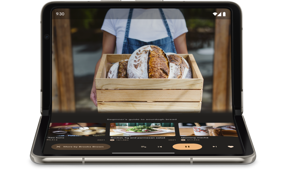
Using the information included in the FoldingFeature object, your app can
support postures like tabletop, where the phone sits on a surface, the hinge is
in a horizontal position, and the foldable screen is half opened.
Tabletop posture offers users the convenience of operating their phones without holding the phone in their hands. Tabletop posture is great for watching media, taking photos, and making video calls.
Use FoldingFeature.State and FoldingFeature.Orientation to determine
whether the device is in tabletop posture:
Kotlin
fun isTableTopPosture(foldFeature : FoldingFeature?) : Boolean {
    contract { returns(true) implies (foldFeature != null) }
    return foldFeature?.state == FoldingFeature.State.HALF_OPENED &&
            foldFeature.orientation == FoldingFeature.Orientation.HORIZONTAL
}
Java
boolean isTableTopPosture(FoldingFeature foldFeature) {
    return (foldFeature != null) &&
           (foldFeature.getState() == FoldingFeature.State.HALF_OPENED) &&
           (foldFeature.getOrientation() == FoldingFeature.Orientation.HORIZONTAL);
}
Once you know the device is in tabletop posture, update your app layout accordingly. For media apps, that typically means placing the playback above the fold and positioning controls and supplementary content just following for a hands‑free viewing or listening experience.
On Android 15 (API level 35) and higher, you can invoke a synchronous API to detect whether a device supports tabletop posture regardless of the current state of the device.
The API provides a list of postures supported by the device. If the list contains tabletop posture, you can split your app layout to support the posture and run A/B tests on your app UI for tabletop and full‑screen layouts.
Kotlin
if (WindowSdkExtensions.getInstance().extensionsVersion >= 6) {
    val postures = WindowInfoTracker.getOrCreate(context).supportedPostures
    if (postures.contains(TABLE_TOP)) {
        // Device supports tabletop posture.
   }
}
Java
if (WindowSdkExtensions.getInstance().getExtensionVersion() >= 6) {
    List<SupportedPosture> postures = WindowInfoTracker.getOrCreate(context).getSupportedPostures();
    if (postures.contains(SupportedPosture.TABLETOP)) {
        // Device supports tabletop posture.
    }
}
Examples
MediaPlayerActivityapp: See how to use Media3 Exoplayer and WindowManager to create a fold‑aware video player.Optimize your camera app on foldable devices with Jetpack WindowManager codelab: Learn how to implement tabletop posture for photography apps. Show the viewfinder on the top half of the screen (above the fold) and the controls on the bottom half (below the fold).
Book posture
Another unique foldable feature is book posture, where the device is half opened and the hinge is vertical. Book posture is great for reading e‑books. With a two‑page layout on a large screen foldable open like a bound book, book posture captures the experience of reading a real book.
It can also be used for photography if you want to capture a different aspect ratio while taking pictures hands‑free.
Implement book posture with the same techniques used for tabletop posture. The only difference is the code should check that the folding feature orientation is vertical instead of horizontal:
Kotlin
fun isBookPosture(foldFeature : FoldingFeature?) : Boolean {
    contract { returns(true) implies (foldFeature != null) }
    return foldFeature?.state == FoldingFeature.State.HALF_OPENED &&
            foldFeature.orientation == FoldingFeature.Orientation.VERTICAL
}
Java
boolean isBookPosture(FoldingFeature foldFeature) {
    return (foldFeature != null) &&
           (foldFeature.getState() == FoldingFeature.State.HALF_OPENED) &&
           (foldFeature.getOrientation() == FoldingFeature.Orientation.VERTICAL);
}
Window size changes
An app's display area can change as a result of a device configuration change, for example, when the device is folded or unfolded, rotated, or a window is resized in multi‑window mode.
The Jetpack WindowManager WindowMetricsCalculator class enables you to
retrieve the current and maximum window metrics. Like the platform
WindowMetrics introduced in API level 30, the WindowManager
WindowMetrics provide the window bounds, but the API is backward compatible
down to API level 14.
Additional resources
Samples
- Jetpack WindowManager: Example of how to use the Jetpack WindowManager library
- Jetcaster : Tabletop posture implementation with Compose
Codelabs
- Support foldable and dual-screen devices with Jetpack WindowManager
- Optimize your camera app on foldable devices with Jetpack WindowManager