
적응형 아이콘 또는 AdaptiveIconDrawable은 개별 기기 기능 및 사용자 테마 설정에 따라 다르게 표시될 수 있습니다. 적응형 아이콘은 주로 홈 화면의 런처에서 사용되지만 바로가기, 설정 앱, 공유 대화상자 및 개요 화면에서도 사용됩니다. 적응형 아이콘은 모든 Android 폼 팩터에서 사용됩니다.
비트맵 이미지와 달리 적응형 아이콘은 다양한 사용 사례에 맞게 조정할 수 있습니다.
다양한 모양: 적응형 아이콘은 다양한 기기 모델에서 여러 가지 형태로 표시될 수 있습니다. 예를 들어 한 OEM 기기에서는 원형으로 표시되고 다른 기기에서는 모서리가 둥근 사각형 (정사각형과 원형의 중간형)으로 표시될 수 있습니다. 각 기기 OEM에서는 마스크가 제공되는데, 시스템에서는 이를 사용하여 모든 적응형 아이콘을 같은 형태로 렌더링합니다.

그림 1. 적응형 아이콘은 기기마다 다른 다양한 마스크를 지원합니다. 시각 효과: 적응형 아이콘은 사용자가 홈 화면에서 아이콘을 배치하거나 옮길 때 관심을 끌 수 있는 다양한 시각적 효과를 지원합니다.

그림 2. 적응형 아이콘에 표시되는 시각 효과의 예 사용자 테마 설정: Android 13 (API 수준 33)부터 사용자는 적응형 아이콘 테마를 설정할 수 있습니다. 사용자가 시스템 설정에서 테마 앱 아이콘을 사용 설정하고 런처에서 이 기능을 지원하는 경우 시스템은 사용자가 선택한 배경화면 및 테마의 색상을 사용하여 적응형 아이콘에
monochrome레이어가 있는 앱의 앱 아이콘 색조 색상을 결정합니다. Android 16 QPR 2부터 Android는 자체 앱 아이콘을 제공하지 않는 앱의 앱 아이콘 테마를 자동으로 설정합니다.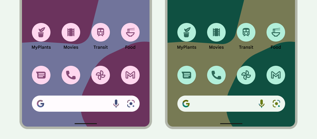
그림 3. 사용자의 배경화면 및 테마에서 상속되는 적응형 아이콘 다음 시나리오에서는 홈 화면에 테마 앱 아이콘이 표시되지 않고 적응형 또는 표준 앱 아이콘이 대신 표시됩니다.
- 사용자가 테마 앱 아이콘을 사용 설정하지 않은 경우
- 앱에서 단색 앱 아이콘을 제공하지 않고 사용자 기기가 Android 16 QPR 2 이전 버전의 Android에서 실행되는 경우
- 런처에서 테마 앱 아이콘을 지원하지 않는 경우
적응형 아이콘 디자인
적응형 아이콘이 다양한 모양, 시각적 효과, 사용자 테마를 지원하게 하려면 앱 디자인이 다음과 같은 요구사항을 따라야 합니다.
아이콘의 색상 버전에 두 개의 레이어를 제공해야 합니다. 하나는 포그라운드용이고 다른 하나는 백그라운드용입니다. 레이어는 벡터 또는 비트맵일 수 있지만 벡터가 더 좋습니다.
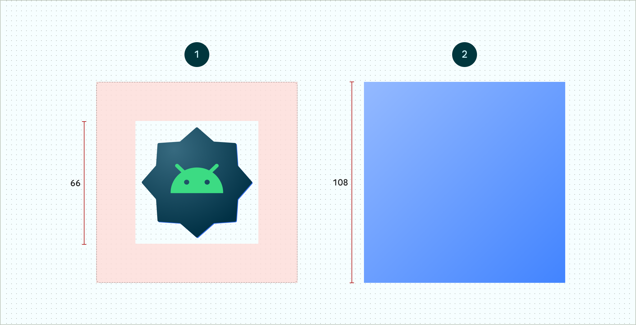
그림 4. 포그라운드 및 백그라운드 레이어를 사용하여 정의된 적응형 아이콘 묘사된 66x66 표시 가능 영역 은 OEM에서 정의한 마스크 모양에 의해 잘리지 않는 영역입니다. 
그림 5. 원형 마스크가 적용된 포그라운드 및 백그라운드 레이어가 함께 표시되는 방식의 예 앱 아이콘의 사용자 테마 설정을 지원하려면 흑백 버전 아이콘을 구성하는 하나의 레이어를 제공해야 합니다.
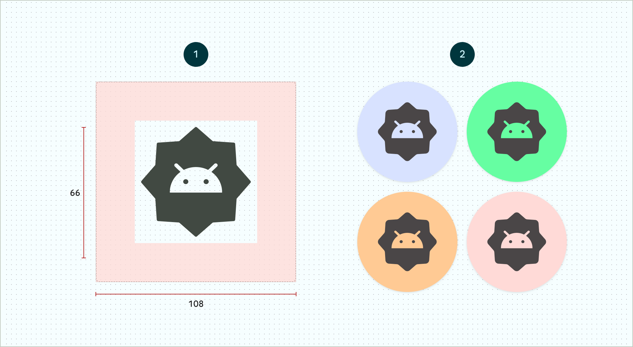
그림 6. 색상 미리보기 예 (오른쪽)가 있는 단색 아이콘 레이어 (왼쪽) 모든 레이어의 크기를 108x108dp로 지정합니다.
가장자리가 깔끔한 아이콘을 사용합니다. 레이어에는 아이콘 윤곽선에 마스크나 백그라운드 그림자가 있어서는 안 됩니다.
48x48dp 이상의 로고를 사용합니다. 아이콘의 내부 66x66dp가 마스크된 표시 영역 내에 표시되므로 66x66dp를 초과해서는 안 됩니다.
레이어의 네 면에 있는 바깥쪽 18dp는 마스크 처리 및 시차 또는 펄싱과 같은 시각 효과를 만드는 데 사용하도록 예약되어 있습니다.
Android 스튜디오를 사용하여 적응형 아이콘을 만드는 방법을 알아보려면 Android 앱 아이콘 Figma 템플릿 또는 런처 아이콘 만들기에 관한 Android 스튜디오 문서를 참고하세요. 또한 블로그 게시물 적응형 아이콘 디자인을 읽어보세요.
앱에 적응형 아이콘 추가
적응형 아이콘은 비적응형 아이콘과 마찬가지로 앱 매니페스트의 using the
android:icon 속성을 사용하여 지정됩니다
manifest.
선택적 속성인 android:roundIcon은 원형 아이콘이 있는 앱을 나타내는 런처에서 사용되며 앱 아이콘에 원형 배경이 디자인의 핵심 부분으로 포함되어 있는 경우 유용할 수 있습니다. 이러한 런처는 android:roundIcon에 원형 마스크를 적용하여 앱 아이콘을 생성해야 하며 이 보장을 통해 예를 들어 로고를 약간 확대하고 잘릴 때 원형 배경이 전체 블리드되도록 하여 앱 아이콘의 모양을 최적화할 수 있습니다.
다음 코드 스니펫은 이러한 두 속성을 모두 보여주지만 대부분의 앱은 android:icon만 지정합니다.
<application
    ...
    android:icon="@mipmap/ic_launcher"
    android:roundIcon="@mipmap/ic_launcher_round"
    ...>
</application>
다음으로 적응형 아이콘을 res/mipmap-anydpi-v26/ic_launcher.xml에 저장합니다.
<adaptive-icon> 요소를 사용하여 아이콘의 포그라운드, 백그라운드, 단색 레이어 리소스를 정의합니다. <foreground>,
<background>, 및 <monochrome> 내부 요소는
벡터 및 비트맵 이미지를 모두 지원합니다.
다음 예에서는 <adaptive-icon> 내에서 <foreground>, <background>, 및
<monochrome> 요소를 정의하는 방법을 보여줍니다.
<?xml version="1.0" encoding="utf-8"?>
...
<adaptive-icon xmlns:android="http://schemas.android.com/apk/res/android">
    <background android:drawable="@drawable/ic_launcher_background" />
    <foreground android:drawable="@drawable/ic_launcher_foreground" />
    <monochrome android:drawable="@drawable/ic_launcher_foreground" />
</adaptive-icon>
...
포그라운드 및 단색 레이어는 동일한 드로어블을 사용합니다. 하지만 필요한 경우 각 레이어에 별도의 드로어블을 만들 수 있습니다.
드로어블을 인라인하여
<foreground>, <background>, <monochrome> 요소로 정의할 수도 있습니다. 다음 스니펫은 포그라운드 드로어블을 사용하여 이 작업을 실행하는 방법을 보여줍니다.
<?xml version="1.0" encoding="utf-8"?>
...
<foreground>
   <inset
       android:insetBottom="18dp"
       android:insetLeft="18dp"
       android:insetRight="18dp"
       android:insetTop="18dp">
       <shape android:shape="oval">
           <solid android:color="#0000FF" />
       </shape>
   </inset>
</foreground>
...
바로가기에 일반 적응형 아이콘과 동일한 마스크와 시각 효과를 적용하려면 다음 중 하나를 사용합니다.
- 정적 바로가기에는
<adaptive-icon>요소를 사용합니다. - 동적 바로가기를 만들 때는
createWithAdaptiveBitmap()메서드를 호출합니다.
적응형 아이콘 구현에 관한 자세한 내용은 적응형 아이콘 구현을 참고하세요. 바로가기에 관한 자세한 내용은 앱 바로가기 개요를 참고하세요.
추가 리소스
적응형 아이콘 디자인 및 구현에 관한 자세한 내용은 다음 리소스를 참고하세요.
- Figma 커뮤니티 페이지 템플릿
- Android 적응형 아이콘 이해
- 적응형 아이콘 디자인
- 적응형 아이콘 구현
- Android 스튜디오에서 앱 아이콘 만들기
- Google Play 아이콘 디자인 사양