編輯器動作
透過集合功能整理內容
你可以依據偏好儲存及分類內容。
Android Studio 會在編輯器區域提供相關功能,改善您使用 Jetpack Compose 的工作效率。
即時範本
Android Studio 內建下列與 Compose 相關的即時範本,只要輸入對應的範本縮寫,就能輸入程式碼片段,實現快速插入:
comp
用來設定 @Composable
函式
prev
用來建立 @Preview
可組合函式
paddp
用來在 dp 中新增 padding
修飾符
weight
用來新增 weight
修飾符
W
、WR
、WC
用來設定以 Box
、Row
或 Column
容器包圍目前的組件。
溝槽圖示
溝槽圖示是側欄中可見的關聯動作,位在行編號旁邊。Android Studio 推出了數個 Jetpack Compose 專屬的溝槽圖示,旨在改善開發人員體驗。
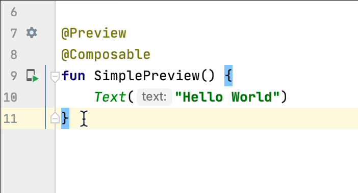
部署預覽
您可以透過溝槽圖示直接將 @Preview
部署到模擬器或實體裝置上:
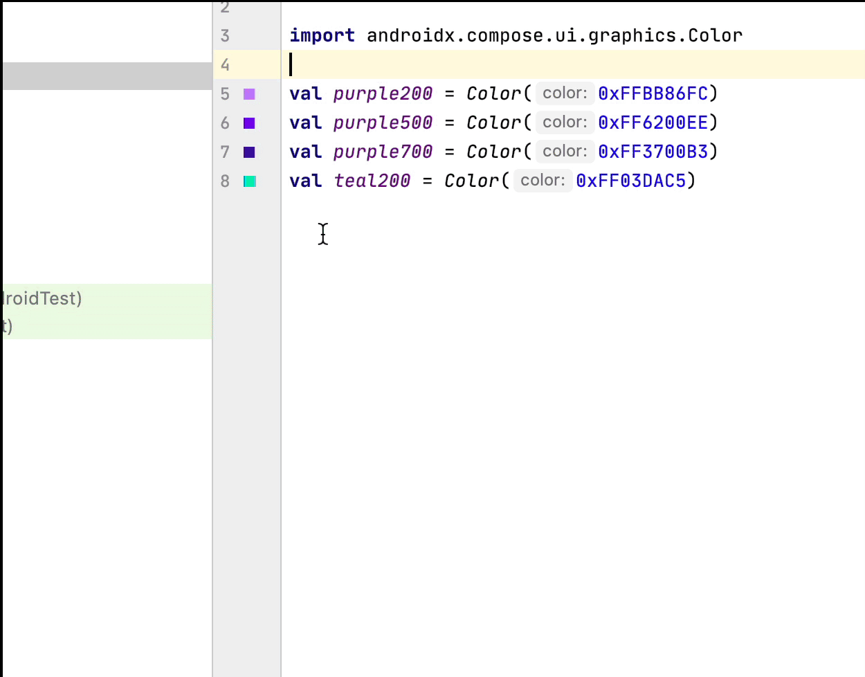
顏色挑選器
每當在組件內部或外部定義顏色時,其預覽畫面就會顯示於溝槽。您可以透過顏色挑選器變更顏色,點選方式如下所示:
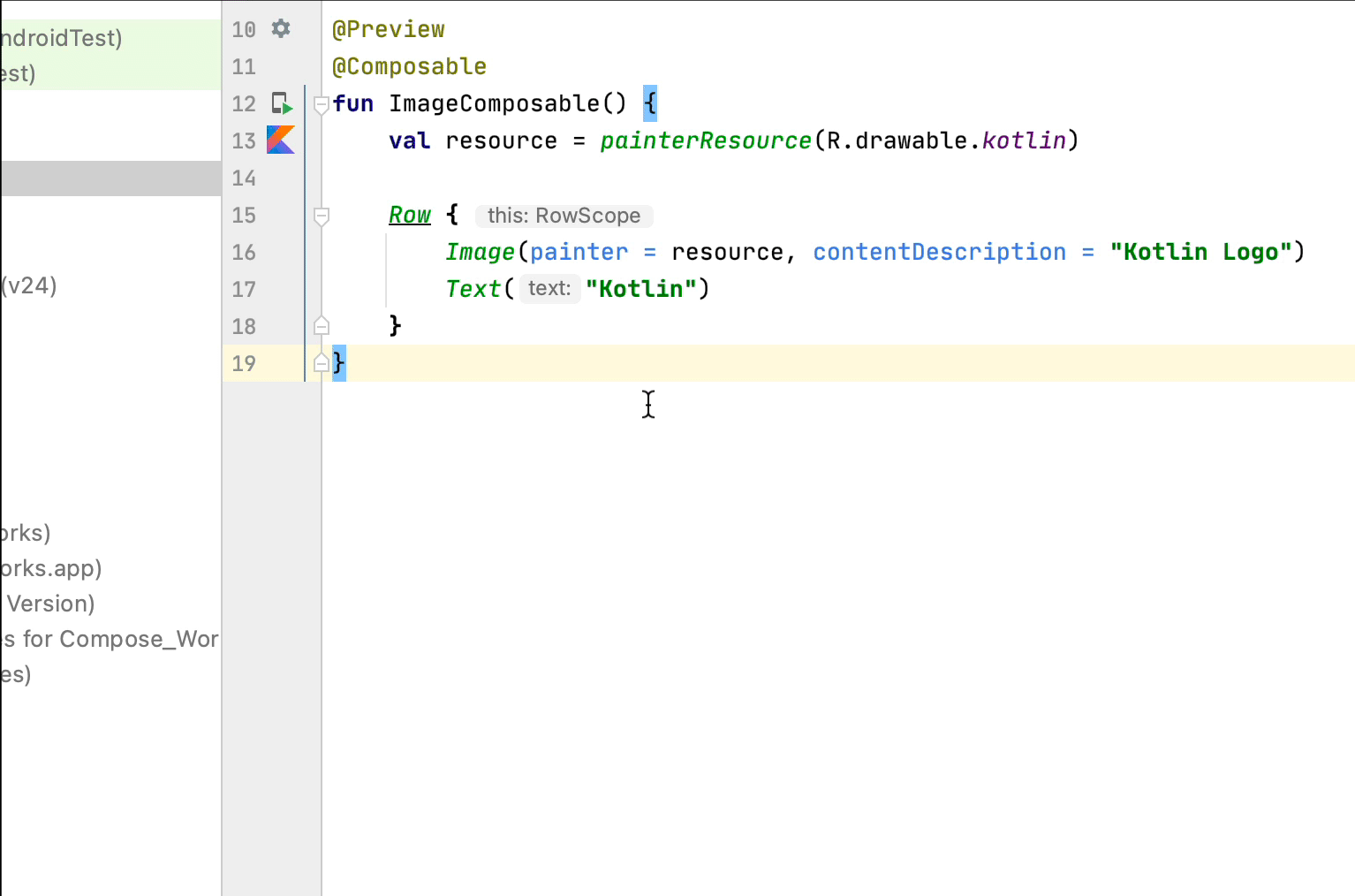
圖片資源挑選器
每當在組件內部或外部定義可繪項目、向量或圖片時,其預覽畫面就會顯示於溝槽。您可以透過圖片資源挑選器加以變更,點選方式如下所示:
為您推薦
這個頁面中的內容和程式碼範例均受《內容授權》中的授權所規範。Java 與 OpenJDK 是 Oracle 和/或其關係企業的商標或註冊商標。
上次更新時間:2025-08-27 (世界標準時間)。
[[["容易理解","easyToUnderstand","thumb-up"],["確實解決了我的問題","solvedMyProblem","thumb-up"],["其他","otherUp","thumb-up"]],[["缺少我需要的資訊","missingTheInformationINeed","thumb-down"],["過於複雜/步驟過多","tooComplicatedTooManySteps","thumb-down"],["過時","outOfDate","thumb-down"],["翻譯問題","translationIssue","thumb-down"],["示例/程式碼問題","samplesCodeIssue","thumb-down"],["其他","otherDown","thumb-down"]],["上次更新時間:2025-08-27 (世界標準時間)。"],[],[],null,["# Editor actions\n\nAndroid Studio has features inside the editor area to improve your productivity\nwith Jetpack Compose.\n\nLive templates\n--------------\n\nAndroid Studio comes with these Compose-related live templates, which allow you\nto enter code snippets for fast insertion by typing the corresponding template\nabbreviation:\n\n- `comp` to set up a `@Composable` function\n- `prev` to create a `@Preview` composable function\n- `paddp` to add a `padding` Modifier in dp\n- `weight` to add a `weight` Modifier\n- `W`, `WR`, `WC` to surround the current composable with a `Box`, `Row`, or `Column`container\n\nGutter icons\n------------\n\nGutter icons are contextual actions visible on the sidebar, next to the line\nnumbers. Android Studio introduces several gutter icons specific to Jetpack\nCompose to ease your developer experience.\n\n### Deploy preview\n\nYou can deploy a `@Preview` to the emulator or physical device directly from the\ngutter icon:\n\n### Color picker\n\nWhenever a color is defined inside or outside a composable, its preview is shown\non the gutter. You can change the color via the color picker by clicking on it\nlike this:\n\n### Image resource picker\n\nWhenever a drawable, vector, or image is defined inside or outside a composable,\nits preview is shown on the gutter. You can change it via the image resource\npicker by clicking on it like this:\n\nRecommended for you\n-------------------\n\n- Note: link text is displayed when JavaScript is off\n- [Compose layout basics](/develop/ui/compose/layouts/basics)\n- [Compose modifiers](/develop/ui/compose/modifiers)\n- [Lists and grids](/develop/ui/compose/lists)"]]