
فئات أحجام النوافذ هي مجموعة من نقاط توقّف إطارات العرض التي تساعدك في تصميم وتطوير واختبار التصاميم السريعة الاستجابة/المتكيّفة. توازن نقاط التوقّف بين بساطة التصميم ومرونة تحسين تطبيقك لحالات الاستخدام الفريدة.
تصنّف فئات حجم النافذة مساحة العرض المتاحة لتطبيقك على النحو التالي: مضغوطة أو متوسطة أو موسّعة أو كبيرة أو كبيرة جدًا. يتم تصنيف العرض والارتفاع المتاحَين بشكل منفصل، لذا يكون لتطبيقك في أي وقت فئتان لحجم النافذة، إحداهما للعرض والأخرى للارتفاع. عادةً ما يكون العرض المتاح أكثر أهمية من الارتفاع المتاح بسبب انتشار التمرير العمودي، لذا من المرجّح أن يكون فئة حجم النافذة للعرض أكثر صلة بواجهة المستخدم لتطبيقك.
وكما هو موضّح في الأشكال، تتيح لك نقاط التوقف مواصلة التفكير في التصاميم من حيث الأجهزة والإعدادات. يمثّل كل فاصل نقاط في فئة الحجم حالة الأغلبية لسيناريوهات الأجهزة النموذجية، ويمكن أن يكون إطارًا مرجعيًا مفيدًا أثناء التفكير في تصميماتك المستندة إلى فواصل النقاط.
| فئة الحجم | نقطة الإيقاف | تمثيل الجهاز |
|---|---|---|
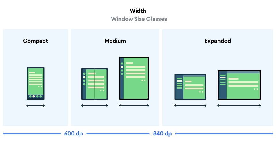
| عرض صغير | width < 600dp | 99.96% من الهواتف في الوضع العمودي |
| عرض متوسط | 600dp ≤ العرض < 840dp | 93.73% من الأجهزة اللوحية في الوضع العمودي
معظم الشاشات الداخلية الكبيرة غير المطوية في الوضع العمودي |
| العرض الموسّع | 840 وحدة بكسل مستقلة عن الكثافة ≤ العرض < 1200 وحدة بكسل مستقلة عن الكثافة | 97.22% من الأجهزة اللوحية في الوضع الأفقي
معظم الشاشات الداخلية الكبيرة غير المطوية في الوضع الأفقي تكون بعرض موسّع على الأقل |
| عرض كبير | 1200dp ≤ العرض < 1600dp | شاشات الأجهزة اللوحية الكبيرة |
| عرض كبير جدًا | width ≥ 1600dp | شاشات الكمبيوتر |
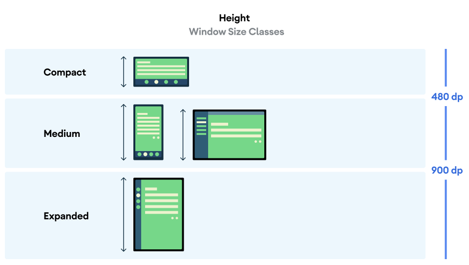
| الارتفاع المكثّف | الارتفاع < 480dp | 99.78% من الهواتف في الوضع الأفقي |
| ارتفاع متوسط | 480dp ≤ الارتفاع < 900dp | 96.56% من الأجهزة اللوحية في الوضع الأفقي
97.59% من الهواتف في الوضع العمودي |
| الارتفاع الموسَّع | height ≥ 900dp | 94.25% من الأجهزة اللوحية في الوضع العمودي |
على الرغم من أنّ تصوُّر فئات الحجم على أنّها أجهزة فعلية قد يكون مفيدًا، إلا أنّ فئات حجم النافذة لا يتم تحديدها بشكل صريح من خلال حجم شاشة الجهاز. لا يُفترض استخدام فئات حجم النافذة مع منطق من النوع isTablet. بدلاً من ذلك، يتم تحديد فئات حجم النافذة حسب حجم النافذة المتاح للتطبيق بغض النظر عن نوع الجهاز الذي يتم تشغيل التطبيق عليه، وهذا له نتيجتان مهمتان:
لا تضمن الأجهزة الفعلية توفُّر فئة حجم نافذة معيّنة. يمكن أن تختلف مساحة الشاشة المتاحة لتطبيقك عن حجم شاشة الجهاز لأسباب عديدة. على الأجهزة الجوّالة، يمكن لوضع تقسيم الشاشة تقسيم الشاشة بين تطبيقَين. على أجهزة ChromeOS، يمكن عرض تطبيقات Android في نوافذ من نوع سطح المكتب يمكن تغيير حجمها بشكل عشوائي. يمكن أن تحتوي الأجهزة القابلة للطي على شاشتين مختلفتَي الحجم يمكن الوصول إليهما بشكل منفصل عن طريق طي الجهاز أو فتحه.
يمكن أن يتغير فئة حجم النافذة طوال فترة استخدام تطبيقك. أثناء تشغيل تطبيقك، يمكن أن يؤدي تغيير اتجاه الجهاز وتنفيذ مهام متعددة وطي الجهاز أو فتحه إلى تغيير مقدار مساحة الشاشة المتاحة. نتيجةً لذلك، يكون فئة حجم النافذة ديناميكية، ويجب أن تتكيّف واجهة مستخدم تطبيقك معها.
يتم ربط فئات حجم النافذة بنقاط التوقّف المضغوطة والمتوسطة والموسّعة في إرشادات التصميم المتعدد الأبعاد. بالإضافة إلى ذلك، تمت إضافة نقاط توقّف كبيرة وكبيرة جدًا لاستهداف أجهزة الكمبيوتر والشاشات المتصلة بشكل أفضل.
استخدِم فئات حجم النافذة لاتخاذ قرارات عالية المستوى بشأن تصميم التطبيق، مثل تحديد ما إذا كان سيتم استخدام تصميم أساسي معيّن للاستفادة من مساحة الشاشة الإضافية.
احسب WindowSizeClass الحالي باستخدام الدالة currentWindowAdaptiveInfo() ذات المستوى الأعلى من مكتبة androidx.compose.material3.adaptive. تعرض الدالة مثيلاً من WindowAdaptiveInfo، والذي يحتوي على windowSizeClass. لإتاحة نقاط توقّف كبيرة وكبيرة جدًا، أضِف مجموعة المَعلمات supportLargeAndXLargeWidth التي تم ضبطها على true إلى استدعاء الدالة. يوضّح المثال التالي كيفية احتساب فئة حجم النافذة وتلقّي إشعارات كلما تغيّرت فئة حجم النافذة:
val windowSizeClass = currentWindowAdaptiveInfo().windowSizeClass
إدارة التخطيطات من خلال فئات حجم النوافذ
تتيح لك فئات حجم النافذة تغيير تنسيق تطبيقك كمساحة للعرض. المتاحة للتطبيق، على سبيل المثال، عند طيّ الجهاز أو فتحه، تغييرات في اتجاه الجهاز، أو يتم تغيير حجم نافذة التطبيق في نوافذ متعددة الحالي.
أقلمة المنطق للتعامل مع تغييرات حجم العرض من خلال تمرير حجم النافذة كحالة إلى عناصر متداخلة قابلة للإنشاء تمامًا مثل أي حالة تطبيق أخرى:
@Composable fun MyApp( windowSizeClass: WindowSizeClass = currentWindowAdaptiveInfo(supportLargeAndXLargeWidth = true).windowSizeClass ) { // Decide whether to show the top app bar based on window size class. val showTopAppBar = windowSizeClass.isHeightAtLeastBreakpoint(WindowSizeClass.HEIGHT_DP_MEDIUM_LOWER_BOUND) // MyScreen logic is based on the showTopAppBar boolean flag. MyScreen( showTopAppBar = showTopAppBar, /* ... */ ) }
اختبار فئات حجم النافذة
أثناء إجراء تغييرات على التصميم، اختبِر سلوك التصميم على جميع أحجام النوافذ، خاصةً عند عرض النوافذ بأحجام صغيرة ومتوسطة وكبيرة.
إذا كان لديك تنسيق حالي للشاشات الصغيرة، عليك أولاً تحسين التنسيق لفئة الحجم ذات العرض الموسّع، لأنّ فئة الحجم هذه توفّر أكبر مساحة للمحتوى الإضافي وتغييرات واجهة المستخدم. بعد ذلك، حدِّد التصميم الذي يناسب فئة الحجم المتوسطة، وفكِّر في إضافة تصميم متخصص.
الخطوات التالية
لمزيد من المعلومات حول كيفية استخدام فئات حجم النافذة لإنشاء تصميمات متجاوبة/قابلة للتكيّف، يُرجى الاطّلاع على ما يلي:
بالنسبة إلى التنسيقات المستندة إلى Compose: التوافق مع أحجام العرض المختلفة
بالنسبة إلى التنسيقات المستندة إلى طرق العرض: التصميم السريع الاستجابة/التكيّفي مع طرق العرض
لمزيد من المعلومات حول ما يجعل التطبيق رائعًا على جميع الأجهزة وأحجام الشاشات، يمكنك الاطّلاع على ما يلي: