
Bố cục chuẩn là bố cục linh hoạt, đã được chứng minh, mang lại trải nghiệm tối ưu cho người dùng trên nhiều hệ số hình dạng.
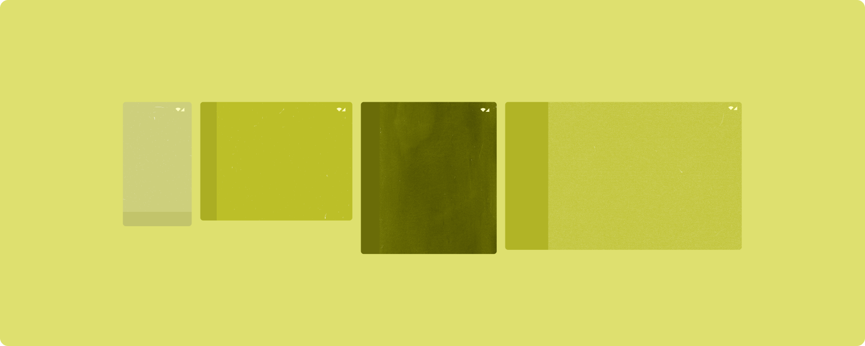
Bố cục chuẩn hỗ trợ điện thoại có màn hình nhỏ cũng như máy tính bảng, thiết bị có thể gập lại và thiết bị ChromeOS. Bắt nguồn từ hướng dẫn của Material Design, bố cục này vừa có tính thẩm mỹ vừa thiết thực.
Khung Android bao gồm các thành phần chuyên biệt giúp việc triển khai bố cục trở nên đơn giản và đáng tin cậy.
Bố cục chuẩn tạo giao diện người dùng hấp dẫn, nâng cao năng suất và là nền tảng cho các ứng dụng tuyệt vời.
Danh sách-chi tiết
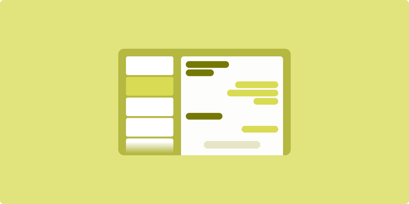
Bố cục danh sách-chi tiết cho phép người dùng khám phá danh sách các mục có thông tin mô tả, nội dung giải thích hoặc thông tin bổ sung khác — thông tin chi tiết của mục.
Bố cục chia cửa sổ ứng dụng thành 2 ngăn cạnh nhau: một ngăn cho danh sách, một ngăn cho thông tin chi tiết. Người dùng chọn các mục trong danh sách để làm hiện thông tin chi tiết của mục đó. Đường liên kết sâu trong thông tin chi tiết sẽ cho thấy nội dung bổ sung trong ngăn chi tiết.
Màn hình có chiều rộng mở rộng (xem Sử dụng các lớp kích thước cửa sổ) chứa cả danh sách lẫn thông tin chi tiết cùng một lúc. Thao tác chọn một mục trong danh sách sẽ cập nhật ngăn thông tin chi tiết để cho thấy nội dung liên quan cho mục đã chọn.
Màn hình có chiều rộng trung bình và nhỏ gọn cho thấy danh sách hoặc thông tin chi tiết, tuỳ thuộc vào lượt tương tác của người dùng với ứng dụng. Khi chỉ danh sách xuất hiện, thao tác chọn một mục trong danh sách sẽ cho thấy thông tin chi tiết thay cho danh sách. Khi chỉ thông tin chi tiết xuất hiện việc nhấn nút quay lại sẽ làm hiện lại danh sách.
Các thay đổi về cấu hình như thay đổi hướng thiết bị hoặc thay đổi kích thước cửa sổ ứng dụng có thể làm thay đổi lớp kích thước cửa sổ của màn hình. Bố cục danh sách‑chi tiết sẽ thích ứng theo, giúp duy trì trạng thái ứng dụng:
- Nếu màn hình có chiều rộng mở rộng, đang hiển thị cả ngăn danh sách và thông tin chi tiết, được thu hẹp đến trung bình hoặc nhỏ gọn, thì ngăn thông tin chi tiết vẫn được hiển thị và ngăn danh sách sẽ được ẩn
- Nếu màn hình có chiều rộng trung bình hoặc nhỏ gọn chỉ có ngăn thông tin chi tiết được hiển thị và lớp kích thước cửa sổ được mở ra thành mở rộng, thì danh sách và thông tin chi tiết sẽ cùng hiện ra, còn danh sách cho biết mục tương ứng với nội dung trong ngăn thông tin chi tiết thì được chọn
- Nếu màn hình có chiều rộng trung bình hoặc nhỏ gọn, chỉ có ngăn danh sách xuất hiện và được mở ra thành mở rộng, thì danh sách và ngăn thông tin chi tiết phần giữ chỗ sẽ cùng hiện ra
Bố cục danh sách-chi tiết rất lý tưởng cho ứng dụng nhắn tin, trình quản lý danh bạ, trình duyệt nội dung nghe nhìn tương tác hoặc bất kỳ ứng dụng nào với nội dung có thể được sắp xếp dưới dạng danh sách các mục để cho thấy thông tin bổ sung.
Triển khai
Mô hình khai báo của Compose hỗ trợ logic lớp kích thước cửa sổ xác định xem có hiện ngăn danh sách và ngăn thông tin chi tiết cùng một lúc hay không (khi lớp kích thước cửa sổ theo chiều rộng được mở rộng) hoặc chỉ hiện ngăn danh sách hoặc thông tin chi tiết (khi lớp kích thước cửa sổ theo chiều rộng là trung bình hoặc nhỏ gọn).
Để bảo đảm luồng dữ liệu một chiều, hãy chuyển tất cả trạng thái lên trên, bao gồm cả lớp kích thước cửa sổ hiện tại và thông tin chi tiết của mục danh sách được chọn (nếu có), để tất cả thành phần kết hợp đều có quyền truy cập vào dữ liệu và có thể hiển thị chính xác.
Khi chỉ hiển thị ngăn thông tin chi tiết trên kích thước cửa sổ nhỏ, hãy thêm BackHandler
để xoá ngăn thông tin chi tiết và chỉ hiện ngăn danh sách. BackHandler không thuộc phạm vi điều hướng tổng thể của ứng dụng vì trình xử lý phụ thuộc vào lớp kích thước cửa sổ và trạng thái thông tin chi tiết được chọn.
ListDetailPaneScaffold là một thành phần kết hợp cấp cao giúp đơn giản hoá việc triển khai bố cục danh sách-chi tiết. Thành phần này tự động xử lý logic ngăn dựa trên các lớp kích thước cửa sổ và hỗ trợ việc di chuyển giữa các ngăn.
Dưới đây là một phương thức triển khai tối giản bằng cách sử dụng ListDetailPaneScaffold:
@OptIn(ExperimentalMaterial3AdaptiveApi::class) @Composable fun MyListDetailPaneScaffold() { val navigator = rememberListDetailPaneScaffoldNavigator() ListDetailPaneScaffold( directive = navigator.scaffoldDirective, value = navigator.scaffoldValue, listPane = { // Listing Pane }, detailPane = { // Details Pane } ) }
Sau đây là các thành phần chính trong ví dụ này:
rememberListDetailPaneScaffoldNavigator: Tạo một trình điều hướng để quản lý việc di chuyển giữa ngăn danh sách và ngăn thông tin chi tiết.listPane: Hiển thị danh sách các mục.detailPane: Hiển thị nội dung của một mục được chọn.
Để biết ví dụ chi tiết về cách triển khai, hãy xem:
- Xây dựng bố cục danh sách-chi tiết hướng dẫn dành cho nhà phát triển
- mẫu danh sách-chi tiết-compose
Nguồn cấp dữ liệu
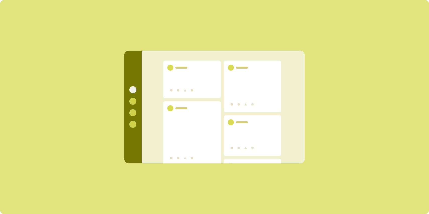
Bố cục nguồn cấp dữ liệu sắp xếp các thành phần với nội dung tương đương trong lưới có thể định cấu hình để thuận tiện xem nhanh một lượng lớn nội dung.
Kích thước và vị trí thiết lập mối quan hệ giữa các thành phần nội dung.
Nhóm nội dung được tạo bằng cách tạo ra các phần tử có cùng kích thước và đặt chúng vào cùng chỗ với nhau. Sự chú ý được thu hút đến các thành phần bằng cách làm cho chúng lớn hơn các thành phần lân cận.
Thẻ và danh sách là các thành phần phổ biến của bố cục nguồn cấp dữ liệu.
Bố cục nguồn cấp dữ liệu hỗ trợ màn hình ở hầu hết mọi kích thước do lưới có thể điều chỉnh từ một cột cuộn duy nhất đến nguồn cấp dữ liệu nội dung gồm nhiều cột xuất hiện nhờ thao tác cuộn.
Nguồn cấp dữ liệu đặc biệt phù hợp với các ứng dụng tin tức và mạng xã hội.
Triển khai
Nguồn cấp dữ liệu bao gồm một lượng lớn thành phần nội dung trong một vùng chứa cuộn theo chiều dọc được đặt trong lưới. Danh sách tải từng phần (lazy list) thể hiện hiệu quả một lượng lớn các mục trong cột hoặc hàng. Lưới tải từng phần (lazy grid) kết xuất các mục trong lưới, hỗ trợ cấu hình kích thước và khoảng (span) của mục.
Hãy định cấu hình các cột của bố cục lưới dựa trên phần hiển thị sẵn có để đặt chiều rộng tối thiểu cho phép cho các mục trong lưới. Khi xác định các mục trong lưới, hãy điều chỉnh khoảng cột để làm một số mục nổi bật hơn so với các mục khác.
Đối với phần tiêu đề, đường phân chia hoặc mục khác được thiết kế nhằm chiếm toàn bộ chiều rộng của nguồn cấp dữ liệu, hãy sử dụng maxLineSpan để chiếm toàn bộ chiều rộng của bố cục.
Trên màn hình có chiều rộng nhỏ gọn không đủ không gian để trình bày nhiều cột, LazyVerticalGrid sẽ hoạt động giống như LazyColumn.
Dưới đây là một phương thức triển khai tối thiểu bằng cách sử dụng LazyVerticalGrid:
@Composable fun MyFeed(names: List<String>) { LazyVerticalGrid( // GridCells.Adaptive automatically adapts column count based on available width columns = GridCells.Adaptive(minSize = 180.dp), ) { items(names) { name -> Text(name) } } }
Yếu tố then chốt của nguồn cấp dữ liệu thích ứng là cấu hình columns.
GridCells.Adaptive(minSize = 180.dp) tạo một lưới trong đó mỗi cột có chiều rộng tối thiểu là 180.dp. Sau đó, lưới sẽ hiển thị nhiều cột nhất có thể trong không gian hiện có.
Hãy xem mẫu Nguồn cấp dữ liệu với Compose để tham khảo ví dụ về cách triển khai.
Ngăn hỗ trợ

Bố cục ngăn bổ trợ bố trí nội dung ứng dụng vào các khu vực hiển thị chính và phụ.
Khu vực hiển thị chính chiếm phần lớn cửa sổ ứng dụng (thường vào khoảng hai phần ba) và chứa nội dung chính. Khu vực hiển thị phụ là một ngăn chiếm phần còn lại của cửa sổ ứng dụng và hiển thị nội dung hỗ trợ nội dung chính.
Bố cục ngăn bổ trợ hoạt động tốt trên màn hình có chiều rộng mở rộng (xem Sử dụng các lớp kích thước cửa sổ) theo hướng ngang. Màn hình có chiều rộng trung bình hoặc nhỏ gọn hỗ trợ hiển thị cả khu vực hiển thị chính và phụ nếu nội dung có thể thích ứng với không gian hiển thị hẹp hơn hoặc nếu nội dung bổ sung có thể được ẩn từ đầu trong một trang ở bên cạnh hoặc ở dưới cùng mà có thể tiếp cận bằng một chế độ điều khiển như trình đơn hoặc nút.
Bố cục ngăn bổ trợ khác với bố cục danh sách‑chi tiết về mối quan hệ giữa nội dung chính và nội dung phụ. Nội dung của ngăn phụ chỉ có ý nghĩa khi có mối quan hệ với nội dung chính; ví dụ: bản thân cửa sổ công cụ của ngăn bổ trợ là không liên quan. Tuy nhiên, nội dung bổ sung trong ngăn thông tin chi tiết của bố cục danh sách‑chi tiết có ý nghĩa ngay cả khi không có nội dung chính, ví dụ: nội dung mô tả về sản phẩm trên trang thông tin sản phẩm.
Các trường hợp sử dụng của ngăn bổ trợ gồm có:
- Ứng dụng cải thiện hiệu suất: Tài liệu hoặc bảng tính đi kèm nhận xét của người đánh giá trong ngăn bổ trợ
- Ứng dụng đa phương tiện: Một video phát trực tuyến và danh sách các video có liên quan trong ngăn bổ trợ hoặc nội dung mô tả đĩa nhạc bổ sung cho danh sách phát
- Công cụ và chế độ cài đặt: Một công cụ chỉnh sửa nội dung nghe nhìn có bảng màu, hiệu ứng và các chế độ cài đặt khác trong ngăn hỗ trợ
Triển khai
Compose hỗ trợ logic lớp kích thước cửa sổ, cho phép bạn xác định xem có hiệncả nội dung chính và nội dung chi tiết cùng một lúc hay không hoặc đặt nội dung chi tiết ở một vị trí thay thế.
Hãy chuyển trạng thái lên trên, bao gồm cả lớp kích thước cửa sổ hiện tại và thông tin liên quan đến dữ liệu trong nội dung chính và nội dung chi tiết.
Đối với màn hình có chiều rộng nhỏ gọn, hãy đặt nội dung chi tiết bên dưới nội dung chính hoặc vào một bảng dưới cùng. Đối với màn hình có chiều rộng trung bình và mở rộng, hãy đặt nội dung chi tiết bên cạnh nội dung chính, với kích thước phù hợp dựa trên nội dung và không gian có sẵn. Đối với màn hình có chiều rộng trung bình, hãy chia đều không gian hiển thị giữa nội dung chính và nội dung chi tiết. Đối với màn hình có chiều rộng mở rộng, hãy cung cấp 70% không gian cho nội dung chính, 30% cho nội dung bổ trợ.
SupportingPaneScaffold là một thành phần kết hợp cấp cao giúp đơn giản hoá việc triển khai bố cục ngăn hỗ trợ. Thành phần kết hợp này tự động xử lý logic ngăn dựa trên các lớp kích thước cửa sổ, hiển thị các ngăn cạnh nhau trên màn hình lớn hoặc ẩn ngăn hỗ trợ trên màn hình nhỏ. SupportingPaneScaffold
cũng hỗ trợ việc di chuyển giữa các ngăn.
Sau đây là một cách triển khai tối thiểu:
@OptIn(ExperimentalMaterial3AdaptiveApi::class) @Composable fun MySupportingPaneScaffold() { // Creates and remembers a navigator to control pane visibility and navigation val navigator = rememberSupportingPaneScaffoldNavigator() SupportingPaneScaffold( // Directive and value help control pane visibility based on screen size and state directive = navigator.scaffoldDirective, value = navigator.scaffoldValue, mainPane = { // Main Pane for the primary content }, supportingPane = { //Supporting Pane for supplementary content } ) }
rememberSupportingPaneScaffoldNavigator: Thành phần kết hợp tạo một trình điều hướng để quản lý khả năng hiển thị của ngăn (ví dụ: ẩn hoặc hiện ngăn hỗ trợ trên màn hình nhỏ gọn)mainPane: Thành phần kết hợp hiển thị nội dung chínhsupportingPane: Thành phần kết hợp hiển thị nội dung bổ sung
Để biết ví dụ chi tiết về cách triển khai, hãy xem:
Tài nguyên khác
- Material Design – Bố cục chuẩn