
कैननिकल लेआउट, आज़माए गए और अलग-अलग तरह के लेआउट होते हैं. ये अलग-अलग साइज़, कॉन्फ़िगरेशन या डाइमेंशन वाले डिवाइसों पर लोगों को बेहतरीन अनुभव देते हैं.
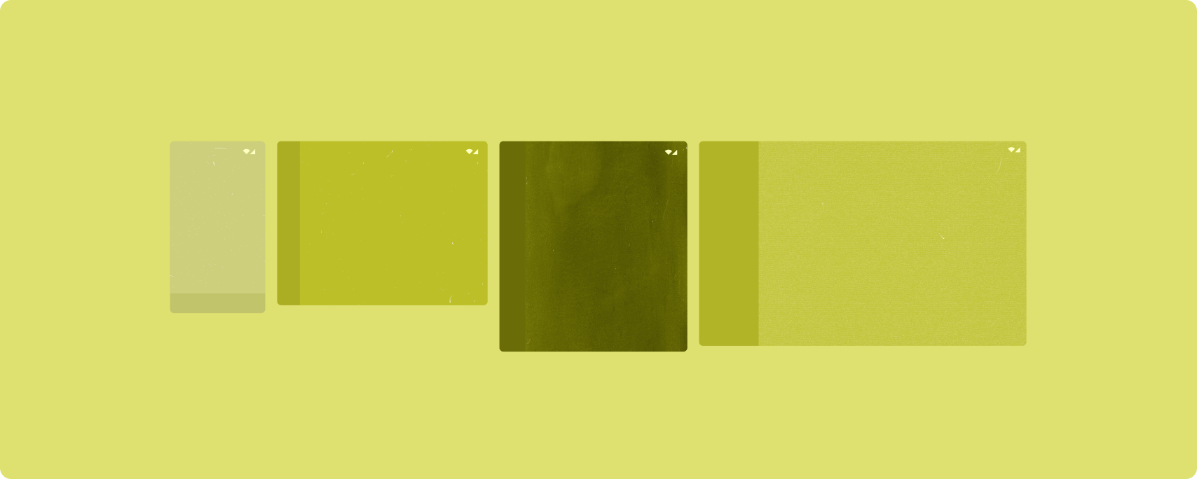
कैननिकल लेआउट, छोटी स्क्रीन वाले फ़ोन के साथ-साथ टैबलेट, फ़ोल्ड किए जा सकने वाले डिवाइस, और ChromeOS डिवाइसों पर काम करते हैं. लेआउट, Material Design के दिशा-निर्देशों के मुताबिक बनाए गए हैं. इसलिए, ये देखने में अच्छे होने के साथ-साथ काम के भी हैं.
Android फ़्रेमवर्क में खास कॉम्पोनेंट शामिल होते हैं. इनकी मदद से, लेआउट को आसानी से और भरोसेमंद तरीके से लागू किया जा सकता है.
कैननिकल लेआउट से, लोगों की दिलचस्पी बढ़ाने वाले और प्रॉडक्टिविटी बढ़ाने वाले यूज़र इंटरफ़ेस (यूआई) बनाए जाते हैं. ये यूआई, बेहतरीन ऐप्लिकेशन की बुनियाद होते हैं.
सूची की जानकारी

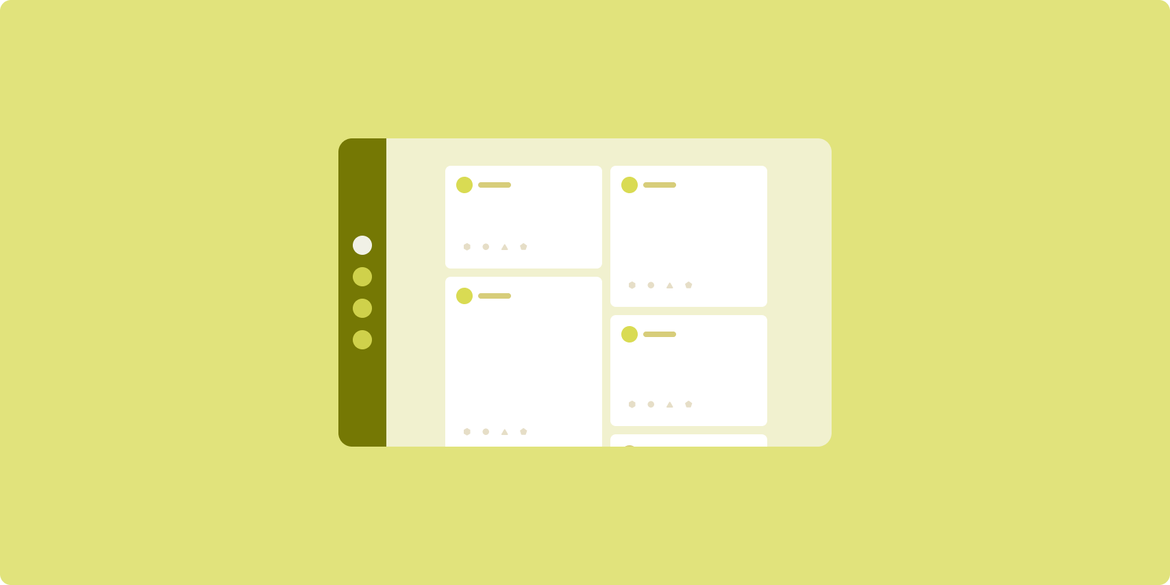
सूची-जानकारी लेआउट की मदद से, उपयोगकर्ता ऐसे आइटम की सूचियां एक्सप्लोर कर सकते हैं जिनके बारे में जानकारी दी गई हो, ब्यौरा दिया गया हो या अन्य पूरक जानकारी दी गई हो. इसे आइटम की जानकारी कहा जाता है.
लेआउट, ऐप्लिकेशन विंडो को अगल-बगल मौजूद दो पैन में बांटता है: एक सूची के लिए और दूसरा जानकारी के लिए. उपयोगकर्ता, आइटम की जानकारी दिखाने के लिए सूची से आइटम चुनते हैं. ज़्यादा जानकारी दिखाने वाले डीप लिंक, ज़्यादा जानकारी वाले पैनल में अतिरिक्त कॉन्टेंट दिखाते हैं.
ज़्यादा चौड़ाई वाले डिसप्ले (विंडो के साइज़ के हिसाब से क्लास का इस्तेमाल करना लेख पढ़ें) में, सूची और जानकारी, दोनों को एक साथ दिखाया जा सकता है. सूची के किसी आइटम को चुनने पर, जानकारी वाले पैनल में उस आइटम से जुड़ा कॉन्टेंट दिखता है.
मीडियम और कॉम्पैक्ट चौड़ाई वाले डिसप्ले पर, सूची या जानकारी में से कोई एक चीज़ दिखती है. यह इस बात पर निर्भर करता है कि उपयोगकर्ता ने ऐप्लिकेशन के साथ किस तरह इंटरैक्ट किया है. सिर्फ़ सूची दिखने पर, सूची में मौजूद किसी आइटम को चुनने पर, सूची की जगह जानकारी दिखती है. सिर्फ़ जानकारी दिखने पर, 'वापस जाएं' बटन दबाने से सूची फिर से दिखती है.
डिवाइस के ओरिएंटेशन या ऐप्लिकेशन की विंडो के साइज़ में बदलाव जैसे कॉन्फ़िगरेशन में बदलाव होने पर, डिसप्ले की विंडो के साइज़ की क्लास बदल सकती है. सूची की जानकारी वाला लेआउट, ऐप्लिकेशन की स्थिति को बनाए रखते हुए इस तरह से रिस्पॉन्स देता है:
- अगर ज़्यादा चौड़ाई वाला डिसप्ले, सूची और जानकारी, दोनों पैनल दिखाता है, तो उसे छोटा या कॉम्पैक्ट करने पर, जानकारी वाला पैनल दिखता रहता है और सूची वाला पैनल छिप जाता है
- अगर मीडियम या कॉम्पैक्ट चौड़ाई वाले डिसप्ले में सिर्फ़ जानकारी वाला पैनल दिखता है और विंडो का साइज़ क्लास बढ़कर बड़ा हो जाता है, तो सूची और जानकारी एक साथ दिखती हैं. साथ ही, सूची से पता चलता है कि जानकारी वाले पैनल में मौजूद कॉन्टेंट से जुड़ा आइटम चुना गया है
- अगर मीडियम या कॉम्पैक्ट चौड़ाई वाले डिसप्ले में सिर्फ़ सूची वाला पैन दिखता है और चौड़ाई बढ़ने पर, सूची और प्लेसहोल्डर के तौर पर जानकारी वाला पैन साथ में दिखता है
सूची की जानकारी वाला लेआउट, मैसेजिंग ऐप्लिकेशन, संपर्क मैनेजर, इंटरैक्टिव मीडिया ब्राउज़र या ऐसे किसी भी ऐप्लिकेशन के लिए सबसे सही है जहां कॉन्टेंट को आइटम की सूची के तौर पर व्यवस्थित किया जा सकता है. इससे ज़्यादा जानकारी मिलती है.
लागू करना
Compose के डिक्लेरेटिव पैराडाइम में, विंडो साइज़ क्लास लॉजिक काम करता है. इससे यह तय होता है कि लिस्ट और जानकारी वाले पैन को एक साथ दिखाना है या नहीं. ऐसा तब होता है, जब चौड़ाई वाली विंडो साइज़ क्लास को बड़ा किया जाता है. इसके अलावा, यह भी तय होता है कि सिर्फ़ लिस्ट या जानकारी वाला पैन दिखाना है या नहीं. ऐसा तब होता है, जब चौड़ाई वाली विंडो साइज़ क्लास, मीडियम या कॉम्पैक्ट होती है.
एक ही दिशा में डेटा फ़्लो पक्का करने के लिए, सभी स्टेट को ऊपर की ओर ले जाएं. इनमें, मौजूदा विंडो साइज़ क्लास और चुनी गई लिस्ट आइटम की जानकारी (अगर कोई है) शामिल है. इससे सभी कंपोज़ेबल के पास डेटा का ऐक्सेस होगा और वे सही तरीके से रेंडर हो पाएंगे.
छोटी विंडो साइज़ पर सिर्फ़ जानकारी वाला पैन दिखाते समय, BackHandler
जोड़ें. इससे जानकारी वाला पैन हट जाएगा और सिर्फ़ लिस्ट वाला पैन दिखेगा. BackHandler, पूरे ऐप्लिकेशन के नेविगेशन का हिस्सा नहीं है. ऐसा इसलिए, क्योंकि हैंडलर, विंडो साइज़ क्लास और चुनी गई जानकारी वाली स्टेट पर निर्भर करता है.
ListDetailPaneScaffold एक हाई-लेवल कंपोज़ेबल है. इससे लिस्ट-डिटेल लेआउट को लागू करना आसान हो जाता है. यह विंडो साइज़ क्लास के आधार पर, पैन लॉजिक को अपने-आप मैनेज करता है. साथ ही, यह पैन के बीच नेविगेट करने की सुविधा देता है.
ListDetailPaneScaffold का इस्तेमाल करके, यहां एक सामान्य उदाहरण दिया गया है:
@OptIn(ExperimentalMaterial3AdaptiveApi::class) @Composable fun MyListDetailPaneScaffold() { val navigator = rememberListDetailPaneScaffoldNavigator() ListDetailPaneScaffold( directive = navigator.scaffoldDirective, value = navigator.scaffoldValue, listPane = { // Listing Pane }, detailPane = { // Details Pane } ) }
इस उदाहरण में, मुख्य कॉम्पोनेंट ये हैं:
rememberListDetailPaneScaffoldNavigator: यह लिस्ट और जानकारी वाले पैन के बीच नेविगेट करने के लिए, नेविगेटर बनाता है.listPane: यह आइटम की सूची दिखाता है.detailPane: यह चुने गए आइटम का कॉन्टेंट दिखाता है.
लागू करने के ज़्यादा उदाहरणों के लिए, ये लेख पढ़ें:
- लिस्ट-डिटेल लेआउट बनाना डेवलपर गाइड
- list-detail-compose सैंपल
फ़ीड
फ़ीड लेआउट, एक जैसे कॉन्टेंट एलिमेंट को कॉन्फ़िगर किए जा सकने वाले ग्रिड में व्यवस्थित करता है. इससे ज़्यादा कॉन्टेंट को आसानी से और तुरंत देखा जा सकता है.
कॉन्टेंट एलिमेंट के बीच संबंध बनाने के लिए, साइज़ और पोज़िशन का इस्तेमाल किया जाता है.
कॉन्टेंट ग्रुप बनाने के लिए, एलिमेंट को एक ही साइज़ का बनाया जाता है और उन्हें एक साथ रखा जाता है. आस-पास के एलिमेंट की तुलना में, एलिमेंट को बड़ा करके उस पर ध्यान दिलाया जाता है.
कार्ड और सूचियां, फ़ीड लेआउट के सामान्य कॉम्पोनेंट हैं.
फ़ीड लेआउट में, लगभग किसी भी साइज़ के डिसप्ले काम करते हैं. ऐसा इसलिए, क्योंकि ग्रिड को एक स्क्रोलिंग कॉलम से लेकर, कॉन्टेंट के कई कॉलम वाले स्क्रोलिंग फ़ीड के हिसाब से अडजस्ट किया जा सकता है.
फ़ीड, खास तौर पर न्यूज़ और सोशल मीडिया ऐप्लिकेशन के लिए सही होते हैं.
लागू करना
फ़ीड में, वर्टिकल स्क्रोलिंग वाले कंटेनर में कॉन्टेंट के कई एलिमेंट होते हैं. इन्हें ग्रिड में व्यवस्थित किया जाता है. लेज़ी लिस्ट, कॉलम या लाइनों में बड़ी संख्या में आइटम को असरदार तरीके से रेंडर करती हैं. लेज़ी ग्रिड, आइटम को ग्रिड में रेंडर करते हैं. साथ ही, आइटम के साइज़ और स्पैन के कॉन्फ़िगरेशन के साथ काम करते हैं.
डिसप्ले के लिए उपलब्ध जगह के हिसाब से, ग्रिड लेआउट के कॉलम कॉन्फ़िगर करें. इससे ग्रिड आइटम के लिए, कम से कम चौड़ाई सेट की जा सकती है. ग्रिड आइटम तय करते समय, कॉलम स्पैन को इस तरह से अडजस्ट करें कि कुछ आइटम दूसरों की तुलना में ज़्यादा दिखें.
सेक्शन हेडर, डिवाइडर या फ़ीड की पूरी चौड़ाई में दिखने वाले अन्य आइटम के लिए, लेआउट की पूरी चौड़ाई का इस्तेमाल करने के लिए maxLineSpan का इस्तेमाल करें.
कम चौड़ाई वाले डिसप्ले पर, एक से ज़्यादा कॉलम दिखाने के लिए जगह नहीं होती. ऐसे में, LazyVerticalGrid, LazyColumn की तरह काम करता है.
यहां LazyVerticalGrid का इस्तेमाल करके, कम से कम ज़रूरी जानकारी को लागू करने का तरीका बताया गया है:
@Composable fun MyFeed(names: List<String>) { LazyVerticalGrid( // GridCells.Adaptive automatically adapts column count based on available width columns = GridCells.Adaptive(minSize = 180.dp), ) { items(names) { name -> Text(name) } } }
अडैप्टिव फ़ीड के लिए, columns कॉन्फ़िगरेशन ज़रूरी है.
GridCells.Adaptive(minSize = 180.dp) एक ऐसी ग्रिड बनाता है जिसमें हर कॉलम कम से कम 180.dp चौड़ा होता है. इसके बाद, ग्रिड में उतने कॉलम दिखते हैं जितने उपलब्ध जगह में फ़िट हो सकते हैं.
लागू करने के उदाहरण के लिए, Compose के साथ फ़ीड का सैंपल देखें.
सहायता वाला पैनल

पेन लेआउट की सुविधा की मदद से, ऐप्लिकेशन के कॉन्टेंट को प्राइमरी और सेकंडरी डिसप्ले एरिया में व्यवस्थित किया जाता है.
मुख्य डिसप्ले एरिया, ऐप्लिकेशन विंडो के ज़्यादातर हिस्से (आम तौर पर, करीब दो-तिहाई) पर दिखता है. इसमें मुख्य कॉन्टेंट होता है. सेकंडरी डिसप्ले एरिया, ऐप्लिकेशन विंडो का बाकी हिस्सा होता है. इसमें ऐसा कॉन्टेंट दिखाया जाता है जो मुख्य कॉन्टेंट के साथ काम करता है.
लैंडस्केप ओरिएंटेशन में, ज़्यादा चौड़ाई वाले डिसप्ले पर स्प्लिट स्क्रीन लेआउट अच्छी तरह से काम करते हैं. इसके बारे में जानने के लिए, विंडो के साइज़ क्लास का इस्तेमाल करना लेख पढ़ें. मीडियम या कॉम्पैक्ट चौड़ाई वाले डिसप्ले पर, प्राइमरी और सेकंडरी, दोनों डिसप्ले एरिया दिखाए जा सकते हैं. ऐसा तब होता है, जब कॉन्टेंट को कम चौड़ाई वाले डिसप्ले स्पेस के हिसाब से बनाया गया हो या जब अतिरिक्त कॉन्टेंट को शुरू में नीचे या साइड शीट में छिपाया जा सकता हो. इसे मेन्यू या बटन जैसे कंट्रोल की मदद से ऐक्सेस किया जा सकता है.
सपोर्टिंग पैन लेआउट, प्राइमरी और सेकंडरी कॉन्टेंट के बीच के संबंध के मामले में, सूची-जानकारी वाले लेआउट से अलग होता है. सेकंडरी पैन का कॉन्टेंट, सिर्फ़ प्राइमरी कॉन्टेंट के हिसाब से काम का होता है. उदाहरण के लिए, सपोर्टिंग पैन टूल विंडो अपने-आप में अप्रासंगिक होती है. हालांकि, सूची-ज़्यादा जानकारी वाले लेआउट के ज़्यादा जानकारी वाले पैनल में मौजूद पूरक कॉन्टेंट, मुख्य कॉन्टेंट के बिना भी काम का होता है. उदाहरण के लिए, प्रॉडक्ट लिस्टिंग में मौजूद किसी प्रॉडक्ट का ब्यौरा.
सहायता पैनल के इस्तेमाल के उदाहरण:
- प्रॉडक्टिविटी ऐप्लिकेशन: सपोर्टिंग पैनल में, समीक्षक की टिप्पणियों के साथ दस्तावेज़ या स्प्रेडशीट
- मीडिया ऐप्लिकेशन: किसी स्ट्रीम किए जा रहे वीडियो और उससे मिलते-जुलते वीडियो की सूची को किसी पैनल में दिखाया जाता है. इसके अलावा, संगीत के किसी एल्बम को प्लेलिस्ट के साथ दिखाया जाता है
- टूल और सेटिंग: सहायता वाले पैनल में, मीडिया में बदलाव करने वाला टूल, पैलेट, इफ़ेक्ट, और अन्य सेटिंग
लागू करना
Compose, विंडो के साइज़ के हिसाब से क्लास लॉजिक का इस्तेमाल करता है. इससे यह तय किया जा सकता है कि मुख्य कॉन्टेंट और उससे जुड़ी जानकारी को एक ही समय में दिखाया जाए या उससे जुड़ी जानकारी को किसी दूसरी जगह पर दिखाया जाए.
सभी स्थितियों को ऊपर उठाएं. इनमें मौजूदा विंडो के साइज़ की क्लास और मुख्य कॉन्टेंट और सहायक कॉन्टेंट में मौजूद डेटा से जुड़ी जानकारी शामिल है.
कम चौड़ाई वाले डिसप्ले के लिए, सहायक कॉन्टेंट को मुख्य कॉन्टेंट के नीचे रखें या बॉटम शीट में रखें. मीडियम और बड़ी चौड़ाई वाले डिसप्ले के लिए, मुख्य कॉन्टेंट के बगल में सहायक कॉन्टेंट रखें. कॉन्टेंट और उपलब्ध जगह के हिसाब से, सहायक कॉन्टेंट का साइज़ तय करें. मीडियम चौड़ाई के लिए, डिसप्ले स्पेस को मुख्य और सहयोगी कॉन्टेंट के बीच बराबर बांटें. ज़्यादा चौड़ाई वाले लेआउट में, मुख्य कॉन्टेंट को 70% और उससे जुड़े कॉन्टेंट को 30% जगह दें.
SupportingPaneScaffold एक हाई-लेवल कंपोज़ेबल है. इससे, पैन लेआउट को लागू करना आसान हो जाता है. विंडो के साइज़ क्लास के आधार पर, कंपोज़ेबल अपने-आप पैन लॉजिक को मैनेज करता है. बड़ी स्क्रीन पर पैन को एक साथ दिखाता है या छोटी स्क्रीन पर साथ में दिखने वाले पैन को छिपाता है. SupportingPaneScaffold
पैनल के बीच नेविगेट करने की सुविधा भी देता है.
यहां कम से कम ज़रूरी कोड दिया गया है:
@OptIn(ExperimentalMaterial3AdaptiveApi::class) @Composable fun MySupportingPaneScaffold() { // Creates and remembers a navigator to control pane visibility and navigation val navigator = rememberSupportingPaneScaffoldNavigator() SupportingPaneScaffold( // Directive and value help control pane visibility based on screen size and state directive = navigator.scaffoldDirective, value = navigator.scaffoldValue, mainPane = { // Main Pane for the primary content }, supportingPane = { //Supporting Pane for supplementary content } ) }
rememberSupportingPaneScaffoldNavigator: यह कंपोज़ेबल, पैन की दृश्यता को मैनेज करने के लिए नेविगेटर बनाता है. उदाहरण के लिए, छोटी स्क्रीन पर साथ काम करने वाले पैन को छिपाना या दिखानाmainPane: यह कंपोज़ेबल, मुख्य कॉन्टेंट दिखाता हैsupportingPane: यह कंपोज़ेबल, पूरक कॉन्टेंट दिखाता है
लागू करने के उदाहरणों के बारे में ज़्यादा जानने के लिए, यहां जाएं:
- सपोर्टिंग पैनल का लेआउट बनाना डेवलपर गाइड
- supporting-pane-compose सैंपल
अन्य संसाधन
- मटीरियल डिज़ाइन — कैननिकल लेआउट