
Com as guias, você pode organizar grupos de conteúdo relacionado. Há dois tipos de guias:
- Guias principais: ficam na parte de cima do painel de conteúdo, abaixo de uma barra de apps superior. Elas mostram os principais destinos de conteúdo e devem ser usadas quando apenas um conjunto de guias é necessário.
- Guias secundárias: usadas em uma área de conteúdo para separar ainda mais o conteúdo relacionado e estabelecer uma hierarquia. Elas são necessárias quando uma tela exige mais de um nível de guias.
Nesta página, mostramos como exibir guias principais no app com telas relacionadas e navegação básica.
Superfície da API
Use os elementos combináveis Tab, PrimaryTabRow e SecondaryTabRow
para implementar guias. O elemento combinável Tab representa uma guia individual na
linha e geralmente é usado em um PrimaryTabRow (para guias de indicador principal
) ou SecondaryTabRow (para guias de indicador secundário).
O Tab inclui os seguintes parâmetros principais:
selected: determina se a guia atual está visualmente destacada.onClick(): uma função lambda obrigatória que define a ação a ser realizada quando o usuário clica na guia. É aqui que você normalmente processa eventos de navegação, atualiza o estado da guia selecionada ou carrega o conteúdo correspondente.text: mostra o texto na guia. Opcional.icon: mostra um ícone na guia. Opcional.enabled: controla se a guia está ativada e pode ser usada. Se definido como "false", a guia vai aparecer desativada e não vai responder a cliques.
Exemplo: navegação baseada em guias
O snippet a seguir implementa uma barra de navegação superior com guias para navegar entre diferentes telas em um app:
@Composable fun NavigationTabExample(modifier: Modifier = Modifier) { val navController = rememberNavController() val startDestination = Destination.SONGS var selectedDestination by rememberSaveable { mutableIntStateOf(startDestination.ordinal) } Scaffold(modifier = modifier) { contentPadding -> PrimaryTabRow(selectedTabIndex = selectedDestination, modifier = Modifier.padding(contentPadding)) { Destination.entries.forEachIndexed { index, destination -> Tab( selected = selectedDestination == index, onClick = { navController.navigate(route = destination.route) selectedDestination = index }, text = { Text( text = destination.label, maxLines = 2, overflow = TextOverflow.Ellipsis ) } ) } } AppNavHost(navController, startDestination) } }
Pontos principais
PrimaryTabRowmostra uma linha horizontal de guias, e cada uma delas corresponde a umDestination.- O
val navController = rememberNavController()cria e lembra de uma instância deNavHostController, que gerencia a navegação em umNavHost. - O
var selectedDestination by rememberSaveable {
mutableIntStateOf(startDestination.ordinal) }
gerencia o estado da guia selecionada.startDestination.ordinalrecebe o índice numérico (posição) da entrada de enumeraçãoDestination.SONGS.
- Quando você clica em uma guia, a lambda
onClickchamanavController.navigate(route = destination.route)para navegar até a tela correspondente. - A lambda
onClickdoTabatualiza o estadoselectedDestinationpara destacar visualmente a guia clicada. - Ele chama o elemento combinável
AppNavHost, transmitindo onavControllerestartDestination, para mostrar o conteúdo real da tela selecionada.
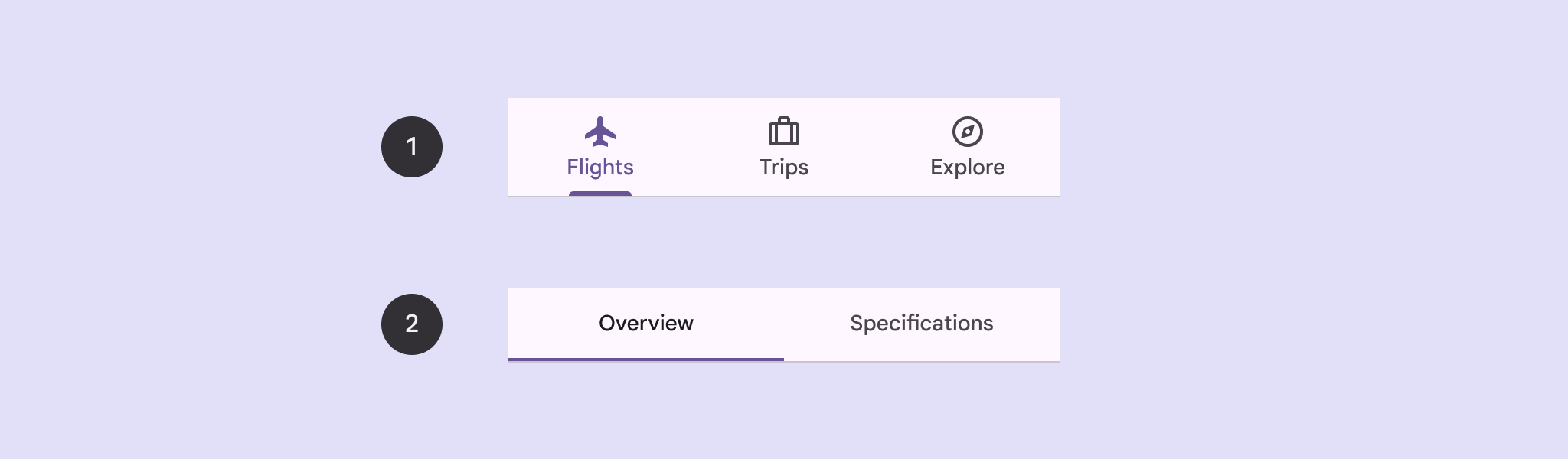
Resultado
A imagem a seguir mostra o resultado do snippet anterior:
.png?hl=pt)