Sử dụng bộ sưu tập để sắp xếp ngăn nắp các trang
Lưu và phân loại nội dung dựa trên lựa chọn ưu tiên của bạn.
Scaffold
Trong Material Design, khung hiển thị là một cấu trúc cơ bản cung cấp nền tảng tiêu chuẩn hoá cho các giao diện người dùng phức tạp. Nó kết hợp các phần khác nhau của giao diện người dùng, chẳng hạn như thanh ứng dụng và nút hành động nổi, giúp ứng dụng có giao diện nhất quán.
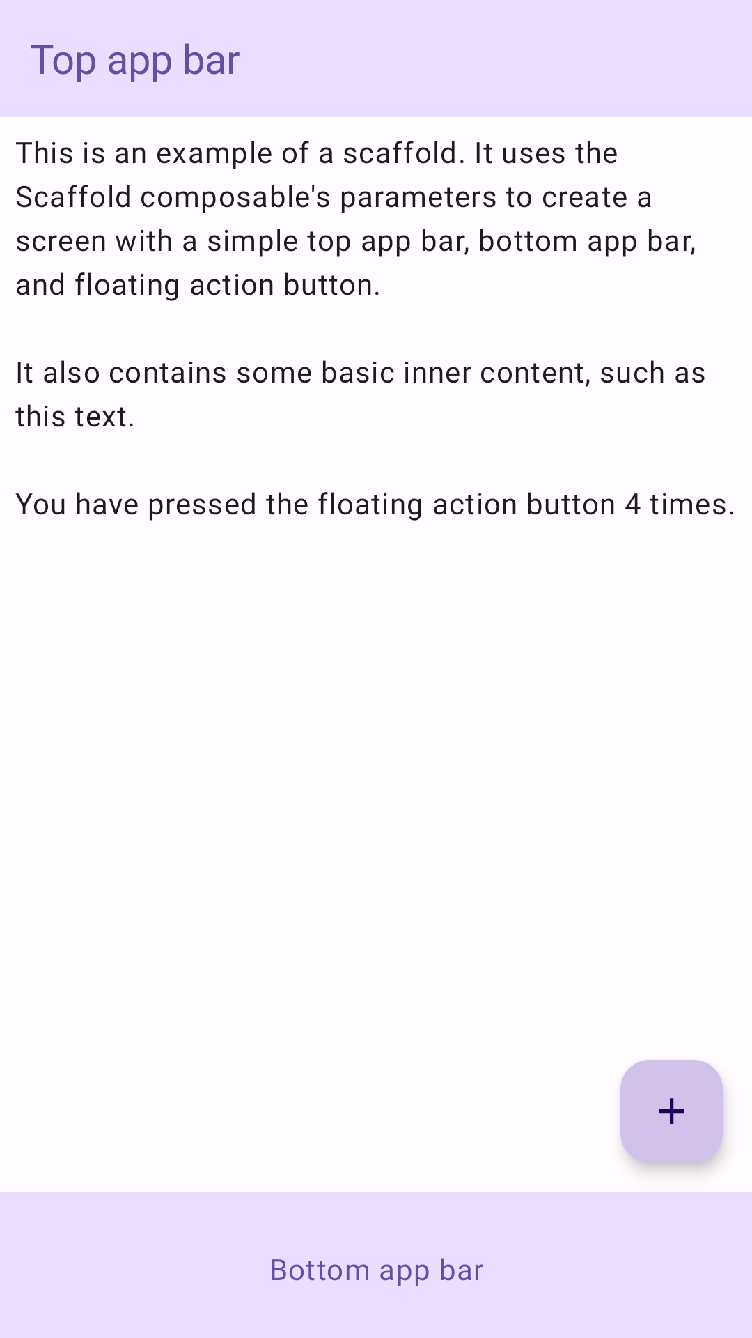
Ví dụ
Thành phần kết hợp Scaffold cung cấp một API đơn giản mà bạn có thể dùng để nhanh chóng lắp ráp cấu trúc của ứng dụng theo các nguyên tắc của Material Design.
Scaffold chấp nhận một số thành phần kết hợp làm tham số. Trong đó có những yếu tố sau:
topBar: Thanh ứng dụng ở trên cùng của màn hình.
bottomBar: Thanh ứng dụng ở cuối màn hình.
floatingActionButton: Một nút xuất hiện ở góc dưới cùng bên phải màn hình mà bạn có thể dùng để hiển thị các thao tác chính.
Bạn cũng có thể truyền nội dung Scaffold như cách bạn truyền nội dung cho các vùng chứa khác. Thành phần này sẽ truyền PaddingValues đến hàm lambda content mà bạn nên áp dụng cho thành phần kết hợp gốc của nội dung để hạn chế kích thước của nội dung.
Ví dụ sau đây cho thấy quá trình triển khai Scaffold hoàn chỉnh. Mẫu này chứa một thanh ứng dụng trên cùng, một thanh ứng dụng dưới cùng và một nút hành động nổi.
@ComposablefunScaffoldExample(){varpressesbyremember{mutableIntStateOf(0)}Scaffold(topBar={TopAppBar(colors=topAppBarColors(containerColor=MaterialTheme.colorScheme.primaryContainer,titleContentColor=MaterialTheme.colorScheme.primary,),title={Text("Top app bar")})},bottomBar={BottomAppBar(containerColor=MaterialTheme.colorScheme.primaryContainer,contentColor=MaterialTheme.colorScheme.primary,){Text(modifier=Modifier.fillMaxWidth(),textAlign=TextAlign.Center,text="Bottom app bar",)}},floatingActionButton={FloatingActionButton(onClick={presses++}){Icon(Icons.Default.Add,contentDescription="Add")}}){innerPadding->
Column(modifier=Modifier.padding(innerPadding),verticalArrangement=Arrangement.spacedBy(16.dp),){Text(modifier=Modifier.padding(8.dp),text=""" This is an example of a scaffold. It uses the Scaffold composable's parameters to create a screen with a simple top app bar, bottom app bar, and floating action button. It also contains some basic inner content, such as this text. You have pressed the floating action button $presses times. """.trimIndent(),)}}}
Nội dung và mã mẫu trên trang này phải tuân thủ các giấy phép như mô tả trong phần Giấy phép nội dung. Java và OpenJDK là nhãn hiệu hoặc nhãn hiệu đã đăng ký của Oracle và/hoặc đơn vị liên kết của Oracle.
Cập nhật lần gần đây nhất: 2025-08-27 UTC.
[[["Dễ hiểu","easyToUnderstand","thumb-up"],["Giúp tôi giải quyết được vấn đề","solvedMyProblem","thumb-up"],["Khác","otherUp","thumb-up"]],[["Thiếu thông tin tôi cần","missingTheInformationINeed","thumb-down"],["Quá phức tạp/quá nhiều bước","tooComplicatedTooManySteps","thumb-down"],["Đã lỗi thời","outOfDate","thumb-down"],["Vấn đề về bản dịch","translationIssue","thumb-down"],["Vấn đề về mẫu/mã","samplesCodeIssue","thumb-down"],["Khác","otherDown","thumb-down"]],["Cập nhật lần gần đây nhất: 2025-08-27 UTC."],[],[],null,["Scaffold\n\nIn Material Design, a scaffold is a fundamental structure that provides a\nstandardized platform for complex user interfaces. It holds together different\nparts of the UI, such as app bars and floating action buttons, giving apps a\ncoherent look and feel.\n\nExample\n\nThe [`Scaffold`](/reference/kotlin/androidx/compose/material3/package-summary#Scaffold(androidx.compose.ui.Modifier,kotlin.Function0,kotlin.Function0,kotlin.Function0,kotlin.Function0,androidx.compose.material3.FabPosition,androidx.compose.ui.graphics.Color,androidx.compose.ui.graphics.Color,androidx.compose.foundation.layout.WindowInsets,kotlin.Function1)) composable provides a straightforward API you can use to\nquickly assemble your app's structure according to Material Design guidelines.\n`Scaffold` accepts several composables as parameters. Among these are the\nfollowing:\n\n- `topBar`: The app bar across the top of the screen.\n- `bottomBar`: The app bar across the bottom of the screen.\n- `floatingActionButton`: A button that hovers over the bottom-right corner of the screen that you can use to expose key actions.\n\n| **Note:** For more detailed examples on how you can implement both top and bottom app bars, see the app bars page.\n\nYou can also pass `Scaffold` content as you would to other containers. It passes\n`PaddingValues` to the `content` lambda that you should apply to your\ncontent's root composable to constrain its size.\n\nThe following example shows a complete `Scaffold` implementation. It contains a\ntop app bar, a bottom app bar, and a floating action button.\n\n\n```kotlin\n@Composable\nfun ScaffoldExample() {\n var presses by remember { mutableIntStateOf(0) }\n\n Scaffold(\n topBar = {\n TopAppBar(\n colors = topAppBarColors(\n containerColor = MaterialTheme.colorScheme.primaryContainer,\n titleContentColor = MaterialTheme.colorScheme.primary,\n ),\n title = {\n Text(\"Top app bar\")\n }\n )\n },\n bottomBar = {\n BottomAppBar(\n containerColor = MaterialTheme.colorScheme.primaryContainer,\n contentColor = MaterialTheme.colorScheme.primary,\n ) {\n Text(\n modifier = Modifier\n .fillMaxWidth(),\n textAlign = TextAlign.Center,\n text = \"Bottom app bar\",\n )\n }\n },\n floatingActionButton = {\n FloatingActionButton(onClick = { presses++ }) {\n Icon(Icons.Default.Add, contentDescription = \"Add\")\n }\n }\n ) { innerPadding -\u003e\n Column(\n modifier = Modifier\n .padding(innerPadding),\n verticalArrangement = Arrangement.spacedBy(16.dp),\n ) {\n Text(\n modifier = Modifier.padding(8.dp),\n text =\n \"\"\"\n This is an example of a scaffold. It uses the Scaffold composable's parameters to create a screen with a simple top app bar, bottom app bar, and floating action button.\n\n It also contains some basic inner content, such as this text.\n\n You have pressed the floating action button $presses times.\n \"\"\".trimIndent(),\n )\n }\n }\n}https://github.com/android/snippets/blob/dd30aee903e8c247786c064faab1a9ca8d10b46e/compose/snippets/src/main/java/com/example/compose/snippets/components/Scaffold.kt#L47-L100\n```\n\n\u003cbr /\u003e\n\nThis implementation appears as follows:\n**Figure 1.** An implementation of scaffold.\n\nAdditional resources\n\n- [App bars](/develop/ui/compose/components/app-bars)"]]