تتيح مربّعات الاختيار للمستخدمين اختيار عنصر واحد أو أكثر من القائمة. يمكنك استخدام مربّع اختيار للسماح للمستخدم بإجراء ما يلي:
- تفعيل أو إيقاف عنصر
- الاختيار من بين خيارات متعدّدة في قائمة
- الإشارة إلى الموافقة أو القبول
الشكل
يتألف مربّع الاختيار من العناصر التالية:
- المربّع: هذا هو الحاوية التي تضمّ مربّع الاختيار.
- مربّع الاختيار: هذا هو المؤشر المرئي الذي يوضّح ما إذا كان مربّع الاختيار محدّدًا أم لا.
- التصنيف: هذا هو النص الذي يصف مربّع الاختيار.
الحالات
يمكن أن يكون مربّع الاختيار في إحدى الحالات الثلاث التالية:
- بلا علامة: لم يتم وضع علامة في مربّع الاختيار ويظهرالمربّع فارغ.
- غير محدّد: يكون مربع الاختيار في حالة غير محدّدة ويحتوي المربّع على شرطة.
- تم وضع علامة: يحتوي المربّع على علامة صح.
توضّح الصورة التالية حالات مربّع الاختيار الثلاث.

التنفيذ
يمكنك استخدام العنصر Checkbox القابل للإنشاء لإنشاء مربّع اختيار في تطبيقك.
هناك بضع مَعلمات رئيسية يجب وضعها في الاعتبار:
-
checked: القيمة المنطقية التي تحدّد ما إذا كان مربّع الاختيار قد تم وضع علامة فيه أم لا. -
onCheckedChange(): الدالة التي يستدعيها التطبيق عندما ينقر المستخدم على مربّع الاختيار.
يوضّح المقتطف التالي كيفية استخدام الدالة المركّبة Checkbox:
@Composable fun CheckboxMinimalExample() { var checked by remember { mutableStateOf(true) } Row( verticalAlignment = Alignment.CenterVertically, ) { Text( "Minimal checkbox" ) Checkbox( checked = checked, onCheckedChange = { checked = it } ) } Text( if (checked) "Checkbox is checked" else "Checkbox is unchecked" ) }
الشرح
تنشئ هذه التعليمات البرمجية مربّع اختيار بلا علامة من البداية. عندما ينقر المستخدم على مربّع الاختيار، تعدِّل دالة onCheckedChange Lambda الحالة checked.
النتيجة
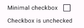
ينتج عن هذا المثال المكوّن التالي عندما يكون بلا علامة:
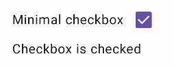
وهذه هي طريقة ظهور مربّع الاختيار نفسه عند وضع علامة فيه:
مثال متقدّم
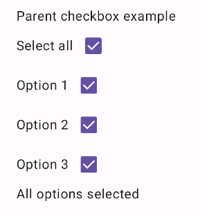
في ما يلي مثال أكثر تعقيدًا على كيفية تنفيذ مربّعات الاختيار في تطبيقك. في هذا المقتطف يتوفّر مربّع اختيار رئيسي وسلسلة من مربّعات الاختيار الثانوية. عندما ينقر المستخدم على مربّع الاختيار الرئيسي، يضع التطبيق علامة في جميع مربّعات الاختيار الثانوية.
@Composable fun CheckboxParentExample() { // Initialize states for the child checkboxes val childCheckedStates = remember { mutableStateListOf(false, false, false) } // Compute the parent state based on children's states val parentState = when { childCheckedStates.all { it } -> ToggleableState.On childCheckedStates.none { it } -> ToggleableState.Off else -> ToggleableState.Indeterminate } Column { // Parent TriStateCheckbox Row( verticalAlignment = Alignment.CenterVertically, ) { Text("Select all") TriStateCheckbox( state = parentState, onClick = { // Determine new state based on current state val newState = parentState != ToggleableState.On childCheckedStates.forEachIndexed { index, _ -> childCheckedStates[index] = newState } } ) } // Child Checkboxes childCheckedStates.forEachIndexed { index, checked -> Row( verticalAlignment = Alignment.CenterVertically, ) { Text("Option ${index + 1}") Checkbox( checked = checked, onCheckedChange = { isChecked -> // Update the individual child state childCheckedStates[index] = isChecked } ) } } } if (childCheckedStates.all { it }) { Text("All options selected") } }
الشرح
في ما يلي عدة نقاط يجب ملاحظتها من هذا المثال:
- إدارة الحالة:
childCheckedStates: قائمة بقيم منطقية تستخدمmutableStateOf()لتتبُّع حالة وضع علامة لكل مربّع اختيار ثانوي.-
parentState:ToggleableStateتستمد قيمته من حالات مربّعات الاختيار الثانوية.
- مكوّنات واجهة المستخدم:
-
TriStateCheckbox: ضروري لمربّع الاختيار الرئيسي لأنّه يتضمّن المَعلمةstateالتي تتيح لك ضبطه على حالة غير محدّدة. -
Checkbox: تُستخدَم لكل مربّع اختيار ثانوي مع ربط حالته بالعنصر المقابل فيchildCheckedStates. -
Text: تعرض هذه السمة التصنيفات والرسائل ("اختيار الكل" و"الخيار X" و"تم وضع علامة على كل الخيارات").
-
- المنطق:
- يعدّل المربع الرئيسي "
onClick" جميع مربعات الثانوية لتُصبح في الحالة المعاكسة لحالته الحالية. - يعدّل كل مربّع ثانوي "
onCheckedChange" حالته المقابلة في القائمة "childCheckedStates". - يعرض الرمز "
All options selected" عندما تكون جميع مربّعات الاختيار الثانوية تحتوي على علامة صح.
- يعدّل المربع الرئيسي "
النتيجة
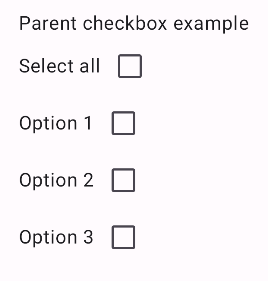
ينتج عن هذا المثال المكوّن التالي عندما تكون جميع مربّعات الاختيار غير محدّدة.
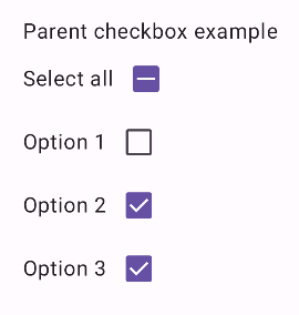
وبالمثل، يظهر المكوّن على النحو التالي عندما يتم وضع علامة على جميع الخيارات، كما يحدث عندما ينقُر المستخدم على "اختيار الكل":
عند وضع علامة في مربّع اختيار واحد فقط، يعرض مربّع اختيار العنصر الرئيسي الحالة غير المحدّدة: