レスポンシブ デザインとアダプティブ デザイン
コレクションでコンテンツを整理
必要に応じて、コンテンツの保存と分類を行います。

画面サイズの増加に対応するため、ProtoLayout マテリアル レイアウト テンプレートと Figma デザイン レイアウトにレスポンシブ動作を組み込み、スロットを自動的に適応させることができるようになりました。基本的に、スロットは使用可能な幅いっぱいに表示されるように設計されています。マージンはパーセンテージで設定され、画面の下部と上部のスロットに追加の内側のマージンが追加されます。これは、画面が拡大するにつれて画面の曲線が変化することを考慮したものです。
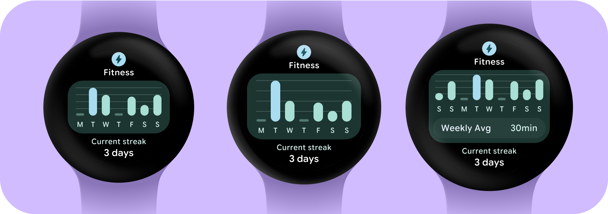
大画面と追加のスペースを最大限に活用するには、追加の画面スペースを利用して、ユーザーが追加の情報やオプションにアクセスできるようにすることで、より多くの価値を提供することを検討してください。このようなレイアウトを実現するには、組み込みのレスポンシブ動作を超える追加のカスタマイズが必要です。そのためには、ブレークポイントの後に、より有用なコンテンツをレイアウトに追加します。推奨されるブレークポイントは、画面サイズ 225 dp に設定されています。
重要な用語
レスポンシブ デザイン: 最適なユーザー エクスペリエンスを実現するために、ボタン、テキスト フィールド、ダイアログなどの要素を動的にフォーマットして配置するレイアウトのデザイン手法。レスポンシブ デザインのベスト プラクティスを活用して、大画面でユーザーに追加の価値を自動的に提供します。一目で確認できるテキストの増加、画面上のアクションの増加、タップ ターゲットの拡大とアクセス性の向上など、レスポンシブな手法は、大画面のユーザーにとってエクスペリエンスを向上させます。
適応型デザイン: ユーザー、デバイス、環境の既知の条件に基づいてインターフェースが変化する設計手法。マテリアルのアダプティブ デザインには、レイアウトとコンポーネントのアダプテーションが含まれます。
レスポンシブで最適化されたデザインを作成する
デザイン レイアウトが大きな画面サイズに適応するように、レイアウトとコンポーネントの動作を更新し、パーセンテージベースの余白やパディングなど、レスポンシブな動作を組み込みました。ProtoLayout テンプレートを使用している場合は、ProtoLayout API とベータ版リリースノートを使用してこれらの更新を自動的に継承できます。指定する必要があるのは、画面サイズのブレークポイントの後に追加のコンテンツやコンポーネントを追加したレイアウトのみです。大画面のメリットを活かすためのガイダンスと推奨事項については、タイルのガイダンスをご覧ください。タイルの画面の高さは固定されているため、不要な切り抜きを発生させることなく、限られた画面領域を最大限に活用できるようにパディングを調整しました。
このページのコンテンツやコードサンプルは、コンテンツ ライセンスに記載のライセンスに従います。Java および OpenJDK は Oracle および関連会社の商標または登録商標です。
最終更新日 2025-07-27 UTC。
[[["わかりやすい","easyToUnderstand","thumb-up"],["問題の解決に役立った","solvedMyProblem","thumb-up"],["その他","otherUp","thumb-up"]],[["必要な情報がない","missingTheInformationINeed","thumb-down"],["複雑すぎる / 手順が多すぎる","tooComplicatedTooManySteps","thumb-down"],["最新ではない","outOfDate","thumb-down"],["翻訳に関する問題","translationIssue","thumb-down"],["サンプル / コードに問題がある","samplesCodeIssue","thumb-down"],["その他","otherDown","thumb-down"]],["最終更新日 2025-07-27 UTC。"],[],[],null,["# Responsive and adaptive design\n\nTo accommodate the increasing screen size, we've incorporated responsive behavior into the [ProtoLayout Material layout templates](https://developer.android.com/reference/kotlin/androidx/wear/protolayout/material3/package-summary#(androidx.wear.protolayout.material3.MaterialScope).primaryLayout(kotlin.Function1,kotlin.Function1,kotlin.Function1,kotlin.Function1,androidx.wear.protolayout.ModifiersBuilders.Clickable,androidx.wear.protolayout.material3.PrimaryLayoutMargins)) and Figma design layouts, allowing the slots to automatically adapt. In essence, slots are designed to fill the available width. Our margins are set as percentages, with additional inner margins added to slots at the bottom and top of the screen, accounting for fluctuations in the curve of the screen as it enlarges.\n\nTo maximize the larger screen size and additional space, consider utilizing the extra screen space to provide more value by allowing users to access additional information or options. Achieving these layouts requires additional customization beyond the built-in responsive behavior. This can be accomplished by adding more helpful content to the layout after the breakpoint. It's important to note that the recommended breakpoint is set at the 225dp screen size.\n\nEssential terms\n---------------\n\n**Responsive design:** A design approach in which layouts dynamically format and position elements such as buttons, text fields, and dialogs for an optimal user experience. Automatically offer users additional value on larger screens by utilizing responsive design practices. Whether it's more text visible at a glance, more actions on screen, or larger, more accessible tap targets, responsive practices provide an enhanced experience for users of large screens.\n\n**Adaptive design:** A design approach in which the interface changes based on known user, device, or environmental conditions. Adaptive design in Material includes layout and component adaptations.\n\nBuilding responsive and optimized designs\n-----------------------------------------\n\nTo ensure your design layouts adapt to larger screen sizes, we have updated the behavior of our layouts and components to have built-in responsive behavior, including percentage-based margins and padding.\nIf you are using our ProtoLayout templates, you can inherit these updates automatically through the [ProtoLayout API](/design/ui/wear/guides/surfaces/tiles/reference/kotlin/androidx/wear/protolayout/material3/package-summary) and the [beta release notes](https://developer.android.com/jetpack/androidx/releases/wear-protolayout#1.3.0-beta02), and only need to supply layouts where you have added additional content or components after a screen size breakpoint. For full guidance and recommendations on how to take advantage of a larger screen size, view our [Tiles guidance](/design/ui/wear/guides/surfaces/tiles/wear/guides/surfaces/tiles). Tiles have a fixed screen height, so we've adjusted the padding to maximize the limited screen real estate without creating unwanted clipping."]]