字型
透過集合功能整理內容
你可以依據偏好儲存及分類內容。
將所有 Roboto 例項替換為 Roboto Flex。針對手錶和 Material 3 表情符號設計語言,調整基本字體比例,以便進行最佳化。
使用變數軸、變數寬度和粗細,決定大型顯示和標題文字的樣式,以提升樣式,並讓較小的文字更實用且易讀。
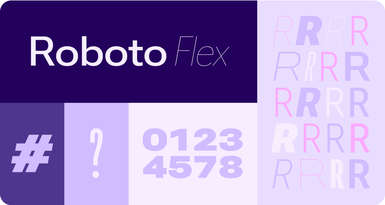
Roboto Flex
Roboto Flex 提供一組可變軸,可滿足應用程式的用途。
可調整的軸
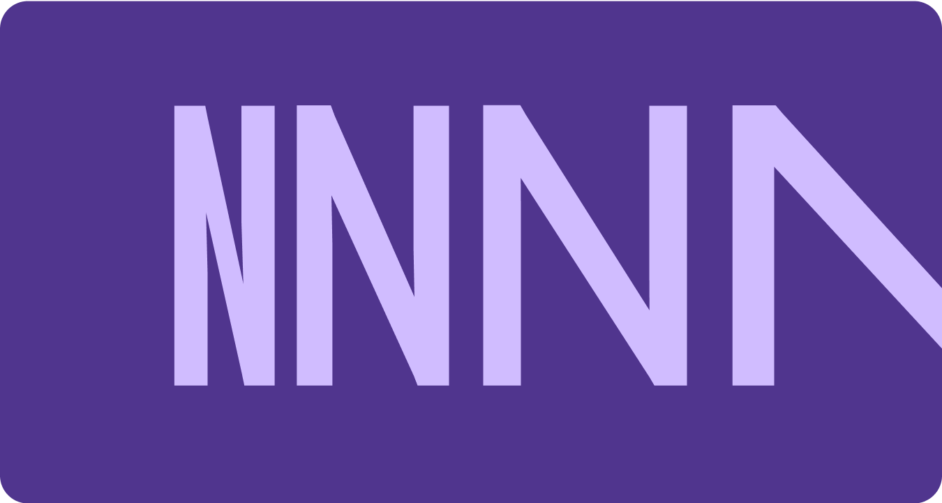
雖然可變字型可提供多種可變字型屬性來表達意涵,但有兩個可自訂的樣式屬性 (或軸) 最適合產品設計:粗細和寬度。
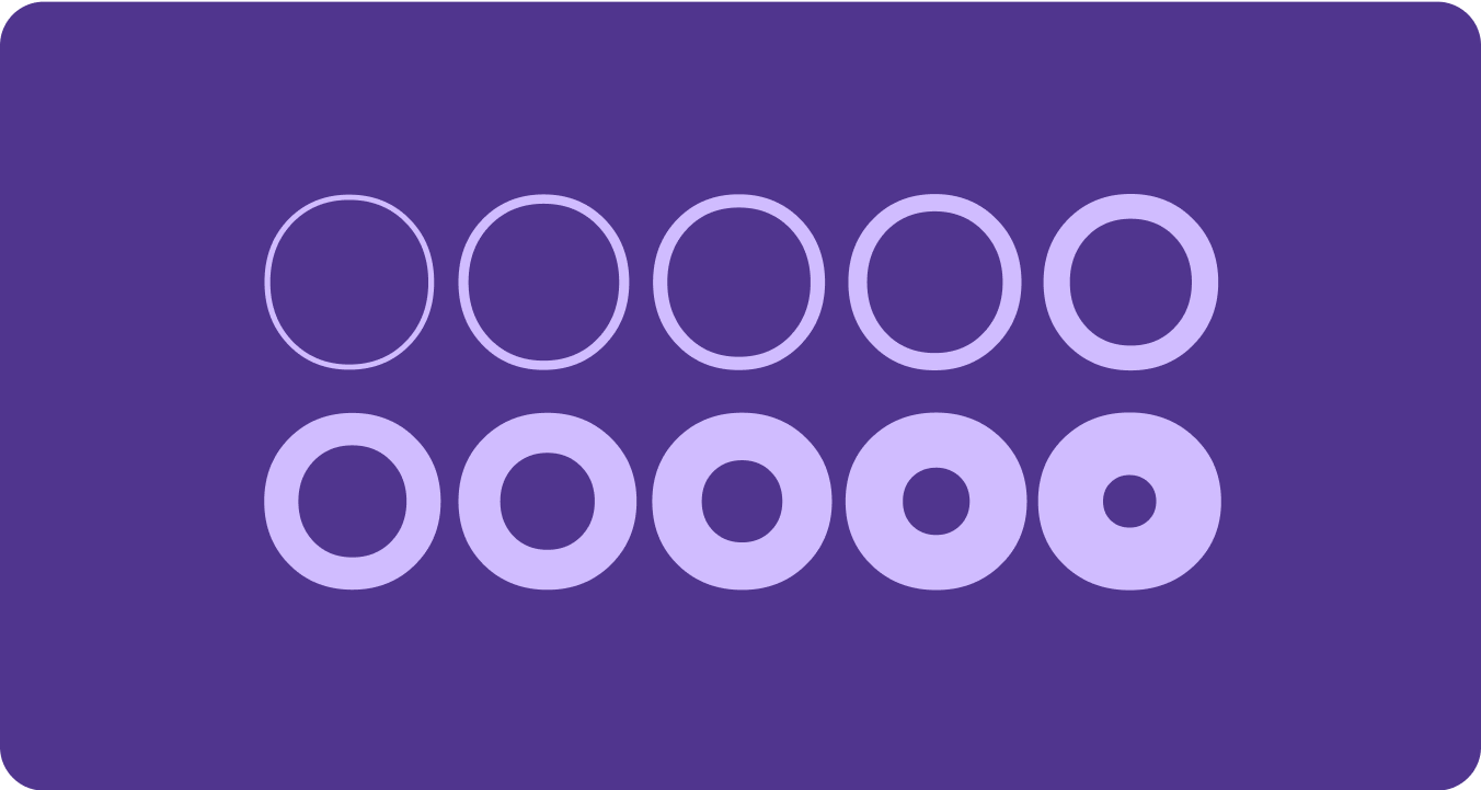
體重
粗細是主要屬性,可定義任一字型中字體筆劃的整體粗細。最常見的粗細為一般和粗體,但粗細可以涵蓋從極輕到極重的極端。如果字體是可變的,則可提供完整的連續筆劃粗細範圍,使字重數量實際上無限。
注意事項
warning
注意
請注意,不要使用太輕的字型重量類型做為內文。
解析度較低的螢幕可能無法顯示精緻的字型,尤其是字型較小的字型。在較大的字型大小 (例如顯示型字型) 使用較輕的粗細。
warning
注意
相反地,如果在較小的尺寸下使用過多重量,可能會影響可讀性。太粗的字型可能難以閱讀。
寬度
寬度是字型字元的橫向空間佔用量。窄版面可讓每行顯示更多字元,而寬版面則可展現更多個人風格。
注意事項
check_circle
正確做法
較窄的寬度可讓較多字元在較小的尺寸中顯示,例如名稱或長數字。
cancel
錯誤做法
較寬的樣式會佔用更多空間,因此請避免在空間有限的區域 (例如應用程式頁面標題) 使用這類樣式。
這個頁面中的內容和程式碼範例均受《內容授權》中的授權所規範。Java 與 OpenJDK 是 Oracle 和/或其關係企業的商標或註冊商標。
上次更新時間:2025-07-27 (世界標準時間)。
[[["容易理解","easyToUnderstand","thumb-up"],["確實解決了我的問題","solvedMyProblem","thumb-up"],["其他","otherUp","thumb-up"]],[["缺少我需要的資訊","missingTheInformationINeed","thumb-down"],["過於複雜/步驟過多","tooComplicatedTooManySteps","thumb-down"],["過時","outOfDate","thumb-down"],["翻譯問題","translationIssue","thumb-down"],["示例/程式碼問題","samplesCodeIssue","thumb-down"],["其他","otherDown","thumb-down"]],["上次更新時間:2025-07-27 (世界標準時間)。"],[],[],null,["# Fonts\n\nReplace all instances of Roboto with Roboto Flex. Tailor a baseline type scale\nthat is optimized for the watch and the Material 3 Expressive design language.\n\nUsing variable axis, variable width and weight to curate how we style big\ndisplay and title text to elevate style and bring more utility and legibility\nfor smaller sizes.\n\nRoboto Flex\n-----------\n\n\nRoboto Flex offers a set of variable axis that serves your app's use cases. \n\n\u003cbr /\u003e\n\nAdjustable axes\n---------------\n\nWhile variable fonts can have a multitude of variable font attributes for\nexpression, there are two customizable stylistic attributes (or axes) that are\nmost applicable for product design: weight and width.\n\n### Weight\n\n\n[Weight](https://fonts.google.com/knowledge/choosing_type/exploring_typefaces_with_multiple_weights_or_grades) is the primary attribute that defines the overall thickness of a\ntypeface's strokes in any given font. The most common weights are regular and\nbold, but weights can cover extremes from the very light to the very heavy. If\nthe typeface is variable, it provides a full, continuous range of stroke\nthicknesses, making the number of weights effectively unlimited. \n\n\u003cbr /\u003e\n\n#### Things to remember\n\nwarning\n\n### Caution\n\nBe careful of using too light a weight type for body text.\nLower resolution displays can struggle with delicate, especially small\ntypography. Use lighter weights at larger font sizes, such as display\ntype. \nwarning\n\n### Caution\n\nConversely, excessive weight at smaller sizes may affect\nlegibility. Too thick a type may be difficult to read.\n\n### Width\n\n\n[Width](https://fonts.google.com/knowledge/glossary/width) is the result of how much horizontal space is taken up by a\ntypeface's characters. A narrow width allows more characters to fit per line\nwhile a wider width may offer more personality. \n\n\u003cbr /\u003e\n\n#### Things to remember\n\ncheck_circle\n\n### Do\n\nA thinner width can allow for more characters to fit at\nsmall sizes, such as name or a long number. \ncancel\n\n### Don't\n\nSince wider styles take up more space, avoid using them for\nareas with limited space, such as in the app page header."]]