フォント
コレクションでコンテンツを整理
必要に応じて、コンテンツの保存と分類を行います。
Roboto のすべてのインスタンスを Roboto Flex に置き換えます。スマートウォッチとマテリアル 3 の表現力豊かなデザイン言語に合わせて最適化されたベースライン タイプスケールを調整します。
可変軸、可変幅、可変ウェイトを使用して、大きなディスプレイとタイトル テキストのスタイルを調整し、スタイルを高め、小さいサイズでも実用性と読みやすさを高めます。
Roboto Flex
Roboto Flex には、アプリのユースケースに対応する可変軸のセットがあります。
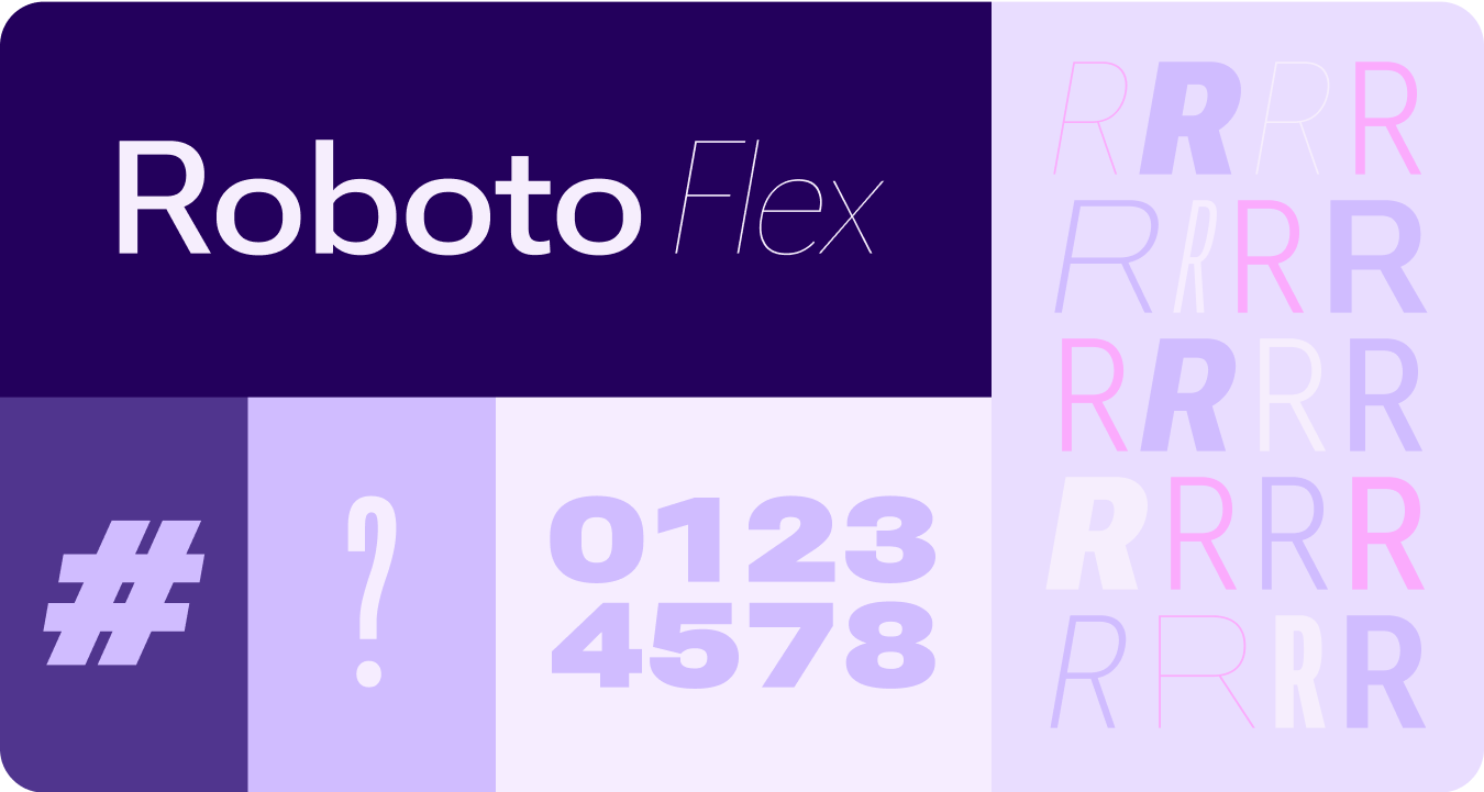
調整可能な軸
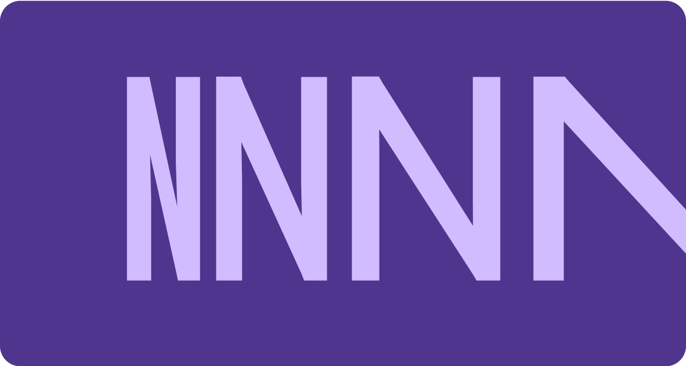
可変フォントには、表現のための可変フォント属性が多数ありますが、プロダクト デザインに最も適したカスタマイズ可能なスタイル属性(または軸)が 2 つあります。それは、太さと幅です。
体重
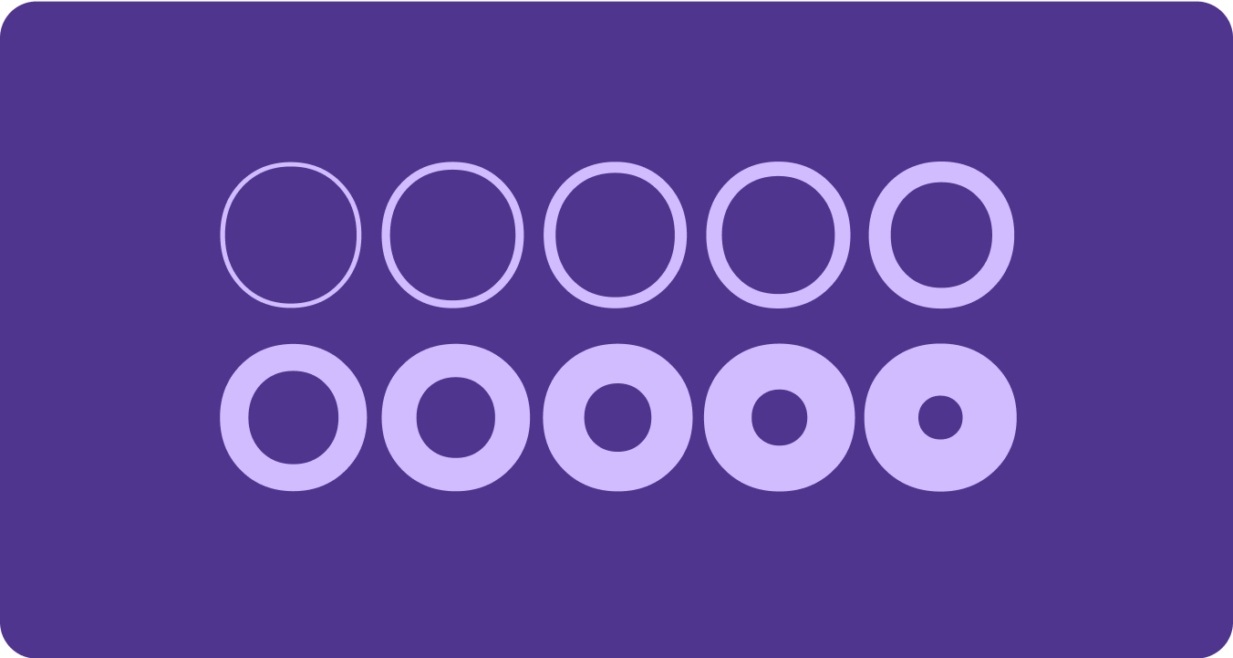
Weight は、特定のフォントにおける書体のストロークの全体的な太さを定義する主な属性です。最も一般的な太さは通常と太字ですが、太さは非常に軽いものから非常に重いものまで極端なものがあります。書体に可変性がある場合、ストロークの太さの全体的な連続範囲が提供されるため、重みの数は実質的に無制限になります。
注意事項
warning
注意
本文のテキストに太さが軽すぎるタイプを使用する場合は注意が必要です。
解像度の低いディスプレイでは、繊細なタイポグラフィ、特に小さなタイポグラフィが読みづらくなることがあります。ディスプレイ タイプなど、大きなフォントサイズでは、より細い太さのフォントを使用します。
warning
注意
逆に、小さいサイズで太すぎると、判読性が低下する可能性があります。太すぎる文字は読みづらい場合があります。
幅
Width(幅)は、タイプフェイスの文字により占有される水平方向のスペースの結果的な分量です。幅が狭いほど、1 行あたりに収まる文字数が増えますが、幅が広いほど個性が出ます。
注意事項
check_circle
すべきこと
幅を狭くすると、名前や長い数字など、小さいサイズでも多くの文字を表示できます。
cancel
すべきでないこと
幅の広いスタイルはスペースを多く占有するため、アプリページのヘッダーなど、スペースが限られている領域には使用しないでください。
このページのコンテンツやコードサンプルは、コンテンツ ライセンスに記載のライセンスに従います。Java および OpenJDK は Oracle および関連会社の商標または登録商標です。
最終更新日 2025-07-27 UTC。
[[["わかりやすい","easyToUnderstand","thumb-up"],["問題の解決に役立った","solvedMyProblem","thumb-up"],["その他","otherUp","thumb-up"]],[["必要な情報がない","missingTheInformationINeed","thumb-down"],["複雑すぎる / 手順が多すぎる","tooComplicatedTooManySteps","thumb-down"],["最新ではない","outOfDate","thumb-down"],["翻訳に関する問題","translationIssue","thumb-down"],["サンプル / コードに問題がある","samplesCodeIssue","thumb-down"],["その他","otherDown","thumb-down"]],["最終更新日 2025-07-27 UTC。"],[],[],null,["# Fonts\n\nReplace all instances of Roboto with Roboto Flex. Tailor a baseline type scale\nthat is optimized for the watch and the Material 3 Expressive design language.\n\nUsing variable axis, variable width and weight to curate how we style big\ndisplay and title text to elevate style and bring more utility and legibility\nfor smaller sizes.\n\nRoboto Flex\n-----------\n\n\nRoboto Flex offers a set of variable axis that serves your app's use cases. \n\n\u003cbr /\u003e\n\nAdjustable axes\n---------------\n\nWhile variable fonts can have a multitude of variable font attributes for\nexpression, there are two customizable stylistic attributes (or axes) that are\nmost applicable for product design: weight and width.\n\n### Weight\n\n\n[Weight](https://fonts.google.com/knowledge/choosing_type/exploring_typefaces_with_multiple_weights_or_grades) is the primary attribute that defines the overall thickness of a\ntypeface's strokes in any given font. The most common weights are regular and\nbold, but weights can cover extremes from the very light to the very heavy. If\nthe typeface is variable, it provides a full, continuous range of stroke\nthicknesses, making the number of weights effectively unlimited. \n\n\u003cbr /\u003e\n\n#### Things to remember\n\nwarning\n\n### Caution\n\nBe careful of using too light a weight type for body text.\nLower resolution displays can struggle with delicate, especially small\ntypography. Use lighter weights at larger font sizes, such as display\ntype. \nwarning\n\n### Caution\n\nConversely, excessive weight at smaller sizes may affect\nlegibility. Too thick a type may be difficult to read.\n\n### Width\n\n\n[Width](https://fonts.google.com/knowledge/glossary/width) is the result of how much horizontal space is taken up by a\ntypeface's characters. A narrow width allows more characters to fit per line\nwhile a wider width may offer more personality. \n\n\u003cbr /\u003e\n\n#### Things to remember\n\ncheck_circle\n\n### Do\n\nA thinner width can allow for more characters to fit at\nsmall sizes, such as name or a long number. \ncancel\n\n### Don't\n\nSince wider styles take up more space, avoid using them for\nareas with limited space, such as in the app page header."]]