Hộp thoại
Sử dụng bộ sưu tập để sắp xếp ngăn nắp các trang
Lưu và phân loại nội dung dựa trên lựa chọn ưu tiên của bạn.
Sử dụng Dialog
để tập trung sự chú ý của người dùng vào một hành động kịp thời hoặc một phần thông tin.

Phân tích
Hộp thoại nên xuất hiện để phản hồi một nhiệm vụ của người dùng hoặc một thao tác, kèm theo thông tin liên quan hoặc dựa trên ngữ cảnh. Không giống như các đối tác trên thiết bị di động, Hộp thoại trong Wear OS chiếm toàn bộ màn hình và được phân lớp trên các nội dung khác.
Hộp thoại hỗ trợ cử chỉ vuốt để đóng. Khi người dùng thực hiện thao tác vuốt này, hệ thống sẽ hiển thị nội dung gốc ở chế độ nền.
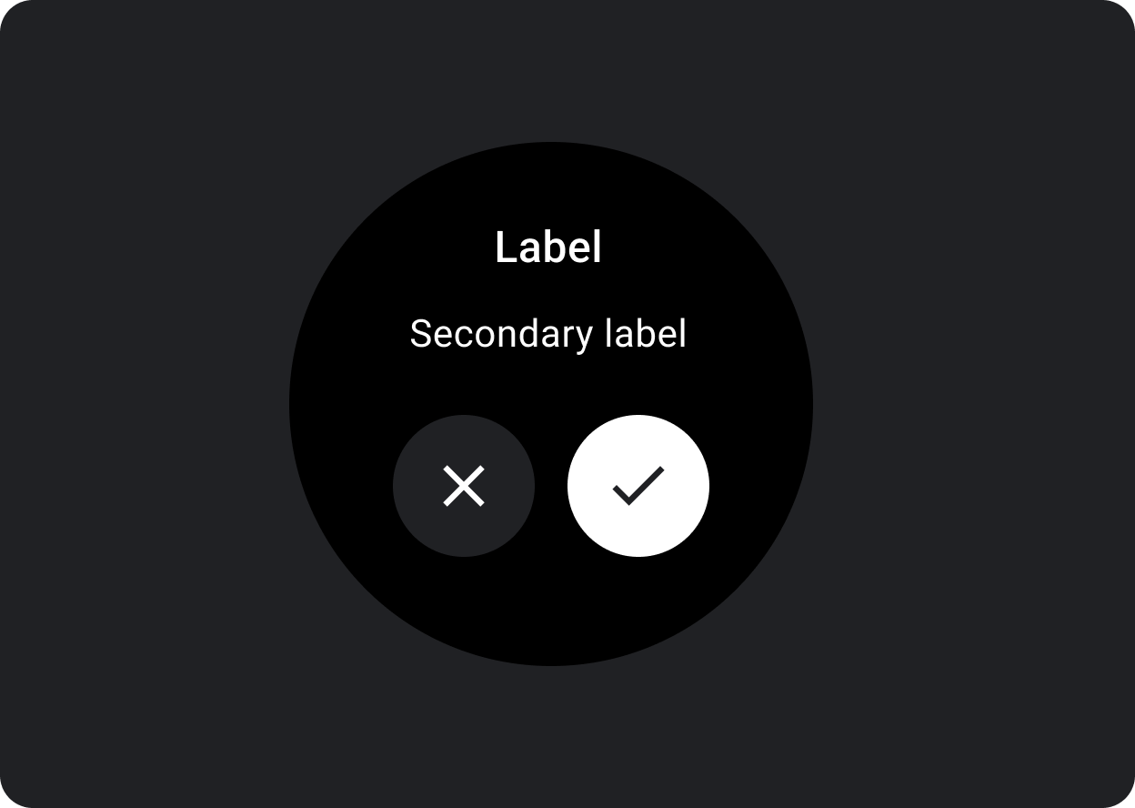
Hộp thoại có một khe duy nhất cho nội dung hộp thoại được cho phép, chẳng hạn như Cảnh báo hoặc Xác nhận.
Cảnh báo
Sử dụng một thành phần thông báo để nhận phản hồi của người dùng về các nhiệm vụ quan trọng.
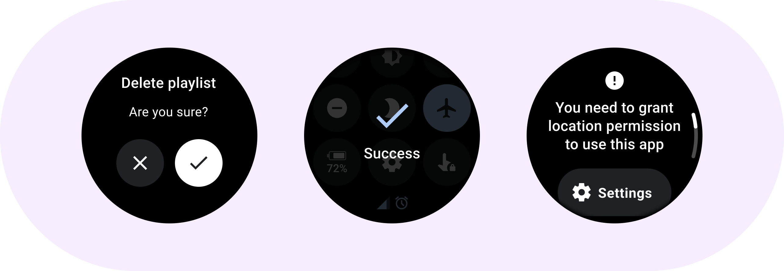
Cảnh báo sẽ tắt mọi chức năng của ứng dụng khi chúng xuất hiện và sẽ hiển thị trên màn hình cho đến khi bạn thực hiện hành động. Cảnh báo thường có chủ đích gây gián đoạn, vậy nên hãy hạn chế sử dụng cảnh báo.
Nếu nội dung của cảnh báo dài hơn ba dòng văn bản, hãy cân nhắc việc căn trái nội dung để cải thiện khả năng đọc. Nếu không, văn bản sẽ được căn giữa theo mặc định.
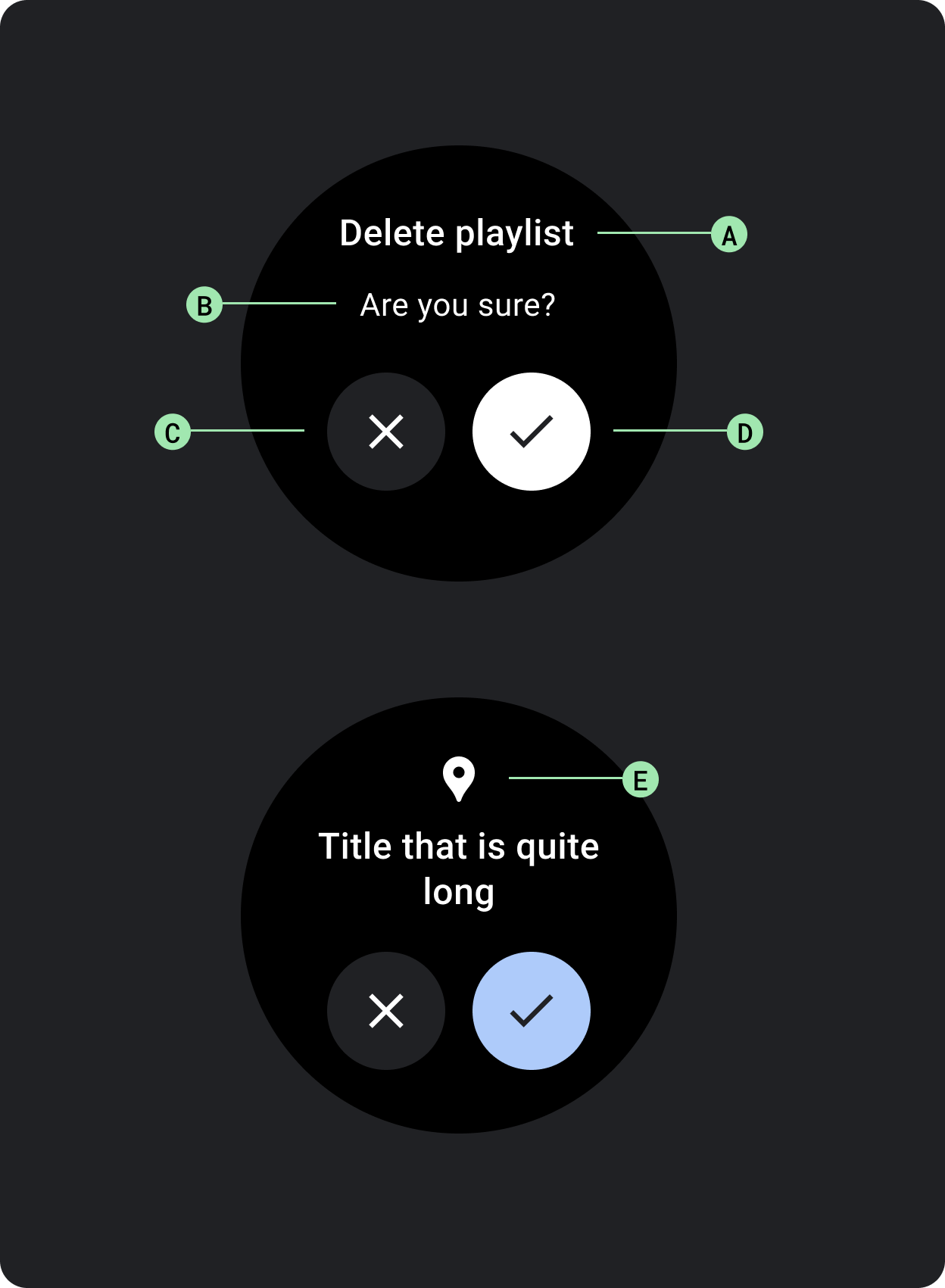
A. Tiêu đề
B. Nội dung (không bắt buộc)
C. Nút Không (không xác nhận)
D. Nút Có (xác nhận)
E. Biểu tượng (không bắt buộc)
Xác nhận
Thành phần xác nhận sẽ hiển thị một thông báo xác nhận cho người dùng trong khoảng thời gian ngắn. Không giống như thành phần trong Material, thành phần xác nhận trong Wear OS không cho phép người dùng xác nhận về lựa chọn cuối cùng.
Hãy sử dụng thành phần này để thu hút sự chú ý của người dùng sau khi thực hiện một hành động.
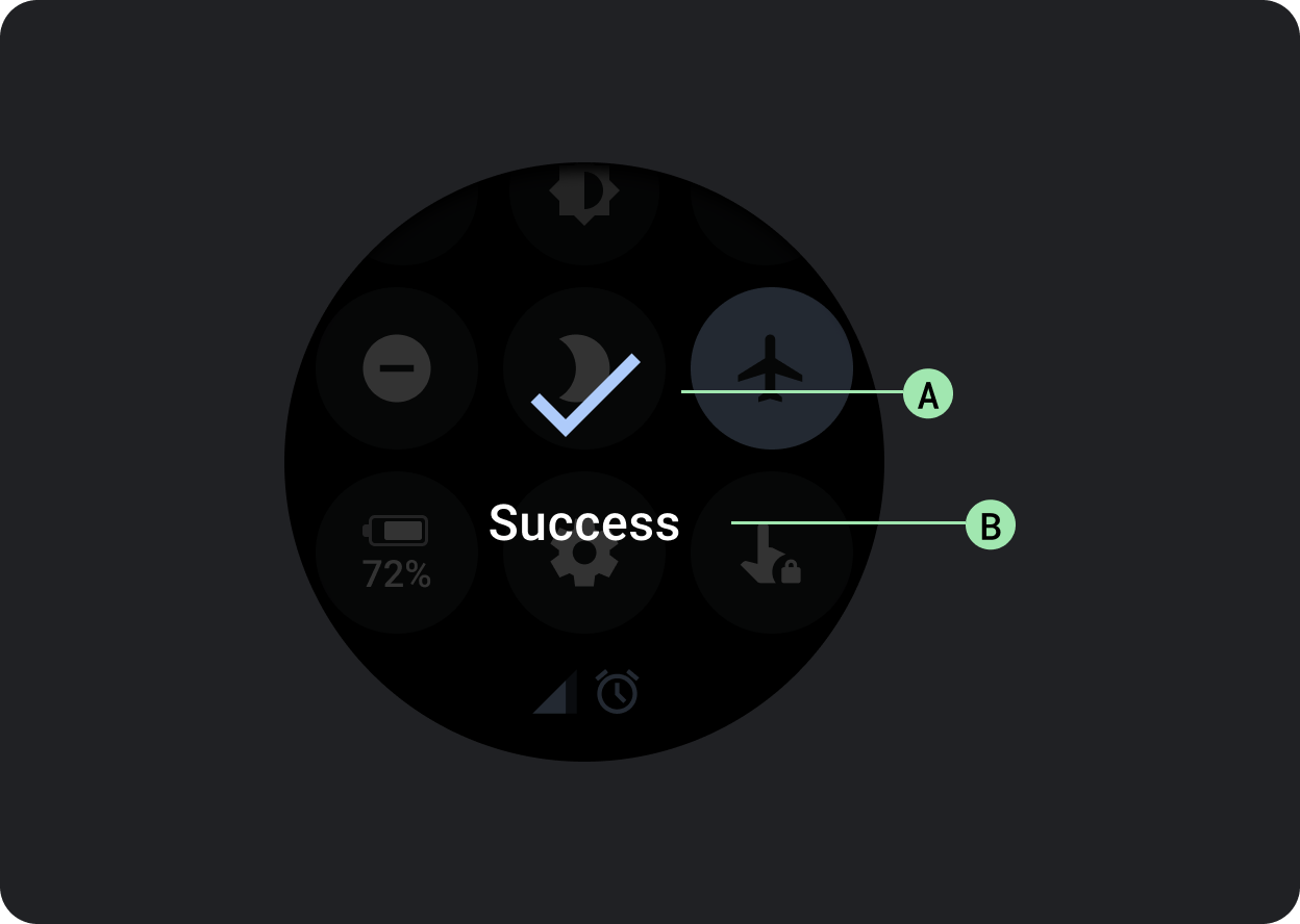
A. Biểu tượng
B. Nhãn
Nội dung và mã mẫu trên trang này phải tuân thủ các giấy phép như mô tả trong phần Giấy phép nội dung. Java và OpenJDK là nhãn hiệu hoặc nhãn hiệu đã đăng ký của Oracle và/hoặc đơn vị liên kết của Oracle.
Cập nhật lần gần đây nhất: 2025-07-27 UTC.
[[["Dễ hiểu","easyToUnderstand","thumb-up"],["Giúp tôi giải quyết được vấn đề","solvedMyProblem","thumb-up"],["Khác","otherUp","thumb-up"]],[["Thiếu thông tin tôi cần","missingTheInformationINeed","thumb-down"],["Quá phức tạp/quá nhiều bước","tooComplicatedTooManySteps","thumb-down"],["Đã lỗi thời","outOfDate","thumb-down"],["Vấn đề về bản dịch","translationIssue","thumb-down"],["Vấn đề về mẫu/mã","samplesCodeIssue","thumb-down"],["Khác","otherDown","thumb-down"]],["Cập nhật lần gần đây nhất: 2025-07-27 UTC."],[],[],null,["# Dialogs\n\nUse a [`Dialog`](/reference/kotlin/androidx/wear/compose/material/dialog/package-summary) to focus users' attention on a timely action or piece of\ninformation.\n\nAnatomy\n-------\n\n\nDialogs should appear in response to a user task or an action, with\nrelevant or contextual information. Unlike their mobile counterparts,\nDialogs in Wear OS occupy the whole screen and are layered over other\ncontent.\n\n\nDialogs support a swipe-to-dismiss gesture. When the user performs\nthis swipe gesture, the system reveals the parent content in the\nbackground.\n\nDialogs have a single slot for opinionated dialog content, such as an\n[Alert](/reference/kotlin/androidx/wear/compose/material/dialog/package-summary#Alert(kotlin.Function1,kotlin.Function0,kotlin.Function0,androidx.compose.ui.Modifier,kotlin.Function1,androidx.wear.compose.material.ScalingLazyListState,androidx.compose.ui.graphics.Color,androidx.compose.ui.graphics.Color,androidx.compose.ui.graphics.Color,androidx.compose.ui.graphics.Color,androidx.compose.foundation.layout.Arrangement.Vertical,androidx.compose.foundation.layout.PaddingValues,kotlin.Function1)) or\n[Confirmation](/reference/kotlin/androidx/wear/compose/material/dialog/package-summary#Confirmation(kotlin.Function0,androidx.compose.ui.Modifier,kotlin.Function1,androidx.wear.compose.material.ScalingLazyListState,kotlin.Long,androidx.compose.ui.graphics.Color,androidx.compose.ui.graphics.Color,androidx.compose.ui.graphics.Color,androidx.compose.foundation.layout.Arrangement.Vertical,androidx.compose.foundation.layout.PaddingValues,kotlin.Function1)).\n\n\u003cbr /\u003e\n\n\n**Alert**\n\nUse an alert component to get the user's response for important\ntasks.\n\nAlerts disable all app functionality when they appear, and remain on\nscreen until an action has been taken. Alerts are purposefully interruptive,\nso use them sparingly.\n\nIf the content of the alert is longer than three lines of text, consider\nleft aligning the content to improve its readability. Otherwise the text\nis center aligned by default.\n\n\n**A. Title\nB. Content (optional)\nC. Negative button\nD. Positive button\nE. Icon (optional)**\n\n\u003cbr /\u003e\n\n**Confirmation**\n\nThe confirmation component displays a confirmation message to the user\nfor a short period of time. Unlike its Material counterpart, the\nconfirmation component in Wear OS doesn't allow users to provide final\nconfirmation of a choice.\n\nUse this component to capture a user's attention after an action has been\nexecuted.\n\n\n**A. Icon\nB. Label**"]]