非捲動式應用程式的常見版面配置
透過集合功能整理內容
你可以依據偏好儲存及分類內容。
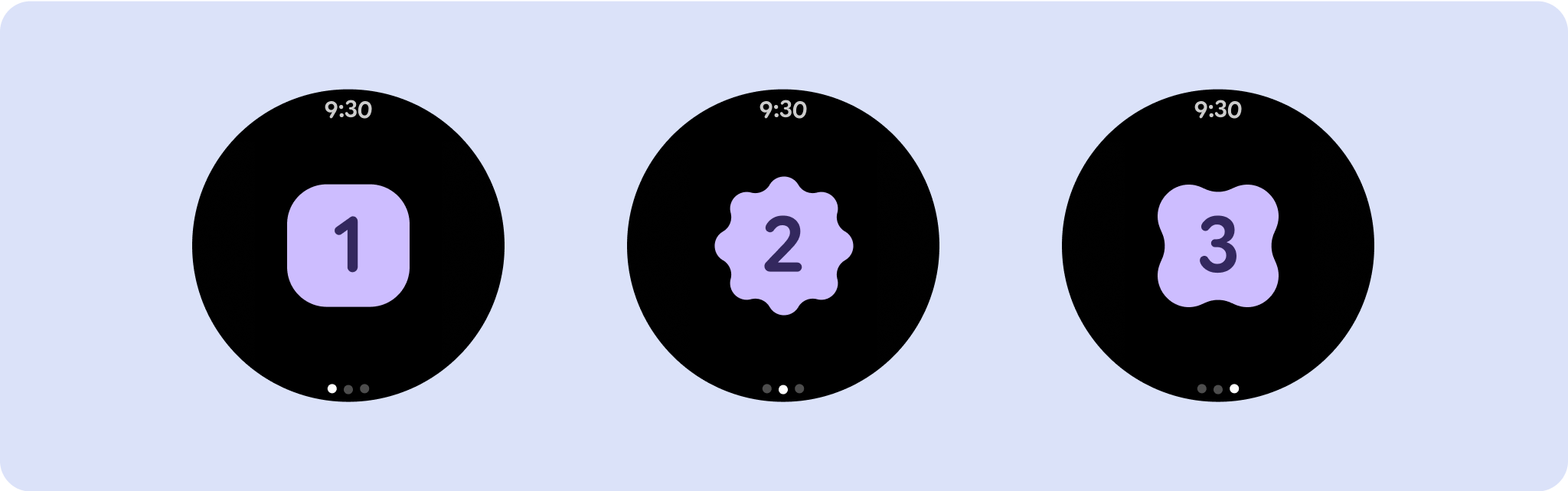
不捲動的應用程式檢視畫面版面配置包括媒體播放器、確認對話方塊、挑選器、切換器,以及使用進度指標的特殊健身或追蹤畫面。您可以限制任何畫面的高度,確保使用者專注於單一工作或一組控制項,而不需要瀏覽選項清單。為了配合螢幕尺寸較小的裝置,請在設計時考量到尺寸限制,確保可一目瞭然,並在適當情況下採用圓形螢幕。

建立回應式及最佳化設計
不捲動的檢視畫面著重於一目瞭然的資訊,並以最少的互動方式為使用者提供價值。不過,在這些版面配置中建立回應式行為可能相當困難。為解決這個問題,我們已更新 Android UI 程式庫版面配置和元件,並內建回應式行為,包括以百分比為依據的邊界和邊框間距。如果您使用 Compose 元件,可以自動繼承這項回應能力。
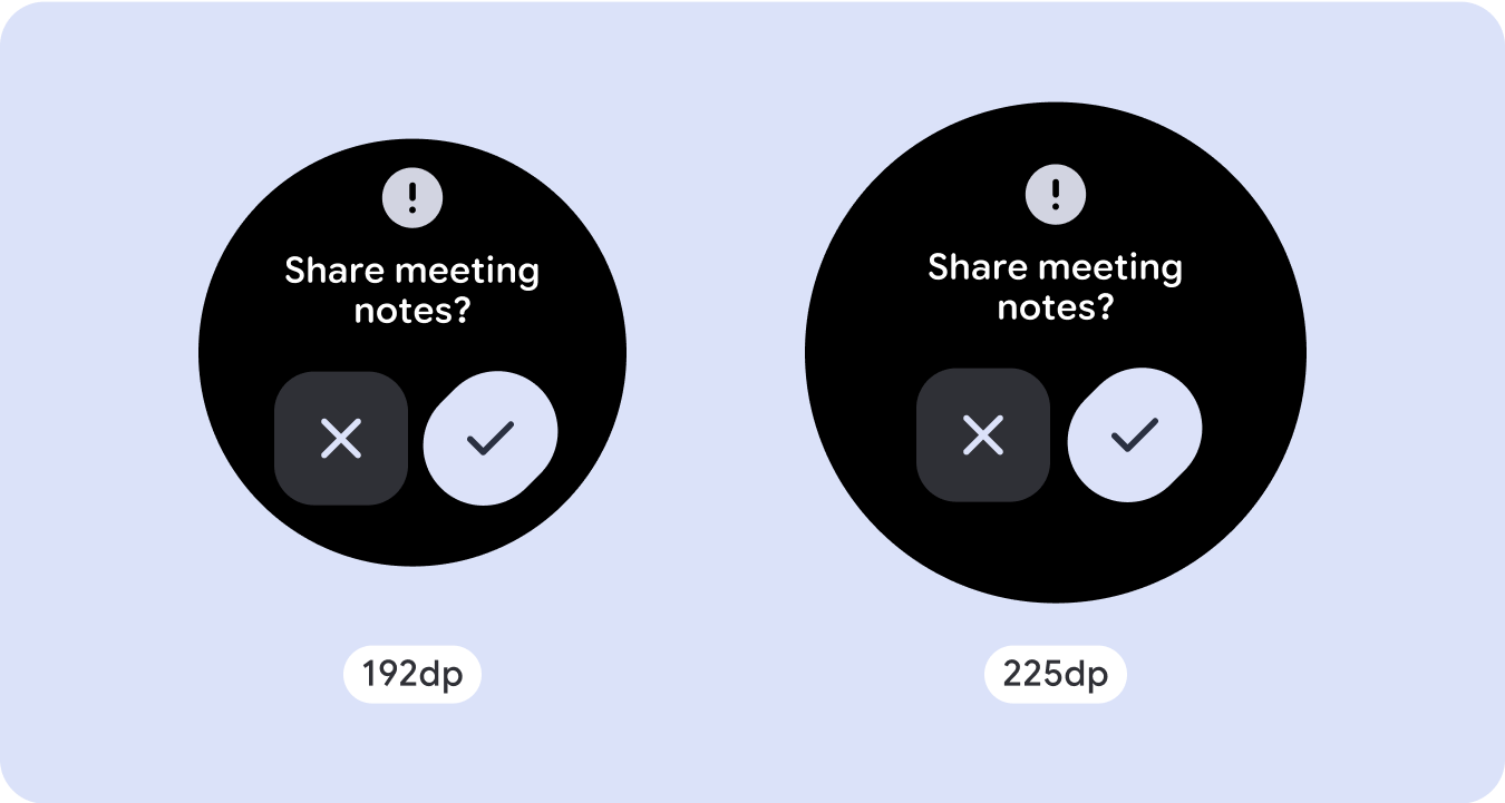
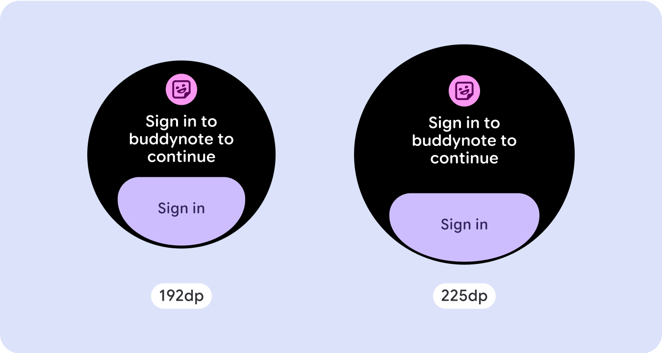
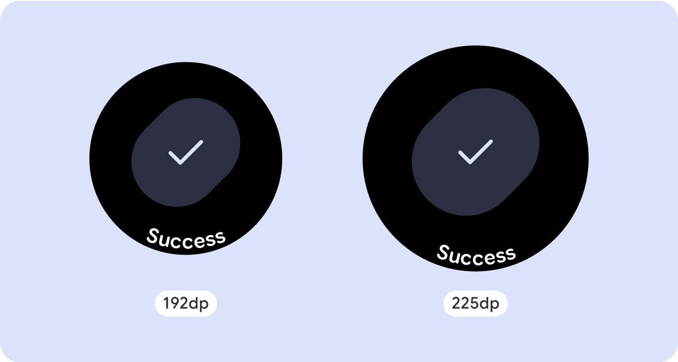
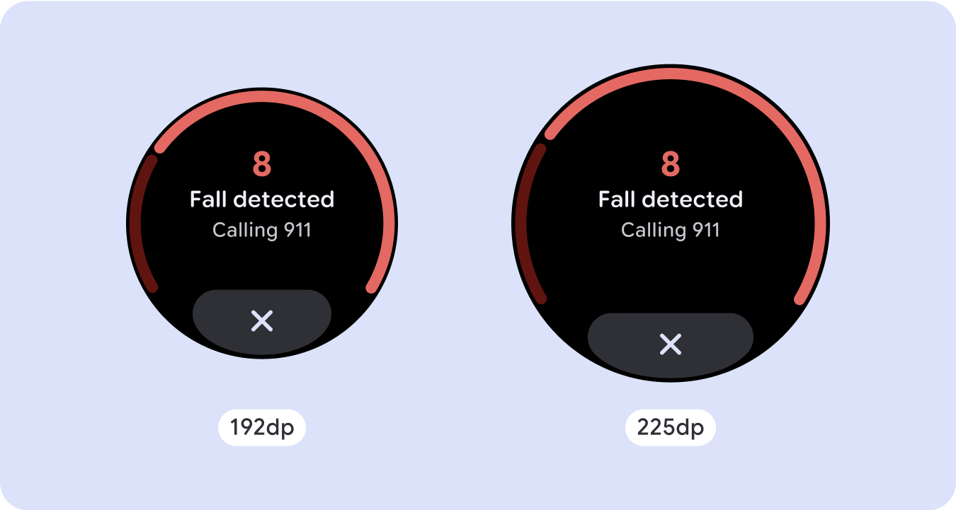
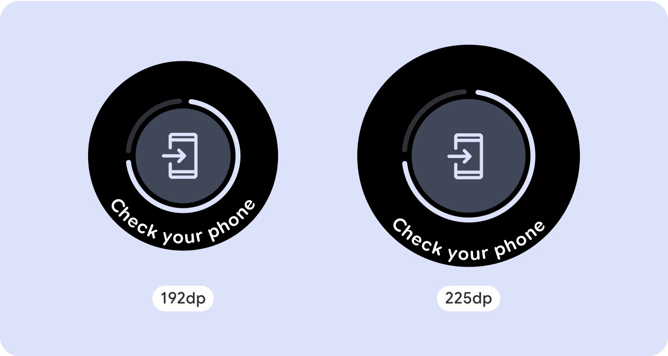
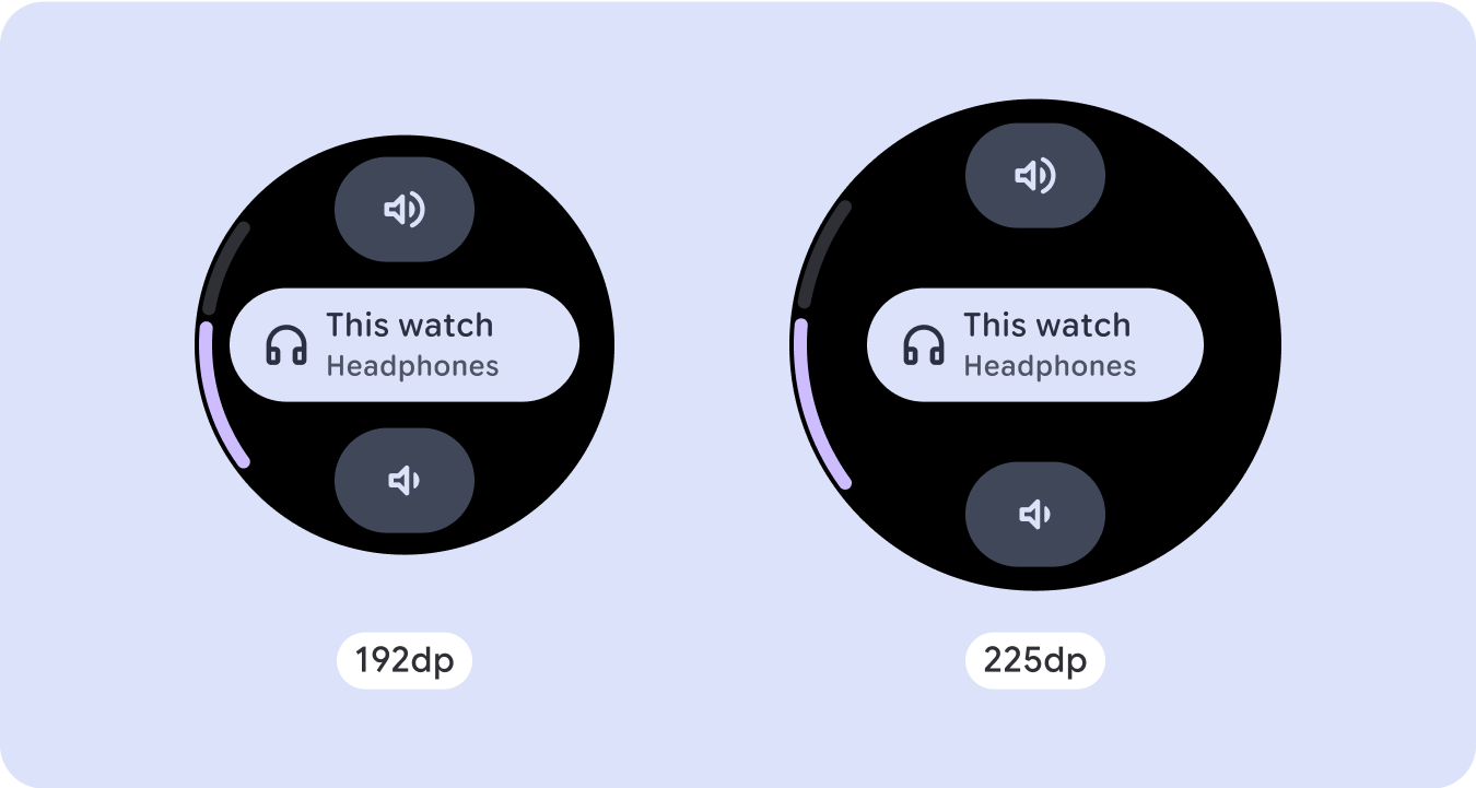
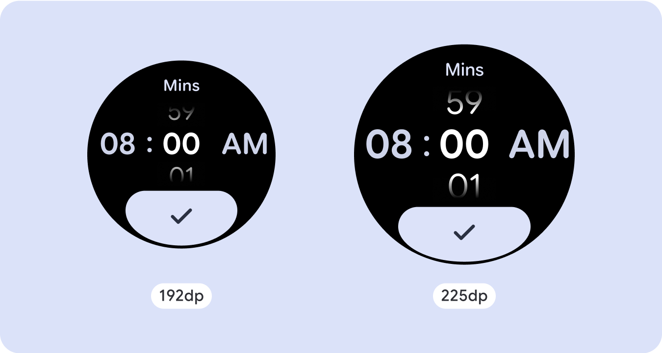
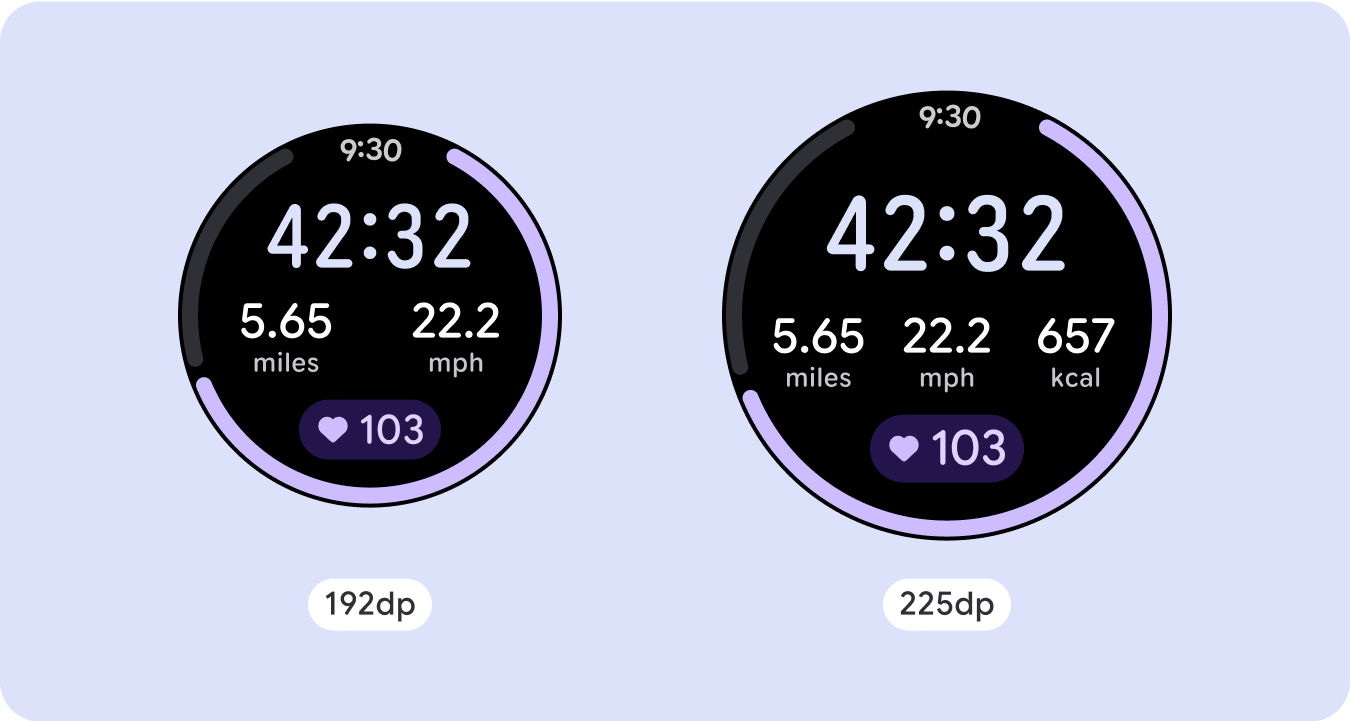
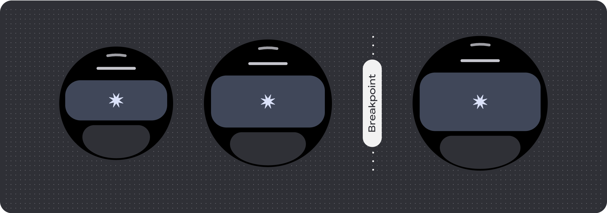
針對獨特的螢幕設計,請在各種螢幕尺寸上徹底測試,確保元件和元素能順利調整,並避免內容遭到裁剪。百分比邊界可有效調整間距,建議您使用 225dp 的斷點,在較大的智慧手錶螢幕上顯示其他資訊和強化功能。
確認元件會根據可用的寬度和高度進行調整
所有元件都是以回應式方式建構,也就是說,它們會根據可用的寬度 (以及全螢幕時的高度) 進行調整。請務必留有必要的邊界,確保內容不會因螢幕圓弧曲線而遭到裁剪。此外,請確認必要的版面配置行為,確保非捲動螢幕內容不會推送版面配置捲動或遭到截斷。
建構可自動調整且獨樹一格的設計
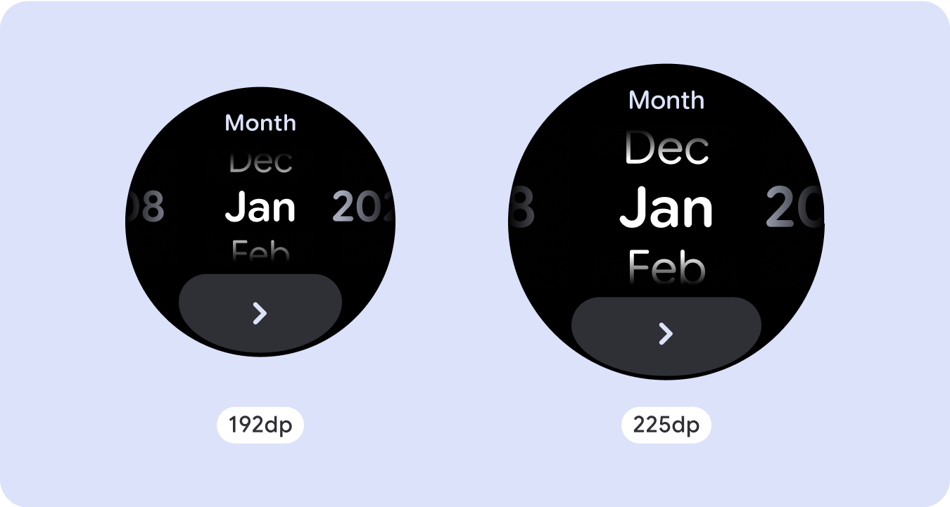
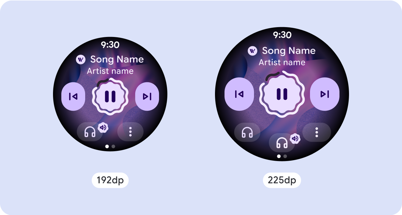
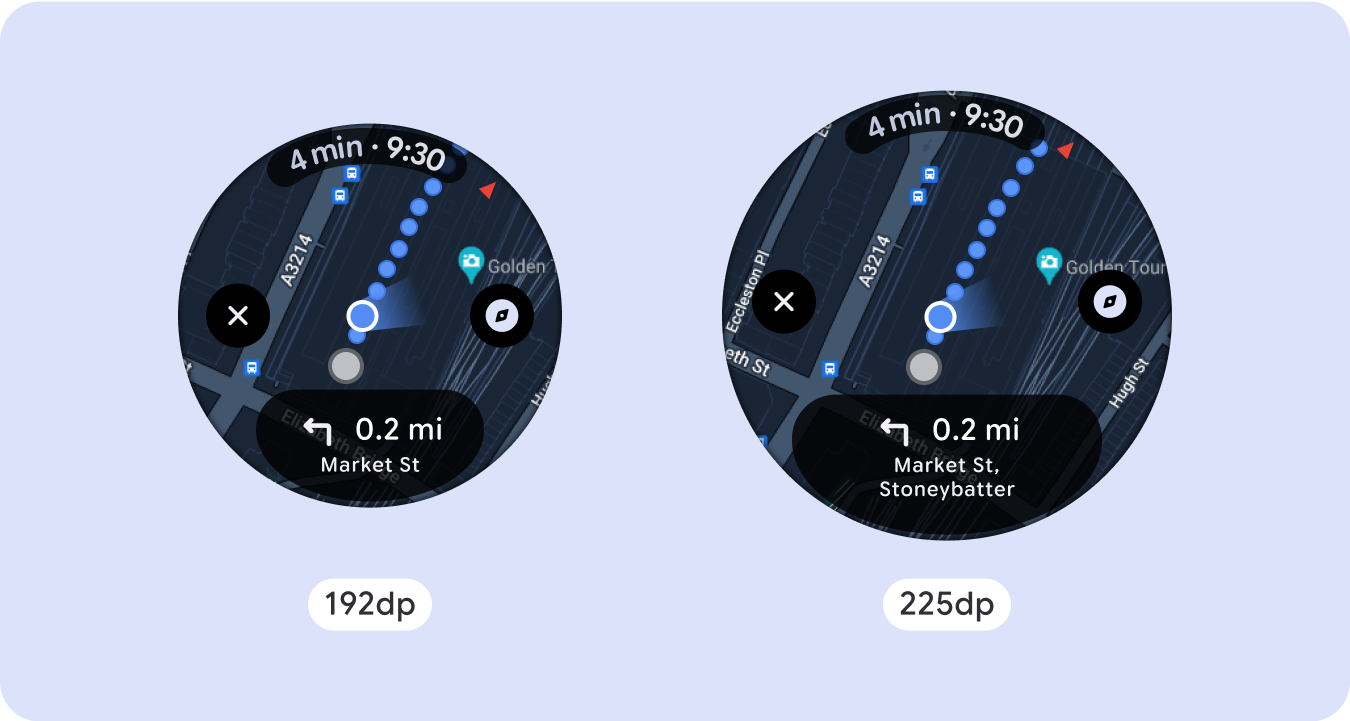
為了在較大的螢幕尺寸上充分利用額外空間,請在 225dp 處新增大小中斷點。這個中斷點可讓您顯示其他內容,包括更多資訊、選項、資料,或變更版面配置,以便更適合較大的螢幕尺寸。
這需要為每個暫停點設計不同的版面配置。較大的螢幕設計 (225 以上) 可納入下列額外元素:
增加現有元件的大小或變更其狀態
使用中斷點可顯示更多詳細資料,或讓內容更一目了然。只要確保在小螢幕上不會發生體驗或功能中斷的情況,且大螢幕的變更僅是額外的變更即可。
在目前版面配置中新增內容
透過新增元件或內容,版面配置可提供更多選項、詳細資料,並最終提供價值。
但這絕不應犧牲一目瞭然的設計。
如果體驗需要更多內容,但希望保留非捲動式版面配置,請考慮使用多頁面版面配置,並搭配垂直或水平分頁。

回應式和自動調整行為
Compose 程式庫中的所有元件都會自動調整為更寬的螢幕尺寸,並獲得寬度和高度。對於這類檢視畫面,使用中斷點可為所有使用者提供特別豐富且有價值的體驗。以百分比定義所有邊界,並定義垂直限制,讓中間的主要內容可延伸至填滿可用的顯示區域。
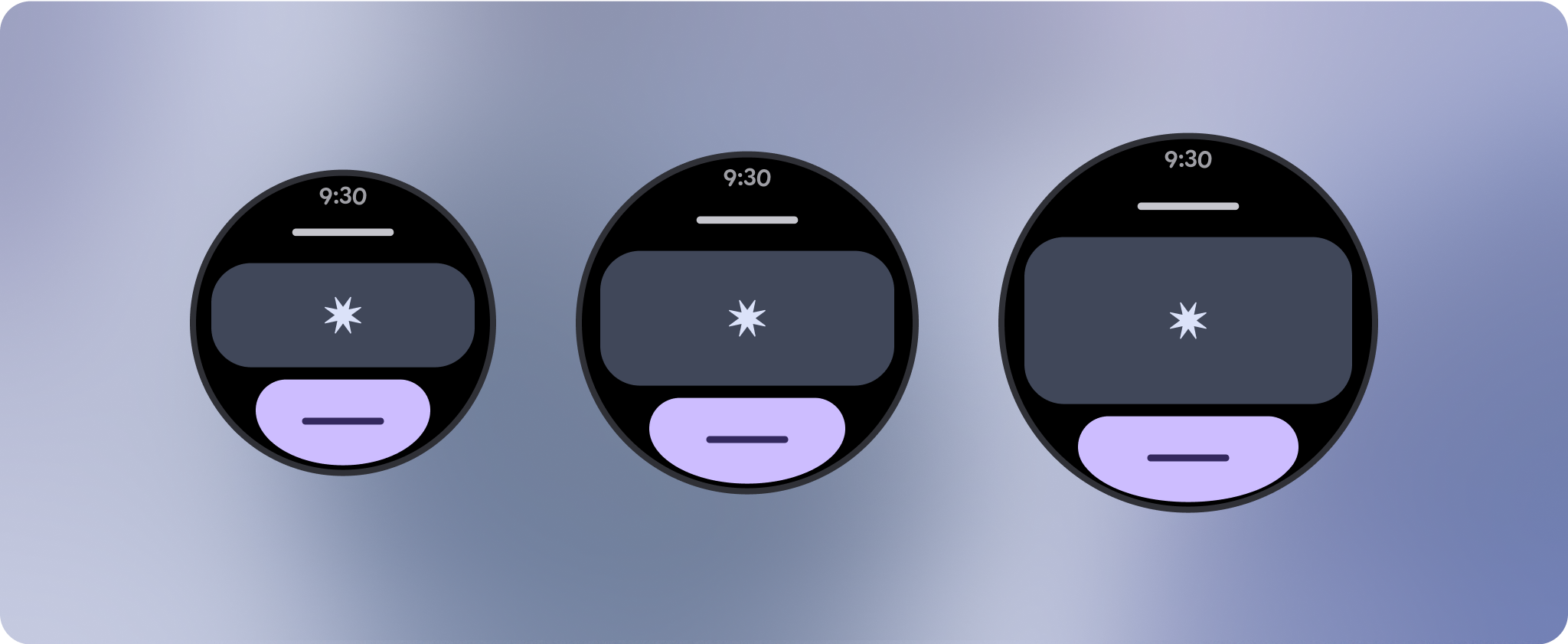
設計時,最好將不捲動的畫面分成頂端、中間和底部區段。這樣一來,您就能在頂端和底端區段新增內部邊界,避免遭到裁剪,但讓中間區段充分利用螢幕的完整寬度。在螢幕大小受限時,建議使用旋轉捲動按鈕控制螢幕元素,因為單靠輕觸互動可能無法提供最佳體驗。
檢查清單
- 建立彈性版面配置,讓所有螢幕尺寸都能正常顯示。
- 套用建議的頂端、底部和側邊邊界。
- 在內容可能遭到裁剪的位置,以百分比值定義邊界。
- 運用版面配置限制,讓元素盡可能善用螢幕空間,並在不同裝置尺寸之間維持平衡。
- 適應時間文字 (如有使用),但不得重疊頁面頂端區段 (請參閱頂端有空白的進度指標)
- 建議使用貼邊按鈕,充分利用有限的空間。
- 建議您在 225dp 處套用中斷點,以便在較大的螢幕尺寸上顯示其他內容,或讓現有內容更容易瀏覽。

全螢幕進度指標
進度指標會自動調整至螢幕大小,因此不會有行為變更,但建議您在中央區域套用比例 (百分比) 邊界和邊框,以便充分利用空間。另外,您也可以考慮使用中斷點,在較大的螢幕上增加元件的大小或數量。

打造與眾不同的體驗
您可以自訂非捲動版面配置,但在可新增至畫面的內容量和最適合的元件類型方面,這類版面配置的限制較多。使用圖示按鈕而非較寬的橢圓形按鈕,可更有效地運用有限的空間,而進度指標和大型資料點等視覺圖形,則有助於以圖像方式傳達重要資訊。所有緊貼螢幕邊框的元素都會隨著螢幕大小自動放大,因此更具影響力。

這個頁面中的內容和程式碼範例均受《內容授權》中的授權所規範。Java 與 OpenJDK 是 Oracle 和/或其關係企業的商標或註冊商標。
上次更新時間:2025-07-27 (世界標準時間)。
[[["容易理解","easyToUnderstand","thumb-up"],["確實解決了我的問題","solvedMyProblem","thumb-up"],["其他","otherUp","thumb-up"]],[["缺少我需要的資訊","missingTheInformationINeed","thumb-down"],["過於複雜/步驟過多","tooComplicatedTooManySteps","thumb-down"],["過時","outOfDate","thumb-down"],["翻譯問題","translationIssue","thumb-down"],["示例/程式碼問題","samplesCodeIssue","thumb-down"],["其他","otherDown","thumb-down"]],["上次更新時間:2025-07-27 (世界標準時間)。"],[],[],null,["# Common layouts for non-scrolling apps\n\nNon-scrolling app view layouts include media players, confirmation dialogs,\npickers, switchers, and special fitness or tracking screens using progress\nindicators. You can restrict the height of any screen, which ensures the user is\nfocused on one task or set of controls, rather than needing to browse through a\nlist of options. To accommodate devices with smaller screen sizes, design with\nthe limited size in mind, ensuring glanceability and embracing the circular\nscreen where relevant.\n\nBuild responsive and optimized designs\n--------------------------------------\n\nNon-scrolling views focus on glanceable information and offer users value with\nminimal interaction. However, building responsive behavior into these layouts\ncan be challenging. To address this, we have updated our Android UI library\nlayouts and components with built-in responsive behavior, including\npercentage-based margins and padding. If you're utilizing our Compose\ncomponents, you can automatically inherit this responsiveness.\n\nFor unique screen designs, thoroughly test across a variety of screen sizes,\nensuring components and elements adapt smoothly and avoid content clipping. Our\npercentage margins help spacers scale effectively, and we recommend using a\nbreakpoint at 225dp to introduce additional information and enhanced\nfunctionality on larger watch screens.\n\nCheck that components adapt to the available width and height\n-------------------------------------------------------------\n\n\nAll components are built responsively, meaning they adapting to the available\nwidth (and height when full screen). Make sure you have the necessary margins to\nensure content doesn't get clipped by the rounding curve of the screen.\nAdditionally, ensure the necessary layout behavior to ensure your non-scrolling\nscreen content doesn't push the layout to scroll or get cut off. \n\n\n\u003cbr /\u003e\n\nBuild adaptive and differentiated designs\n-----------------------------------------\n\nIn order to best use the additional space on larger screen sizes, add a size\nbreakpoint at 225dp. This breakpoint makes it possible to reveal additional\ncontent, include more information, options, data, or change the layout to better\nsuit the larger screen size.\n\nThis requires a different design for each breakpoint. The larger screen design\n(225+) could include the following additional elements:\n\n### Increase the size or change the state of the existing components\n\n\nUse the breakpoint to show more detail or make the content more glanceable. Just\nmake sure the experience or functionality isn't broken on small screen and the\nlarge screen changes are only additional. \n\n\n\u003cbr /\u003e\n\n### Add content within the current layout\n\n\nBy adding components or content, the layout provides additional options, detail\nand ultimately, value.\n\nThis should never come at the cost of the glanceability. \n\n\u003cbr /\u003e\n\nUse pagination\n--------------\n\nIn scenarios where an experience requires more content but wants to retain a\nnon-scrolling layout, consider a multi-page layout with either vertical or\nhorizontal pagination.\n\nResponsive and adaptive behavior\n--------------------------------\n\nAll components in the Compose library will automatically adapt to the wider\nscreen size, and gain width and height. For these views in particular, utilizing\nbreakpoints can deliver a particularly rich and valuable experience for all\nusers. Define all margins in percentages, and define vertical constraints such\nthat the main content in the middle can stretch to fill the available display\narea.\n\nIt's best to break a non-scrolling screen into a top, middle, and bottom section\nwhen designing. This way, you can add inner margins to the top and bottom\nsection to avoid clipping, but allow your middle section to take advantage of\nthe full width of the screen. Consider the use of the rotary scroll button to\ncontrol elements of the screen when its size is limited, as tapping interactions\nalone may not provide the best experience.\n\n### Checklist\n\n- Create flexible layouts that look reasonable on all screen sizes.\n- Apply the recommended top, bottom, and side margins.\n- Define margins in percentage values in places where content might otherwise be clipped.\n- Utilize layout constraints so that elements make the best possible use of the space within the screen and maintain balance across different device sizes.\n- Accommodate Time Text if used, but not overlapping the top section of the page (see progress indicators with a top gap for more)\n- Consider using edge-hugging buttons to utilize more of the limited space.\n- Consider applying a breakpoint at 225dp to introduce additional content or make existing content more glanceable when on bigger screen sizes.\n\n**Full screen progress indicators**\n\nThere is no behavior change on the progress indicator as it automatically adapts\nto the screen size, however, consider applying proportional (percentage) margins\nand padding on the central area to best utilize space. Also consider a\nbreakpoint to increase the size or number of components on larger screen.\n\nCreate differentiated experiences\n---------------------------------\n\nNon-scrolling layouts are customizable, but are more limited in how much content\ncan be added to the screen and what kind of components work best. Using Icon\nButtons instead of wider pill shaped Buttons makes better use of the limited\nspace, and visual graphics like Progress Indicators and large data points help\ncommunicate key information in a graphical way. All elements that hug the screen\nbezel automatically grow with the screen size, so they become even more\nimpactful."]]