
Android 用户可以与不同类型的媒体内容(包括有声读物、音乐、播客和电台)互动。请务必设计让用户能在手表上方便地访问媒体内容的应用。手表作为一个独特的平台,能够轻松快速地进行互动是我们的重中之重,因为与手机或平板电脑相比,用户花在与手表互动上的时间要少得多。
如需了解详情,请参阅 GitHub 上的 Media Toolkit。
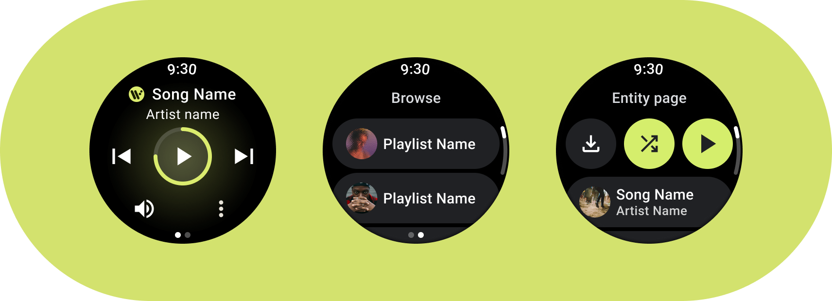
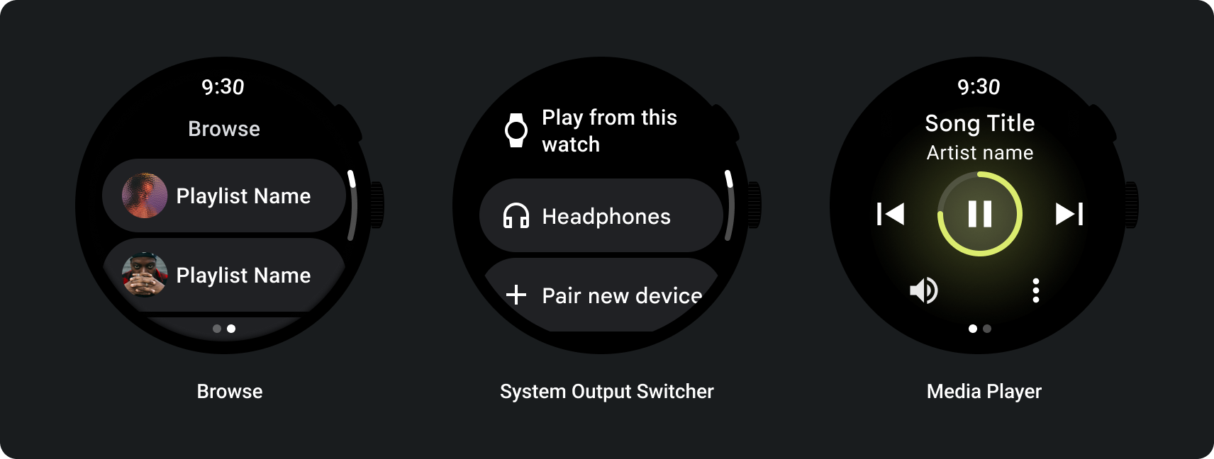
媒体应用架构
创建符合 Wear OS 设计要求的媒体应用。媒体应用通常包含浏览和实体页面。
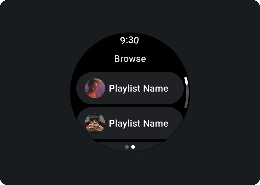
浏览
让用户查找要播放的媒体。优先处理已下载的内容,以便用户快速开始或继续播放。
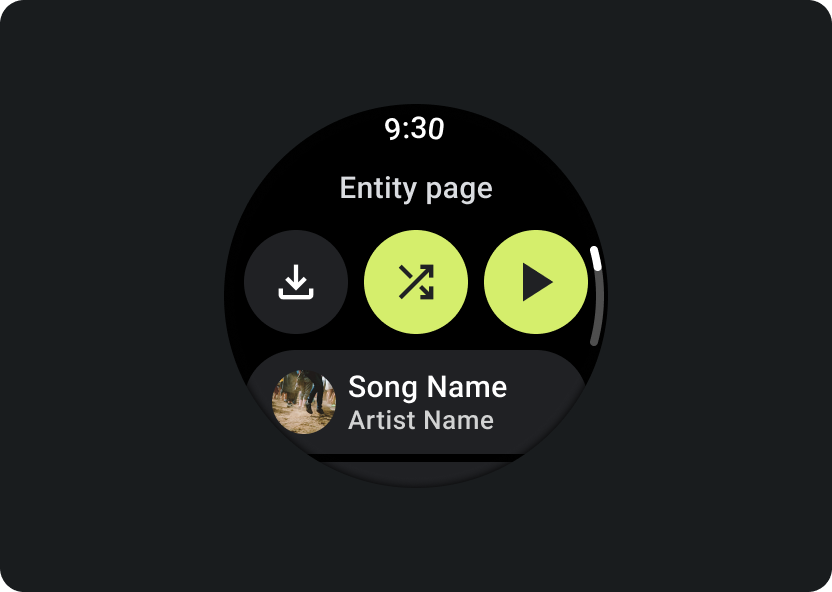
实体
向用户提供有关特定媒体项的更多信息。应随时提供重要的情境和关键操作,例如下载、播放或随机播放。
减少应用层次结构,并向用户展现媒体内容。采用扁平的信息架构进行设计,让用户能够快速访问列表并向用户显示缩略图。考虑为 Wear OS 使用自定义设计组件。如需了解详情,请参阅条状标签和卡片的设计建议。
媒体控制屏幕
媒体应用还应包含媒体控制界面。使用 5 个按钮的布局创建媒体控件。这是为了确保符合最小点按目标要求。以下是一款音乐应用和一款播客应用的媒体控件示例:
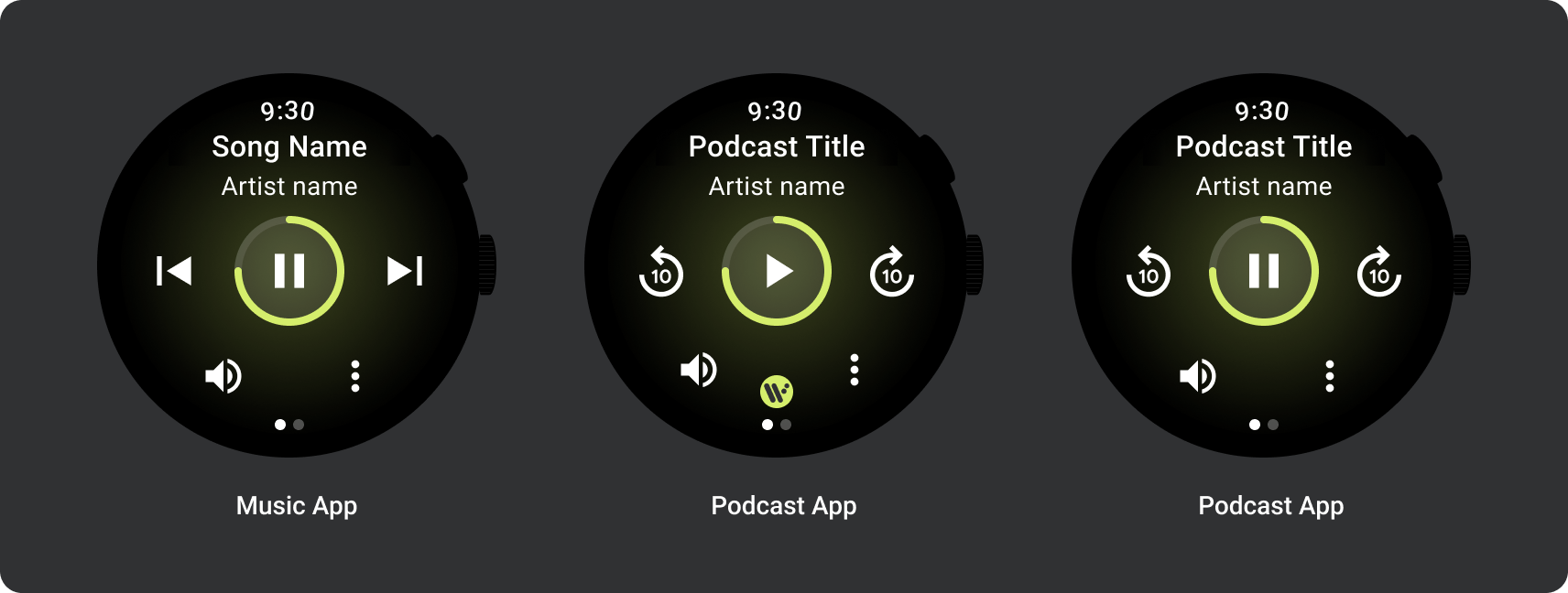
根据内容类型调整显示的媒体控件。如果您要包含的操作超过 5 项,请使用三点状溢出图标将用户带到其他页面。您可以为您的应用使用自定义图标和字体。
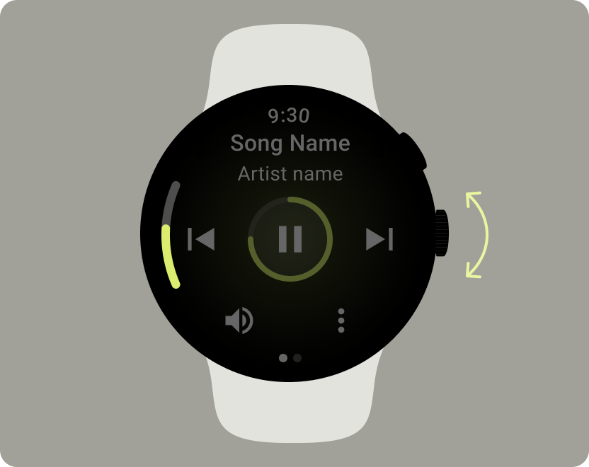
控制音量
音量控制是手表上对用户最重要的媒体控件之一。媒体控件应包含用于进入音量控件屏幕的音量按钮。
大多数 Wear OS 设备都有一个可旋转的侧面按钮 (RSB) 或屏幕边框。某些 Wear OS 设备还有其他硬件按钮来控制音量。应用可支持使用 RSB、屏幕边框或其他按钮来控制音量。仅在用户旋转 RSB 或屏幕边框时显示指示标志,如示例所示。
常见用例
在设计媒体应用时,请务必优先考虑以下重要用例:
- 聆听已下载的媒体内容
- 通过手表在线播放音乐
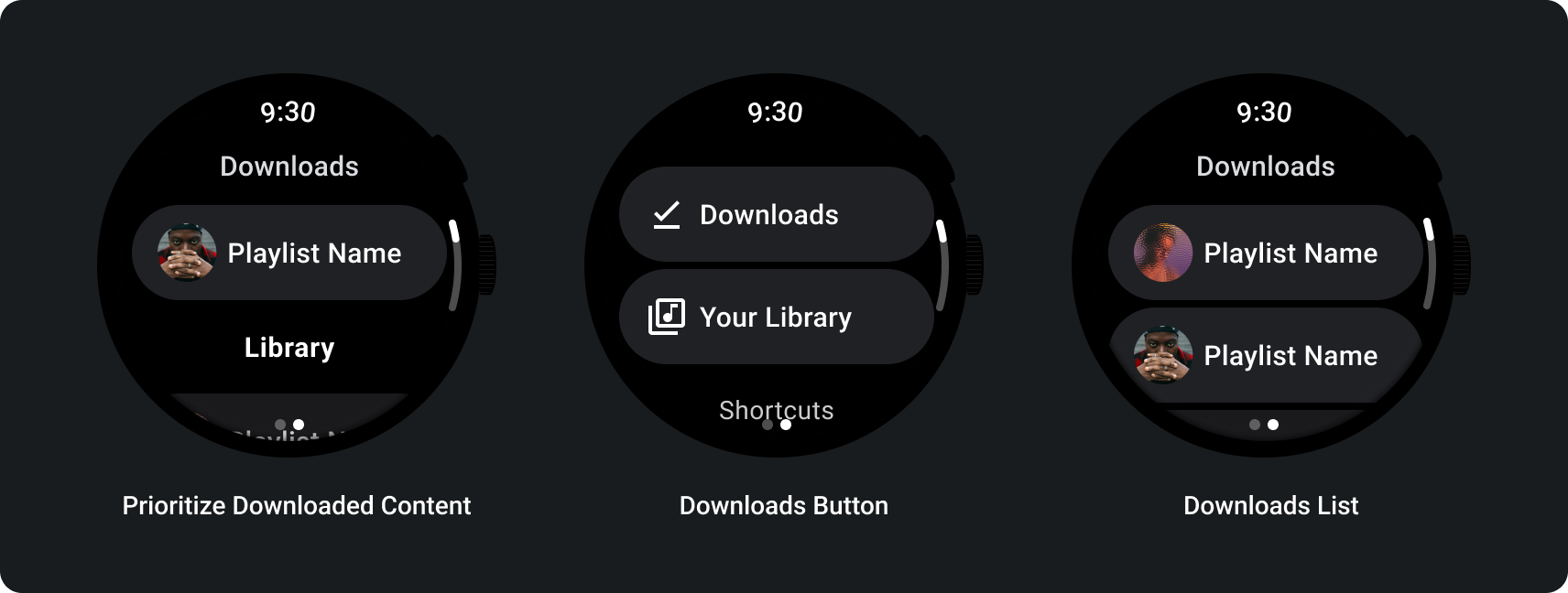
聆听已下载的媒体内容
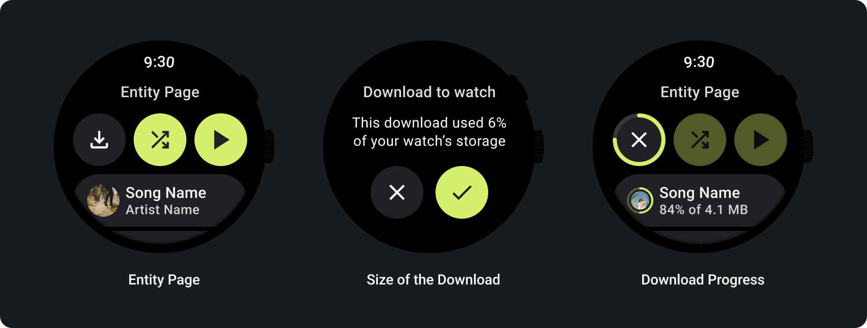
用户应该能够从实体页面手动下载媒体项。
告知用户从何处下载内容、下载进度、所花费的时间以及下载内容的大小,如以下示例所示:
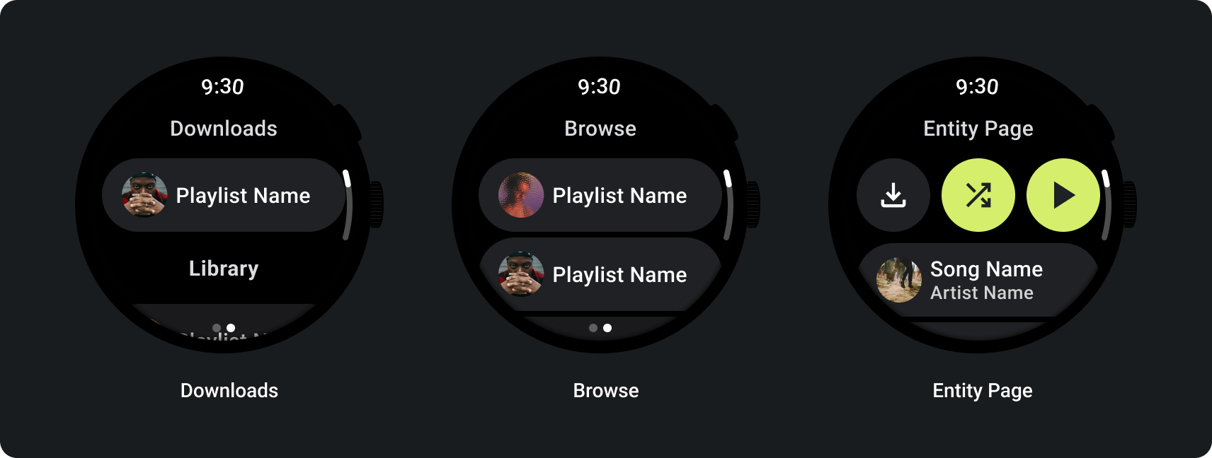
当用户浏览媒体内容时,显示最近下载的媒体内容:
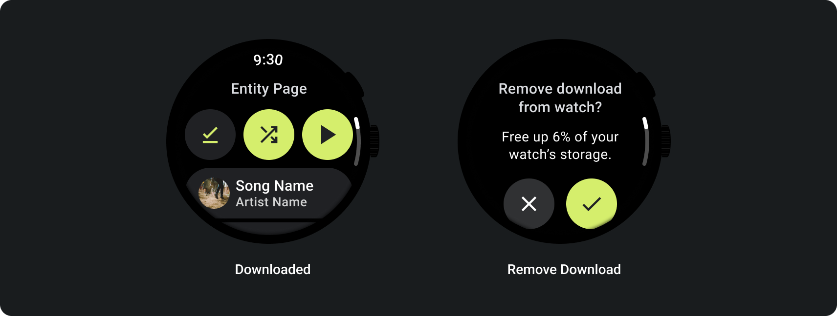
如果内容已经下载,可以在手表上显示一项用于移除下载内容的操作来阐明这一点。在这种情况下,您还必须显示下载内容在手表上占用了多少空间,如下图所示:
如果源设备是手表,请在用户开始听音乐之前提示用户连接耳机。连上耳机后,播放媒体内容并打开媒体控件。
通过手表在线播放音乐
从手表流式传输媒体对 Wear OS 设备的电池有很大影响。当用户选择在 Wear OS 设备上听音乐时,应用可在浏览列表中显示最近用过的下载内容,以便用户优先聆听已下载的内容。考虑添加一个按钮,点按该按钮可将用户带到完整的下载内容列表,如下图所示:
如需了解详情,请参阅 GitHub 上的 Media Toolkit。
自适应布局
媒体应用的大屏适配仅专注于媒体播放器体验。所有其他元素均在条状标签、按钮、对话框和列表页面中捕获,这些页面描述了适应更大屏幕的正确应用行为。
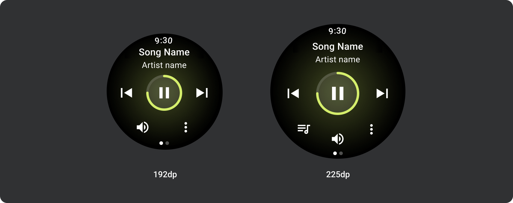
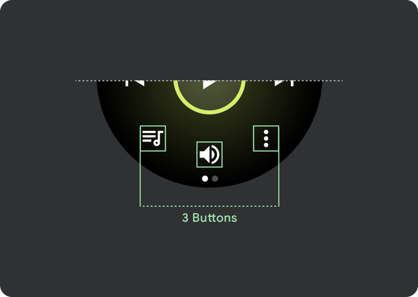
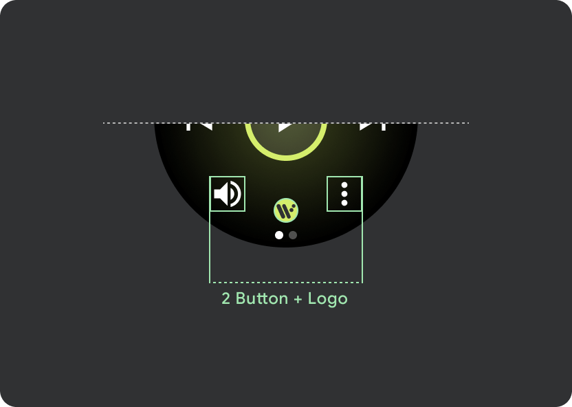
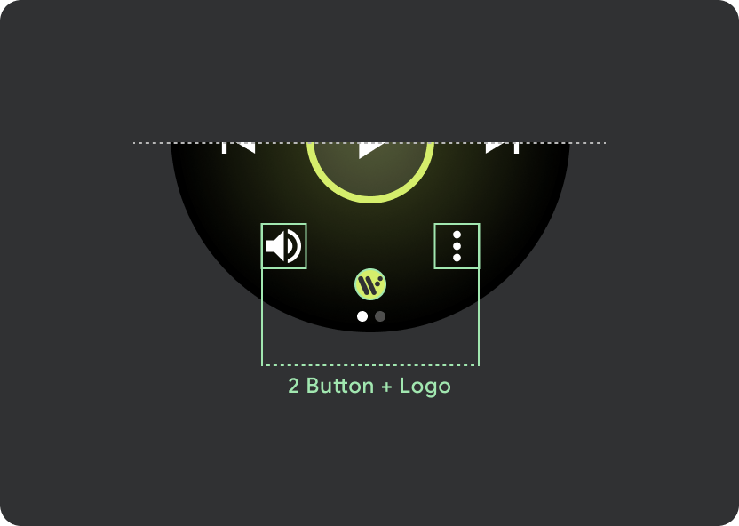
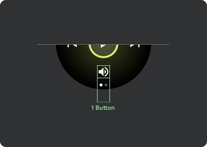
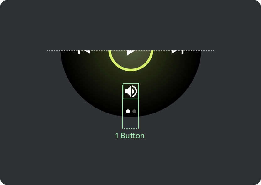
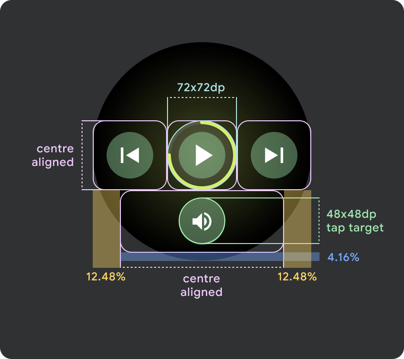
按钮配置
为了遵循触摸目标大小调整原则,请在小于 225 dp 的 Wear OS 设备上显示“双按钮”布局,在屏幕较大的设备上显示“三按钮”布局。以下图片列出了其他示例,例如 1 个按钮的布局和带徽标的 2 个按钮的布局:
响应式控件按钮
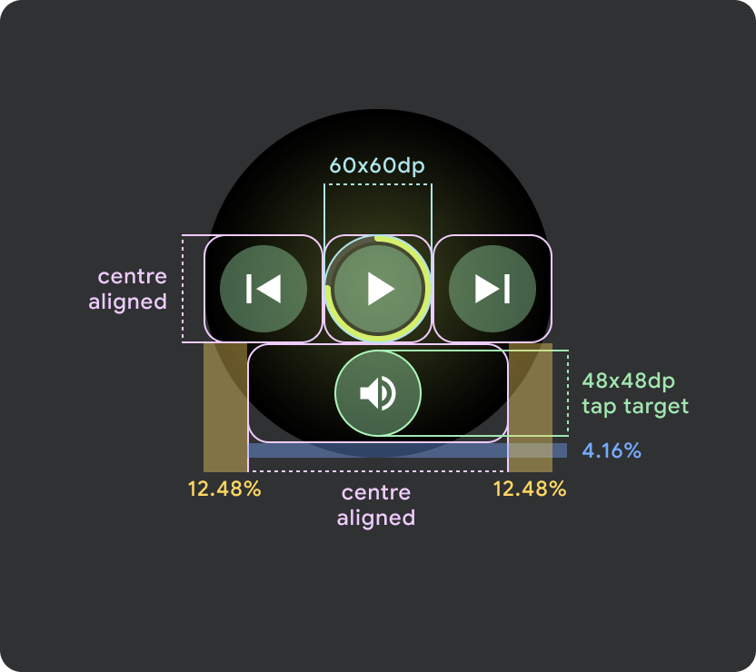
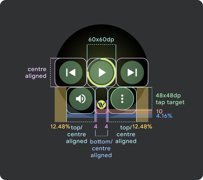
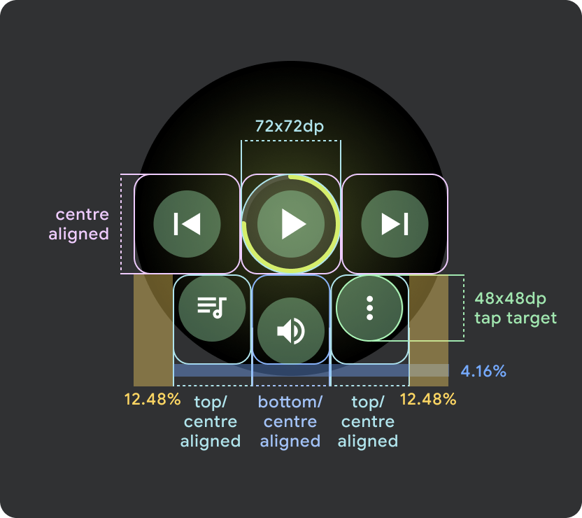
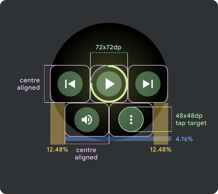
在尺寸大于 225dp 的 Wear OS 设备上,主控件(播放/暂停)的尺寸会从 60dp 放大到 72dp,中间部分的高度为 72dp,因此会增大其中所有控件的点按目标。这是内置的自适应行为,您将从媒体播放器模板继承此行为。
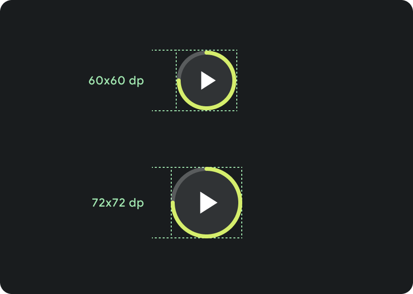
在不同屏幕尺寸上缩放:
小于 225 dp:60 dp x 60 dp
大于 225 dp:72 dp x 72 dp
滚动条行为
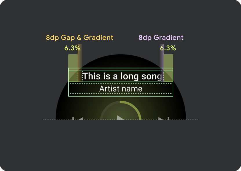
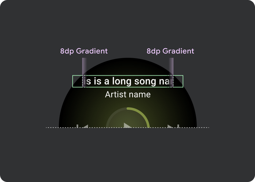
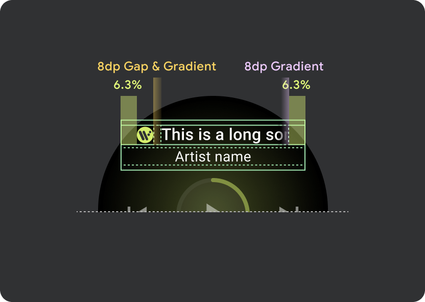
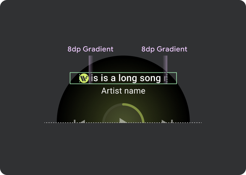
在标题内使用 9.38% 的通用边距,并在歌曲名称额外增加 6.3% 的边距。为滚动标题使用 8dp 渐变,如果存在图标,则额外增加 8dp 间距(带有 8dp 渐变)。在图标下方添加任何 Marquee 滚动过渡效果,其位置保持固定。
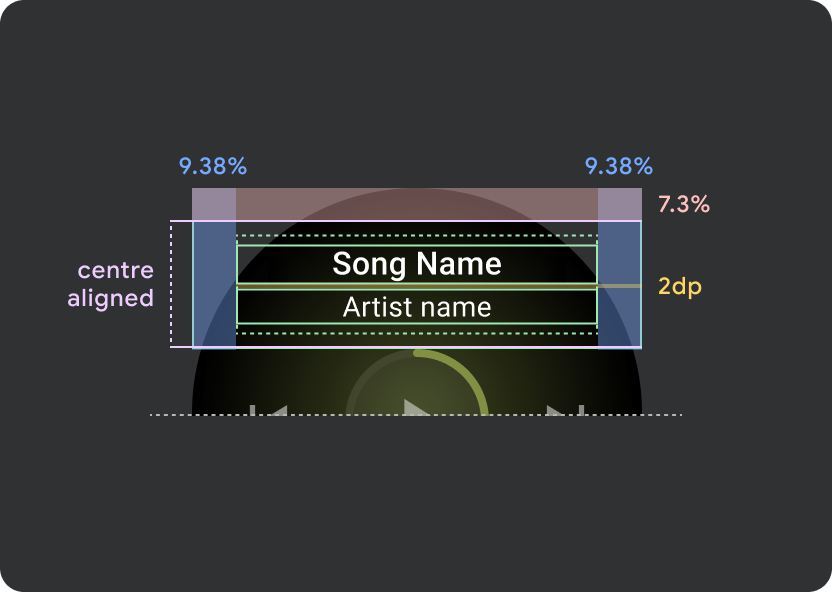
标题 atom 边距
9.38%
歌曲名内部利润
6.3%
渐变
8 dp 边距
额外的 8dp 左内边距(以容纳应用图标)
图标间距
8 dp
点按目标
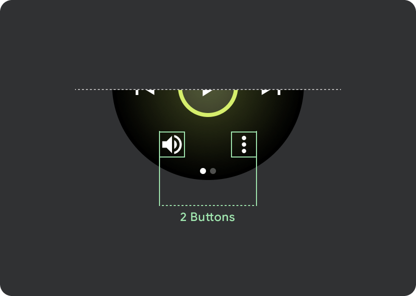
在屏幕较大的 Wear OS 设备上,中间部分和页脚部分中的图标会利用额外的空间来增加点按目标大小。这意味着,除了固定的控件原子之外,“填充可用空间”属性也会应用于图标容器:
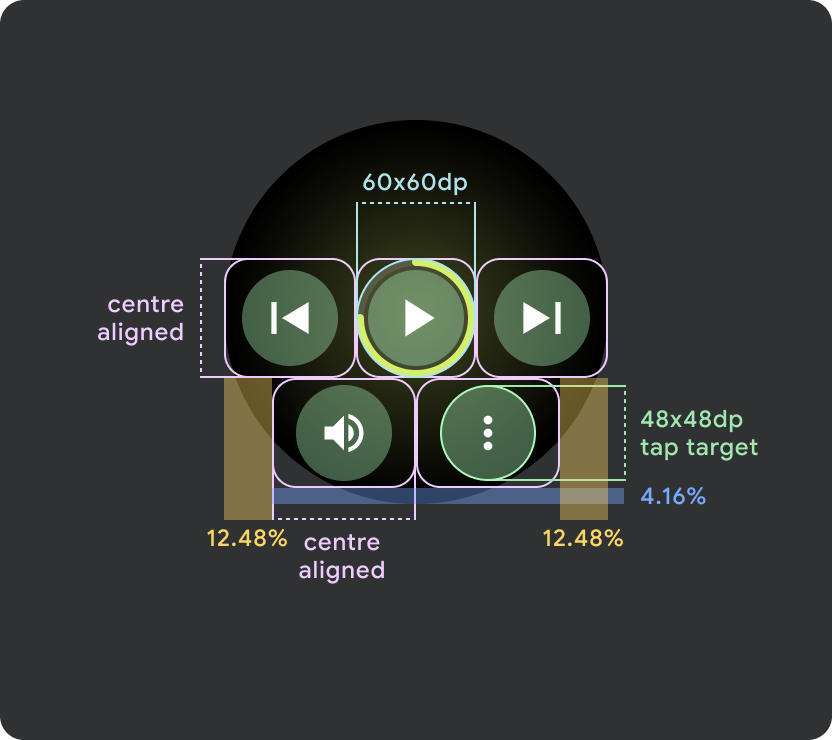

小屏幕 Wear OS 设备(小于 225dp)
- 建议在较小的屏幕上最多显示 2 个按钮,在最小的屏幕尺寸上显示 2 个按钮
- 底部按钮的最小点按目标必须为 48dp(高)x 48dp(宽)
- 图标应位于点按目标的中心区域
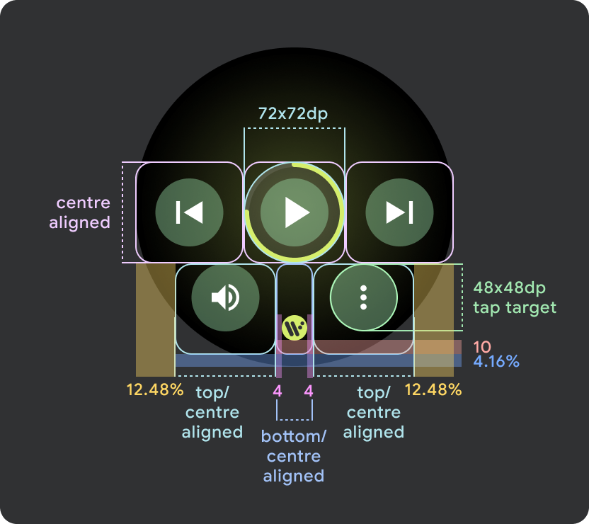
更大的 Wear OS 屏幕 / 断点 (>225dp)
- 建议在较大的屏幕上最多显示 3 个按钮,其中最小的“较大屏幕”上也显示 3 个按钮
- 底部按钮的最小点按目标必须为 48dp (H) x 48dp (W)
- 图标应位于点按目标的中间区域(但应采用上/下对齐和内部内边距,以产生圆角效果)