
Android 스튜디오의 편집기 영역 내부에는 Jetpack Compose로 생산성을 개선할 수 있는 기능이 있습니다.
라이브 템플릿
Android 스튜디오에는 다음과 같은 Compose 관련 라이브 템플릿이 포함되어 있습니다. 이 템플릿을 사용하면 상응하는 템플릿 약어를 입력하여 코드 스니펫을 빠르게 삽입할 수 있습니다.
comp:@Composable함수 설정prev: 구성 가능한@Preview함수 만들기paddp: dp에padding수정자 추가weight:weight수정자 추가W,WR,WC: 현재 컴포저블을Box,Row또는Column컨테이너로 둘러싸기
여백 아이콘
여백 아이콘은 줄 번호 옆 사이드바에 표시되는 상황별 작업입니다. 개발자가 편리하게 사용할 수 있도록 Android 스튜디오에 Jetpack Compose 전용 여백 아이콘이 여러 개 추가되었습니다.
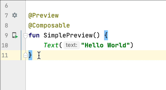
미리보기 배포
여백 아이콘에서 직접 에뮬레이터 또는 실제 기기에 @Preview를 배포할 수 있습니다.
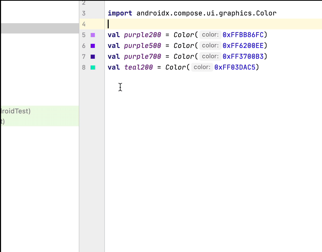
색상 선택 도구
컴포저블 내부 또는 외부에서 색상이 정의될 때마다 여백에 미리보기가 표시됩니다. 다음과 같이 색상을 클릭하여 색상 선택 도구를 통해 변경할 수 있습니다.
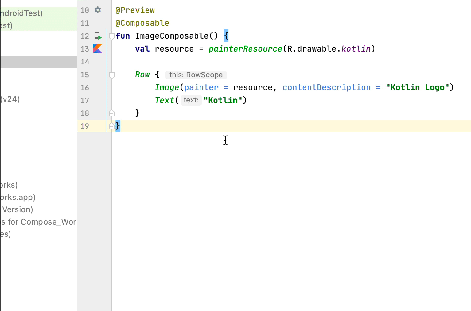
이미지 리소스 선택 도구
컴포저블 내부 또는 외부에서 드로어블, 벡터 또는 이미지가 정의될 때마다 여백에 미리보기가 표시됩니다. 다음과 같이 이미지 리소스를 클릭하여 이미지 리소스 선택 도구를 통해 변경할 수 있습니다.
추천 서비스
- 참고: JavaScript가 사용 중지되어 있으면 링크 텍스트가 표시됩니다.
- Compose 레이아웃 기본사항
- Compose 수정자
- 목록 및 그리드