Modifiers allow you to decorate or augment a composable. Modifiers let you do these sorts of things:
- Change the composable's size, layout, behavior, and appearance
- Add information, like accessibility labels
- Process user input
- Add high-level interactions, like making an element clickable, scrollable, draggable, or zoomable
Modifiers are standard Kotlin objects. Create a modifier by calling one of the
Modifier class functions:
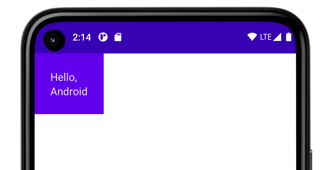
@Composable private fun Greeting(name: String) { Column(modifier = Modifier.padding(24.dp)) { Text(text = "Hello,") Text(text = name) } }

You can chain these functions together to compose them:
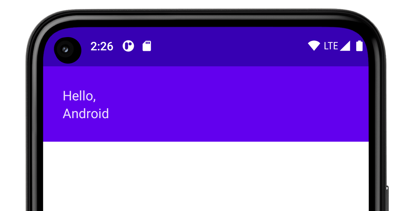
@Composable private fun Greeting(name: String) { Column( modifier = Modifier .padding(24.dp) .fillMaxWidth() ) { Text(text = "Hello,") Text(text = name) } }

In the code above, notice different modifier functions used together.
paddingputs space around an element.fillMaxWidthmakes the composable fill the maximum width given to it from its parent.
It's a best practice to have all of your composables accept a modifier
parameter, and pass that modifier to its first child that emits UI.
Doing so makes your
code more reusable and makes its behavior more predictable and intuitive. For
more information, see the Compose API guidelines, Elements accept and respect a
Modifier parameter.
Order of modifiers matters
The order of modifier functions is significant. Since each function makes
changes to the Modifierreturned by the previous function, the sequence
affects the final result. Let's see an example of this:
@Composable fun ArtistCard(/*...*/) { val padding = 16.dp Column( Modifier .clickable(onClick = onClick) .padding(padding) .fillMaxWidth() ) { // rest of the implementation } }

In the code above the whole area is clickable, including the surrounding
padding, because the padding modifier has been applied after the clickable
modifier. If the modifiers order is reversed, the space added by padding does
not react to user input:
@Composable fun ArtistCard(/*...*/) { val padding = 16.dp Column( Modifier .padding(padding) .clickable(onClick = onClick) .fillMaxWidth() ) { // rest of the implementation } }

Built-in modifiers
Jetpack Compose provides a list of built-in modifiers to help you decorate or augment a composable. Here are some common modifiers you'll use to adjust your layouts.
padding and size
By default, layouts provided in Compose wrap their children. However,
you can set a size by using the size modifier:
@Composable fun ArtistCard(/*...*/) { Row( modifier = Modifier.size(width = 400.dp, height = 100.dp) ) { Image(/*...*/) Column { /*...*/ } } }
Note that the size you specified might not be respected if it does not satisfy
the constraints coming from the layout's parent. If you require the composable
size to be fixed regardless of the incoming constraints, use the requiredSize
modifier:
@Composable fun ArtistCard(/*...*/) { Row( modifier = Modifier.size(width = 400.dp, height = 100.dp) ) { Image( /*...*/ modifier = Modifier.requiredSize(150.dp) ) Column { /*...*/ } } }

In this example, even with the parent height set to 100.dp, the height of
the Image will be 150.dp, as the requiredSize modifier takes
precedence.
If you want a child layout to fill all the available height allowed by the
parent, add the fillMaxHeight modifier (Compose also provides
fillMaxSize and fillMaxWidth):
@Composable fun ArtistCard(/*...*/) { Row( modifier = Modifier.size(width = 400.dp, height = 100.dp) ) { Image( /*...*/ modifier = Modifier.fillMaxHeight() ) Column { /*...*/ } } }

To add padding all around an element, set a padding modifier.
If you want to add padding above a text baseline such that you achieve a
specific distance from the top of the layout to the baseline, use the
paddingFromBaseline modifier:
@Composable fun ArtistCard(artist: Artist) { Row(/*...*/) { Column { Text( text = artist.name, modifier = Modifier.paddingFromBaseline(top = 50.dp) ) Text(artist.lastSeenOnline) } } }

Offset
To position a layout relative to its original position, add the
offset modifier and set the offset in the x and y axis.
Offsets can be positive as well as non-positive. The difference between
padding and offset is that adding an offset to a composable does not
change its measurements:
@Composable fun ArtistCard(artist: Artist) { Row(/*...*/) { Column { Text(artist.name) Text( text = artist.lastSeenOnline, modifier = Modifier.offset(x = 4.dp) ) } } }

The offset modifier is applied horizontally according to the layout direction.
In a left-to-right context, a positive offset shifts the element to the
right, while in a right-to-left context, it shifts the element to the left.
If you need to set an offset without considering layout direction, see the
absoluteOffset
modifier, in which a positive offset value always shifts the element to the
right.
The offset modifier provides two overloads - offset that takes the
offsets as parameters and offset that takes in a lambda.
For more in depth information on when to use each of these and how to optimize
for performance, read through the
Compose performance - Defer reads as long as possible section.
Scope safety in Compose
In Compose, there are modifiers that can only be used when applied to children of certain composables. Compose enforces this by means of custom scopes.
For example, if you want to make a child as big as the parent Box without
affecting the Box size, use the
matchParentSize
modifier. matchParentSize is only available in
BoxScope.
Therefore, it can only be used on a child within a Box parent.
Scope safety prevents you from adding modifiers that wouldn't work in other composables and scopes and saves time from trial and error.
Scoped modifiers notify the parent about some information the parent should know about the child. These are also commonly referred to as parent data modifiers. Their internals are different from the general purpose modifiers, but from a usage perspective, these differences don't matter.
matchParentSize in Box
As mentioned above, if you want a child layout to be the same size as a parent
Box without affecting the Box size, use the matchParentSize modifier.
Note that matchParentSize is only available within a Box scope, meaning that
it only applies to direct children of Box composables.
In the example below, the child Spacer takes its size from its parent Box,
which in turn takes its size from the biggest children,
ArtistCard in this case.
@Composable fun MatchParentSizeComposable() { Box { Spacer( Modifier .matchParentSize() .background(Color.LightGray) ) ArtistCard() } }

If fillMaxSize were used instead of matchParentSize, the Spacer would take
all the available space allowed to the parent, in turn causing the parent to
expand and fill all the available space.

weight in Row and Column
As you have seen in the previous section on Padding and
size, by default, a composable size is defined by the
content it is wrapping. You can set a composable size to be flexible within its
parent using the weight Modifier that is only available in RowScope, and
ColumnScope.
Let’s take a Row that contains two Box composables.
The first box is given twice the weight of the second, so it's given twice the
width. Since the Row is 210.dp wide, the first Box is 140.dp wide, and
the second is 70.dp:
@Composable fun ArtistCard(/*...*/) { Row( modifier = Modifier.fillMaxWidth() ) { Image( /*...*/ modifier = Modifier.weight(2f) ) Column( modifier = Modifier.weight(1f) ) { /*...*/ } } }

Extracting and reusing modifiers
Multiple modifiers can be chained together to decorate or
augment a composable. This chain is created via the Modifier interface
which represents an ordered, immutable list of single Modifier.Elements.
Each Modifier.Element represents an individual behavior, like layout, drawing
and graphics behaviors, all gesture-related, focus and semantics behaviors, as
well as device input events. Their ordering matters: modifier elements that are
added first will be applied first.
Sometimes it can be beneficial to reuse the same modifier chain instances in multiple composables, by extracting them into variables and hoisting them into higher scopes. It can improve code readability or help improve your app's performance for a few reasons:
- The re-allocation of the modifiers won’t be repeated when recomposition occurs for composables that use them
- Modifier chains could potentially be very long and complex, so reusing the same instance of a chain can alleviate the workload Compose runtime needs to do when comparing them
- This extraction promotes code cleanliness, consistency and maintainability across the codebase
Best practices for reusing modifiers
Create your own Modifier chains and extract them to reuse them on multiple
composable components. It is completely fine to just save a modifier, as they
are data-like objects:
val reusableModifier = Modifier .fillMaxWidth() .background(Color.Red) .padding(12.dp)
Extracting and reusing modifiers when observing frequently changing state
When observing frequently changing states inside composables, like animation
states or scrollState, there can be a significant amount of recompositions
done. In this case, your modifiers will get allocated on every recomposition
and potentially for every frame:
@Composable fun LoadingWheelAnimation() { val animatedState = animateFloatAsState(/*...*/) LoadingWheel( // Creation and allocation of this modifier will happen on every frame of the animation! modifier = Modifier .padding(12.dp) .background(Color.Gray), animatedState = animatedState ) }
Instead, you can create, extract and reuse the same instance of the modifier and pass it to the composable like this:
// Now, the allocation of the modifier happens here: val reusableModifier = Modifier .padding(12.dp) .background(Color.Gray) @Composable fun LoadingWheelAnimation() { val animatedState = animateFloatAsState(/*...*/) LoadingWheel( // No allocation, as we're just reusing the same instance modifier = reusableModifier, animatedState = animatedState ) }
Extracting and reusing unscoped modifiers
Modifiers can be unscoped or scoped to a specific composable. In the case of unscoped modifiers, you can easily extract them outside of any composables as simple variables:
val reusableModifier = Modifier .fillMaxWidth() .background(Color.Red) .padding(12.dp) @Composable fun AuthorField() { HeaderText( // ... modifier = reusableModifier ) SubtitleText( // ... modifier = reusableModifier ) }
This can be especially beneficial when combined with Lazy layouts. In most cases, you’d want all of your, potentially significant, amount of items to have the exact same modifiers:
val reusableItemModifier = Modifier .padding(bottom = 12.dp) .size(216.dp) .clip(CircleShape) @Composable private fun AuthorList(authors: List<Author>) { LazyColumn { items(authors) { AsyncImage( // ... modifier = reusableItemModifier, ) } } }
Extracting and reusing scoped modifiers
When dealing with modifiers that are scoped to certain composables, you can extract them to the highest possible level and reuse where appropriate:
Column(/*...*/) { val reusableItemModifier = Modifier .padding(bottom = 12.dp) // Align Modifier.Element requires a ColumnScope .align(Alignment.CenterHorizontally) .weight(1f) Text1( modifier = reusableItemModifier, // ... ) Text2( modifier = reusableItemModifier // ... ) // ... }
You should only be passing the extracted, scoped modifiers to the same-scoped, direct children. See the section Scope safety in Compose for more reference on why this matters:
Column(modifier = Modifier.fillMaxWidth()) { // Weight modifier is scoped to the Column composable val reusableItemModifier = Modifier.weight(1f) // Weight will be properly assigned here since this Text is a direct child of Column Text1( modifier = reusableItemModifier // ... ) Box { Text2( // Weight won't do anything here since the Text composable is not a direct child of Column modifier = reusableItemModifier // ... ) } }
Further chaining of extracted modifiers
You can further chain or append your extracted modifier chains by calling the
.then() function:
val reusableModifier = Modifier .fillMaxWidth() .background(Color.Red) .padding(12.dp) // Append to your reusableModifier reusableModifier.clickable { /*...*/ } // Append your reusableModifier otherModifier.then(reusableModifier)
Just keep in mind that the order of modifiers matters!
Learn more
We provide a full list of modifiers, with their parameters and scopes.
For more practice on how to use modifiers, you can also go through the Basic layouts in Compose codelab or refer to the Now in Android repository.
For more information on custom modifiers and how to create them, take a look at the documentation on Custom layouts - Using the layout modifier.
Recommended for you
- Note: link text is displayed when JavaScript is off
- Compose layout basics
- Editor actions {:#editor-actions}
- Custom layouts {:#custom-layouts }
