Scaffold
Material Design에서 스캐폴드는 복잡한 사용자 인터페이스를 위한 표준화된 플랫폼을 제공하는 기본 구조입니다. 앱 바, 플로팅 작업 버튼 등 UI의 여러 부분을 함께 유지하여 앱에 일관된 디자인을 제공합니다.
예
Scaffold 컴포저블은 Material Design 가이드라인에 따라 앱의 구조를 빠르게 어셈블하는 데 사용할 수 있는 간단한 API를 제공합니다.
Scaffold는 여러 컴포저블을 매개변수로 허용합니다. 여기에는 다음이 포함됩니다.
topBar: 화면 상단의 앱 바입니다.bottomBar: 화면 하단의 앱 바입니다.floatingActionButton: 주요 작업을 표시하는 데 사용할 수 있는 화면 오른쪽 하단에 마우스를 가져가면 표시되는 버튼입니다.
다른 컨테이너에 전달하는 것과 마찬가지로 Scaffold 콘텐츠를 전달할 수도 있습니다. 크기를 제한하기 위해 콘텐츠의 루트 컴포저블에 적용해야 하는 content 람다에 PaddingValues를 전달합니다.
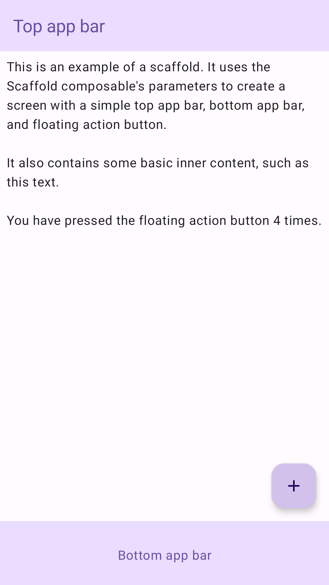
다음 예는 완전한 Scaffold 구현을 보여줍니다. 상단 앱 바, 하단 앱 바, 플로팅 작업 버튼이 포함되어 있습니다.
@Composable fun ScaffoldExample() { var presses by remember { mutableIntStateOf(0) } Scaffold( topBar = { TopAppBar( colors = topAppBarColors( containerColor = MaterialTheme.colorScheme.primaryContainer, titleContentColor = MaterialTheme.colorScheme.primary, ), title = { Text("Top app bar") } ) }, bottomBar = { BottomAppBar( containerColor = MaterialTheme.colorScheme.primaryContainer, contentColor = MaterialTheme.colorScheme.primary, ) { Text( modifier = Modifier .fillMaxWidth(), textAlign = TextAlign.Center, text = "Bottom app bar", ) } }, floatingActionButton = { FloatingActionButton(onClick = { presses++ }) { Icon(Icons.Default.Add, contentDescription = "Add") } } ) { innerPadding -> Column( modifier = Modifier .padding(innerPadding), verticalArrangement = Arrangement.spacedBy(16.dp), ) { Text( modifier = Modifier.padding(8.dp), text = """ This is an example of a scaffold. It uses the Scaffold composable's parameters to create a screen with a simple top app bar, bottom app bar, and floating action button. It also contains some basic inner content, such as this text. You have pressed the floating action button $presses times. """.trimIndent(), ) } } }
이 구현은 다음과 같이 표시됩니다.