Dialog 구성요소는 기본 앱 콘텐츠 위의 레이어에 대화상자 메시지를 표시하거나 사용자 입력을 요청합니다. 사용자의 관심을 사로잡기 위해 방해적인 UI 환경을 만듭니다.
대화상자의 사용 사례는 다음과 같습니다.
- 파일 삭제와 같은 사용자 작업을 확인하는 경우
- 할 일 목록 앱과 같이 사용자 입력을 요청하는 경우
- 프로필 설정에서 국가를 선택하는 것과 같이 사용자가 선택할 수 있는 옵션 목록을 표시합니다.

알림 대화상자
AlertDialog 컴포저블은 Material Design 테마 대화상자를 만들기 위한 편리한 API를 제공합니다. AlertDialog에는 대화의 특정 요소를 처리하기 위한 특정 매개변수가 있습니다. 그중에는 다음이 포함됩니다.
title: 대화상자 상단에 표시되는 텍스트입니다.text: 대화상자 중앙에 표시되는 텍스트입니다.icon: 대화상자 상단에 표시되는 그래픽입니다.onDismissRequest: 사용자가 대화상자 외부를 탭하는 등 대화상자를 닫을 때 호출되는 함수입니다.dismissButton: 닫기 버튼 역할을 하는 컴포저블입니다.confirmButton: 확인 버튼 역할을 하는 컴포저블입니다.
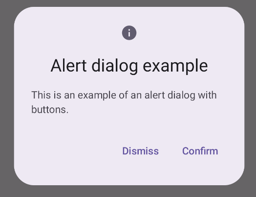
다음 예에서는 알림 대화상자에 두 개의 버튼을 구현합니다. 하나는 대화상자를 닫고 다른 하나는 요청을 확인합니다.
@Composable fun AlertDialogExample( onDismissRequest: () -> Unit, onConfirmation: () -> Unit, dialogTitle: String, dialogText: String, icon: ImageVector, ) { AlertDialog( icon = { Icon(icon, contentDescription = "Example Icon") }, title = { Text(text = dialogTitle) }, text = { Text(text = dialogText) }, onDismissRequest = { onDismissRequest() }, confirmButton = { TextButton( onClick = { onConfirmation() } ) { Text("Confirm") } }, dismissButton = { TextButton( onClick = { onDismissRequest() } ) { Text("Dismiss") } } ) }
이 구현은 다음과 같이 하위 컴포저블에 인수를 전달하는 상위 컴포저블을 의미합니다.
@Composable fun DialogExamples() { // ... val openAlertDialog = remember { mutableStateOf(false) } // ... when { // ... openAlertDialog.value -> { AlertDialogExample( onDismissRequest = { openAlertDialog.value = false }, onConfirmation = { openAlertDialog.value = false println("Confirmation registered") // Add logic here to handle confirmation. }, dialogTitle = "Alert dialog example", dialogText = "This is an example of an alert dialog with buttons.", icon = Icons.Default.Info ) } } } }
이 구현은 다음과 같이 표시됩니다.
대화상자 컴포저블
Dialog은 스타일 지정이나 콘텐츠를 위한 사전 정의된 슬롯을 제공하지 않는 기본 컴포저블입니다. Card와 같은 컨테이너로 채워야 하는 비교적 간단한 컨테이너입니다. 다음은 대화상자의 주요 매개변수입니다.
onDismissRequest: 사용자가 대화상자를 닫을 때 호출되는 람다입니다.properties: 맞춤설정을 위한 추가 범위를 제공하는DialogProperties인스턴스입니다.
기본 예시
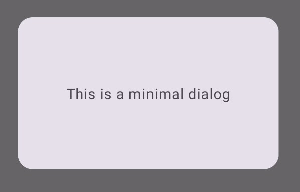
다음 예는 Dialog 컴포저블의 기본 구현입니다. Card을 보조 컨테이너로 사용합니다. Card가 없으면 Text 구성요소가 기본 앱 콘텐츠 위에 단독으로 표시됩니다.
@Composable fun MinimalDialog(onDismissRequest: () -> Unit) { Dialog(onDismissRequest = { onDismissRequest() }) { Card( modifier = Modifier .fillMaxWidth() .height(200.dp) .padding(16.dp), shape = RoundedCornerShape(16.dp), ) { Text( text = "This is a minimal dialog", modifier = Modifier .fillMaxSize() .wrapContentSize(Alignment.Center), textAlign = TextAlign.Center, ) } } }
이 구현은 다음과 같습니다. 대화상자가 열리면 대화상자 아래의 기본 앱 콘텐츠가 어두워지고 회색으로 표시됩니다.
고급 예시
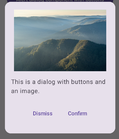
다음은 Dialog 컴포저블의 고급 구현입니다. 이 경우 구성요소는 위의 AlertDialog 예와 유사한 인터페이스를 수동으로 구현합니다.
@Composable fun DialogWithImage( onDismissRequest: () -> Unit, onConfirmation: () -> Unit, painter: Painter, imageDescription: String, ) { Dialog(onDismissRequest = { onDismissRequest() }) { // Draw a rectangle shape with rounded corners inside the dialog Card( modifier = Modifier .fillMaxWidth() .height(375.dp) .padding(16.dp), shape = RoundedCornerShape(16.dp), ) { Column( modifier = Modifier .fillMaxSize(), verticalArrangement = Arrangement.Center, horizontalAlignment = Alignment.CenterHorizontally, ) { Image( painter = painter, contentDescription = imageDescription, contentScale = ContentScale.Fit, modifier = Modifier .height(160.dp) ) Text( text = "This is a dialog with buttons and an image.", modifier = Modifier.padding(16.dp), ) Row( modifier = Modifier .fillMaxWidth(), horizontalArrangement = Arrangement.Center, ) { TextButton( onClick = { onDismissRequest() }, modifier = Modifier.padding(8.dp), ) { Text("Dismiss") } TextButton( onClick = { onConfirmation() }, modifier = Modifier.padding(8.dp), ) { Text("Confirm") } } } } } }
이 구현은 다음과 같이 표시됩니다.