Buttons are fundamental components that allow the user to trigger a defined action. There are five types of buttons. This table describes the appearance of each of the five button types, as well as where you should use them:
| Type | Appearance | Purpose |
|---|---|---|
| Filled | Solid background with contrasting text. | High-emphasis buttons. These are for primary actions in an application, such as "submit" and "save." The shadow effect highlights the button's importance. |
| Filled tonal | Background color varies to match the surface. | Also for primary or significant actions. Filled tonal buttons provide more visual weight and suit functions such as "add to cart" and "Sign in." |
| Elevated | Stands out by having a shadow. | Serves a similar purpose to tonal buttons. Increase elevation to make the button appear even more prominently. |
| Outlined | Features a border with no fill. | Medium-emphasis buttons, containing actions that are important but not primary. They pair well with other buttons to indicate alternative, secondary actions like "Cancel" or "Back." |
| Text | Displays text with no background or border. | Low-emphasis buttons, ideal for less critical actions such as navigational links, or secondary functions like "Learn More" or "View details." |
This image demonstrates the five types of buttons in Material Design:

API surface
onClick- The function that the system calls when the user presses the button.
enabled- When
false, this parameter makes the button appear unavailable and inactive. colors- An instance of
ButtonColorsthat determines the colors used in the button. contentPadding- The padding within the button.
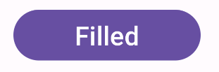
Filled button
The filled button component uses the basic Button composable. It is
filled with a solid color by default. The snippet shows how to implement the
component:
@Composable fun FilledButtonExample(onClick: () -> Unit) { Button(onClick = { onClick() }) { Text("Filled") } }
This implementation appears as shown:
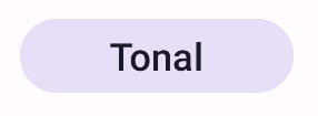
Filled tonal button
The filled tonal button component uses the FilledTonalButton composable.
It is filled with a tonal color by default.
The snippet shows how to implement the component:
@Composable fun FilledTonalButtonExample(onClick: () -> Unit) { FilledTonalButton(onClick = { onClick() }) { Text("Tonal") } }
This implementation appears as shown:
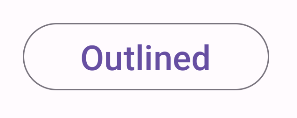
Outlined button
The outlined button component uses the OutlinedButton composable. It
appears with an outline by default.
The snippet shows how to implement the component:
@Composable fun OutlinedButtonExample(onClick: () -> Unit) { OutlinedButton(onClick = { onClick() }) { Text("Outlined") } }
This implementation appears as shown:
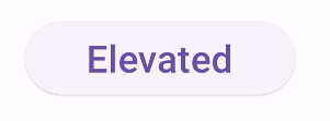
Elevated button
The elevated button component uses the ElevatedButton composable. It has
a shadow that represents the elevation effect by default. It is a filled button
that includes a shadow.
The snippet shows how to implement the component:
@Composable fun ElevatedButtonExample(onClick: () -> Unit) { ElevatedButton(onClick = { onClick() }) { Text("Elevated") } }
This implementation appears as shown:
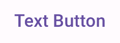
Text button
The text button component uses the TextButton composable. It appears as
only text until pressed. It does not have a solid fill or outline by default.
The snippet shows how to implement the component:
@Composable fun TextButtonExample(onClick: () -> Unit) { TextButton( onClick = { onClick() } ) { Text("Text Button") } }
This implementation appears as shown: