
표준 레이아웃은 검증된 다목적 레이아웃으로, 다양한 폼 팩터에서 최적의 사용자 환경을 제공합니다.
표준 레이아웃은 태블릿, 폴더블, ChromeOS 기기는 물론 소형 화면 휴대전화도 지원합니다. Material Design 가이드에서 파생된 레이아웃은 보기에도 좋고 기능적입니다.
Android 프레임워크에는 간단하고 안정적으로 레이아웃을 구현할 수 있는 특수 구성요소가 포함되어 있습니다.
표준 레이아웃은 참여도와 생산성을 높이며 뛰어난 앱의 토대를 이루는 UI를 만듭니다.
적응형 앱 표준 레이아웃에 관해 이미 잘 알고 있지만 사용할 Android API를 잘 모르겠다면 적용 대상 섹션으로 이동하여 앱의 사용 사례에 적합한 레이아웃을 결정하는 방법을 알아보세요.
목록 세부정보
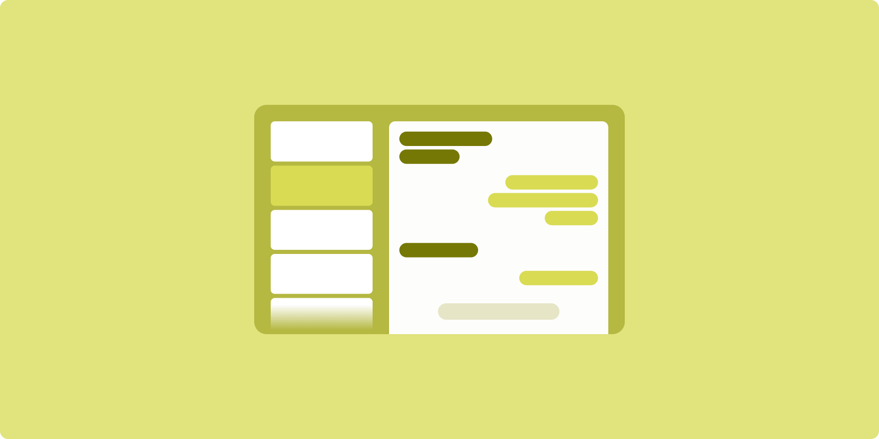
목록 세부정보 레이아웃에서 사용자는 설명 정보 또는 기타 추가 정보가 있는 항목의 목록(항목 세부정보)을 탐색할 수 있습니다.
이 레이아웃은 앱 창을 목록 창과 세부정보 창으로 하나씩, 두 개의 나란한 창으로 나눕니다. 사용자는 목록에서 항목을 선택하여 항목 세부정보를 표시합니다. 세부정보의 딥 링크는 세부정보 창에 추가 콘텐츠를 표시합니다.
넓은 너비 디스플레이 (창 크기 클래스 사용 참고)는 목록과 세부정보를 동시에 수용합니다. 목록 항목을 선택하면 세부정보 창이 업데이트되어 선택한 항목의 관련 콘텐츠가 표시됩니다.
중간 너비 및 좁은 너비 디스플레이는 사용자와 앱의 상호작용에 따라 목록이나 세부정보를 표시합니다. 목록만 표시된 경우 목록 항목을 선택하면 목록 대신 세부정보가 표시됩니다. 세부정보만 표시된 경우 뒤로 버튼을 누르면 목록이 다시 표시됩니다.
기기 방향 변경이나 앱 창 크기 변경과 같은 구성 변경으로 인해 디스플레이의 창 크기 클래스가 변경될 수 있습니다. 목록-세부정보 레이아웃이 적절하게 응답하여 앱 상태를 유지합니다.
- 목록 창과 세부정보 창을 모두 표시하는 넓은 너비 디스플레이가 중간 너비나 좁은 너비로 축소되는 경우 세부정보 창이 계속 표시되고 목록 창이 숨겨집니다.
- 중간 너비 또는 좁은 너비 디스플레이에 세부정보 창만 표시되고 창 크기 클래스가 펼쳐지는 경우 목록과 세부정보가 함께 표시되며 목록은 세부정보 창의 콘텐츠에 해당하는 항목이 선택되었음을 나타냅니다.
- 중간 너비 또는 좁은 너비 디스플레이에 목록 창만 표시되고 이 디스플레이가 펼쳐지는 경우 목록 및 자리표시자 세부정보 창이 함께 표시됩니다.
목록-세부정보는 메시지 앱, 연락처 관리자, 대화형 미디어 브라우저 또는 추가 정보를 표시하는 항목 목록으로 콘텐츠를 구성할 수 있는 앱에 적합합니다.
구현
목록-세부정보 레이아웃은 Compose, 뷰, 활동 삽입 (기존 앱)을 비롯한 다양한 기술로 만들 수 있습니다. 앱에 가장 적합한 기술을 결정하는 데 도움이 필요하면 적용 대상 섹션을 참고하세요.
SlidingPaneLayout 라이브러리는 뷰 또는 프래그먼트를 기반으로 목록-세부정보 레이아웃을 구현하도록 설계되었습니다.
먼저 SlidingPaneLayout을 XML 레이아웃의 루트 요소로 선언합니다.
그런 다음, 목록 및 세부정보 콘텐츠를 나타내는 두 하위 요소(뷰 또는 프래그먼트)를 추가합니다.
목록-세부정보 뷰 또는 프래그먼트 간에 데이터를 전달하는 통신 방법을 구현합니다. ViewModel은 비즈니스 로직을 저장하고 구성 변경 후에도 유지할 수 있으므로 권장됩니다.
SlidingPaneLayout은 목록과 세부정보를 함께 표시할지 아니면 개별적으로 표시할지를 자동으로 결정합니다. 두 영역을 모두 수용할 수 있는 가로 공간이 충분한 창에서는 목록과 세부정보가 나란히 표시됩니다. 공간이 부족한 창에는 사용자와 앱의 상호작용에 따라 목록이나 세부정보가 표시됩니다.
구현 예는 슬라이딩 창을 사용한 목록-세부정보 샘플을 참고하세요.
활동 삽입
활동 삽입을 사용하면 기존의 다중 활동 앱이 같은 화면에 두 활동을 나란히 표시하거나 스택 (하나가 다른 활동을 오버레이함)으로 표시할 수 있습니다. 앱이 별도의 활동에서 목록-세부정보 레이아웃의 목록과 세부정보를 구현하는 경우 활동 삽입을 사용하면 코드 리팩터링을 사용하지 않거나 최소한으로 사용하여 목록-세부정보 레이아웃을 만들 수 있습니다.
XML 구성 파일을 사용하여 작업 창 분할을 지정하면 활동 삽입을 구현할 수 있습니다. 분할은 기본 활동(분할 시작)과 보조 활동을 정의합니다. 창 크기 클래스 중단점을 사용하여 분할의 최소 표시 너비를 지정합니다. 디스플레이 너비가 최소 중단점 아래로 떨어지면 활동이 다른 활동에 오버레이되어 표시됩니다. 예를 들어 최소 디스플레이 너비가 600dp인 경우 활동은 소형 디스플레이에 겹쳐서 표시되지만 중간 및 확장 디스플레이에는 나란히 표시됩니다.
활동 삽입은 Android 12L (API 수준 32) 이상에서 지원되지만 기기 제조업체에서 구현하는 경우 더 낮은 API 수준에서도 사용할 수 있습니다. 기기에서 활동 삽입을 사용할 수 없는 경우 대체 동작으로 인해 목록 활동 또는 세부정보 활동이 사용자와 앱의 상호작용에 따라 전체 앱 창을 차지하게 됩니다.
자세한 내용은 활동 삽입을 참고하세요.
구현 예는 활동 삽입을 사용한 목록-세부정보 샘플을 참고하세요.
피드
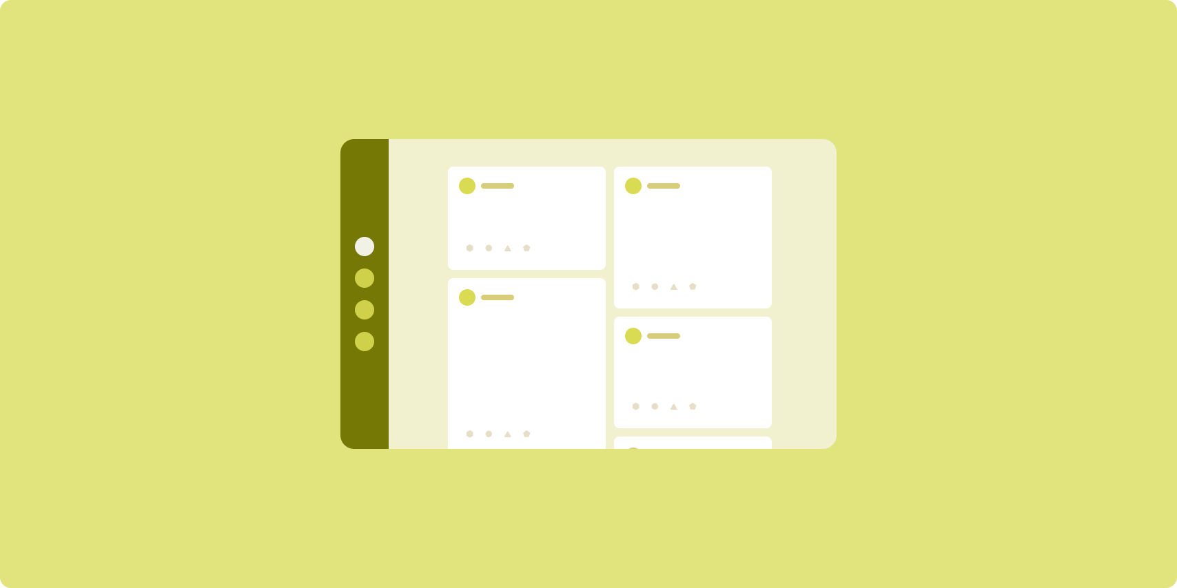
피드 레이아웃은 구성 가능한 그리드에 동등한 콘텐츠 요소를 정렬하여 많은 양의 콘텐츠를 빠르고 편리하게 표시합니다.
크기 및 위치는 콘텐츠 요소 간의 관계를 설정합니다.
콘텐츠 그룹은 요소의 크기를 동일하게 만들고 위치를 함께 지정하여 생성됩니다. 요소를 주변 요소보다 크게 만들어 요소에 주의를 끌 수 있습니다.
카드와 목록은 피드 레이아웃의 일반적인 구성요소입니다.
피드 레이아웃은 거의 모든 크기의 디스플레이를 지원합니다. 그리드를 단일 스크롤 열에서 다중 열 스크롤 콘텐츠 피드로 조정할 수 있기 때문입니다.
피드는 뉴스 및 소셜 미디어 앱에 특히 적합합니다.
구현
RecyclerView는 다수의 항목을 단일 열에 효율적으로 렌더링합니다. GridLayoutManager는 항목을 그리드에 배치하여 항목 크기 및 스팬을 구성할 수 있습니다.
사용 가능한 디스플레이 영역의 크기에 따라 그리드 열을 구성하여 항목의 최소 허용 너비를 설정합니다.
GridLayoutManager 기본 스팬 전략(항목당 스팬 하나)은 맞춤 SpanSizeLookup을 만들어 재정의할 수 있습니다. 스팬을 조정하여 일부 항목을 다른 항목보다 강조합니다.
열 하나만 수용할 공간이 있는 좁은 너비 디스플레이에서는 GridLayoutManager 대신 LinearLayoutManager를 사용합니다.
구현 예는 뷰를 사용한 피드 샘플을 참고하세요.
지원 창

지원 창 레이아웃은 앱 콘텐츠를 기본 및 보조 디스플레이 영역으로 구성합니다.
기본 디스플레이 영역은 앱 창의 대부분 (일반적으로 약 2/3)를 차지하며 기본 콘텐츠를 포함합니다. 보조 디스플레이 영역은 앱 창의 나머지 부분을 차지하며 기본 콘텐츠를 지원하는 콘텐츠를 표시하는 창입니다.
지원 창 레이아웃은 가로 방향의 넓은 너비 디스플레이 (창 크기 클래스 사용 참고)에서 잘 작동합니다. 중간 너비 또는 좁은 너비 디스플레이는 콘텐츠가 좁은 디스플레이 공간에 맞게 조정되는 경우 또는 메뉴나 버튼 등의 컨트롤로 추가 콘텐츠를 처음에 하단 또는 측면 시트에 숨길 수 있는 경우 기본 및 보조 디스플레이 영역을 모두 표시하도록 지원합니다.
지원 창 레이아웃은 기본 콘텐츠와 보조 콘텐츠의 관계에서 목록 세부정보 레이아웃과 다릅니다. 보조 창 콘텐츠는 기본 콘텐츠와 관련해서만 의미가 있습니다. 예를 들어 지원 창 도구 창은 그 자체만으로는 관련이 없습니다. 그러나 목록 세부정보 레이아웃의 세부정보 창에 표시되는 보조 콘텐츠는 제품 등록정보의 제품 설명과 같이 기본 콘텐츠가 없는 경우에도 의미가 있습니다.
지원 창의 사용 사례는 다음과 같습니다.
- 생산성 앱: 지원 창에서 평가자 의견이 포함된 문서 또는 스프레드시트
- 미디어 앱: 지원 창의 스트리밍 동영상 및 관련 동영상 목록 또는 재생목록이 추가된 음악 앨범 묘사
- 도구 및 설정: 지원 창에 팔레트, 효과, 기타 설정이 있는 미디어 편집 도구
구현
지원 창 레이아웃은 다음과 같은 도우미 레이아웃을 사용하여 구현됩니다.
LinearLayout 또는 ConstraintLayout. 앱에 사용할 수 있는 가로 디스플레이 공간을 좁게(600dp 미만), 중간(600dp 이상), 확장(840dp 이상)의 세 가지 카테고리로 나누는 창 크기 클래스를 설정합니다.
각 창 크기 클래스에 다음과 같이 레이아웃을 정의합니다.
- 좁게: 앱 리소스
layout폴더에 기본 콘텐츠 아래 또는 하단 시트 내부에 지원 창을 렌더링합니다. - 중간:
layout-w600dp폴더에 지원 창 콘텐츠를 제공합니다. 그 결과 기본 콘텐츠와 지원 창 렌더링이 나란히 표시됩니다. 가로 디스플레이 공간을 균등하게 분할하여 - 확장:
layout-w840dp폴더에 기본 콘텐츠와 지원 창 렌더링을 나란히 표시하는 지원 창 콘텐츠를 포함합니다. 하지만 지원 창이 가로 공간의 30%만 차지하고 나머지 70%는 기본 콘텐츠용으로 남깁니다.
ViewModel를 사용하여 기본 콘텐츠와
지원 창을 사용할 수 있습니다.
구현 예는 다음 샘플을 참고하세요.
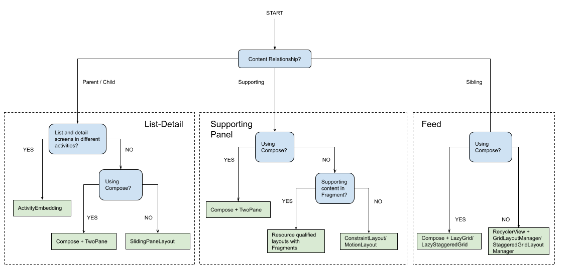
적용 대상
표준 레이아웃은 쉽게 액세스하고 자세히 탐색할 수 있도록 콘텐츠의 다각적 프레젠테이션을 만듭니다. 다음 플로우 차트를 사용하여 앱의 사용 사례에 가장 적합한 레이아웃 및 구현 전략을 결정하세요.
다양한 유형의 앱에 구현된 표준 레이아웃의 예는 대형 화면 갤러리를 참고하세요.
추가 리소스
- Material Design — 표준 레이아웃