Menambahkan tombol
Tetap teratur dengan koleksi
Simpan dan kategorikan konten berdasarkan preferensi Anda.
Mencoba cara Compose
Jetpack Compose adalah toolkit UI yang direkomendasikan untuk Android. Pelajari cara menambahkan komponen di Compose.
Jika Anda menggunakan tata letak berbasis View
, ada tiga pilihan utama untuk
mengimplementasikan tombol beralih. Sebaiknya gunakan komponen
SwitchMaterial
dari library Material
Components:
<androidx.constraintlayout.widget.ConstraintLayout xmlns:android="http://schemas.android.com/apk/res/android"
xmlns:app="http://schemas.android.com/apk/res-auto"
android:layout_width="match_parent"
android:layout_height="match_parent"
android:padding="16dp">
<com.google.android.material.switchmaterial.SwitchMaterial
android:id="@+id/material_switch"
android:layout_width="wrap_content"
android:layout_height="wrap_content"
android:text="@string/material_switch"
app:layout_constraintEnd_toEndOf="parent"
app:layout_constraintStart_toStartOf="parent"
app:layout_constraintTop_toTopOf="parent" />
</androidx.constraintlayout.widget.ConstraintLayout>
Aplikasi lama mungkin masih menggunakan komponen
AppCompat SwitchCompat
versi lama, seperti yang ditunjukkan pada contoh berikut:
<androidx.constraintlayout.widget.ConstraintLayout xmlns:android="http://schemas.android.com/apk/res/android"
xmlns:app="http://schemas.android.com/apk/res-auto"
android:layout_width="match_parent"
android:layout_height="match_parent"
android:padding="16dp">
<androidx.appcompat.widget.SwitchCompat
android:id="@+id/switchcompat"
android:layout_width="wrap_content"
android:layout_height="wrap_content"
android:text="@string/switchcompat"
app:layout_constraintEnd_toEndOf="parent"
app:layout_constraintStart_toStartOf="parent"
app:layout_constraintTop_toTopOf="parent" />
</androidx.constraintlayout.widget.ConstraintLayout>
Contoh berikut menunjukkan
AppCompatToggleButton
,
yang merupakan komponen lama lain yang memiliki UI yang sangat berbeda:
<androidx.constraintlayout.widget.ConstraintLayout xmlns:android="http://schemas.android.com/apk/res/android"
xmlns:app="http://schemas.android.com/apk/res-auto"
android:layout_width="match_parent"
android:layout_height="match_parent"
android:padding="16dp">
<TextView
android:id="@+id/toggle_button_label"
android:layout_width="wrap_content"
android:layout_height="wrap_content"
app:layout_constraintStart_toStartOf="parent"
app:layout_constraintEnd_toStartOf="@id/toggle"
app:layout_constraintHorizontal_chainStyle="packed"
app:layout_constraintBaseline_toBaselineOf="@id/toggle"
android:text="@string/toggle_button" />
<androidx.appcompat.widget.AppCompatToggleButton
android:id="@+id/toggle"
android:layout_width="wrap_content"
android:layout_height="wrap_content"
app:layout_constraintEnd_toEndOf="parent"
app:layout_constraintStart_toEndOf="@id/toggle_button_label"
app:layout_constraintTop_toTopOf="parent"
app:layout_constraintBottom_toBottomOf="parent"/>
</androidx.constraintlayout.widget.ConstraintLayout>
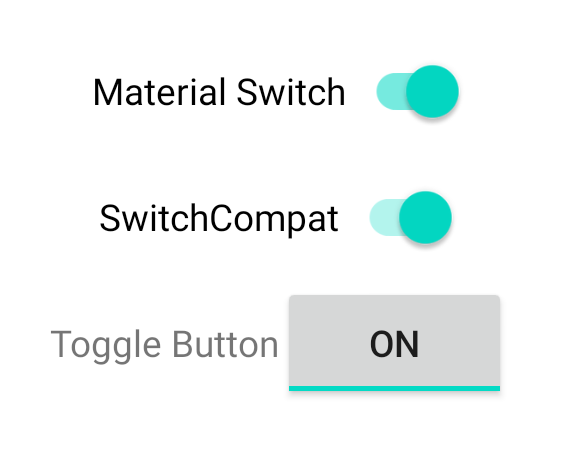
Ketiga komponen ini menawarkan perilaku yang sama, tetapi terlihat berbeda. Perbedaan
antara SwitchMaterial
dan SwitchCompat
tidak begitu jelas, tetapi
AppCompatToggleButton
sangat berbeda:
Gambar 1. Tiga jenis tombol alih.
Menangani perubahan status
SwitchMaterial
, SwitchCompat
, dan AppCompatToggleButton
adalah subclass
CompoundButton
, yang
memberi mereka mekanisme umum untuk menangani perubahan status yang dicentang. Anda mengimplementasikan
instance
CompoundButton.OnCheckedChangeListener
dan menambahkannya ke tombol, seperti yang ditunjukkan dalam contoh berikut:
Kotlin
class MainActivity : AppCompatActivity() {
override fun onCreate(savedInstanceState: Bundle?) {
super.onCreate(savedInstanceState)
val binding: SwitchLayoutBinding = SwitchLayoutBinding.inflate(layoutInflater)
setContentView(binding.root)
binding.materialSwitch.setOnCheckedChangeListener { _, isChecked ->
if (isChecked) {
// The switch is checked.
} else {
// The switch isn't checked.
}
}
}
}
Java
public class MainActivity extends AppCompatActivity {
@Override
protected void onCreate(Bundle savedInstanceState) {
super.onCreate(savedInstanceState);
SwitchLayoutBinding binding = SwitchLayoutBinding.inflate(getLayoutInflater());
setContentView(binding.getRoot());
binding.materialSwitch.setOnCheckedChangeListener((buttonView, isChecked) -> {
if (isChecked) {
// The switch is checked.
} else {
// The switch isn't checked.
}
});
}
}
CompoundButton.OnCheckedChangeListener
adalah antarmuka metode abstrak tunggal
(atau antarmuka SAM), sehingga Anda dapat mengimplementasikannya sebagai lambda. Lambda dipanggil
setiap kali status dicentang berubah, dan nilai boolean isChecked
yang diteruskan ke lambda menunjukkan status dicentang yang baru.
Konten dan contoh kode di halaman ini tunduk kepada lisensi yang dijelaskan dalam Lisensi Konten. Java dan OpenJDK adalah merek dagang atau merek dagang terdaftar dari Oracle dan/atau afiliasinya.
Terakhir diperbarui pada 2025-07-27 UTC.
[[["Mudah dipahami","easyToUnderstand","thumb-up"],["Memecahkan masalah saya","solvedMyProblem","thumb-up"],["Lainnya","otherUp","thumb-up"]],[["Informasi yang saya butuhkan tidak ada","missingTheInformationINeed","thumb-down"],["Terlalu rumit/langkahnya terlalu banyak","tooComplicatedTooManySteps","thumb-down"],["Sudah usang","outOfDate","thumb-down"],["Masalah terjemahan","translationIssue","thumb-down"],["Masalah kode / contoh","samplesCodeIssue","thumb-down"],["Lainnya","otherDown","thumb-down"]],["Terakhir diperbarui pada 2025-07-27 UTC."],[],[],null,["# Add toggle buttons\n\nTry the Compose way \nJetpack Compose is the recommended UI toolkit for Android. Learn how to add components in Compose. \n[Switch →](/develop/ui/compose/components/switch) \n\n\u003cbr /\u003e\n\nIf you're using a `View`-based layout, there are three main choices for\nimplementing toggles. We recommend using the\n[`SwitchMaterial`](https://m3.material.io/components/switch/overview) component\nfrom the [Material\nComponents](https://m3.material.io/develop/android/mdc-android) library: \n\n \u003candroidx.constraintlayout.widget.ConstraintLayout xmlns:android=\"http://schemas.android.com/apk/res/android\"\n xmlns:app=\"http://schemas.android.com/apk/res-auto\"\n android:layout_width=\"match_parent\"\n android:layout_height=\"match_parent\"\n android:padding=\"16dp\"\u003e\n\n \u003ccom.google.android.material.switchmaterial.SwitchMaterial\n android:id=\"@+id/material_switch\"\n android:layout_width=\"wrap_content\"\n android:layout_height=\"wrap_content\"\n android:text=\"@string/material_switch\"\n app:layout_constraintEnd_toEndOf=\"parent\"\n app:layout_constraintStart_toStartOf=\"parent\"\n app:layout_constraintTop_toTopOf=\"parent\" /\u003e\n\n \u003c/androidx.constraintlayout.widget.ConstraintLayout\u003e\n\nLegacy apps might still use the older\n[`SwitchCompat`](/reference/androidx/appcompat/widget/SwitchCompat) AppCompat\ncomponent, as shown in the following example: \n\n \u003candroidx.constraintlayout.widget.ConstraintLayout xmlns:android=\"http://schemas.android.com/apk/res/android\"\n xmlns:app=\"http://schemas.android.com/apk/res-auto\"\n android:layout_width=\"match_parent\"\n android:layout_height=\"match_parent\"\n android:padding=\"16dp\"\u003e\n\n \u003candroidx.appcompat.widget.SwitchCompat\n android:id=\"@+id/switchcompat\"\n android:layout_width=\"wrap_content\"\n android:layout_height=\"wrap_content\"\n android:text=\"@string/switchcompat\"\n app:layout_constraintEnd_toEndOf=\"parent\"\n app:layout_constraintStart_toStartOf=\"parent\"\n app:layout_constraintTop_toTopOf=\"parent\" /\u003e\n\n \u003c/androidx.constraintlayout.widget.ConstraintLayout\u003e\n\nThe following example shows\n[`AppCompatToggleButton`](/reference/androidx/appcompat/widget/AppCompatToggleButton),\nwhich is another legacy component that has a noticeably different UI: \n\n \u003candroidx.constraintlayout.widget.ConstraintLayout xmlns:android=\"http://schemas.android.com/apk/res/android\"\n xmlns:app=\"http://schemas.android.com/apk/res-auto\"\n android:layout_width=\"match_parent\"\n android:layout_height=\"match_parent\"\n android:padding=\"16dp\"\u003e\n\n \u003cTextView\n android:id=\"@+id/toggle_button_label\"\n android:layout_width=\"wrap_content\"\n android:layout_height=\"wrap_content\"\n app:layout_constraintStart_toStartOf=\"parent\"\n app:layout_constraintEnd_toStartOf=\"@id/toggle\"\n app:layout_constraintHorizontal_chainStyle=\"packed\"\n app:layout_constraintBaseline_toBaselineOf=\"@id/toggle\"\n android:text=\"@string/toggle_button\" /\u003e\n\n \u003candroidx.appcompat.widget.AppCompatToggleButton\n android:id=\"@+id/toggle\"\n android:layout_width=\"wrap_content\"\n android:layout_height=\"wrap_content\"\n app:layout_constraintEnd_toEndOf=\"parent\"\n app:layout_constraintStart_toEndOf=\"@id/toggle_button_label\"\n app:layout_constraintTop_toTopOf=\"parent\"\n app:layout_constraintBottom_toBottomOf=\"parent\"/\u003e\n\n \u003c/androidx.constraintlayout.widget.ConstraintLayout\u003e\n\nThese three components offer the same behavior but look different. The\ndifferences between the `SwitchMaterial` and `SwitchCompat` are subtle, but\n`AppCompatToggleButton` is noticeably different:\n\n\n**Figure 1.** Three toggle button types.\n\n\u003cbr /\u003e\n\n### Handle state changes\n\n`SwitchMaterial`, `SwitchCompat`, and `AppCompatToggleButton` are all subclasses\nof [`CompoundButton`](/reference/android/widget/CompoundButton), which\ngives them a common mechanism for handling checked state changes. You implement\nan instance of\n[`CompoundButton.OnCheckedChangeListener`](/reference/android/widget/CompoundButton.OnCheckedChangeListener)\nand add it to the button, as shown in the following example: \n\n### Kotlin\n\n```kotlin\nclass MainActivity : AppCompatActivity() {\n override fun onCreate(savedInstanceState: Bundle?) {\n super.onCreate(savedInstanceState)\n\n val binding: SwitchLayoutBinding = SwitchLayoutBinding.inflate(layoutInflater)\n setContentView(binding.root)\n\n binding.materialSwitch.setOnCheckedChangeListener { _, isChecked -\u003e\n if (isChecked) {\n // The switch is checked.\n } else {\n // The switch isn't checked.\n }\n }\n }\n}\n```\n\n### Java\n\n```java\npublic class MainActivity extends AppCompatActivity {\n\n @Override\n protected void onCreate(Bundle savedInstanceState) {\n super.onCreate(savedInstanceState);\n\n SwitchLayoutBinding binding = SwitchLayoutBinding.inflate(getLayoutInflater());\n setContentView(binding.getRoot());\n\n binding.materialSwitch.setOnCheckedChangeListener((buttonView, isChecked) -\u003e {\n if (isChecked) {\n // The switch is checked.\n } else {\n // The switch isn't checked.\n }\n });\n }\n}\n```\n\n`CompoundButton.OnCheckedChangeListener` is a single abstract method interface\n(or *SAM interface* ), so you can implement it as a lambda. The lambda is called\nwhenever the checked state changes, and the value of the `isChecked` boolean\nthat is passed to the lambda indicates the new checked state."]]