Ajouter des boutons d'activation
Restez organisé à l'aide des collections
Enregistrez et classez les contenus selon vos préférences.
Essayer Compose
Jetpack Compose est le kit d'outils d'UI recommandé pour Android. Découvrez comment ajouter des composants dans Compose.
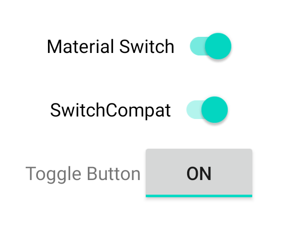
Si vous utilisez une mise en page basée sur View
, trois options principales s'offrent à vous pour implémenter des boutons d'activation/de désactivation. Nous vous recommandons d'utiliser le composant SwitchMaterial
de la bibliothèque Material Components :
<androidx.constraintlayout.widget.ConstraintLayout xmlns:android="http://schemas.android.com/apk/res/android"
xmlns:app="http://schemas.android.com/apk/res-auto"
android:layout_width="match_parent"
android:layout_height="match_parent"
android:padding="16dp">
<com.google.android.material.switchmaterial.SwitchMaterial
android:id="@+id/material_switch"
android:layout_width="wrap_content"
android:layout_height="wrap_content"
android:text="@string/material_switch"
app:layout_constraintEnd_toEndOf="parent"
app:layout_constraintStart_toStartOf="parent"
app:layout_constraintTop_toTopOf="parent" />
</androidx.constraintlayout.widget.ConstraintLayout>
Les anciennes applications peuvent toujours utiliser l'ancien composant AppCompat SwitchCompat
, comme illustré dans l'exemple suivant:
<androidx.constraintlayout.widget.ConstraintLayout xmlns:android="http://schemas.android.com/apk/res/android"
xmlns:app="http://schemas.android.com/apk/res-auto"
android:layout_width="match_parent"
android:layout_height="match_parent"
android:padding="16dp">
<androidx.appcompat.widget.SwitchCompat
android:id="@+id/switchcompat"
android:layout_width="wrap_content"
android:layout_height="wrap_content"
android:text="@string/switchcompat"
app:layout_constraintEnd_toEndOf="parent"
app:layout_constraintStart_toStartOf="parent"
app:layout_constraintTop_toTopOf="parent" />
</androidx.constraintlayout.widget.ConstraintLayout>
L'exemple suivant montre AppCompatToggleButton
, un autre ancien composant dont l'UI est sensiblement différente :
<androidx.constraintlayout.widget.ConstraintLayout xmlns:android="http://schemas.android.com/apk/res/android"
xmlns:app="http://schemas.android.com/apk/res-auto"
android:layout_width="match_parent"
android:layout_height="match_parent"
android:padding="16dp">
<TextView
android:id="@+id/toggle_button_label"
android:layout_width="wrap_content"
android:layout_height="wrap_content"
app:layout_constraintStart_toStartOf="parent"
app:layout_constraintEnd_toStartOf="@id/toggle"
app:layout_constraintHorizontal_chainStyle="packed"
app:layout_constraintBaseline_toBaselineOf="@id/toggle"
android:text="@string/toggle_button" />
<androidx.appcompat.widget.AppCompatToggleButton
android:id="@+id/toggle"
android:layout_width="wrap_content"
android:layout_height="wrap_content"
app:layout_constraintEnd_toEndOf="parent"
app:layout_constraintStart_toEndOf="@id/toggle_button_label"
app:layout_constraintTop_toTopOf="parent"
app:layout_constraintBottom_toBottomOf="parent"/>
</androidx.constraintlayout.widget.ConstraintLayout>
Ces trois composants offrent le même comportement, mais ont un aspect différent. Les différences entre SwitchMaterial
et SwitchCompat
sont subtiles, mais AppCompatToggleButton
est sensiblement différent :
Figure 1. Trois types de boutons d'activation/de désactivation.
Gérer les changements d'état
SwitchMaterial
, SwitchCompat
et AppCompatToggleButton
sont toutes des sous-classes de CompoundButton
, ce qui leur donne un mécanisme commun pour gérer les modifications d'état de vérification. Vous allez implémenter une instance de CompoundButton.OnCheckedChangeListener
et l'ajouter au bouton, comme illustré dans l'exemple suivant:
Kotlin
class MainActivity : AppCompatActivity() {
override fun onCreate(savedInstanceState: Bundle?) {
super.onCreate(savedInstanceState)
val binding: SwitchLayoutBinding = SwitchLayoutBinding.inflate(layoutInflater)
setContentView(binding.root)
binding.materialSwitch.setOnCheckedChangeListener { _, isChecked ->
if (isChecked) {
// The switch is checked.
} else {
// The switch isn't checked.
}
}
}
}
Java
public class MainActivity extends AppCompatActivity {
@Override
protected void onCreate(Bundle savedInstanceState) {
super.onCreate(savedInstanceState);
SwitchLayoutBinding binding = SwitchLayoutBinding.inflate(getLayoutInflater());
setContentView(binding.getRoot());
binding.materialSwitch.setOnCheckedChangeListener((buttonView, isChecked) -> {
if (isChecked) {
// The switch is checked.
} else {
// The switch isn't checked.
}
});
}
}
CompoundButton.OnCheckedChangeListener
est une interface à méthode abstraite unique (ou interface SAM). Vous pouvez donc l'implémenter en tant que lambda. Le lambda est appelé chaque fois que l'état coché change, et la valeur de la valeur booléenne isChecked
transmise au lambda indique le nouvel état coché.
Le contenu et les exemples de code de cette page sont soumis aux licences décrites dans la Licence de contenu. Java et OpenJDK sont des marques ou des marques déposées d'Oracle et/ou de ses sociétés affiliées.
Dernière mise à jour le 2025/07/27 (UTC).
[[["Facile à comprendre","easyToUnderstand","thumb-up"],["J'ai pu résoudre mon problème","solvedMyProblem","thumb-up"],["Autre","otherUp","thumb-up"]],[["Il n'y a pas l'information dont j'ai besoin","missingTheInformationINeed","thumb-down"],["Trop compliqué/Trop d'étapes","tooComplicatedTooManySteps","thumb-down"],["Obsolète","outOfDate","thumb-down"],["Problème de traduction","translationIssue","thumb-down"],["Mauvais exemple/Erreur de code","samplesCodeIssue","thumb-down"],["Autre","otherDown","thumb-down"]],["Dernière mise à jour le 2025/07/27 (UTC)."],[],[],null,["# Add toggle buttons\n\nTry the Compose way \nJetpack Compose is the recommended UI toolkit for Android. Learn how to add components in Compose. \n[Switch →](/develop/ui/compose/components/switch) \n\n\u003cbr /\u003e\n\nIf you're using a `View`-based layout, there are three main choices for\nimplementing toggles. We recommend using the\n[`SwitchMaterial`](https://m3.material.io/components/switch/overview) component\nfrom the [Material\nComponents](https://m3.material.io/develop/android/mdc-android) library: \n\n \u003candroidx.constraintlayout.widget.ConstraintLayout xmlns:android=\"http://schemas.android.com/apk/res/android\"\n xmlns:app=\"http://schemas.android.com/apk/res-auto\"\n android:layout_width=\"match_parent\"\n android:layout_height=\"match_parent\"\n android:padding=\"16dp\"\u003e\n\n \u003ccom.google.android.material.switchmaterial.SwitchMaterial\n android:id=\"@+id/material_switch\"\n android:layout_width=\"wrap_content\"\n android:layout_height=\"wrap_content\"\n android:text=\"@string/material_switch\"\n app:layout_constraintEnd_toEndOf=\"parent\"\n app:layout_constraintStart_toStartOf=\"parent\"\n app:layout_constraintTop_toTopOf=\"parent\" /\u003e\n\n \u003c/androidx.constraintlayout.widget.ConstraintLayout\u003e\n\nLegacy apps might still use the older\n[`SwitchCompat`](/reference/androidx/appcompat/widget/SwitchCompat) AppCompat\ncomponent, as shown in the following example: \n\n \u003candroidx.constraintlayout.widget.ConstraintLayout xmlns:android=\"http://schemas.android.com/apk/res/android\"\n xmlns:app=\"http://schemas.android.com/apk/res-auto\"\n android:layout_width=\"match_parent\"\n android:layout_height=\"match_parent\"\n android:padding=\"16dp\"\u003e\n\n \u003candroidx.appcompat.widget.SwitchCompat\n android:id=\"@+id/switchcompat\"\n android:layout_width=\"wrap_content\"\n android:layout_height=\"wrap_content\"\n android:text=\"@string/switchcompat\"\n app:layout_constraintEnd_toEndOf=\"parent\"\n app:layout_constraintStart_toStartOf=\"parent\"\n app:layout_constraintTop_toTopOf=\"parent\" /\u003e\n\n \u003c/androidx.constraintlayout.widget.ConstraintLayout\u003e\n\nThe following example shows\n[`AppCompatToggleButton`](/reference/androidx/appcompat/widget/AppCompatToggleButton),\nwhich is another legacy component that has a noticeably different UI: \n\n \u003candroidx.constraintlayout.widget.ConstraintLayout xmlns:android=\"http://schemas.android.com/apk/res/android\"\n xmlns:app=\"http://schemas.android.com/apk/res-auto\"\n android:layout_width=\"match_parent\"\n android:layout_height=\"match_parent\"\n android:padding=\"16dp\"\u003e\n\n \u003cTextView\n android:id=\"@+id/toggle_button_label\"\n android:layout_width=\"wrap_content\"\n android:layout_height=\"wrap_content\"\n app:layout_constraintStart_toStartOf=\"parent\"\n app:layout_constraintEnd_toStartOf=\"@id/toggle\"\n app:layout_constraintHorizontal_chainStyle=\"packed\"\n app:layout_constraintBaseline_toBaselineOf=\"@id/toggle\"\n android:text=\"@string/toggle_button\" /\u003e\n\n \u003candroidx.appcompat.widget.AppCompatToggleButton\n android:id=\"@+id/toggle\"\n android:layout_width=\"wrap_content\"\n android:layout_height=\"wrap_content\"\n app:layout_constraintEnd_toEndOf=\"parent\"\n app:layout_constraintStart_toEndOf=\"@id/toggle_button_label\"\n app:layout_constraintTop_toTopOf=\"parent\"\n app:layout_constraintBottom_toBottomOf=\"parent\"/\u003e\n\n \u003c/androidx.constraintlayout.widget.ConstraintLayout\u003e\n\nThese three components offer the same behavior but look different. The\ndifferences between the `SwitchMaterial` and `SwitchCompat` are subtle, but\n`AppCompatToggleButton` is noticeably different:\n\n\n**Figure 1.** Three toggle button types.\n\n\u003cbr /\u003e\n\n### Handle state changes\n\n`SwitchMaterial`, `SwitchCompat`, and `AppCompatToggleButton` are all subclasses\nof [`CompoundButton`](/reference/android/widget/CompoundButton), which\ngives them a common mechanism for handling checked state changes. You implement\nan instance of\n[`CompoundButton.OnCheckedChangeListener`](/reference/android/widget/CompoundButton.OnCheckedChangeListener)\nand add it to the button, as shown in the following example: \n\n### Kotlin\n\n```kotlin\nclass MainActivity : AppCompatActivity() {\n override fun onCreate(savedInstanceState: Bundle?) {\n super.onCreate(savedInstanceState)\n\n val binding: SwitchLayoutBinding = SwitchLayoutBinding.inflate(layoutInflater)\n setContentView(binding.root)\n\n binding.materialSwitch.setOnCheckedChangeListener { _, isChecked -\u003e\n if (isChecked) {\n // The switch is checked.\n } else {\n // The switch isn't checked.\n }\n }\n }\n}\n```\n\n### Java\n\n```java\npublic class MainActivity extends AppCompatActivity {\n\n @Override\n protected void onCreate(Bundle savedInstanceState) {\n super.onCreate(savedInstanceState);\n\n SwitchLayoutBinding binding = SwitchLayoutBinding.inflate(getLayoutInflater());\n setContentView(binding.getRoot());\n\n binding.materialSwitch.setOnCheckedChangeListener((buttonView, isChecked) -\u003e {\n if (isChecked) {\n // The switch is checked.\n } else {\n // The switch isn't checked.\n }\n });\n }\n}\n```\n\n`CompoundButton.OnCheckedChangeListener` is a single abstract method interface\n(or *SAM interface* ), so you can implement it as a lambda. The lambda is called\nwhenever the checked state changes, and the value of the `isChecked` boolean\nthat is passed to the lambda indicates the new checked state."]]