Un bouton d'action flottant (FAB) est un bouton circulaire qui déclenche l'action principale dans l'UI de votre application. Ce document explique comment ajouter un FAB à votre mise en page, personnaliser son apparence et répondre aux appuis sur le bouton.
Pour savoir comment concevoir un bouton d'action flottant pour votre application en suivant les consignes Material Design, consultez Bouton d'action flottant Material Design.
Image 1. Bouton d'action flottant
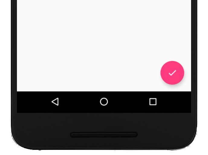
Ajouter le bouton d'action flottant à votre mise en page
Le code suivant montre comment l'élément
FloatingActionButton
apparaît dans votre fichier de mise en page :
Vous pouvez configurer d'autres propriétés du bouton d'action flottant à l'aide d'attributs XML ou de méthodes correspondantes, telles que les suivantes :
Taille du bouton d'action flottant, à l'aide de l'attribut app:fabSize ou de la méthode setSize()
Couleur de l'onde du FAB, à l'aide de l'attribut app:rippleColor ou de la méthode setRippleColor()
L'icône du bouton d'action flottant, à l'aide de l'attribut android:src ou de la méthode setImageDrawable()
Répondre aux commandes tactiles
Vous pouvez ensuite appliquer un View.OnClickListener pour gérer les appuis sur le bouton d'action flottant. Par exemple, le code suivant affiche un Snackbar lorsque l'utilisateur appuie sur le FAB :
Kotlin
valfab:View=findViewById(R.id.fab)fab.setOnClickListener{view->Snackbar.make(view,"Here's a Snackbar",Snackbar.LENGTH_LONG).setAction("Action",null).show()}
Java
FloatingActionButtonfab=findViewById(R.id.fab);fab.setOnClickListener(newView.OnClickListener(){@OverridepublicvoidonClick(Viewview){Snackbar.make(view,"Here's a Snackbar",Snackbar.LENGTH_LONG).setAction("Action",null).show();}});
Pour en savoir plus sur les fonctionnalités du FAB, consultez la documentation de référence de l'API pour FloatingActionButton.
Le contenu et les exemples de code de cette page sont soumis aux licences décrites dans la Licence de contenu. Java et OpenJDK sont des marques ou des marques déposées d'Oracle et/ou de ses sociétés affiliées.
Dernière mise à jour le 2025/08/27 (UTC).
[[["Facile à comprendre","easyToUnderstand","thumb-up"],["J'ai pu résoudre mon problème","solvedMyProblem","thumb-up"],["Autre","otherUp","thumb-up"]],[["Il n'y a pas l'information dont j'ai besoin","missingTheInformationINeed","thumb-down"],["Trop compliqué/Trop d'étapes","tooComplicatedTooManySteps","thumb-down"],["Obsolète","outOfDate","thumb-down"],["Problème de traduction","translationIssue","thumb-down"],["Mauvais exemple/Erreur de code","samplesCodeIssue","thumb-down"],["Autre","otherDown","thumb-down"]],["Dernière mise à jour le 2025/08/27 (UTC)."],[],[],null,["Try the Compose way \nJetpack Compose is the recommended UI toolkit for Android. Learn how to add components in Compose. \n[Floating Action Button →](/develop/ui/compose/components/fab) \n\n\u003cbr /\u003e\n\nA floating action button (FAB) is a circular button that triggers the primary\naction in your app's UI. This document shows how to add a FAB to your layout,\ncustomize some of its appearance, and respond to button taps.\n\nTo learn more about how to design a FAB for your app according to the Material\nDesign Guidelines, see [Material Design\nFAB](https://m3.material.io/components/floating-action-button/overview)\n.\n**Figure 1.** A floating action button (FAB).\n\nAdd the floating action button to your layout\n\nThe following code shows how the\n[`FloatingActionButton`](/reference/com/google/android/material/floatingactionbutton/FloatingActionButton)\nappears in your layout file: \n\n```xml\n\u003ccom.google.android.material.floatingactionbutton.FloatingActionButton\n android:id=\"@+id/fab\"\n android:layout_width=\"wrap_content\"\n android:layout_height=\"wrap_content\"\n android:layout_gravity=\"end|bottom\"\n android:src=\"@drawable/ic_my_icon\"\n android:contentDescription=\"@string/submit\"\n android:layout_margin=\"16dp\" /\u003e\n```\n\nBy default, a FAB is colored by the `colorAccent` attribute, which you can\n[customize with the theme's color\npalette](/guide/topics/ui/look-and-feel/themes#ColorPalette).\n\nYou can configure other FAB properties using XML attributes or corresponding\nmethods, such as the following:\n\n- The size of the FAB, using the `app:fabSize` attribute or the [`setSize()`](/reference/com/google/android/material/floatingactionbutton/FloatingActionButton#setSize(int)) method\n- The ripple color of the FAB, using the `app:rippleColor` attribute or the [`setRippleColor()`](/reference/com/google/android/material/floatingactionbutton/FloatingActionButton#setRippleColor(int)) method\n- The FAB icon, using the `android:src` attribute or the [`setImageDrawable()`](/reference/android/widget/ImageView#setImageDrawable(android.graphics.drawable.Drawable)) method\n\nRespond to button taps\n\nYou can then apply an\n[`View.OnClickListener`](/reference/android/view/View.OnClickListener) to\nhandle FAB taps. For example, the following code displays a\n[`Snackbar`](/reference/com/google/android/material/snackbar/Snackbar) when\nthe user taps the FAB: \n\nKotlin \n\n```kotlin\nval fab: View = findViewById(R.id.fab)\nfab.setOnClickListener { view -\u003e\n Snackbar.make(view, \"Here's a Snackbar\", Snackbar.LENGTH_LONG)\n .setAction(\"Action\", null)\n .show()\n}\n```\n\nJava \n\n```java\nFloatingActionButton fab = findViewById(R.id.fab);\nfab.setOnClickListener(new View.OnClickListener() {\n @Override\n public void onClick(View view) {\n Snackbar.make(view, \"Here's a Snackbar\", Snackbar.LENGTH_LONG)\n .setAction(\"Action\", null).show();\n }\n});\n```\n\nFor more information about the capabilities of the FAB, see the API reference\nfor the\n[`FloatingActionButton`](/reference/com/google/android/material/floatingactionbutton/FloatingActionButton)."]]